Established just four years go, Studio Hato and its sister business risograph printers Hato Press have an impressive roster of clients, including the Tate and Serpentine Galleries. We caught up with director Ken Kirton to discuss experimental production, community engagement, and new digital venture Hato Labo.

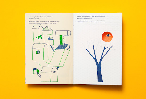
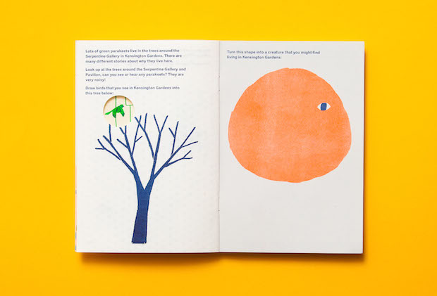
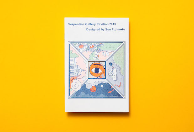
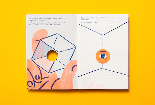
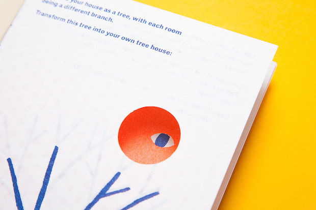
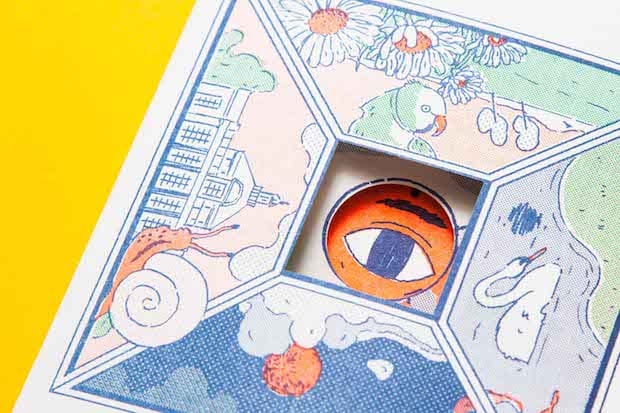
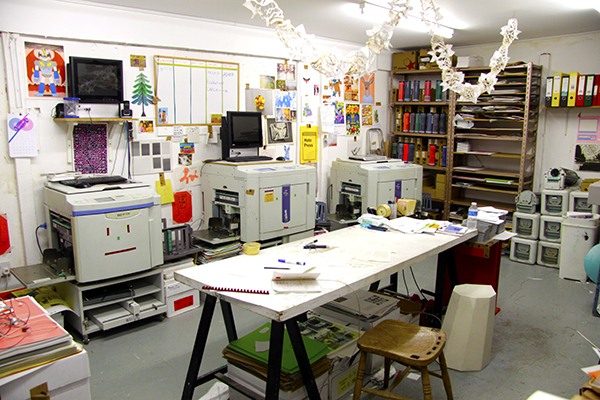
Down a Hackney side street tucked around the corner from Mecca Bingo lies a smart but innocuous cafe. Inside, the chorus of percolating coffee and frothing milk is underpinned by a more repetitive sound, the faint clunking of machinery at work. For here, embedded behind the cappuccinos-in-progress, is the home of Hato Press and sister company Studio Hato, a symbiotic Risograph printers and design studio that specialises in identity projects, workshops and print publications for cultural organisations, as well as offering their Riso expertise to a host of other customers. Filled to the ceiling with inks, papers and the hum of the press, from here they’ve brought into existence everything from books for mainstream art galleries, such as the children’s art packs to accompany Sou Fujimoto’s Serpentine Pavilion, through to subversive client jobs, like Broken Fingaz’ ghoulish erotic zine Sex Picnic. If you’ve picked up something Riso printed in the last year, it’s likely that Hato had something to do with it.
But although the press is integral to the way that Hato operates, the practice is far from consumed by a nostalgic loyalty to print. In the past year, Studio Hato and Hato Press have been joined by Hato Labo, a digital-led arm of the business that aims to increase the studio’s capacity for interactive educational projects and experimental installations. Rather than being driven by a desire to make beautiful printed objects (although that is of course a part of what Hato do), it’s clear that the importance of the press instead lies in its power to put the means of production into the hands of the designers. As well as generating enough income through printing other people’s projects to support the burgeoning design studio, it has allowed them to publish the work of friends, collaborators and people they admire, as well as experiment with unorthodox binding and folding techniques and, something that is very important to Hato’s ethos, teach those skills to others.
Founders Ken Kirton and Jackson Lam met while studying graphic design at Central Saint Martins, and knew part way through their final year that their similar approach and ideals would make them excellent collaborators. One of their first projects together was inspired by Italian product designer Enzo Mari, whose egalitarian approach to design made quite an impression on their pair, not least his book Autoprogettazione, which shows you how to make a range of beautiful, geometric furniture using just straight cuts, a saw, nail and hammer. Whereas Mari’s Living workshop tasked architecture students to design houses for fictional people whose identities where determined by a series of cards, Kirton and Lam’s project involved challenging friends to design objects that would prove the existence of fictional characters. Realising pretty early on that no physical object would be able to do this, Kirton and Lam ended up giving a presentation to the class, which was interrupted by a delivery of flowers to an absent class member, who it was then revealed at the end of the presentation was their fictional character. Convoluted perhaps, but the project highlights three things that are still integral to how Hato work today, they’re playful and collaborative but also, like Mari, believe that design is not just about creating something for a client, but also helping others to create.
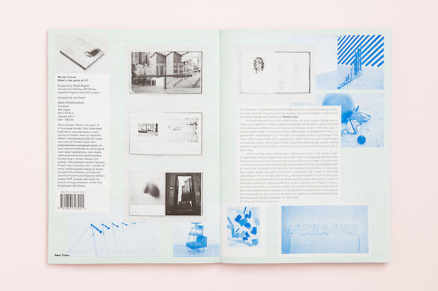
In their final year, the pair read about Riso printers in IDEA magazine and decided both to set up a studio together and to invest in one of these huge machines. “For us it was the idea of being able to understand, make and play with our own production,” explains Hato’s Ken Kirton. “You weren't told by someone that you couldn't do this or you couldn't do that. It’s a great resource for us as designers.” It was a decision that quickly paid off as, even before the pair graduated, their tutor, Åbäke’s Patrick Lacey, had commissioned them for The Incidental, a project that crowd-sourced all of the tweets and images tagged with London Design Festival and printed them into a newsletter overnight. Through this project and their relationship with Lacey, the pair began picking up more regular projects.
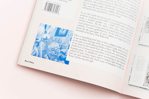
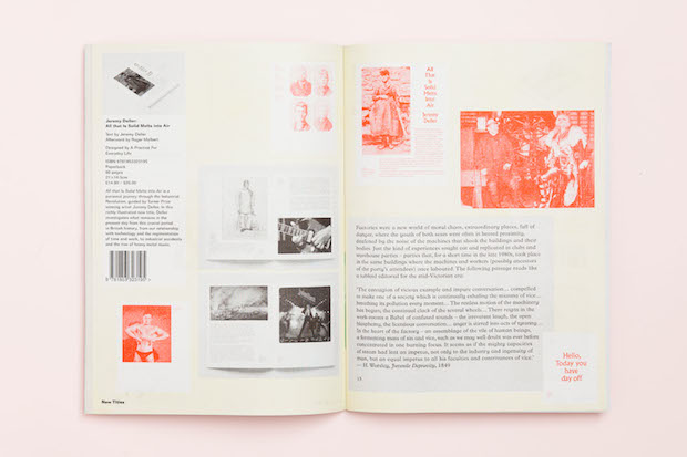
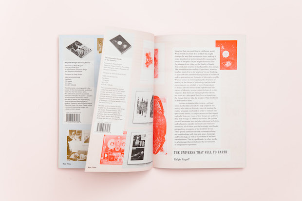
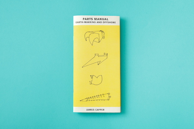
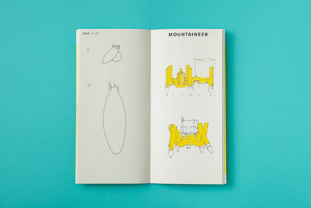
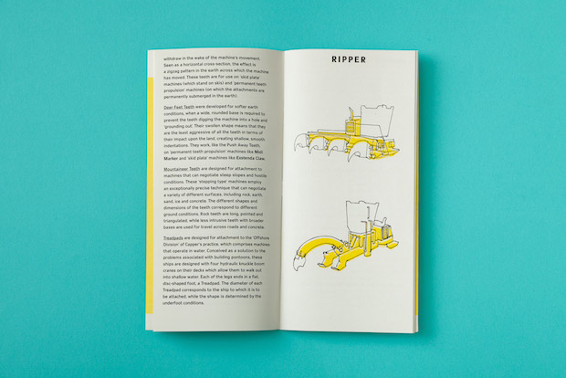
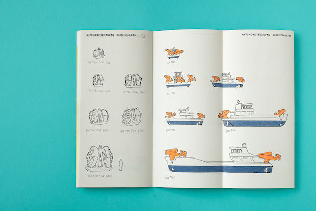
Today, their approach towards the press is still quite unorthodox. All profits are fed back into the press to either upgrade machinery or pay wages to print technicians Sophie Marchbank, Jordan Taylor and Justin Bailey, studio designer Mélanie Dautreppe-Liermann and publishing distributor Amber Jones, meaning that they can both keep production costs low for customers. Hato Press also publishes books of its own, something which Kirton and Lam have tried to focus on in 2014 after letting studio commissions absorb most of their energy for the past few years. Although attention to detail and inventive production techniques are common themes throughout many of the publications, the content is incredibly varied. Recent releases include Emily Rand’s beautifully simplistic In the Garden, which traces a feather’s journey through a verdant garden, and James Capper’s Parts Manual II, an illustrated inventory of the incredible JCB-like machines made by this young inventor, which range from a contraption designed to specifically climb the alps to a room-sized transportation vehicle dreamt up by a Chinese military commander in 231AD.
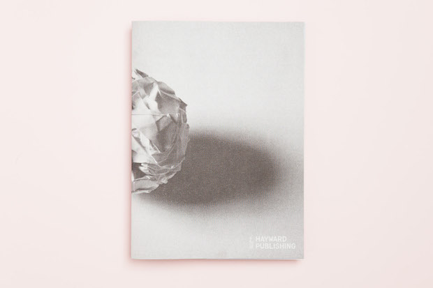
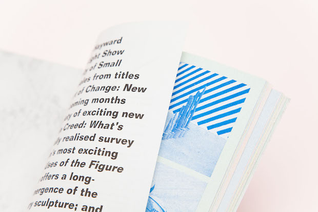
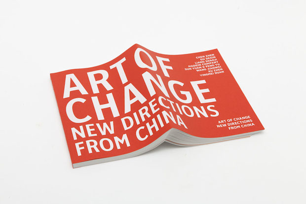
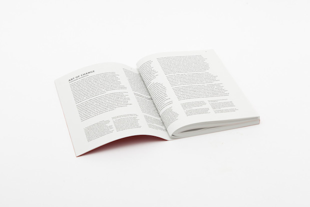
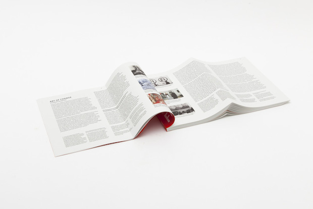
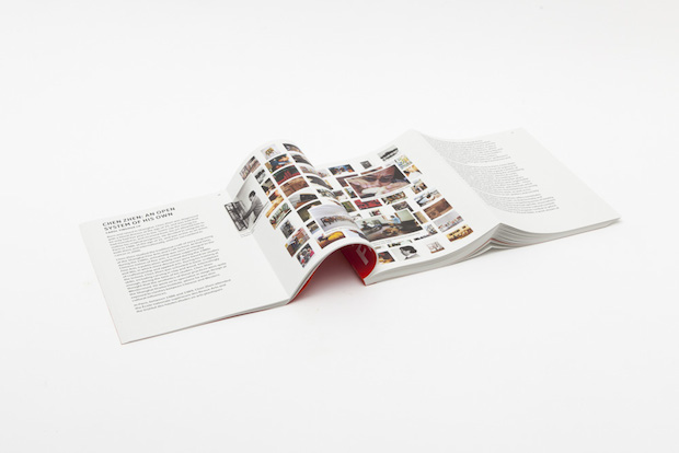
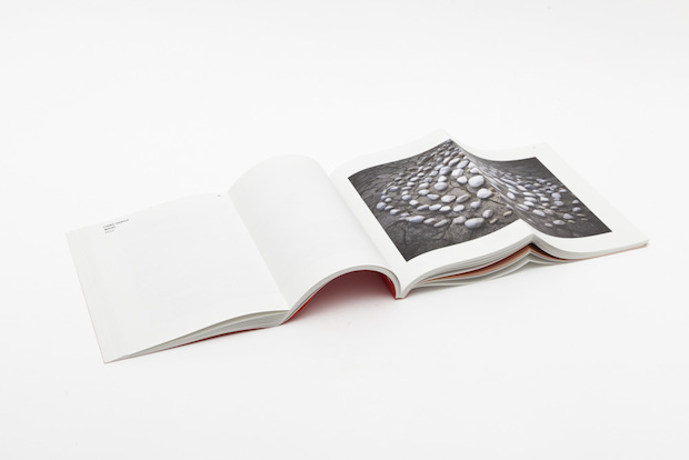
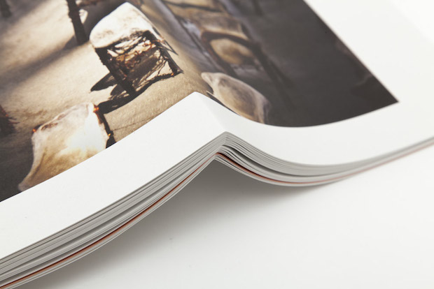
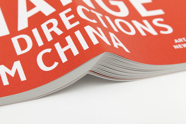
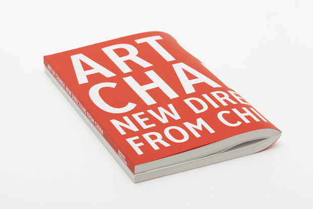
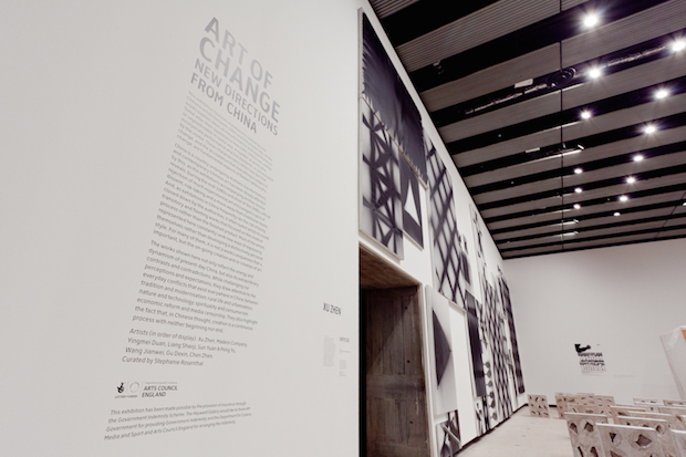
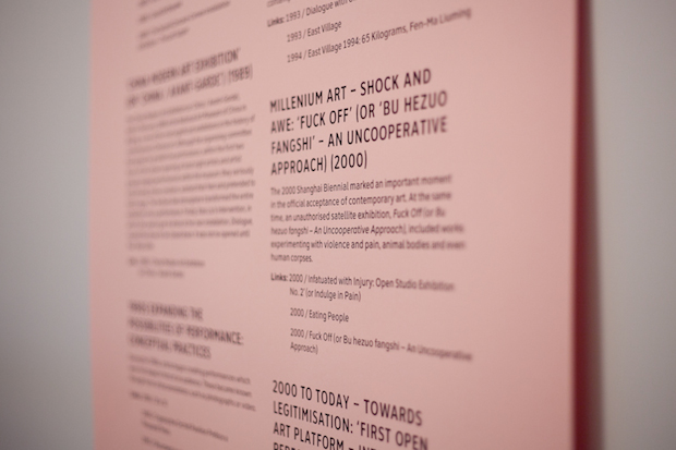
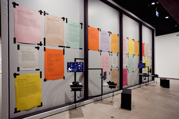
But not only does Hato Press work as a financial support system for the studio, it also has a profound effect on the studio’s ability to experiment, try new approaches and tailor design solutions accordingly. For the catalogue for The Hayward Gallery’s Art of Change: New Directions from China exhibition in 2012 for example, the studio created a perfect bound book that folds into itself. The exhibition’s curator Stephanie Rosenthal was keen that the publication recreated the internet in some manner, so this folding technique allows the book to present text then open out like Google Image Search. “This book would never have been able to be made without the printing press,” says Kirton. “We had the folding machine downstairs so we could make a mock-up in minutes. It's actually a new format that we developed, every page is folded at a different increment to make sure the spine is flush, there's no creep.” To bring the book into fruition, Studio Hato had to travel to a printers in Belgium after every UK printer turned it down because of its complexity. “Going into the meeting with a physical mock-up was so important,” adds Kirton. “It's starting a project with an idea of what is physically possible.”
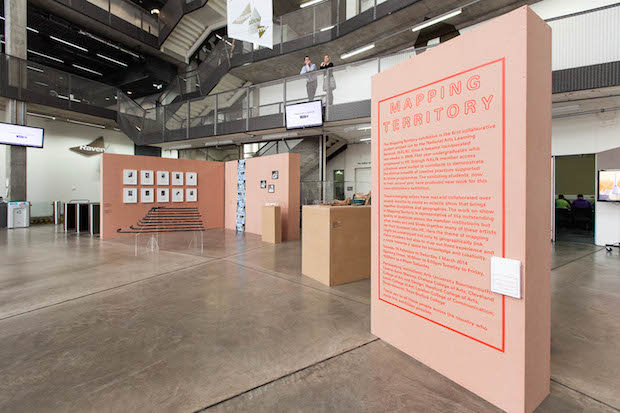
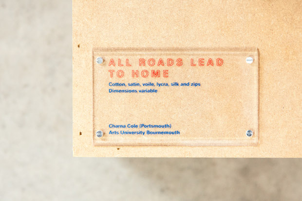
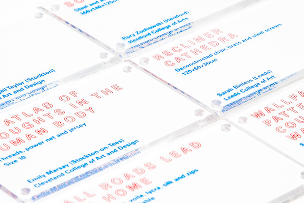
As well as bringing complex concepts into existence, the studio’s drive to get to grips with production processes also allows them to simplify. When designing an exhibition for the National Arts Learning Network called Mapping Territory, Studio Hato developed a new cut of Univers, which historically has been used on maps, for both the exhibition and website. Because they wanted to use acrylic for the signage and knew that this would be most easily engraved with a rounded drill, they made the typeface rounded too. This led to an easier, cheaper and better quality end product.
Establishing Hato Labo, the studio’s digital business, is also an extension of this idea. “There's this huge argument that everyone tries to negotiate, digital vs print,” says Kirton. It's not really an argument at all, they both have to co-exist. Labo is similar to the printing press in that it’s about understanding that production tool. Content management systems, html, they’re all tools, the more we understand them then the more of an experience or an object we can produce for clients.” Interested in the space where the physical and the digital meet, currently Labo (led by Jason Chow) is working on an education pack for the Serpentine that allows usesr to create animated dancing puppets using their own drawings. “Labo really pushes what we can do with physical computing, increases interaction when with working with kids, and allows us to reach a larger audience through the internet,” Kirton adds.
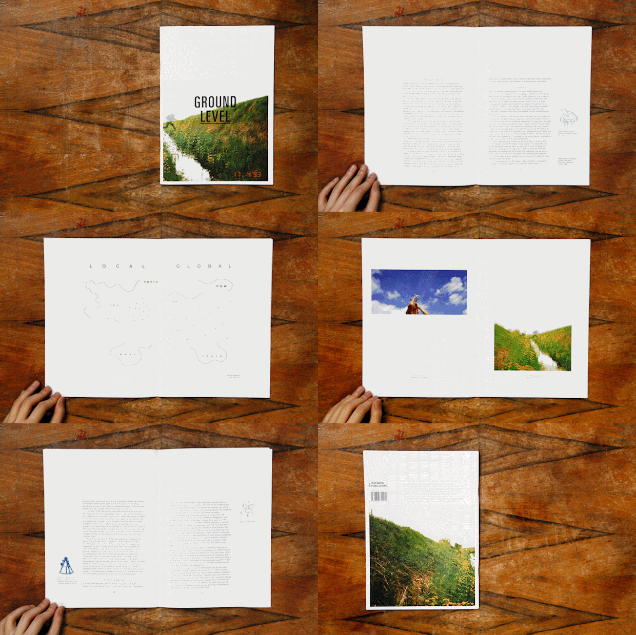
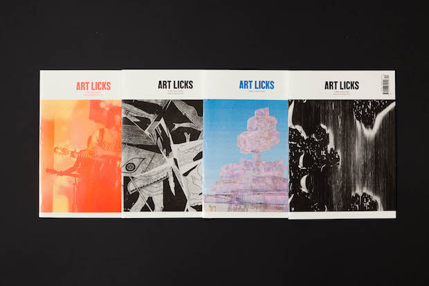
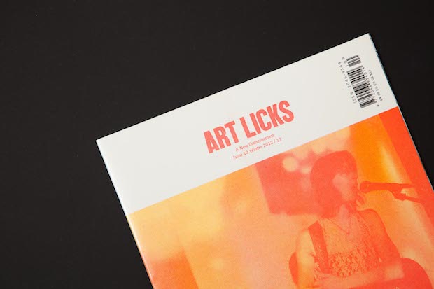
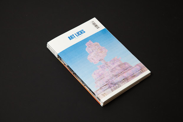
Identity, exhibition design and workshop projects for cultural institutions have become Studio Hato’s bread and butter, something Kirton attributes both to their fruitful relationship with Åbäke and their involvement in Art Licks, an arts magazine they designed for a two-year long stretch which put them in touch with a large number of artists. Since their initial project for the Hayward Gallery, a catalogue for geography and cartography-inspired exhibition Ground Level, the Studio has worked on a wide range of exhibition materials for institutions like St Brides, the Serpentine and the Tate.“What I really like about graphic design is that you can become an expert amateur for that point of time while you're doing that project,” says Kirton. “That idea of being a good amateur at something, whether that's building furniture or understanding a production method or designing an identity around a specific topic, it's nice to focus in on something for that moment of time and create something with the client.”
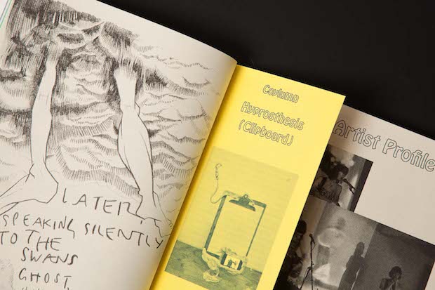
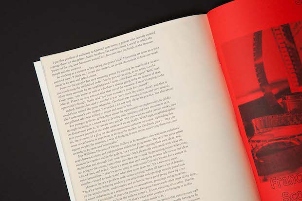
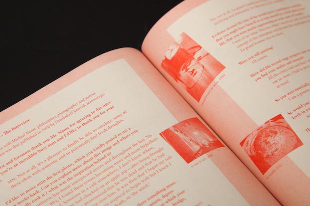
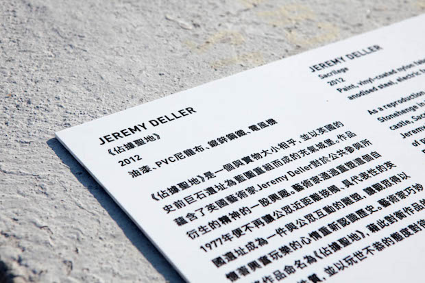
Perhaps the largest project Studio Hato has worked on to date is the identity, publications, website and exhibition signage for Mobile M+ Inflation!, an exhibition on the site of Hong Kong’s forthcoming M+ visual culture museum located in the West Kowloon Cultural District. The exhibition brought together a series of huge inflatable artworks, including Jeremy Deller’s Stone Henge-inspired Sacrilege and towering works by Paul McCarthy and Choi Jeong, meaning that Studio Hato’s designs had to be equally epic. Noticing that many of the typefaces used in Hong Kong’s parks were stencilled, Hato developed a stencil typeface, which gave shape to the exhibition identity and the huge concrete blocks used as exhibition plinths. Scale was also the main idea behind the publications and website, taking inspiration from Charles and Ray Eames’ Powers of Ten film for IBM to create both printed and digital formats where you could zoom in and out for additional detail.


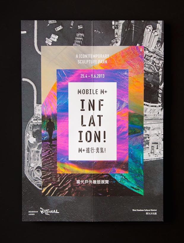
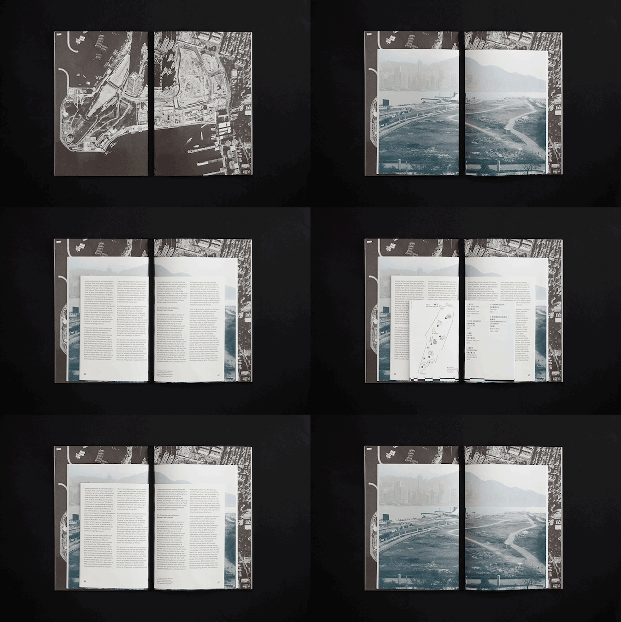
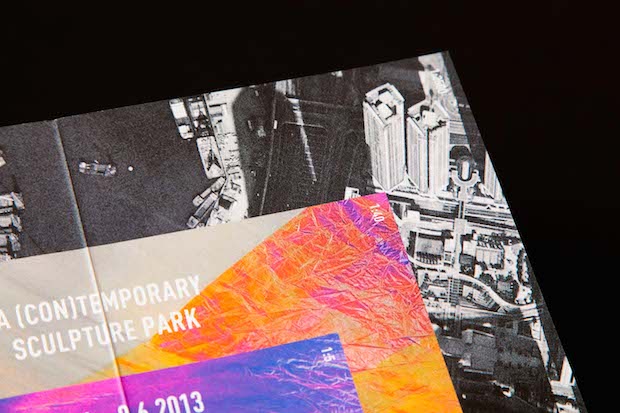
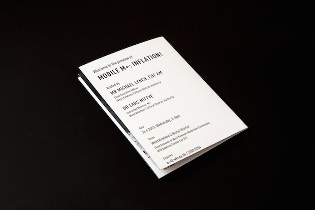
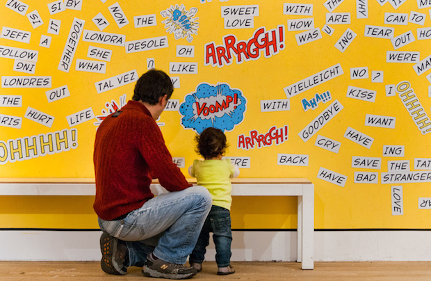
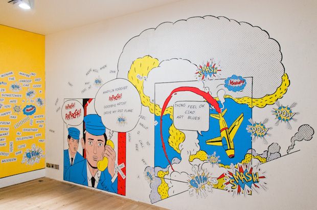
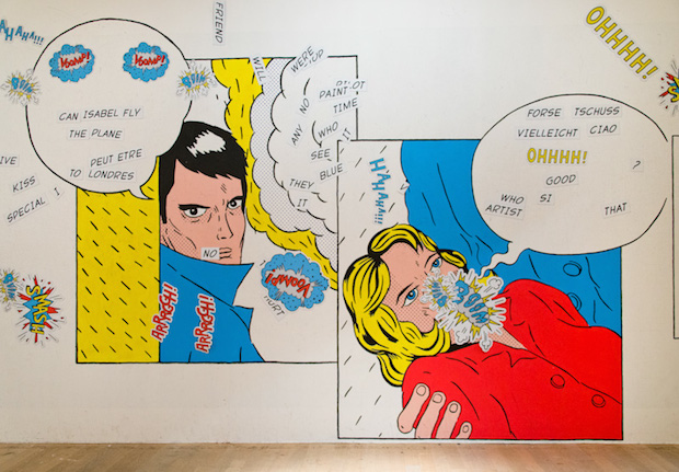
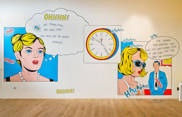
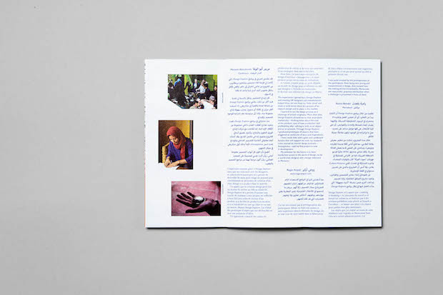
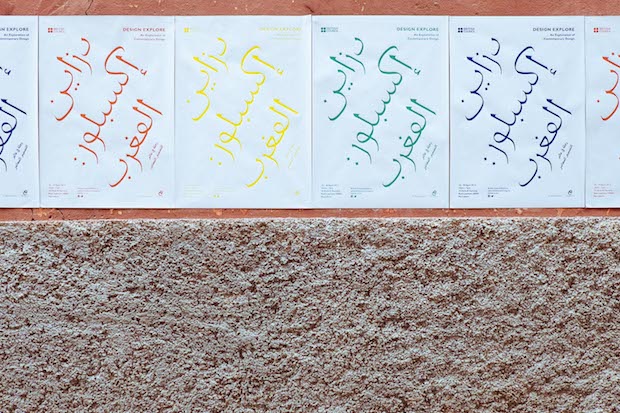
Perhaps Hato’s popularity with arts and cultural organisations stems from the studio’s interest in creating materials that provoke interaction. Last year for example, Hato collaborated on a project with illustrator and director Ping Mak which transformed one of the Tate’s rooms into a magnetic Lichtenstein comic, based on unpublished panels of his work. Here visitors could play about with the words to create their own narratives. Most recently, Studio Hato worked on Design Explore, a British Council project that brought together young Moroccan creatives and UK-based designers around a series of workshops. The exhibition design included commissioning product designer Peter Marigold to make a series of plinths, which somehow embodied the locality. Marigold’s ingenious response was to develop a tilted frame that would fall over unless you placed a bucket (a green variety which is available absolutely everywhere in Morocco) on its bottom to balance the weight. This plinth would not work outside of its Moroccan context. For the project Studio Hato also reworked an incomplete typeface by Eric Gill, a huge inspiration for the studio, and used it to form a series of posters and wall graphics.


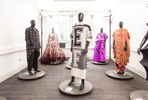
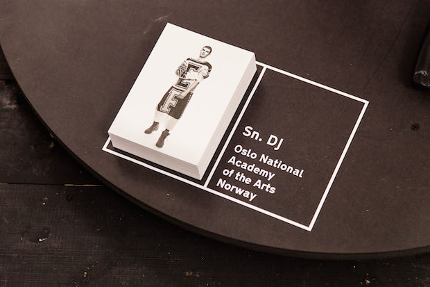
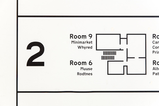
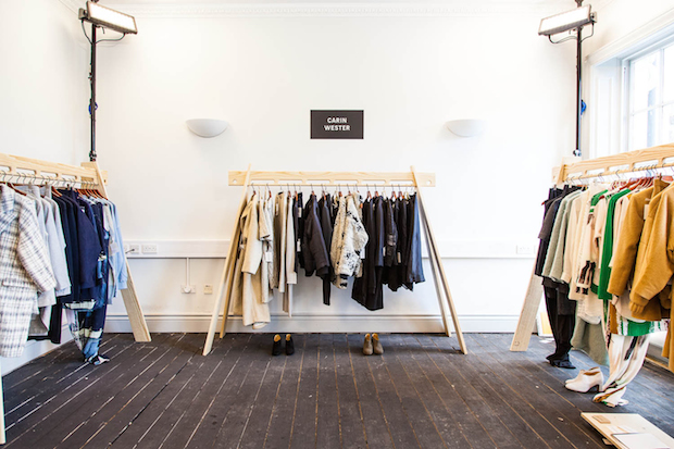
As well as Gill and Enzo Mari (whose influence you can clearly see in the studio’s furniture design for Scandinavian fashion showcase Re Present below), William Morris is also held up by Kirton as one of the Studio Hato’s biggest inspirations. Although Kirton admires his ornate aesthetic, it is more his philosophical views that have helped shape the studio, not least his essay News from Nowhere, which imagines an alternative future where currency is no longer necessary. In this utopia a good conversation or meaningful interaction is considered worthy enough payment for goods. In that vein, every day one member of the studio will cook for other members (leading to two studio cook books and upcoming Cooking with Scorsese, a book of recipes featured in the famous director’s films) and when the designers help students with their work or give talks, all they ask in return is that they prepare a meal (that Studio Hato funds) and that everyone eat together.
Like William Morris, Hato is interested in how the printing press can be used as an educational tool, especially to help youth groups and young people self-publish. Residencies and workshops now make up a large proportion of the studio’s workload, something also inspired by Morris’ socialist ideas and design/art crossover. Currently Studio Hato are artists in residence at the Edgware Road Project, an initiative that aims to give young people aged fourteen to seventeen a voice about development in the area. With a large number of architectural masterplans underway in that part of London, it is key to channel the opinions of its young residents who cannot vote in planning decisions until they reach eighteen. Studio Hato has been helping the students create publications expressing their opinions about their neighbourhood in flux.
As for the future, Hato’s trajectory has been set in motion by this year events, both in the reinvigoration of the press and the emergence of Labo. The only other area Kirton would like to expand even further is Hato’s workshops and teaching practice, especially with their newfound digital capabilities. Kirton adds, “Meeting a studio like Åbäke, which was so much of freer in terms of residencies and being and artist, also really broadened our perspective of what design is. Graphic design is such a young disciple, no one really knows what it is yet – in reality it's sort like an added service. If graphic design didn't exist the world wouldn't suddenly stop working, its not like doctors or architects even. Graphic design is almost still understanding its purpose. Now with the internet and iPhones, you’re really interacting with design on an important level. It will be interesting to see how design changes as we go forwards.”
studiohato.com
hatopress.net
