
Here Penguin designer Claire Mason takes us through her many and varied influences, from the worlds of film, art and music, with a smattering of graphic designers in between.
When selecting people and things I tried not to be either too discriminating or too over conscious, resulting in feeling slightly exposed when seeing my influences laid out before me. This list, which reads loosely like an infographic, allows me to make basic calculations on tastes and where my allegiances lie. For instance, moving image has always heavily featured on my radar – I watch a lot of film (which I knew) but the choice of film put forward firmly reads ‘over stylised romance.’ Ha. There are more artists than graphic designers (which I suspected), and I definitely do not read as much as I thought I did.
The subject of personal influences is a fascinating one. The net is cast a lot wider than citing a single person or movement responsible for your inner motivation. When I think of my influences I see shifting shapes, diagrams, lists and large messy collections of words inbuilt with randoms, triggers and variables, that reference people yes, but all kinds of people from different kinds of places. A book or a piece of music can be as essential as a whole person (although I stopped short of citing a website).
My final output, an inconclusive list, I see as a personal algorithm. A fixture of today's world, algorithms exist in many forms. I find most interesting the algorithms that attempt to capture the myriad of tastes and likes of a human, not only because they never quite manage it. The attempts of the techno giants to build profiles that aim to mine the complex influences of a brain is a bold one. Its failure exposes its limitations and highlights the beauty of the human brain.
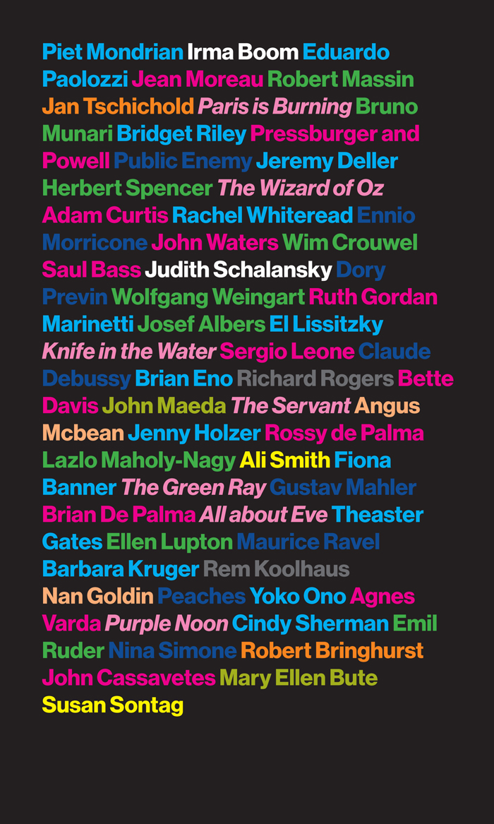
Tempting as it was to submit a scribbled page from my sketchbook, setting text formalises it. A bold weight Neue Haas Grotesk for the typeface offers the right amount of tension between rational distance and warmth. I am aware that the final piece looks like a film poster or club flyer, this was subconscious. Also subconsciously, I found myself colour coding:
Dark Blue = Music
Magenta = Film (people)
Pink italic = Film (motion pictures)
Orange = Typography
Green = Graphic design
Cyan = Art
Yellow = Writing
White = Book design
Grey = Architecture
Peach = Photography
Bright green = Other
See some of Claire's personal work here.


