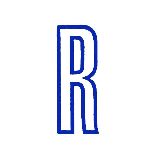
Letterpress expert Rose Gridneff shares her fondness for Sheffield foundry Stephenson Blake’s Grotesque No. 1 ‘R’, which reminds her of her acrobat grandparents and another special partnership. Stephenson Blake was one of the longest running British type foundries, operating in Sheffield from 1818 right up until the 1990s. I have a particular fondness for what I believe to be their two-colour Grotesque No. 1 ‘R’, although I cannot be certain that’s what it is.
My paternal grandparents were in the circus, an unsupported ladder act. They originated from Russia and settled in West London during the war after many years travelling in India and the Far East. Growing up, there were a series of framed playbills that ran up our stairs that I would pass several times a day without much thought. These documented a lifetime of performance, from Berlin’s Winter Garten to Tower Circus Blackpool (billed in the 1941 season as The Grand British Colonial All-Star Programme). On these, the ‘Seven Amazing Gridneffs; (sometimes the ‘Six Gridneffs', occasionally ‘Gridneff and Partner’ or ‘George and Lydia’) appeared alongside a range of circus and variety acts that have become assigned to memory; Forest Bred Lions, Adele’s Royal Assam Elephants, Cilla’s Football Dogs. These were printed predominantly in red and blue and inadvertently acted as type specimens for printers of the period, showcasing a range of condensed sans serif typefaces that were mixed and thrown together according to measure, and presumably, the availability of characters.
This 36 line ‘R’ belongs to the ‘CIRCUS’ of ‘GILBERT’S CIRCUS’ – the ‘R’ in Gilbert is slightly different. It’s printed in warm red with a blue outline on a yellow solid and advertises ‘one week only’ at the Margate Hippodrome in October 1954. Letter-spacing between the R and C is awkward, accentuated by a vertical fold that occupies the space. The poster is imposing at thirty by forty inches, printed by W.E. Berry in Bradford who were renowned for producing posters for the film industry as they were one of only a handful of printers in the UK able to print at British Quad size.
I remember showing this to my husband, along with a few others I had recently acquired, not long after we had met. I had no inkling that any were missing until he turned up on my doorstep a few days later carrying a thirty by forty inch frame.
Rose Gridneff
… is a designer who works with letterpress, and is Course Leader for Graphic Design at UCA Epsom. She runs collaborative design practice Workshop with Alexander Cooper and was part of the 6x6 project, which aimed to document and promote letterpress resources in education.
Stephenson Blake
One of the last remaining active type foundries in the UK, Stephenson Blake was still producing type in zinc as late as 2001. When it finally shut down in 2005, its matrices and other typographic equipment were passed on to Monotype and became a key part of London’s Type Museum. Probably the most famous typefaces to come out of Stephenson Blake are Impact (designed by Geoffrey Lee in 1965) and Playbill, which was an adaption of French typeface Claredon by Robert Harling in 1938.
December 2, 2014 2 minutes read
Roll Up
Rose Gridneff shares her fondness for Sheffield foundry Stephenson Blake’s Grotesque No. 1 ‘R’, which reminds her of her acrobat grandparents and another special partnership.

