As varied as they are impressive, the posters of this talented Irish designer caught our eye with their innovative use of typography. We catch up with Ronan to delve further into his portfolio.
How would you describe your approach to graphic design?
I think my approach to design is something that will never stop changing and adapting, I see it as something that I've still got many years to refine and nail down. The bigger the problem, the more enjoyable the project is. I see design as being about solving problems of communication first and foremost – the outcome should never be dictated by aesthetic opinion. While I do try and make my work look as good or enticing as possible, I never prioritise aesthetics over function or message. The challenge can be as simple as a poster for a gig, or as hard as a piece of UI/UX design for a complex digital experience, but at the end of the day the role remains the same in my eyes: 'make these people understand and enjoy this message or idea through the use of colour, typography etc'.
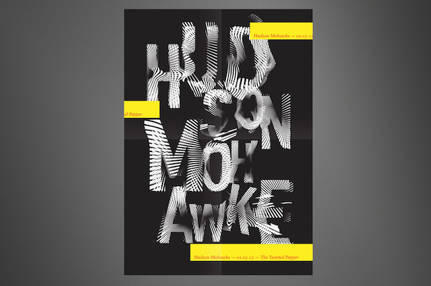
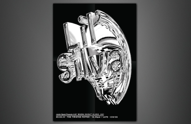
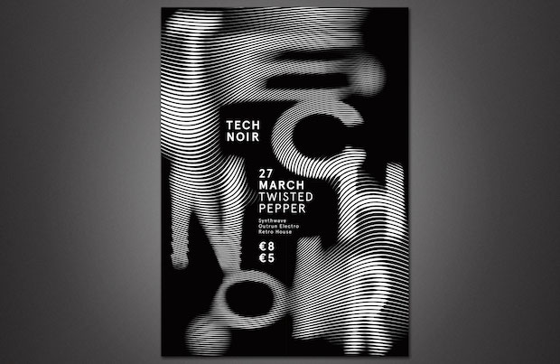
Tell us a bit more about your poster series for Junior Spesh.
Junior Spesh
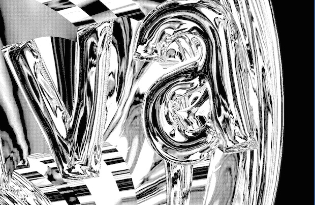
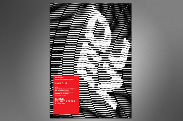
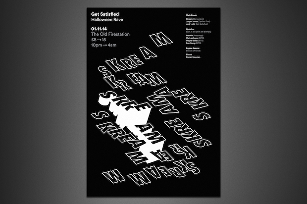
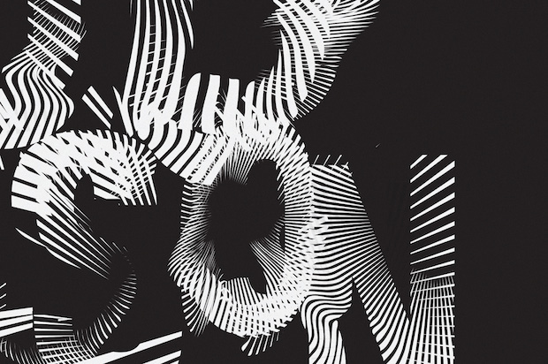
was a weekly club night that my friend Tadhg ran in Dublin from 2011 until quite recently. Being a musical artist himself, he was keen to use Spesh as a platform for many genres of musicians and visual artists to showcase their talents on a weekly basis. Over the years the night grew and brought some great acts to the city. My role as the 'poster guy' was one that I hugely enjoyed and would attribute much of my practical skill to. I saw the opportunity to treat every poster completely differently and to use them as a form of play. The freedom I was allowed meant I could experiment with different concepts and styles. Posters were never amended and my friend was always so enthusiastic – something I feel that crucially important to their success. While I was afforded huge freedom, I tried to restrict myself to using only typography as much as possible, interpreting the music rather than depicting the artist or the venue literally. Music is so much of an experience, that it made more sense to me to try and give a sense of atmosphere or feeling rather than using a boring press photo of the artist.
Typography often plays a big part in your designs. What’s the key to creating unexpected effects?
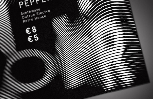
I'm a type nerd, a big old type nerd. Typography has naturally played a large part in my work and, despite the more abstract nature of a lot of my typography, I feel that it equally helps my understanding of type and letterforms in the traditional sense. I love playing with composition on a page using only letters, like many people I just get a serious kick out of it. In terms of creating unexpected effects, I would say that really it comes down to my own personal interpretation of the subject matter. I generally have a rule of thumb for designing for music, in that I try to evoke or interpret the sound in a visual way – to describe the experience visually. After that I think of an idea and how to do it, and then I play until I get to where I need to be. I love 2D optical illusions so a lot of my work is often quite complex in that way but it all comes out of experimentation around an image that I have in my head when listening to the sound.
What have you worked on since you graduated and what’s next?
I've been going flat out since I graduated in 2013. I spent nine months as one of three graduates chosen to participate in the Threex3 internship program for emerging Irish talent. I got some great experience over three diverse practices in Dublin over that time. After that I moved to London, and am currently junior designer at Mr.President. I've worked on freelance projects constantly for three years, and I think that's where a lot of my personality and passion comes out. I'm constantly busy and have recently taken on some amazing projects for a number of freelance clients, including Wired magazine. In terms of what's next – who knows? I'm still a London newbie and everything has moved very fast for me in the last few months. Still looking forward to the next brief that comes into my inbox though, I don't think that'll ever change.
ronankellydesign.com