
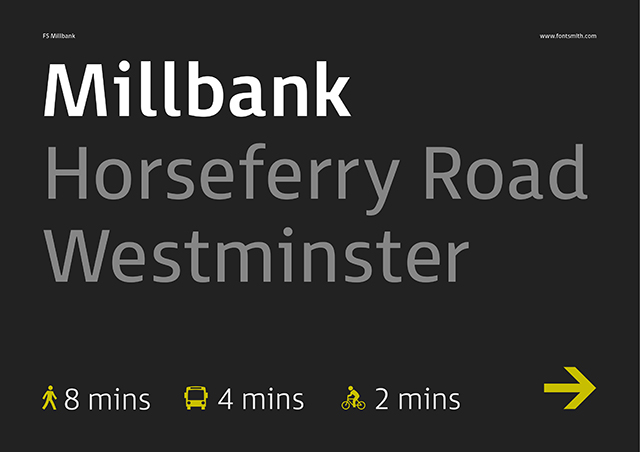
Fontsmith's FS Millbank is a new wayfinding font with a distinctive personality. Here its designer Stuart de Rozario talks us through the rigorous design process involved in creating it.
How did this project come about?
At the beginning of 2013, Jason Smith and Phil Garnham approached me about looking at the possibility of creating a typeface that said something new for signage, as the off-the-shelf fonts appear dated, staid and sterile.
What was the original brief and did it change at all?
The brief was very open and entirely up to me on the outcome – it could have been as graphical or functional as I wanted, also it needed to include an icon font that worked in tandem with the typeface family. The brief didn't change, but I discovered through my research that signage typography covers many different mediums. I needed to design to a broader landscape for signage, not only for large display use but for the smaller scale usage i.e. information on Totem Poles and on-screen devices. Ultimately FS Millbank is a versatile signage font package which caters for all of your branding requirements.
Has Fontsmith worked on wayfinding projects before? If so, did this project involve a different approach?
We designed a set of icons for a train company a few years back, but I believe they’re no longer in use. The core approach is still the same, typeface and icons still need to relate to show a form of visual cohesion. FS Millbank was conceived from a blank piece of paper and then crafted, it's not reworked from old or existing fonts. FS Millbank definitely has its own characteristics and personality.
At Fontsmith we specialise in offering font solutions for many well-known brands and corporate identities, we collaborate with global brands and design agencies to tailor bespoke fonts for their typographic needs. Signage projects very rarely come around and design agencies and wayfinders tend to use off-the-shelf typefaces rather than commission bespoke fonts for projects. FS Millbank can now be an option and can be chosen specifically for large interior / exterior projects and small print or screen devices.
A few typefaces from our library have been implemented for signage, such as FS Dillon for the Olympic Park in 2012 and Westfield Stratford shopping centre, and FS Albert, which is used for the Wolverhampton Wanderers stadium Molineux and also for The Shard. Maybe FS Millbank will open new avenues to Fontsmith – we are always looking for new challenges and exciting projects in any typographic realm.
Can you describe the process of designing FS Millbank?
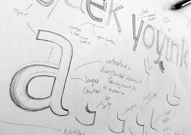
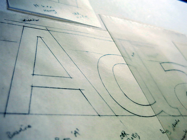
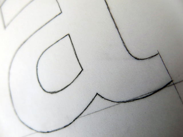
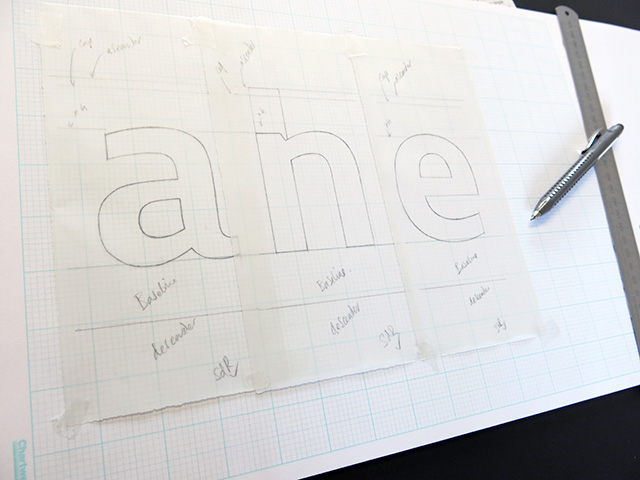
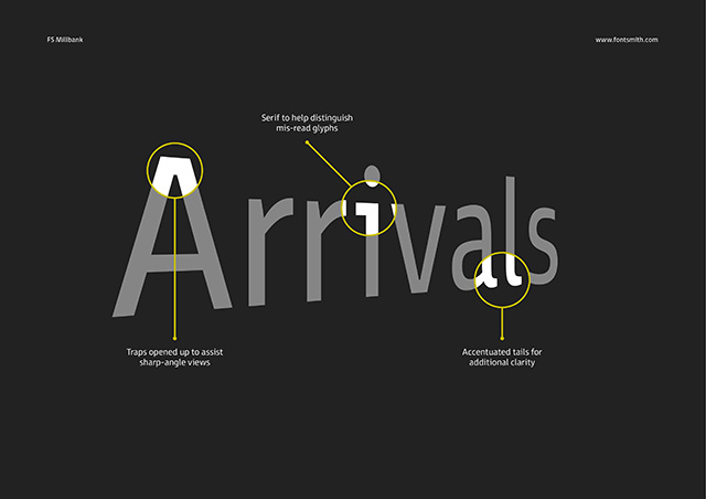
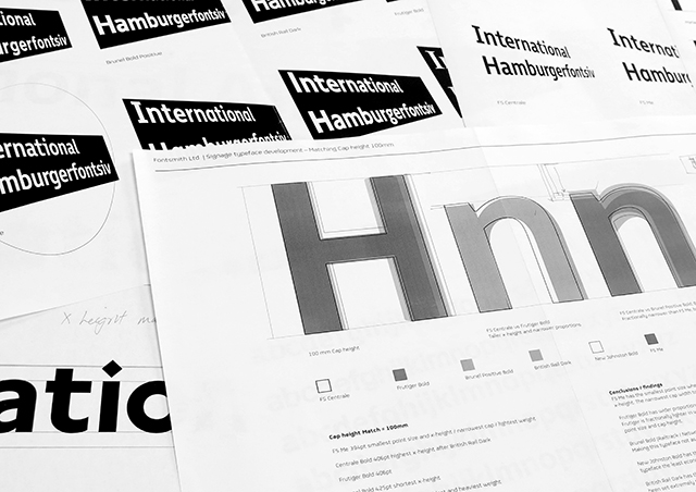
At first, I excitedly sketched down some basic ideas and concepts to get a feel where I wanted the direction to go – then I interviewed leading industry signage and wayfinding designers about how they decide which typeface to choose for any new projects and what criteria and standards they adhere to. After researching extensively about the principals for signage typography (such as legibility, Optical Character Recognition features, suitability for partially sighted, perspective and distance analysis), I proceeded to draw the standard characters and tested line lengths, did blur tests to simulate halation, and also tested stroke weights against frequently used signage typefaces to see how FS Millbank compared.
Once I had my basic caps and lowercase H, O, A, N, a, h, n and o, I then expanded the other glyphs in the character set and then progressed to design and develop the other weights in the family. Creating a negative version was a crucial part of the family as many signage displays use white or a light coloured text on a darkened background. I then rigorously tested all weights for visual balance across the family.
How do you balance legibility with style? What are the key factors to consider when designing a typeface with such a specific use in mind?
It’s an incredibly tricky task to balance legibility with a personality style without either appearing graphical or neutral.
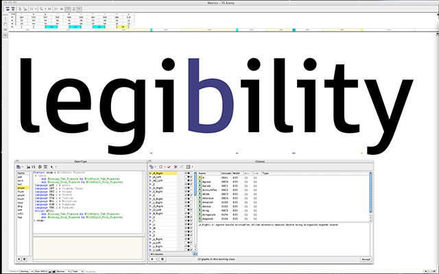
What I have tried to do with FS Millbank is to design a typeface combining a high x-height for legibility along with approachable letterform characteristics that brim with personality and a font that is fitting for the Fontsmith library.
After reading a plethora of books, blogs and recommendations on all things regarding legibility and readability, my upmost priority was to design FS Millbank to be as effortlessly readable as possible – I wanted to eliminate any possible ambiguous characters. I scrutinized key glyph characteristics, assessing the line length of other signage typefaces and their basic stem weights, proportions and glyph features. I conducted blur and angle tests, these tests gave me surprising results and impacted the final outcome – not only did the tests tell me that some of the most recognisable typefaces for signage appeared too wide, heavy and not very legible, but that they were also misleading to the reader.
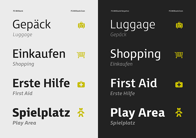
What was the reason for creating a negative version of the typeface?
Many of the wayfinding designers I spoke to requested both positive and negative sets, but essentially the negative version purely comes out of necessity, when you use standard type on a darkened background the font appears heavier in weight causing an imbalance of the original true weight. To achieve the correct visual balance when using any font on a dark colour, the negative version needs to be psychically lighter to help eradicate the effect of this distortion.
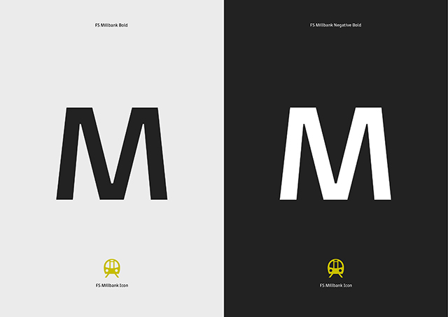
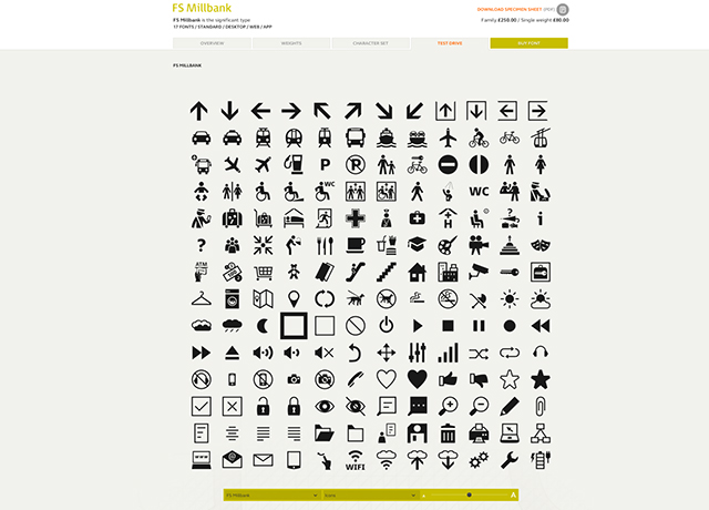
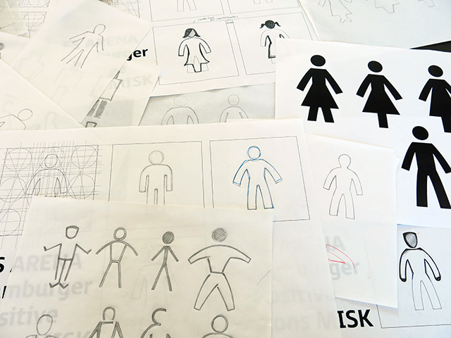
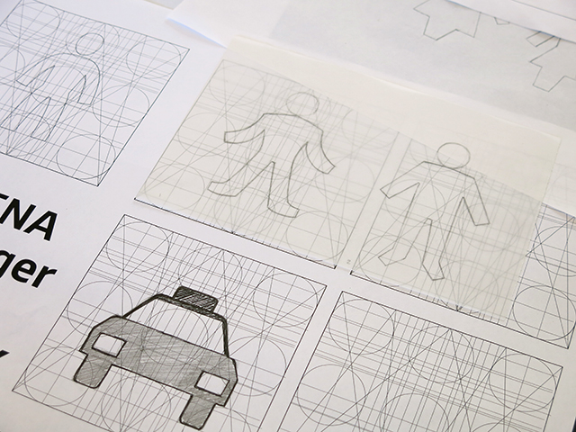
Tell us about FSMillbank’s icons, is it a challenge to create a set which work both stylistically and practically with the typeface?
When it came to designing the icons I already had a certain style for the figures in my head. The figure felt quite natural when used along side the typeface. I wanted a friendly and approachable spirit to the icons, so I formulated a complex circular grid using the cap H perimeters and the curved lowercase shapes. I sketched the arrows, figures, car and bicycle with a pencil, enabling me to have a basis from which to develop the other icons, and to give them a personality and character which harmonises well with the font family.
What’s the story behind the name?
Naming a font is a very personal thing. Typefaces are like your own babies – we conceive them, nurture them with loving care, and then at some point they fly the nest. A few of the Fontsmith typefaces are named after people or places (such as FS Albert, FS Jack or FS Pimlico) and I travel past Millbank everyday on my journey into work. I thought that it relates to me in that sense, also the letters that spell Millbank are quite distinctive and fit visually with the typeface.
What were the most challenging aspects of the project?
Naming fonts are tough, but in all honesty, crafting the negative version trying to get the correct visual balance between the two families was the most challenging aspect. I spent many hours agonising over printouts, viewing through the spy glass, assessing and fine tuning – one unit here, one unit there – in FontLab. It was excruciatingly laborious.
And which aspects do you think have worked particularly well?
That's for the public to decide. In all honesty it's really difficult to pinpoint what I think has worked well – but I'm very pleased how the legibility at small sizes works and how the icons relate to the family. FS Millbank is very versatile as it covers small and large scale use. I'm very proud of the final outcome. Markus, Craig and Rosario at Taylor / Thomas did an incredible job on the micro site and really pushed the boundaries in their field – they can be equally proud too of a job well done.
See more of FS Millbank at fsmillbank.com
fontsmith.com


