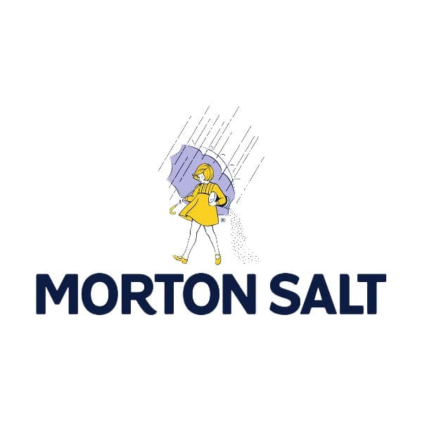
Writer and educator Debbie Millman is metaphorically bowled over by a little girl with a large umbrella. Joy Morton started The Morton Salt Company in 1910 with a novel idea: by adding magnesium carbonate to salt crystals, moisture would not effect the granules, and lumps and clumps could be avoided in damp, humid weather. This allowed for a uniquely consistent, smooth pour. In 1911, after a number of clunky iterations, a clever advertising slogan touting the brand’s benefit was created, and “When It Rains, It Pours” has been in use ever since.
Three years later, design history was made in the form of the illustration that graced Morton’s cylindrical package. Featuring an image of a mop-headed little girl rendered in yellow and blue; she carried an over-sized umbrella warding off rain in one hand and a canister of pouring salt in the other. But what made this illustration so remarkable was neither the style nor the craft. Rather, this was the first time a logo was developed as a metaphor in order to articulate a product’s innovative benefit. The image of the Morton Umbrella Girl was a puzzle to be figured out, and her enigmatic stance has influenced marks such as I ♥ NY and Fedex.
Though she has remained ageless since her inception, she has been modernised numerous times with updates including a mini skirt, a bigger smile and a more stylish bob. The most recent redesign was in honour of her hundredth birthday and, mercifully, brand consultancy Pause For Thought left her nearly untouched: small, subtle iterations simply feature cleaner, more elegant line work. The bolder, welcome changes are with the Morton Salt word mark: the new logo features a fresher, friendly font, and the letter ‘R’ in Morton carries a slight kick to mimic our Morton Salt Girl’s step. But, fear not — her iconic attributes remain: the skip in her step, her joyful expression and the fact that after nearly a century of selling salt, Morton management has never given this Umbrella Girl a name.
Debbiemillman.com
Debbie Millman
…has many titles: writer, teacher, brand consultant, artist. She is perhaps most widely recognised for her long running podcast, Design Matters, hosted by the influential online magazine Design Observer. Millman is also President of the design division at Sterling Brands, President Emeritus of the AIGA, contributing editor at Print magazine and co-founder of the Masters in Branding program at the School of Visual Arts in New York.
N.W. Ayer & Company
…was the advertising agency selected by Morton to manage their national consumer advertising campaign. Founded in 1869, it used to subsequently refer to itself as the oldest advertising firm in the US. Alongside the Morton Salt slogan, it was responsible for some of the most famous tag lines in advertising history: “I'd walk a mile for a Camel” for Camel cigarettes; “Reach out and touch someone” for AT&T; and “A diamond is forever” for De Beers. The company was closed in 2002 and its assets sold to Publicis.
May 20, 2014 2 minutes read
Saline Solution
Writer and educator Debbie Millman is metaphorically bowled over by a little girl with a large umbrella.

