
This Riyad-based designer pairs concept-driven work with a clean style, from a poster series featuring Arabic proverbs aiming to make Saudi culture more accessible to an homage to the colour grey.
What are you favourite types of briefs to work on?
A brief that blurs the line between art and design gets me so excited. I love when I get the chance to design pieces that are more conceptual in nature and require a bit more time to ‘get’ than the usual graphic design works.
Describe your approach in three words.
As cliché as it sounds, I'm a believer of ‘less is more’.
Tell us a little bit about your Dokkan project.
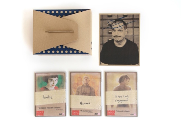
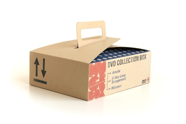
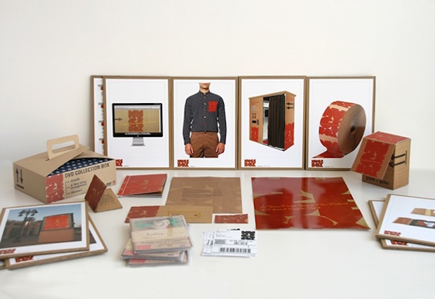
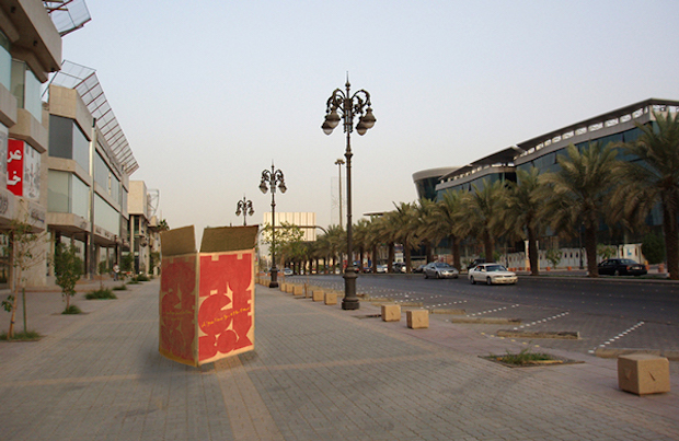
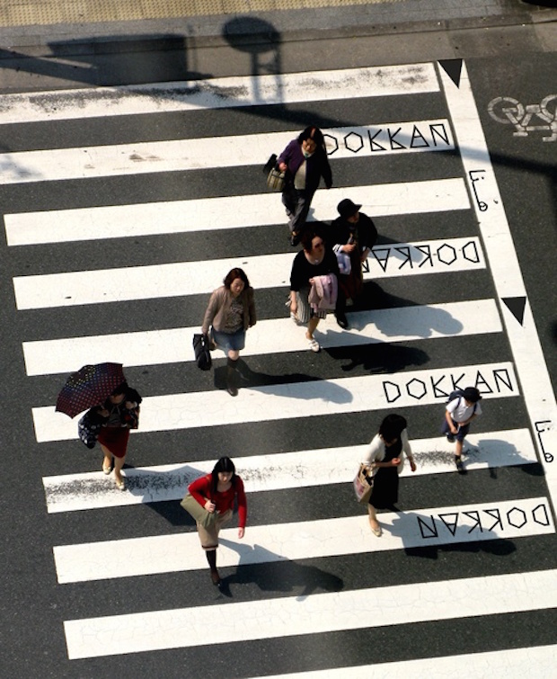
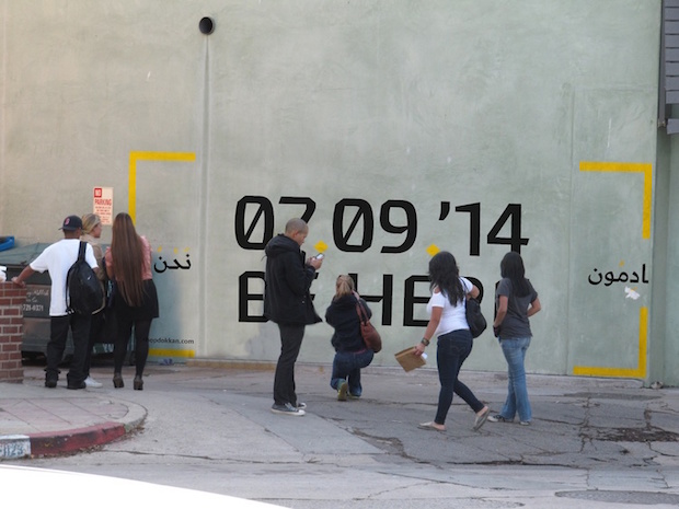
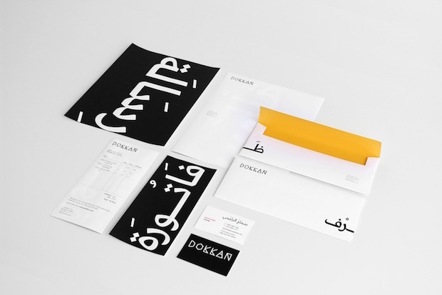
Being from Saudi Arabia, I experience some interesting reactions from people around the world when traveling and telling them where I'm from. They usually reflect what the media and news showcase about Saudi. So, for my Masters thesis project, I decided to create Dokkan, which is a traveling pop-up shop presenting and promoting a sample of Saudi Arabian culture and history through its products. The word dokkan is Arabic for shop or store. The brand, the experience, and the products show a new perspective and promotes positive connections to Saudi Arabia and its people.
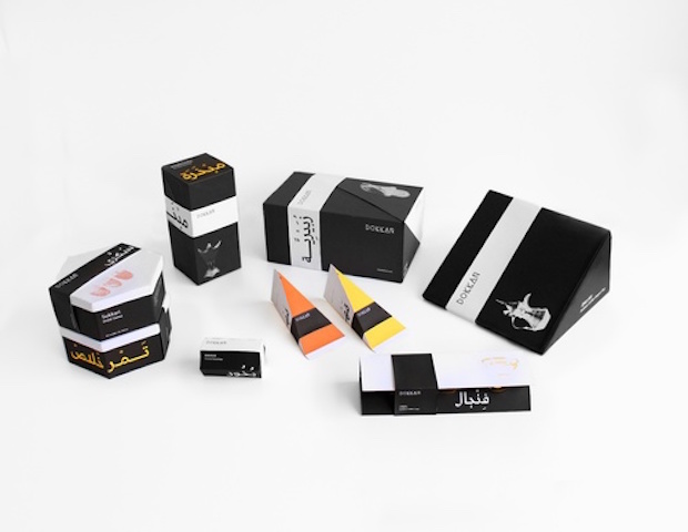
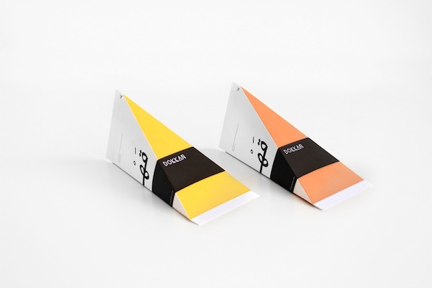
Every aspect of Dokkan's design was inspired by Saudi and presented in a modern, edgy way. In my research, it was pretty clear that geometry played a big role in the decorative shapes used in architecture and tapestry. And at the heart of all those geometrical patterns is the shape of the triangle. From this, the triangle became the most important design element in the identity of Dokkan.
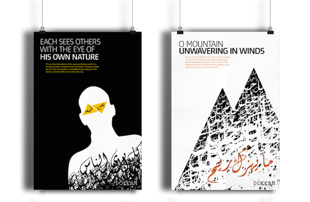
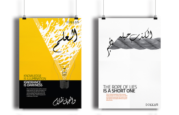
The project was big, it included the brand design, advertising, packaging, storefront design, website and creation of new products like a poster series. The packaging of each of the products sold in Dokkan tells the story of that particular product, how it's used, what it symbolises or what the word means. The poster series features Arabic proverbs in which the proverb is written in Arabic in a way that illustrates the meaning, and it is translated to English in a literal manner and the meaning behind it is explained.
What is the graphic design community like in Riyadh and how do you fit in?
It is just blossoming. In the recent past, big global corporations dominated the market, but now talented up-and-coming designers are making a name for themselves. I am hoping more and more great designs come out of us independent designers from Riyadh soon.
Tell us a bit more about a recent project that you’ve particularly enjoyed working on.
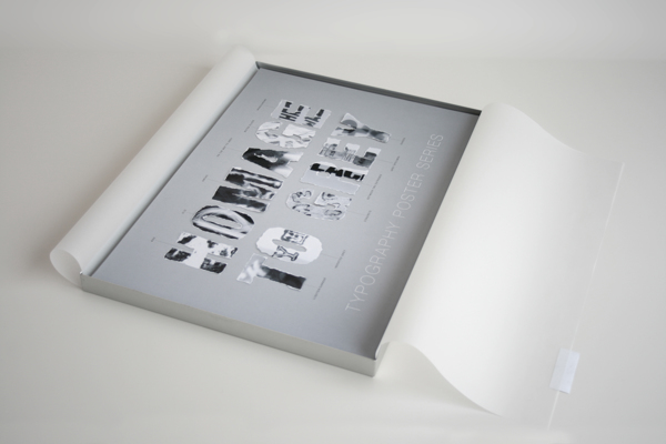
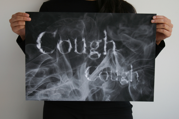
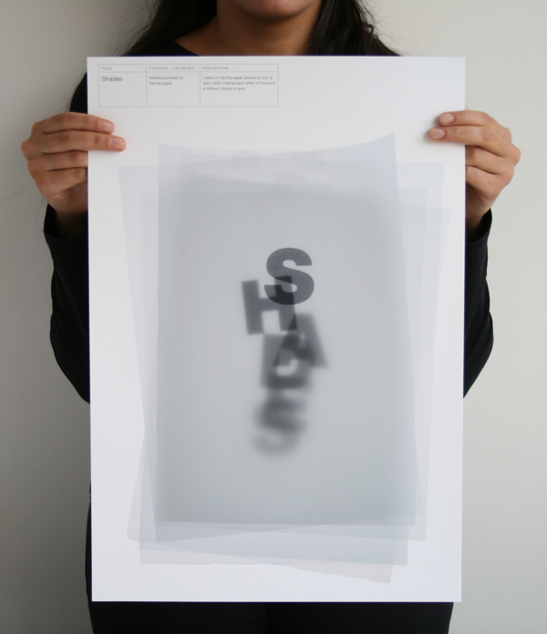
I absolutely loved working on Homage to Grey. The brief was to make a series of 12 posters. The subjects of the posters were open, but there were two rules: firstly, all the subjects must be visualised typographically. Secondly, they had to be tied together by one colour theme.Grey is my favourite colour. It was time to pay my homage and I was delighted to do so. Experimenting with typography and different materials was so much fun, and it made way for surprising outcomes. The result was a series of conceptual posters all alluding to the idea of grey, if they weren’t showing it clearly. I used many different materials like ash, concrete, water, and hair to create the posters.
samahalrajhi.com


