
An in-house retrospective of the RCA’s feted student magazine, ARK, corrals three decades of visual and literary experimentation into one sophisticated package. We talk to designer Jörg Schwertfeger.


Can you begin by describing the project in basic terms?
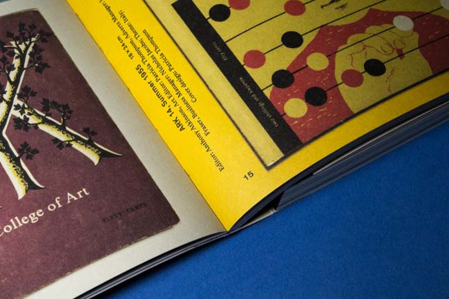
ARK was a magazine created by students at the Royal College of Art in London. It ran for fifty-four issues spanning nearly three decades, hosting an incredible range of literary and artistic voices such Ralph Rumney, Lucio Fontana, Alison and Peter Smithson, Toni del Renzio, Cedric Price and Reyner Banham, as well as college students and staff. ARK: Words and Images from the Royal College of Art Magazine 1950–1978 is an anthology of original material selected and introduced by students on the Critical Writing in Art and Design MA programme at the RCA today. It features all the covers of ARK in full colour, alongside an index of the magazine’s contents and a preface by design critic Rick Poynor.
How did the project originally come about?
It was set out as a pitch for graphic designers in the Visual Communication programme at the RCA while the project itself was still in the making by a group of students on the Critical Writing in Art and Design programme. The basic structure of the planned content was already clear at that point.


What was the original brief and did it change at all?
The original brief was very thorough, listing almost everything that is to be found in the finished book – from a designer’s point of view, it’s nice not to have too many surprises along the way. Part of that brief was to find a structure that allowed each piece of content to hold equal weight. Another was to fathom a way to handle such a variety of different images, all of which had to be drawn from the original print publications.
The book as it exists now is pretty close to the first draft for the pitch, though the dimensions did change during the course of the editing process when the actual word-counts and images of all the different texts were clarified.
One vital design direction that didn’t change from my initial pitch was the aim to separate the covers from the content by applying a doubled Swiss binding. As far as the written content was concerned, my idea was to try and weave the texts into each other, without separators, to make the reader browse the book like a magazine. I was keen to establish a means of distinguishing between the original and contemporary article, hence why the latter are set in François Rappo’s Theinhardt with its entertaining numerary and the former in Henrik Kubel’s Antwerp with it’s nice expressive italic.


Did this project present any particular challenges and if so how were these overcome?
The biggest challenge was to represent visually what this anthology is: a series of objects pulled straight from the archive and reassessed from a contemporary perspective. Fortunately the editorial team shared my feeling that the publication should be true to the look of the originals, even if that material was sometimes quite battered. That approach required close collaboration with the team, especially Keren Goldberg, who had to make a lot of decisions in that regard, and Nick Frayling who took these great haptic photos. I should also mention the wonderful work done by PUSH, our printer. It was a hugely enjoyable experience working with everyone involve to find the right balance to navigate along this thin line between ARK’s past and present.


How difficult was it to respond to a publication that has such a long and, crucially, such a varied design history?
That was first and foremost a challenge for the editorial team. The decisions that they took excluded ideas that would provoke a weird coexistence between the (extremely varied) historical design language of the original magazines and whatever we might be doing in 2014. Most of all we wanted to avoid ending up with a rather strict and neutral layout based on chronological separations. Instead the design intends to recreate the experience you might have when casually thumbing through three decades of ARK: a diverse range of looks, printing techniques and typographic solutions – and a lot of room for error and entertainment.
Are there any aspects of the finished work that you are especially happy with? Are there any frustrations?
I am especially happy with the cover. The photo used was already present in the first rough draft of my initial pitch and the enthusiasm everyone showed towards it never diminished. The photo, by Keith Branscombe, was used for the cover of ARK 33 (1963) and to me it made the most sense out of all the options to be used as the cover for this retrospective as it depicts a student of the college, shot by a student from college; now it has been chosen again by their fellow alumni to reintroduce the excellent work that they did to an audience beyond the college's physical and institutional boundaries.
What was the client's feedback?
Fortunately really positive, and as far as I know it is already selling quite well at this year's graduate show, which is very encouraging for all involved.
cwadrca.bigcartel.com
joergschwertfeger.ch


