
As a major new Ivan Chermayeff show opens in the majestic building designed by his late father Serge, the exhibition's co-curator Alan Powers pays tribute to the great, yet surprisingly unsung graphic designer.
Is it the fate of graphic designers to be anonymous? Not all of them, granted, because we have adopted a few as folk heroes. Our own Design Museum celebrated Alan Fletcher a few years ago, alongside Robert Brownjohn. Fletcher was a character and also, in his later years, author of that great brick-like book, The Art of Looking Sideways, one of the best ways in to understanding graphic design as a mental process. Brownjohn died young and did film titles for James Bond movies – two useful hooks for the memory. Ivan Chermayeff was their friend and contemporary, and their equal as a designer – indeed his first partnership in New York in the 1950s included Brownjohn – but the Chermayeff name has not been carried back across the ocean to Britain, the country where he was born 82 years ago, and few outside the professional field know his work, in contrast to America where he has long been seen as one of the greats, in conjunction with his business partner of over 50 years, Tom Geismar.
Now the De La Warr Pavilion is redressing this neglect with the first British exhibition about Ivan Chermayeff (19 June to 14 September). If that association between the building and the designer’s name rings a bell, it is because Ivan’s father, the self-taught Russian émigré architect Serge Chermayeff was co-designer of the Pavilion in Bexhill-on-Sea with Erich Mendelsohn, winning the competition in 1934 and delivering the dazzling white liner at the end of 1935, five years before he emigrated to the USA and a new career in teaching. To add to the generational layering, Ivan’s son Sam practices architecture in Berlin and New York with Johanna Meyer-Grohbügge as June 14, named after the date when they set up after working together with SANAA in Japan. They have contributed the installation design for the De La Warr show.
Ivan claims that his education at the Institute of Design, Chicago, and then at Harvard and Yale (all places where Serge was involved at different times) was largely something he later had to unlearn and perhaps there is some truth in this. From childhood he was used to having Moholy-Nagy, Frank Lloyd Wright, Walter Gropius and Marcel Breuer as part of the family circle, first in Britain and later in the States, so he didn’t have to study their work. The teaching of Paul Rand at Yale must have left a mark, however, especially with respect to his use of collage and his preference for childlike simplicity over the more obvious forms of Madison Avenue sophistication. In words that might be applied to himself, Ivan has described Rand’s “great and very personal and thoughtful choices about every ingredient made provocative, interesting, tasty visual meals, abounding with subtle and sensitive Rand seasoning. He used type like salt and pepper, sprinkled in just the right quantities in just the right places.”
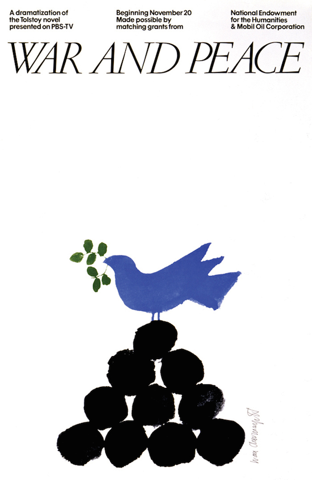
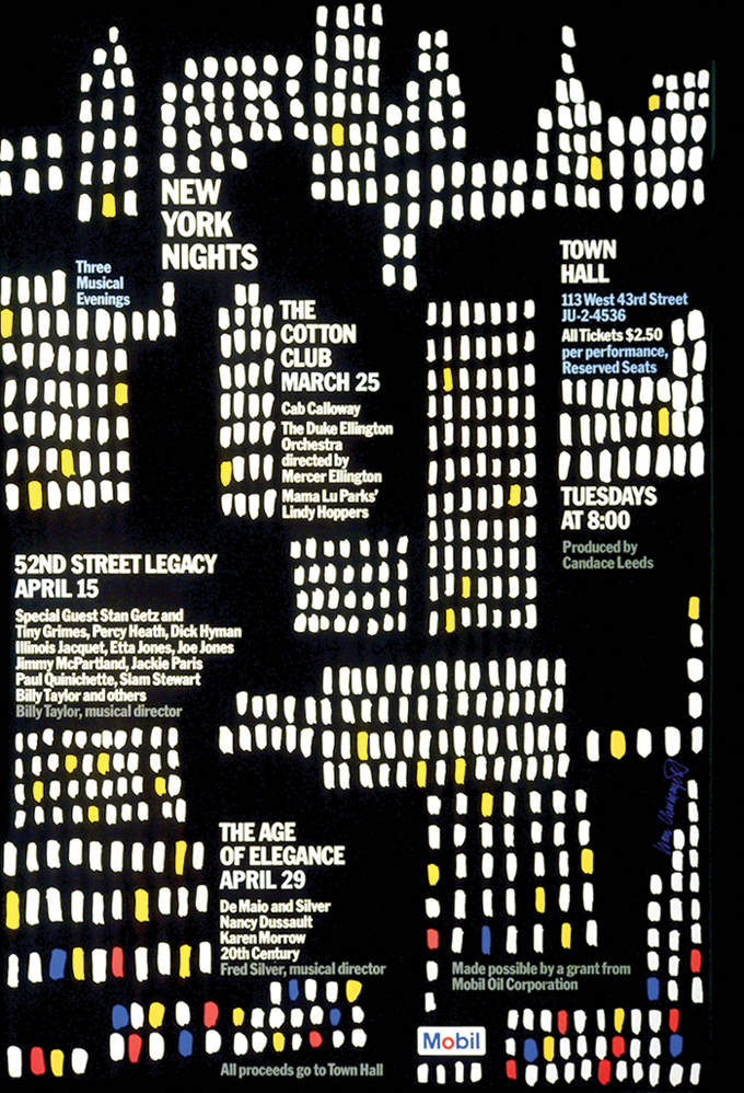
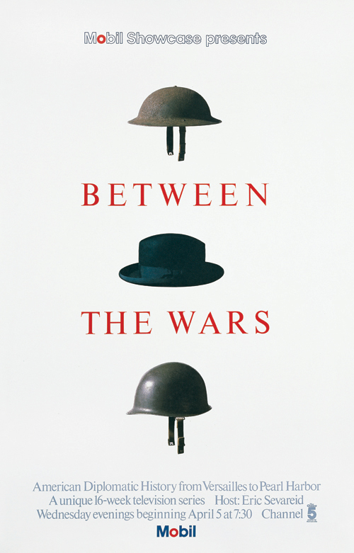
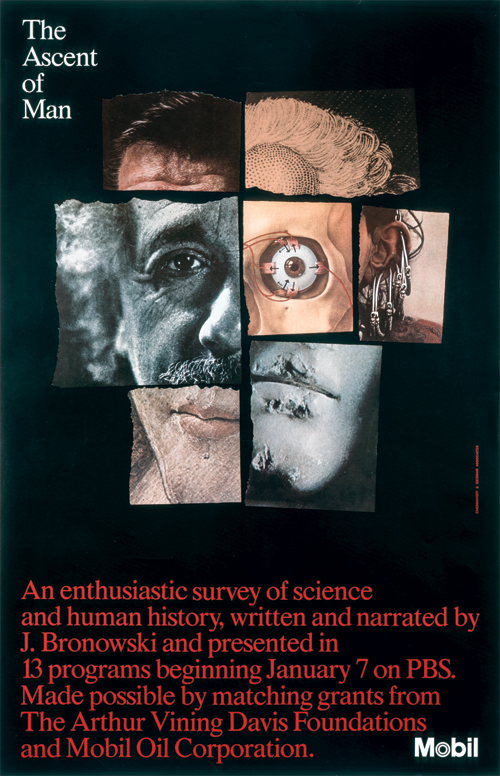
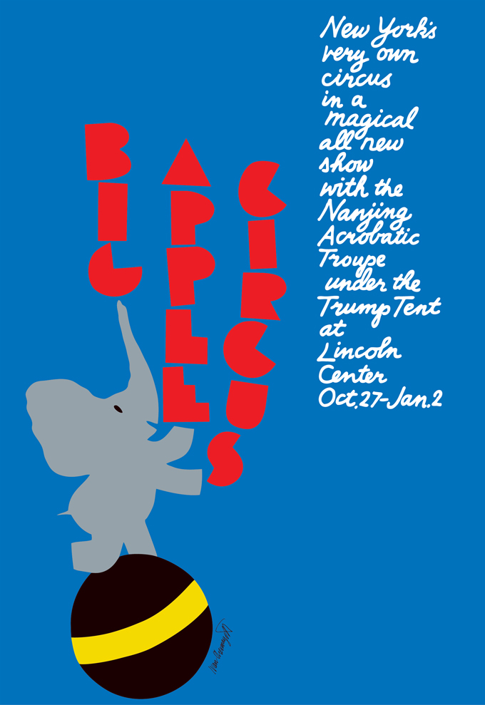
Ivan’s first work experience was with Alvin Lustig, now rightly celebrated as a book cover designer for New Directions, and something of Lustig’s ability to make a graphic equivalent in a few colours and lines to capture the mood of a complex text can also be seen in Ivan’s way of summarizing a TV show, as in his series of posters sponsored by Mobil for Public Broadcasting System, or a book or magazine content.
The kind of wit that Alan Fletcher deployed to tease the brain a little and stimulate the pleasure of putting two or more things together to construct pattern and meaning is there in nearly all Chermayeff and Geismar’s work, and even while they continue to practice it, it seems to define a historical period of optimism in which the public’s intelligence was taken for granted. Words are used very sparingly if at all, and often casually hand written. Colours are bright if not primary – instance the famous Mobil identity created by the partnership in 1964. These principles could be equated to the Bauhaus desire to eliminate the extraneous in search of the timeless, but there is a quality of humour that the Bauhaus didn’t always project.
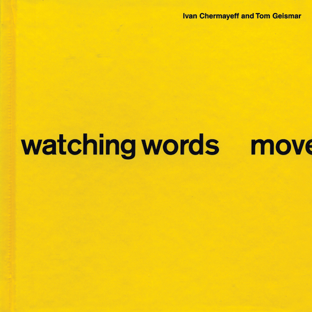
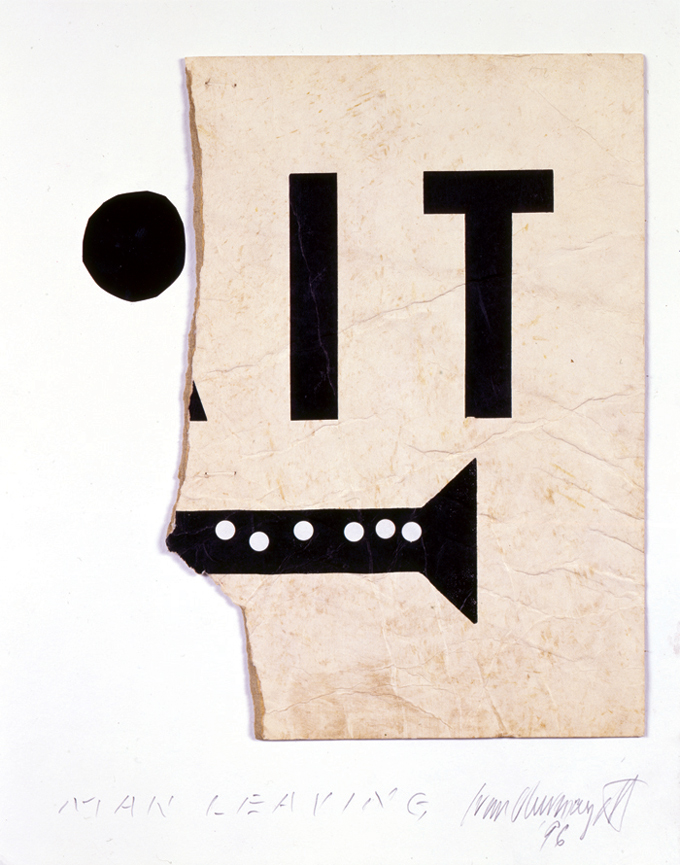
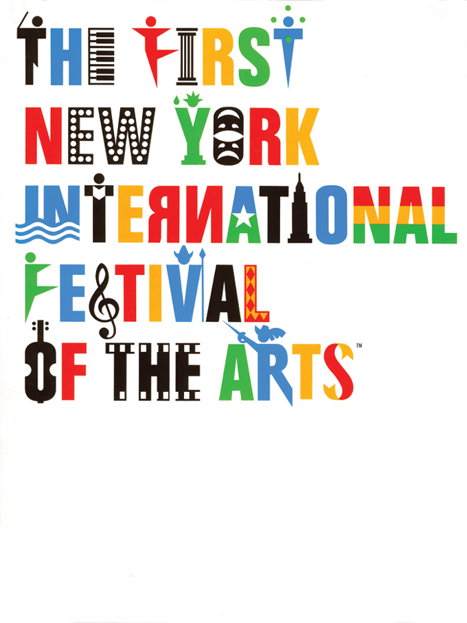
One of the best known early products of the Chermayeff Brownjohn Geismar partnership was the book watching words move, begun in 1958 as a private notebook exercise using paste-ups of Standard Bold proofs, first published in 1962 in the British magazine Typographica. It was reprinted by Chronicle Books in 2006. It set the tone for their work in finding the curious and meaningful hidden in the simple content of a single word, which could then be manipulated entirely within the scope of a single colour and font, following, as their 2006 introduction explains, in the tradition of Guillaume Apollinaire and Winnie the Pooh.“At the time” Chermayeff and Geismar explain, “it caused considerable stir within the fledgling graphic design community. Today, its ideas have become part of the standard graphic design curriculum, and in movie titles, television commercials, and print advertising, one can still see the influence of that little insert from forty years ago.”

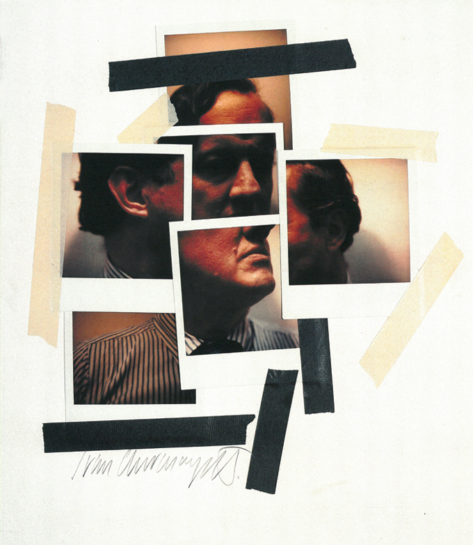
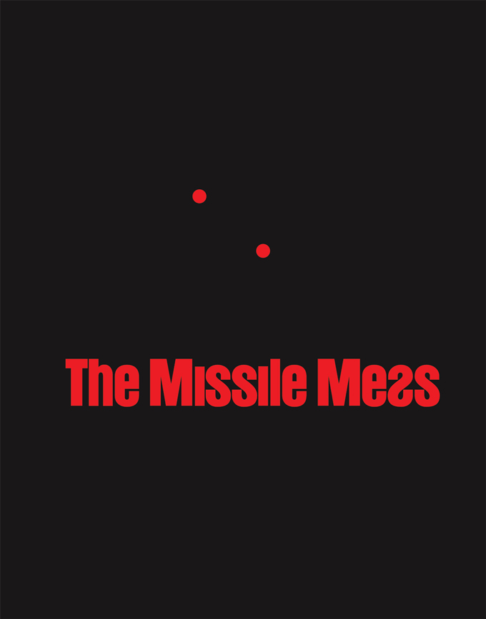
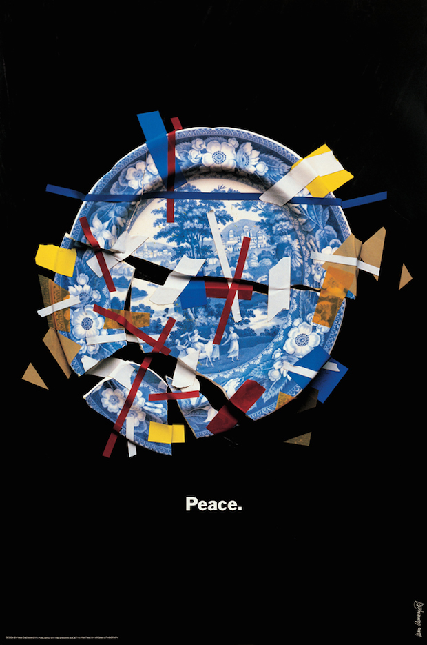
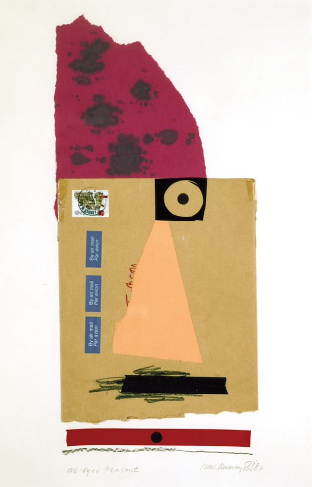
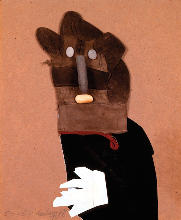
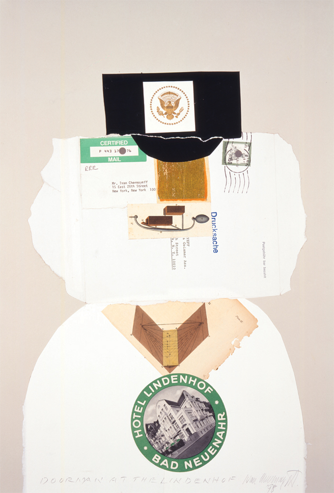
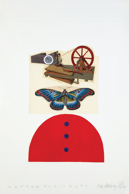
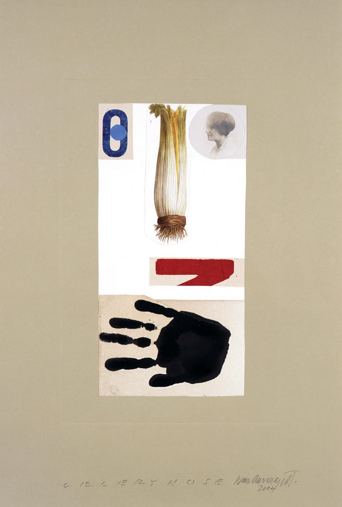
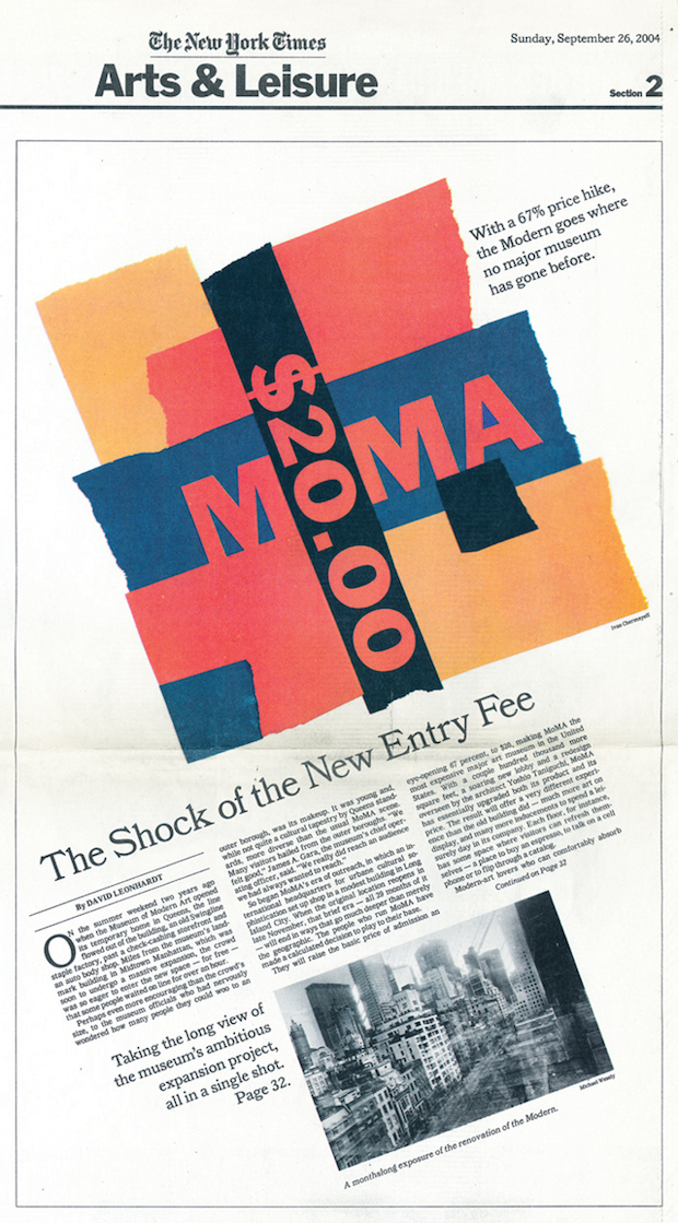
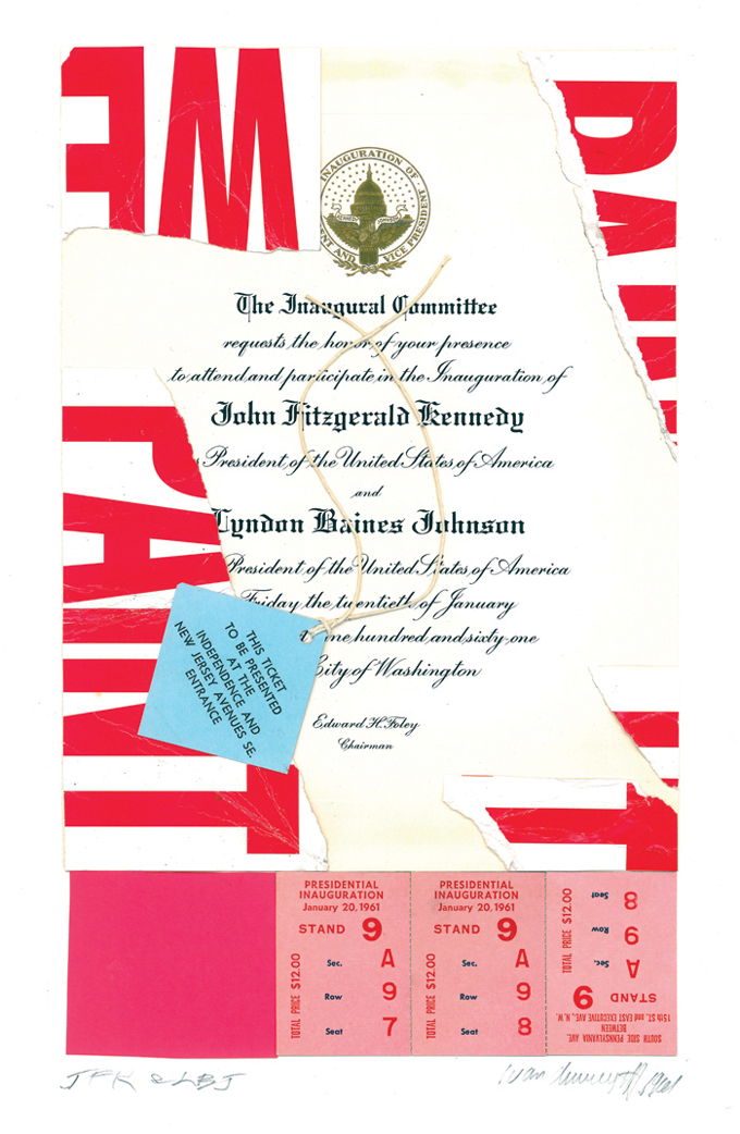
Humour, can be deployed in anger or indignation, as in Ivan’s cover for Harper’s Magazine in 1961 on the theme of ‘The Missile Mess’, and in the many magazine and book covers he has done for liberal causes such as environmental movements and Democratic politics. It is the thread that links Ivan’s private world of collage to his professional world of design. When I say ‘private’, it only means that he does them at weekends and on holiday rather than in office time, as a relaxation and as a way of keeping an individual identity, for these works have been widely exhibited and published in books, and form the largest group of items in the Bexhill show, also providing its title.
Ivan claims that he started making collages as a child because he didn’t think that his drawing was good enough. If so, it was an unconscious realization of the difference between modern and earlier art forms in which there was a particular kind of craft skill that could actually endanger creativity by its own self-sufficiency. He also explains his “packrat behaviour” that leads him to collect “garbage on the street that catches my eye, whether it includes discarded empty packages, lost gloves, flattened soft-drink cans dropped out of car windows at drive-in movie theatres, left behind and never picked up; fragments of peeling posters – graphic ephemera of everyday life, flattened by cars or flat to begin with, found on the streets and sidewalks or torn out of magazines.”
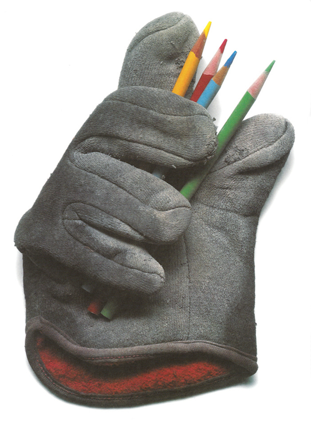
By their life in the wild, these objects are already beginning to become something else, and the artist’s job is to complete this process. It is not unlike Kurt Schwitters’ Merz technique, but the mind and personality behind it is a different one. The process is a quick one, and the meaning doesn’t demand a deeper interpretation than one might give to an illusionist or trapeze artist, but one’s pleasure in a skilled performance is just the same.
As Ivan says, “Fragments of color, letters, numbers, eyes, images, which can then be sorted and arranged in new ways. The goal is always to have enough raw material to choose from. The end results may then be visually interesting when put together in new ways. Their prior context is always irrelevant. Their meaning is inconsequential but can be visually provocative for any number of reasons, as subtle as their shape or texture, their degree of wear and tear, or their association to other worlds. Bits and pieces of stuff, some of which was out there ready to be used. Stuff can remain an orphan, but is there waiting, all the same, for a new home, which comes into focus sometimes.”
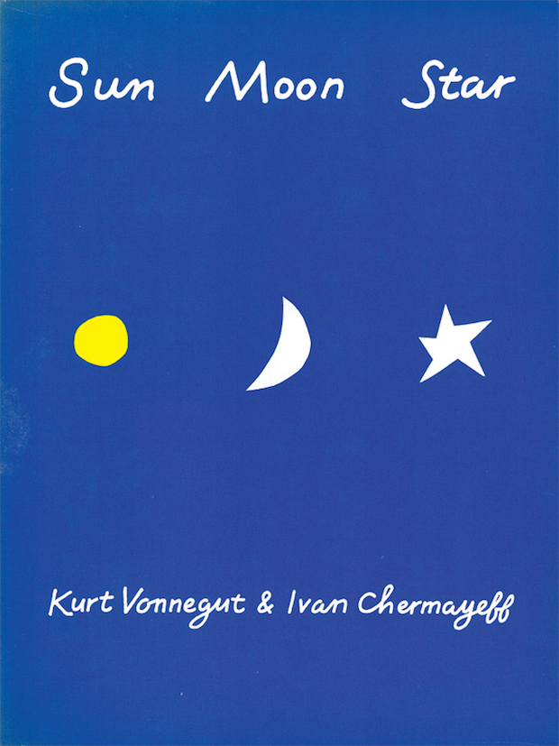
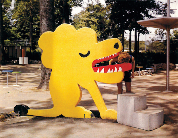
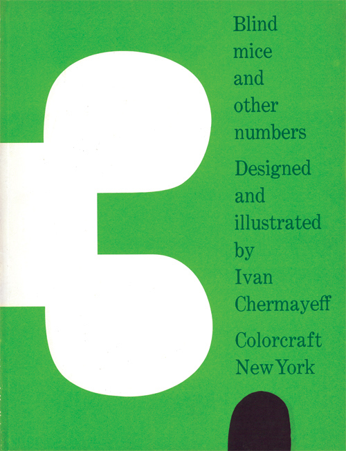
It is not surprising that children are the audience for much of Ivan’s work. The most famous of his children’s books is probably the one he did with Kurt Vonnegut, Sun Moon Star, in 1980, but there are others using different techniques. His wife Jane Clark Chermayeff, who sadly died only a few weeks before the opening of the Bexhill show, was a designer of exhibitions, including children’s outdoor play and learning spaces, often involving Ivan as a collaborator. The simplicity appropriate for communicating with young children, together with their ability to make mental jumps unfettered by verbal logic, are characteristics that have pervaded modernism, and are particularly appropriate for graphic design that needs to be both comprehensible and memorable.
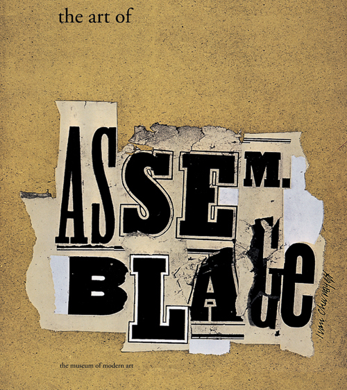
I have been collaborating on Ivan Chermayeff: Cut and Paste with Jane Won, the Curator at the De La Warr Pavilion, responsible for a stream of engaging and stimulating contemporary art shows in the past five years. It has been a privilege to work with a great living designer, and the selection is very much his choice, as is the title, after he rejected any proposals containing either of the words ‘graphic’ or ‘design’.
Sadly it has not yet found any touring venues, evidence that not only is Ivan Chermayeff’s work awaiting discovery in Britain for the first time, but that graphic design in general falls outside the remit of art galleries, even those in universities and colleges where the subject is taught. Luckily Bexhill had the excuse of an ancestral connection and a memorable name to anchor the show, but without that, it is unlikely to have happened, but there seems to be no obvious way in which the whole subject area and the talent within it will make its mark with an art public that can probably be counted on to enjoy it, if they are given the chance to see it.
Ivan Chermayeff: Cut and Paste
19 July-14 September
De La Warr Pavilion
www.dlwp.com