
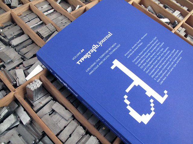
Now on issue four, the TYPOgraph.Journal is a small-but-perfectly-formed typographic labour of love for its talented creator Nicole Arnett Phillips – aka TypograpHer.
Issue 4 of the TYPOgraph.Journal has already gained a loyal following of readers from all around the world. We caught up with its editor, designer and publisher Nicole Arnett Phillips to get the lowdown…
Can you tell us a bit about your background? What made you first want to be a designer?
I always loved books and visual communication. When I grew up, my Dad worked at the New Zealand Herald Newspaper. The process of seeing language become visible and distributed to so many people excited me. I started making handmade books in the early 80s (mostly about cats, dogs, and Michael Jackson during that decade.) By the late 90s there was no question in my mind I had to be a book designer. This was really hard at a time most people in the industry were touting print as being a dead medium. But I persevered with print, and I have spent the last thirty-four years in and around publishing and typography... It continues to stimulate and excite me.
What prompted you to publish the first edition of the TYPOgraph.journal?
While I studied art and design at university – I am pretty much self-taught with all things type. I constantly set myself research questions to continue my own learning (be it written or visual)... the outcomes of this research were produced as letterpress printed books in small editions of 1-5 in my backyard print pavilion (glorified garden shed). I loved making these documents, but they are insular and self-indulgent – they were also really expensive to produce (which made them difficult to share) TYPOgraph.Journal was born with a desire to create a low-cost document I could share with other enthusiastic type lovers. I hoped it would continue my typographic learning and hopefully provide learning outcomes for our community too.
How would you describe it to someone who hasn’t seen it before?
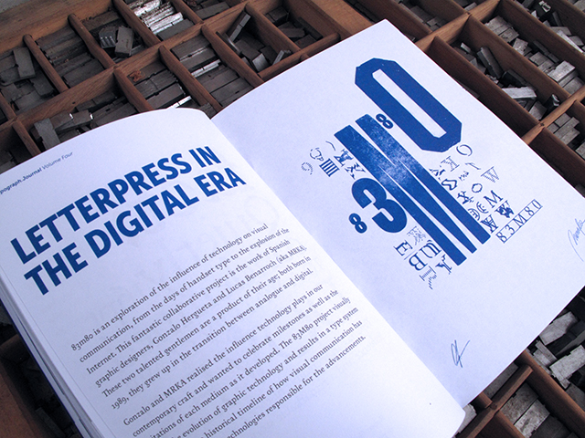
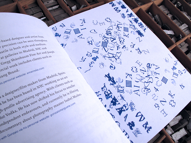
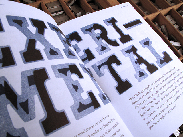
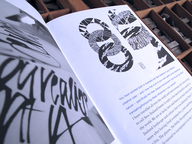
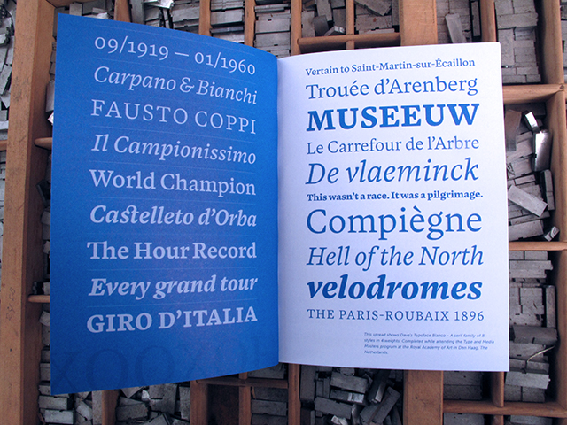
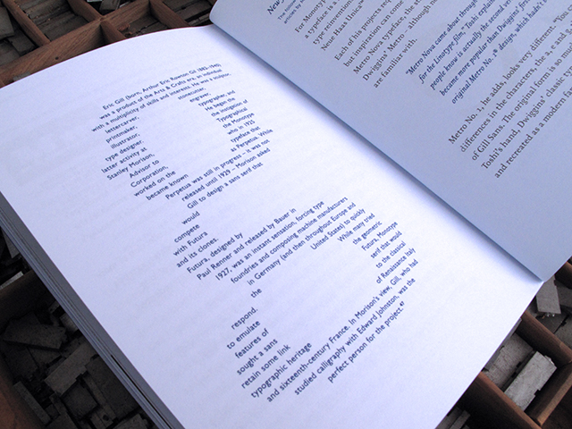
The journals are all about balancing practice and theory. There is eye-candy and visual inspiration, but the visual matter is balanced with concise articles written in accessible language. It is a small format (5x7 inches) as I hoped it would be something people could dip in and out of – reading a sound byte as they travelled to and from work or between classes. They use the golden section as a structural device.The TYPOgraph.Journal's are written by designers for designers. I believe content and form are inseparable, so the design treatment and layouts are often used to reinforce the meaning of the text. Volume 01 is black only and each subsequent volume is black + a spot colour.
What have you learned along the way? How does issue 4 differ from issue 1?
I saw volume one as a static object. It contained information about resources, tools, and events that dated the document. I am constantly listening to feedback from the community, who valued those resources and information but wanted to access them online and called for a better digital platform in support of the printed editions. Since volume 02 I have been continually expanding and updating typographHer.com with glossaries, tools, profiles and events pages. (I am working on a new resource page at the moment I am really excited to share!) Also, volume 01 contained a lot of my thinking and intent – a sort of manifesto for the series, sharing my design philosophy – each subsequent volume has been less about me and my thinking and more about the amazing and inspirational people I am profiling. Also, the paper stock has changed, it is still Australian, but I needed to get the weight down for shipping. (International shipping and customs issues have been super challenging).
How do you balance making the journal with doing the stuff that pays the bills?
Total transparency this is hard, and I don't always get the balance right! My business model is built on a split of professional and passionate practice. The stuff I do for clients pays my bills; I try to focus on the professional practice (nicoleap) and the business of being a freelance designer 2-3 days per week. The 'passionate practice' projects I do for myself and our community (TypographHer) doesn't make money but provides value in other ways. So I spend 2-3 days per week curiously exploring typographic culture and practice. I live and die by my calendar, and I have colour coded days for client work, publishing, visual research, and letterpress... If I have a particular project I need to focus on, the system sometimes swings out of balance, but that can be a fast track to bad cashflow – or burn out, so I try hard to maintain a good mix work that both sustains my bank account and sustains me creatively…
What advice would you give anyone thinking of publishing something themselves?
I am a Luddite and gravitate toward print, but digital is also a great mechanism to reach lots of people and keep your upfront costs down... so consider who your audience is, and the best channel (or format) to reach, connect with and engage those people. I think if it is something you're excited about there is a good chance others will be excited about it too. So I would strongly encourage anyone thinking about creating, sharing and publishing content to do it.
What’s the typography and lettering scene like in Australia at the moment?
It's amazing…I am constantly inspired by the enthusiasm and interest in type and lettering down under. We don't have the depth of typographic history down here, and there are still very few schools offering formal type education. But there is a huge amount of passion and talent down under (in both Australia and New Zealand)... And lots of that talent comes with tenacity, so we are seeing more and more events (like the Typism Conferences, which was the first national-scale event dedicated to type), and there are plenty of local workshops, exhibitions, lectures and regular type/lettering club meetups happening around the different states. We are still a small and niche part of the design scene, but we are totally gaining momentum.
Has publishing the journal opened up any doors?
Yes absolutely. I think people can see that I am genuinely keen to support community and champion the good work other creatives are doing. I believe in working in collaboration not opposition with my peers. So people are reaching out and sharing their work – which is fantastic – as it has enabled me to meet and discover lots of awesome people and projects, make new friends and find new collaborators.
What’s next for you? And what’s coming up in issue 5?
I am working on a book entitled Alphabet is Code which I am excited about. I crushed my right hand in one of my printing presses a few years ago and started drawing type with a pencil; pushing and pulling curves, scribbling letterforms, and manipulating typographic proportions as part of my rehabilitation. That lead to the opportunity to teach some workshops and I have been encouraged to publish the drawing exercises... so I am collecting them into a workbook at the moment which I intend to publish under the banner TYPOgraph.Press. I have also started curating content for vol 05 of TYPOgraph.Journal and have some exciting articles on grids, type design process, and speculative typography to draw from for that volume.
Finally, what would be your desert island typeface?
Oh, this is such a tough question. I think Bembo – I could read type set in Bembo all day, every day. It is a glorious text face. But when you blow it up large, all its quirks and personality reveals itself – so it would work for making signs out of washed up debris and coconut shells too.
Grab your copy of the TYPOgraph.Journal and read more of Nicole's typographic musings at typographHer.com


