In today's Logoform, designer Richard Depesando looks at a marque by Hingston Studio for the Campaign for Wool, which is soft, springy and deceptively simple. For most of my career I’ve worked in or around fashion – design, manufacture and retailing. I’ve always been attracted to the industry and hard work, as well as the colour, imagination and the tactile qualities of fabrics. I’ve worked closely with wool and linen mills, fabric designers and merchandisers and tailors. At my first studio in Whitechapel countless knitwear samples were generated upstairs and downstairs were two small weaving looms. I’ve always seen fabric as ‘alive’ and working in and around the industry as exciting and inventive as it gets.
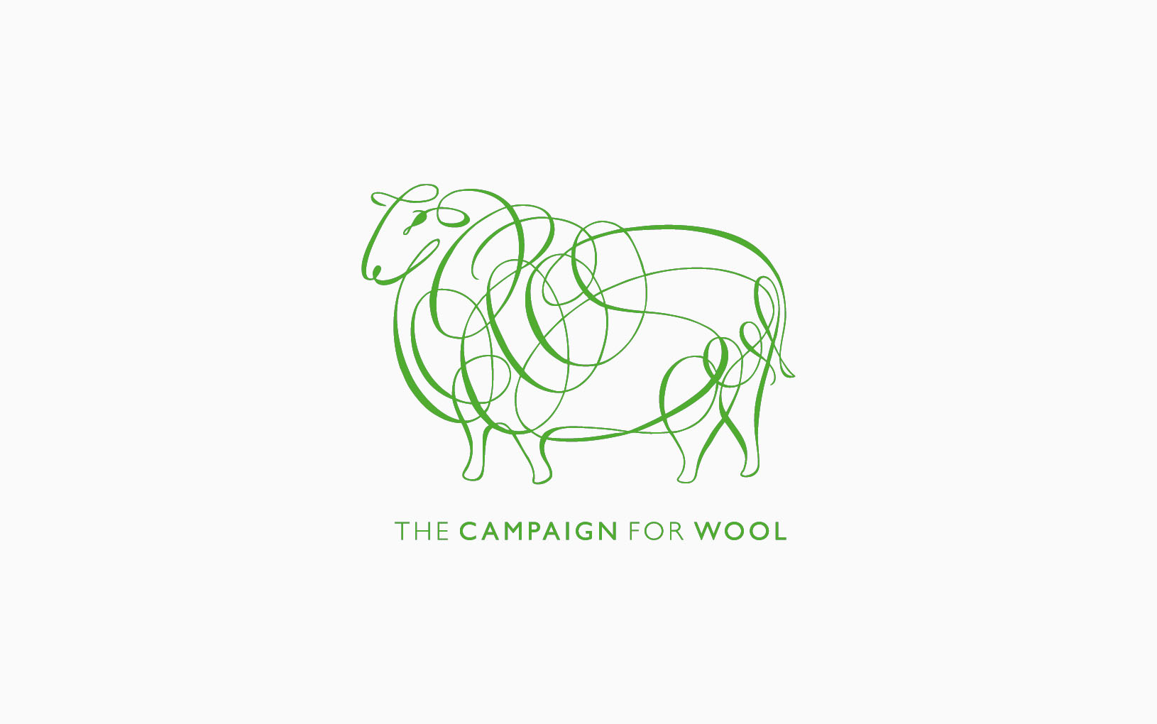
In my own practice I strive to understand ‘who’ a client is and ‘what’ they do within their brand identity, and for me the campaign logo for The Campaign For Wool drawn by Peter Horridge and commissioned by Hingston Studio/Keep (who also adapted the familiar Woolmark) is the benchmark in getting it right.
This isn’t just a cartoon fluffy sheep – this is alive, a full mature fleece, soft and springy, full of volume and texture on a proud looking animal. The simple, expressive typographic line fills the form with life. It’s incredibly difficult to draw this well (I’ve tried). The simplicity is deceptive – and it’s brave to be this loose and unstructured with the line (or two lines – I traced them all the way back). I intuitively and instantly know what it is, can already feel the texture of raw, oily wool in my hands and the fluid folds from bolts of woven fabric. It has a very British look about it, like a Victorian trademark, almost a bit cocky – but is incredibly modern and full of joy. It’s the marque that always makes me smile, and the one I wish I had the confidence to do myself.
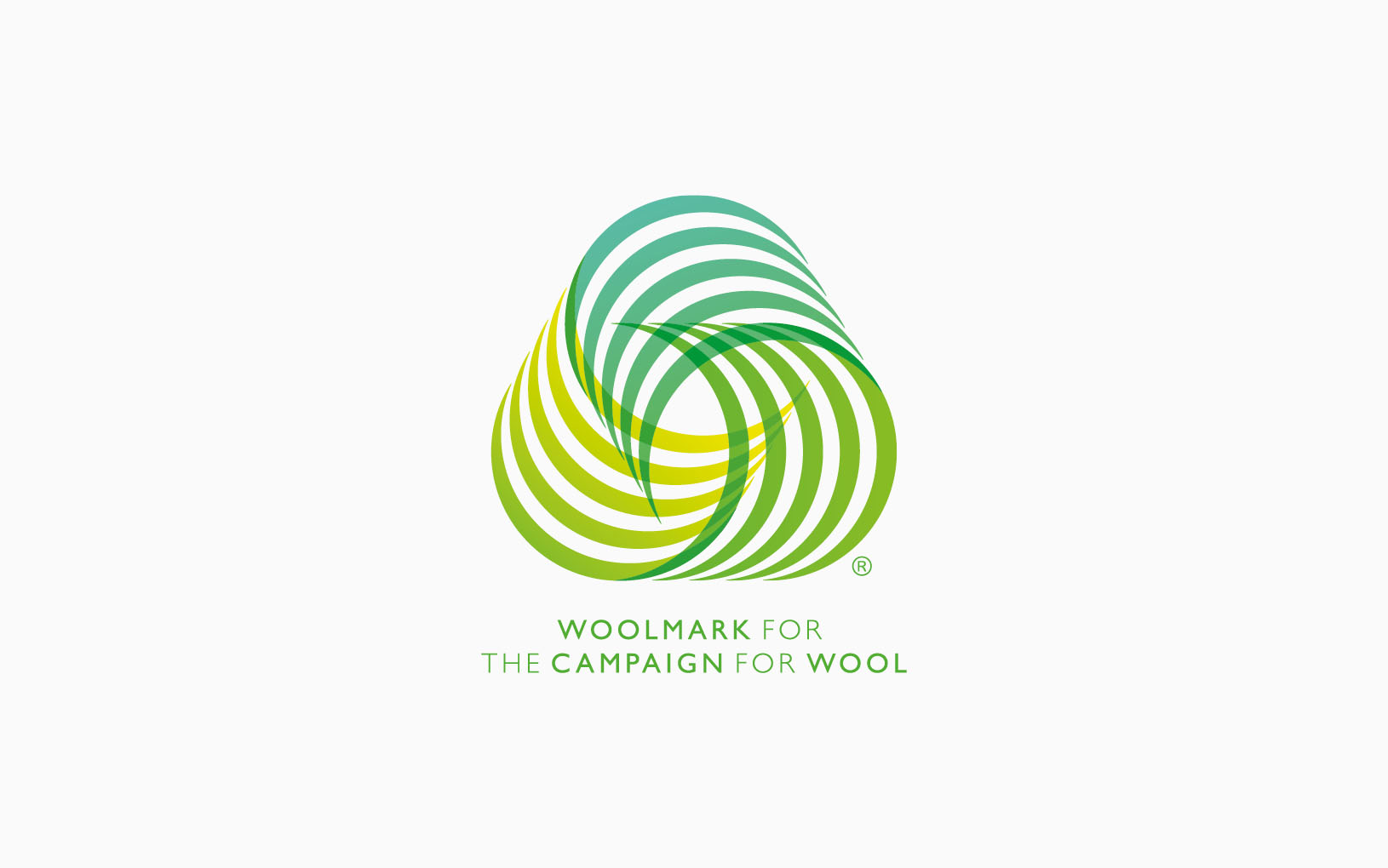
The Woolmark…
…is a quality assurance logo which has been used on wool products for over fifty years. The design was the result of a competition and was originally credited to a (probably imaginary) designer called Francesco Saroglia. It's since been attributed to one of Italy's most revered designers, Franco Grignani (whose work it bears a remarkably close resemblance to). Grignani couldn't enter the competition himself because he was a judge, hence the pseudonym.
Richard Depesando
…
…is a designer specialising in identity with a background in fashion and high street retail. With over twenty years experience of bringing brands 'to life', from big hitters like French Connection and Nisa to tiny startups with no discernible budget, he prefers to work with clients long term – evolving their identity with their products/services. After many years working in London, Brighton and Liverpool, he’s firmly based in Hastings, where he does his best thinking looking out to sea.