
It's not often the chance to design lettering for a ship comes up, and who better to make sure that HMS Victory was typographically ship shape (and Bristol fashion) than John Morgan and Adrien Vasquez of John Morgan Studio?
Earlier this year, John Morgan Studio received an unusual commission – to reinstate the lettering on one of the country’s most important historic ships, HMS Victory. This wasn't just a case of repainting an existing design, but a unique opportunity to reimagine the ship’s lettering in an appropriate and historically accurate way. As they wait for the scaffolding to come down (and the full reveal), John Morgan and Adrien Vasquez explain the process behind the project…
How did the project first come about? Had you worked with James Mosley before?
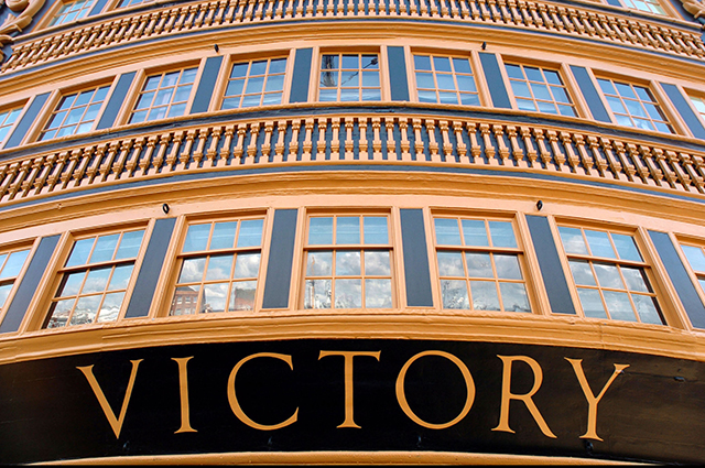
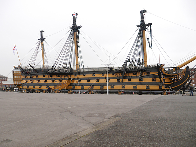
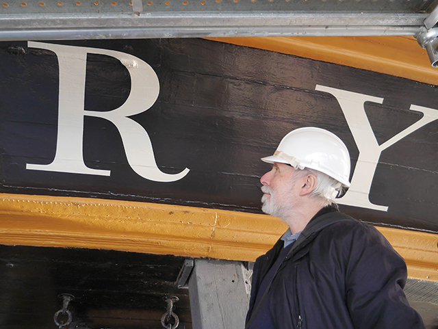
The project is the result of years of correspondence between James and the various parties involved in the restoration of HMS Victory, in which James challenged the well-intended but anachronistic use of a pallid and weakly realised Trajan letterform on the ship’s transom. The ship (which was completed in 1765) is currently being restored to its aspect just before the battle of Trafalgar (1805). The wood and paint have been analysed scientifically to determine the exact original colours: black and a pale beige rather than a golden yellow.
This re-painting gave a welcome opportunity for a reconsideration of the Victory lettering. Our relationship with James begins in the Typography Department of The University of Reading, where James taught a course (on Saturday mornings…) in the History of Letterforms. John took on James’s call for action at the end of his quietly influential Motif piece ‘The English Vernacular; A study in traditional’ (1963), and began to introduce the English Vernacular letterform into the studio work. Firstly in the journal AA Files through the development of initial caps with Paul Barnes, and more recently and in consultation with James on the use of this ‘British’ letterform for the signage and way-finding for Tate Britain. The next step was Victory.
What were the key factors you needed to consider when designing the new lettering for HMS Victory?
What was needed here was a piece of lettering that responded to the unique combination of letters in a very particular context, and a style of letterform as accurate and truthful to the one in which the name of Victory must have appeared in 1805.
What were your main visual references?
James had gathered a body of research some of which is documented in his Motif piece, and in the article ‘Naming Victory’ from the studio designed journal AA Files 60(2010). Ships of the Royal Navy didn’t have their names painted on them until about 1771, when an order was issued requiring this to be done in large and legible letters. This can be seen in paintings from the period and the name of Victory is clearly visible in a painting by Nicolas Pocock, Nelson’s Flagships at Anchor (1807). Although it can’t be considered as an authentic rendering it was an helpful and convincing visual reference for the setting of the name.
Can you describe the design process you went through – did you come up with several different routes, or follow one from the beginning?Which letters did you start with?
Guided by the historical research, we began by setting the name in various letterforms, including those from alphabets by Carington Bowles (1775) and William Hollins (1813). We established that the work of the writing master and engraver George Bickam (1684–1758) was the most fitting starting point. Using alphabets from his Universal Penman (1733) we drew new letterforms digitally, which we then tested at the real size (about 650mm) and modified to ensure every detail worked on the ship – in this respect the new lettering departs from its source in many details and is very much tailored for Victory.
What were the particular challenges you found in creating lettering which needed to be so historically accurate?
Accuracy here is very relative as there aren’t any traces left of the original setting of the name, and the English vernacular model is more a general idea than a specific set of forms. So while we can’t say for certain this is what the original lettering looked like, we can certainly say it wouldn’t be based on a Trajan model and it should feel more vigorous and lively in spirit.
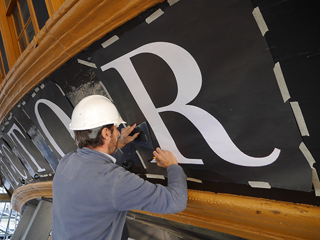
The most debated point between us was the shape of the ‘R’ – whether to go with a flat leg that worked with the horizontal stretch of the transom or to go for the more curly legged and characteristic English vernacular model.
How was the lettering applied to HMS Victory? Did the scale of the letters or the surface they were applied to present any particular challenges?
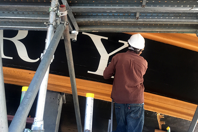
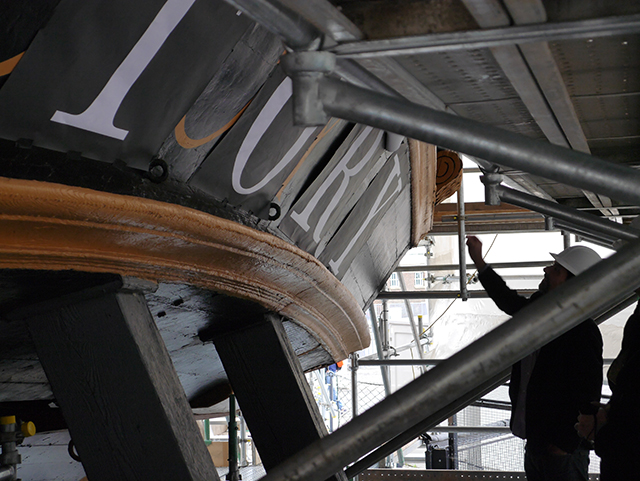
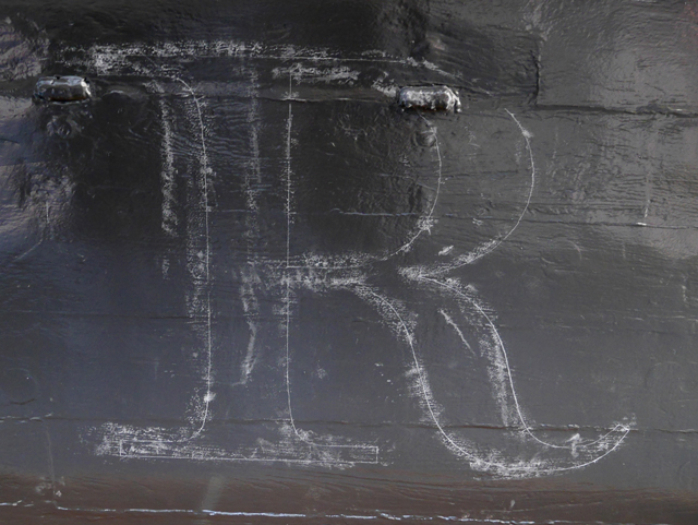
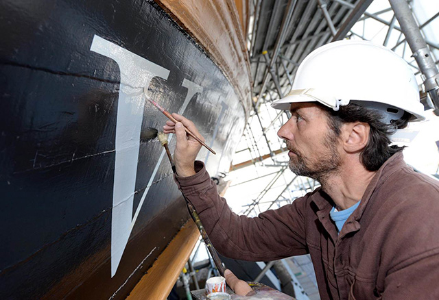
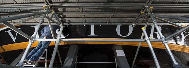
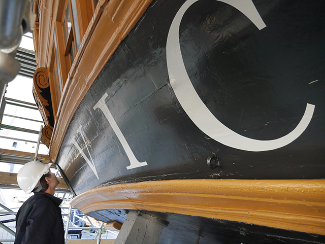
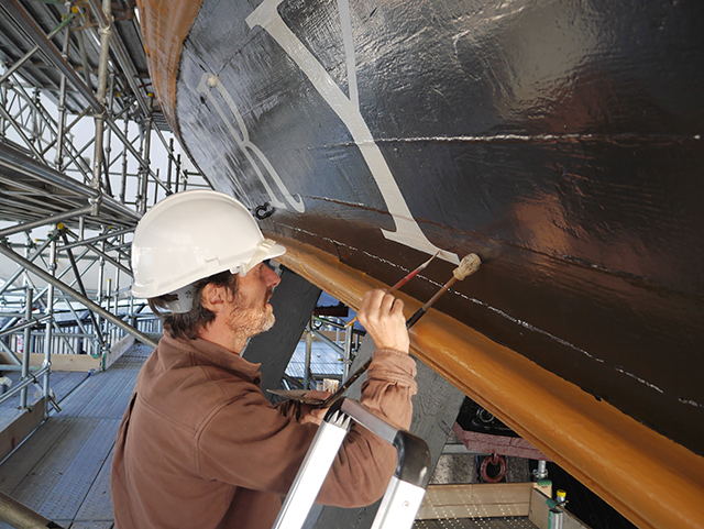
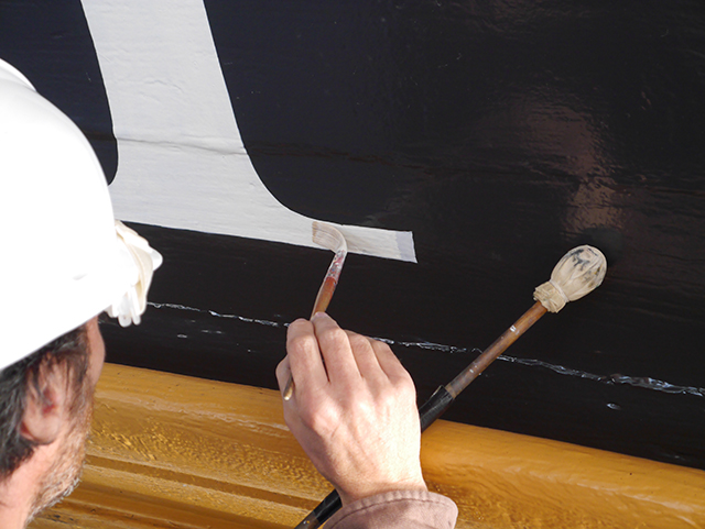
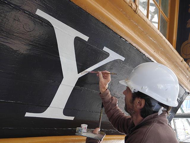
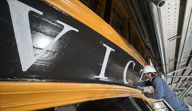
Together with sign painter Phil Surey, we visited the ship in dry dock in Portsmouth several times to establish the scale and position of the letterforms through using actual size paper print outs taped to the transom. The twelve metre-long stern is curved, which demanded an optical adjustment to both the height and position of the letterforms from left to right, an activity not made any easier through the stern being covered in scaffolding blocking the essential long-distance view. It took a day to letter-space seven characters.
Once this was resolved chalk was rubbed over the back of the print outs and the letters outlined with a pen, leaving a rough chalk letter guide on the ship. Over the next two days, Phil then applied several coats of the off-white paint. We look forward to the scaffolding coming down to see if we have the right result.
What’s next for John Morgan Studio?
A new magazine and identity for The Artist’s Institute in New York.
morganstudio.co.uk
Images (unless otherwise stated) and lettering copyright John Morgan Studio, 2015.


