Sarah Schrauwen combines her skills as an editor and designer in this book about virtuosic performance artist Rose English. We quiz her on the approach to handling its theatrical content.
Could you tell us about your approach to handling the photographic content — particularly for the cover, it's very dramatic.
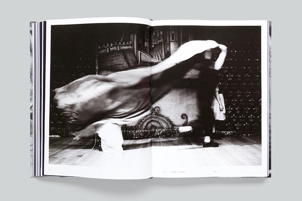
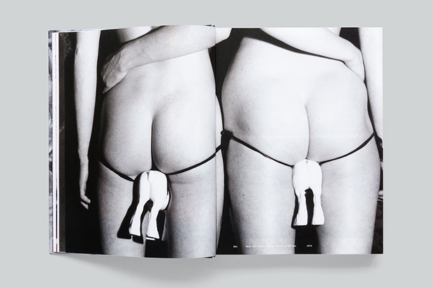
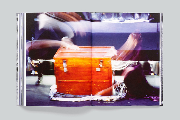
When I first started working on it and looked through the many folders of photographs, I was stunned by the range and quantity of amazing imagery. The black and white photographs from the 1970s especially spoke to me – very contrasty and grainy, great compositions. The artist Rose English also spoke of them fondly. She had worked very closely with the photographers and was often involved in the development process. It was immediately clear that photography was a crucial part of her work (as it was, then, one of the few ways to capture ephemeral work like a performance).
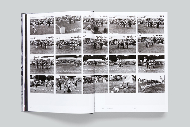
This made me think that the images should get a clean treatment and that each set of performance images should be looked at separately, rather than creating one treatment for all of them. I knew there should be lots of big, full-bleed images to contrast with spreads that show sequences of smaller performance images.
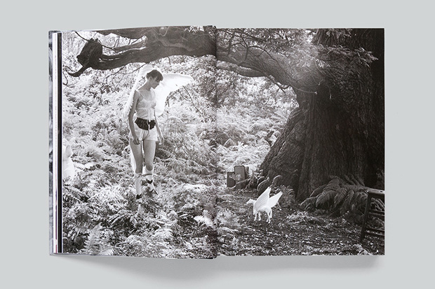
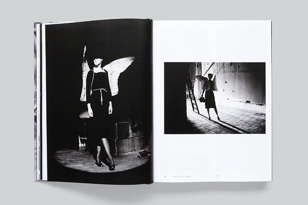
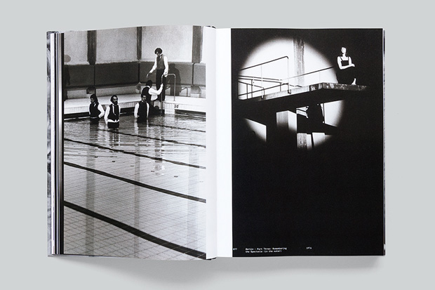
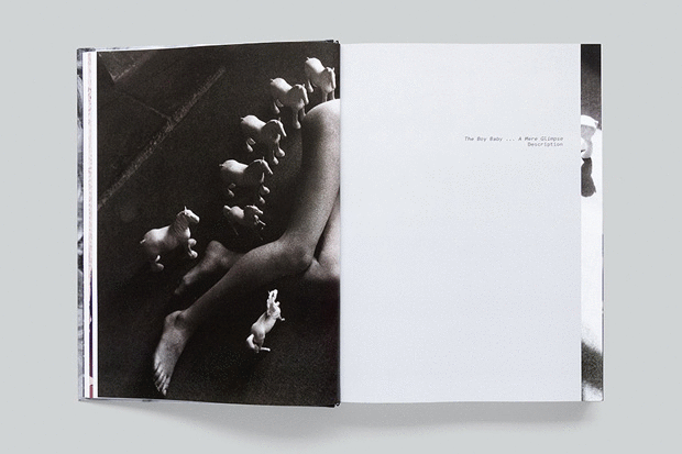
The structure of the book was actually quite complicated because there were so many images with different registers: performance images, research and development images, personal pictures, backstage photos, etc. Along with that, there were different registers of text: the main essay by Guy Brett, performance transcripts and scripts, interviews and captions. After a few proposals we decided to go with the approach of intertwining the research and development and other images in the main essay text, leading up to the more dramatic performance images at the back of each chapter.
The transcripts and scripts are presented on cut-short pages in between a full-bleed image from that performance – this creates a sort of ‘book-in-a-book’ experience and clearly separates the scripts from the other text registers.
How did you approach the production elements of the book’s design?
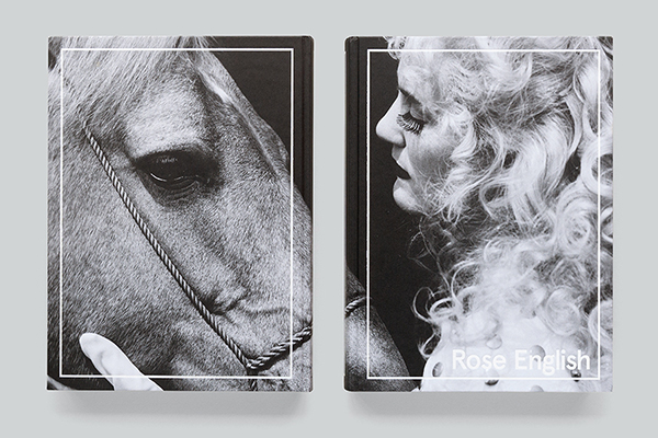
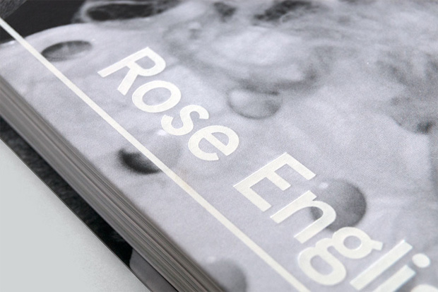
The photographic content also influenced the production of the book: I suggested working with a round spine so that the book would lie completely flat and the full-bleed images would work to their full effect. We also chose for a thin board for the cover (1.5mm instead of the usual 3mm) to keep the book light and flexible, and to create a sense of intimacy. We tried lots of different images for the cover, going over the front, spine and back as wrap-arounds. There were many good options among these proposals, all highlighting a particular aspect of Rose’s career, for instance her early feminist work in the 1970s or large-scale spectaculars from the 1980s. In the end, we felt that this photograph – My Mathematics [performance to camera] (1992) – by Gavin Evans would be the most striking. Horses in general are a fundamental aspect of her work (present from the very beginning) – to show Goldy as her counterpart on the cover worked really well.
Here are some geeky technical specs of the book: the cover is printed on Fedrigoni Constellation Snow with Raster embossing and printed in duotone black. The type and frames on the cover are foil blocked in white. The endpapers are unprinted black Plike 140gsm and the inside pages are printed on Condat Matt Perigord 115gsm. The fonts used in the book are Aperçu Mono, Medium and Bold by type foundry Colophon. The book measures 27x20cm and it is 432 pages.
In your practice you combine editorial and design skills — in your view, what's important about working in such a holistic way?
I think it’s very important for designers to be involved with the content of their work. It’s a large part of what we do: structuring the words on a page or webpage – I believe it’s important to read those words and understand what the client is trying to communicate.
I have always had a deep interest in content and context; before I moved to London to study design I got a degree in Literature and Linguistics at the University of Antwerp. It wasn’t until I started working at Unit Editions that I understood that this could actually be a benefit instead of a disadvantage: after graduation I felt that most young designers had years more experience than me (because I only studied one year of design instead of three or four), but my ‘different' background actually proved to be quite useful.
When I’m working on books, it feels natural to be involved with both editing and design. For me, structuring the content and curating images is as important (and fun) as doing the layouts and setting the type. I find the whole process of making a book – from concepts and research down to production and marketing – really fascinating and I love to be involved with all aspects of that process. Eventually I would love to be more involved with creating the content for books: commissioning written and visual work, and maybe even writing myself.