
A freshly graduated student of Kingston University, this week’s Talent has a portfolio full of confident and well-executed projects that belie his years.
How would you describe your practice?
I make graphic design and I’d like my work to be characterised by a firm rationale and a detailed, conceptual approach. I like to make a lot out of very little, taking care with visual elements which might otherwise be taken for granted – page furniture like titles, links, numbers, image figures and punctuation. In my final term of university I was working on a lot of print and web design simultaneously, which I’ve found is a satisfying balance to maintain. I enjoy print because it is fixed, tactile and precious. I think web design’s complete fluidity provides a wonderful counterpoint to this: ambivalent to size and format and open to differing kinds of interaction, be it clicking and hovering, or swiping and prodding. I don’t want to have a definite answer as to what my practice is just yet, but I’d like to continue working in both these mediums.
You studied graphic design at Kingston University, what's the course like there and what have you taken from it?
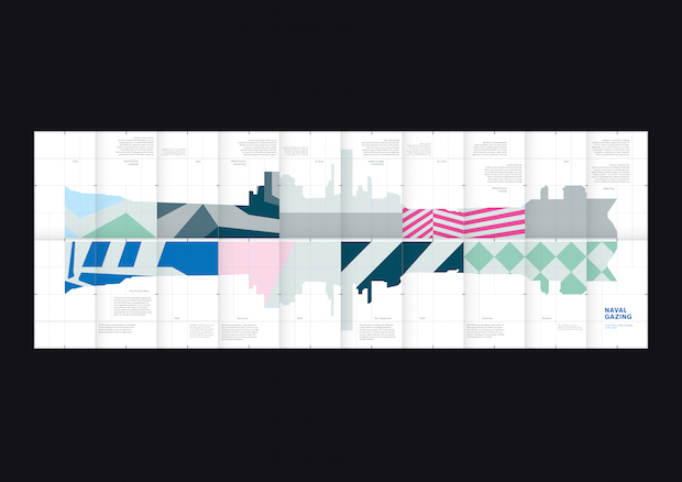
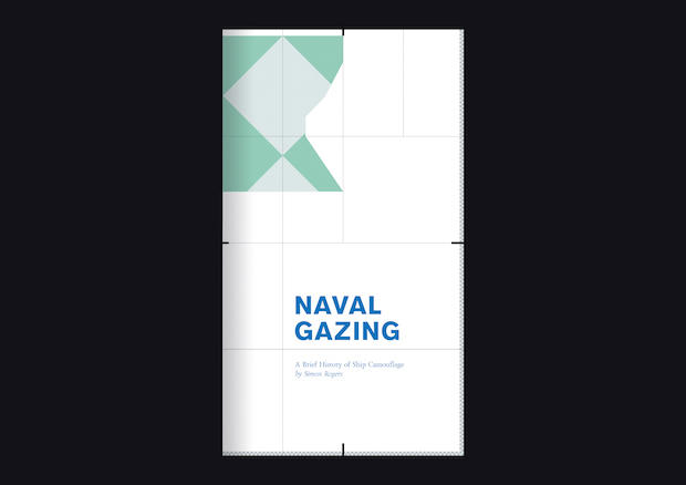
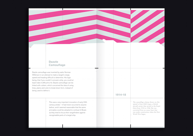
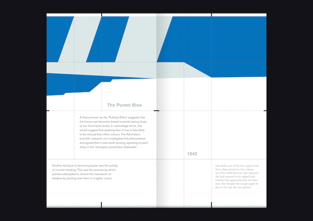
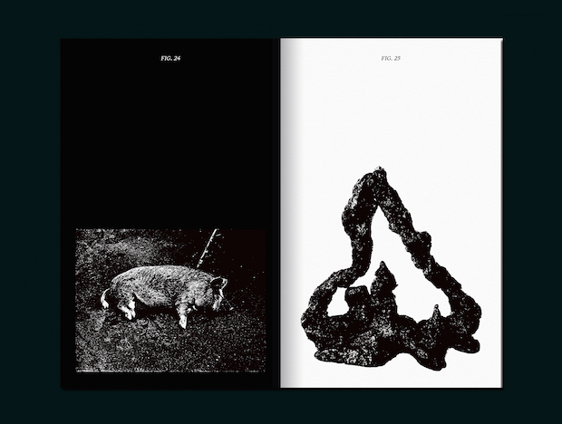
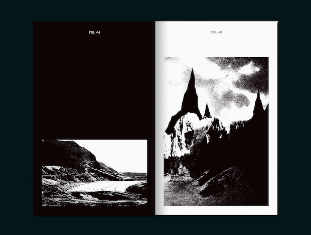
I owe a lot to Kingston and have benefitted greatly from the generosity of my tutors and friends. Despite its broad scope, the course is united by a focus on ideas, research and process, which lends the work a richness and depth you wouldn’t necessarily expect from a graphic design course. Most recently, the course has helped me to realise the value writing has within my practice. This can be demonstrated in one sense by the names I’ve chosen for projects: Backsides (mentioned below), or Naval Gazing which is an illustrated history of ship camouflage designed and written by me. I’ve found that writing can help me quickly define what tone of voice is right for a project, and from this written voice an appropriate visual language can quickly be developed.
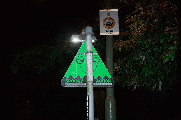
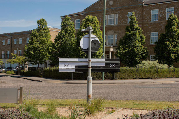
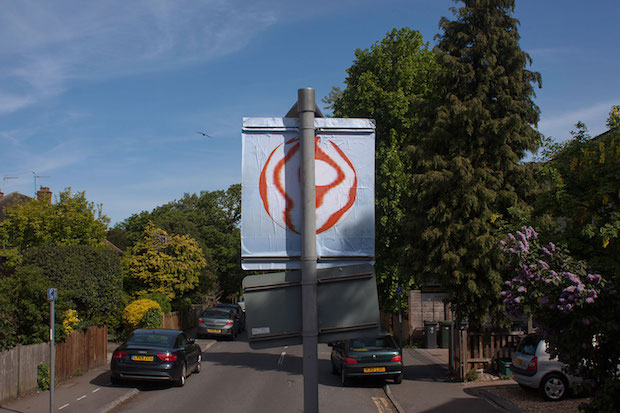
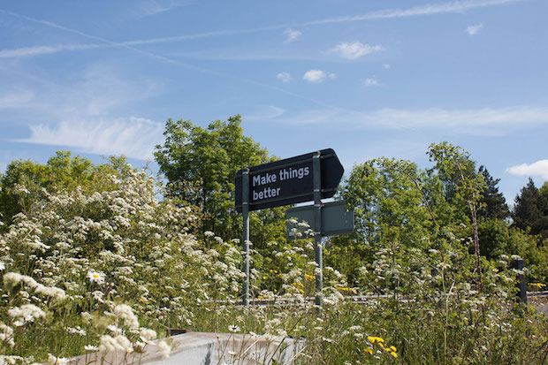
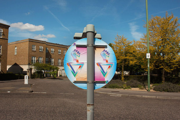
You have a project called Backsides which involves you sourcing designers to produce works for the reverse of street signs; could you tell us a bit about how the project came about and its intentions?
Backsides is a parasitic poster exhibition. It’s opportunistic in spirit and capitalises on an overlooked space that’s ripe for the presentation of visual material. I often go cycling in the Surrey Hills and to get there from where I live you have to cycle through miles of London’s suburbia. Backsides was partly conceived as an attempt to offer something other than another corner shop or hairdressers to look at along this route.
Backsides also stems from my road sign-focused kleptomania, which has littered my house (and my Instagram) with a large collection of signage – I guess it was inevitable that these would eventually weasel their way into my work. Backsides is an ongoing project, so if you’d like to participate please get in touch. The current collection can be viewed in full here.
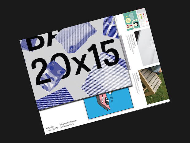
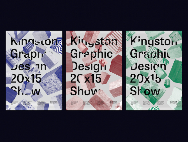
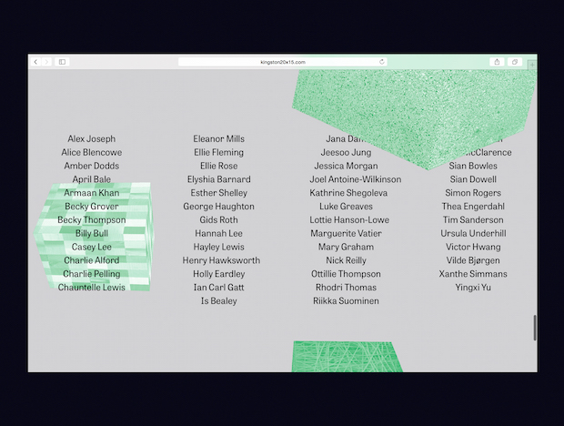
Could you tell us about the thinking behind your work on the 2015 Kingston Graphic Design degree show identity?
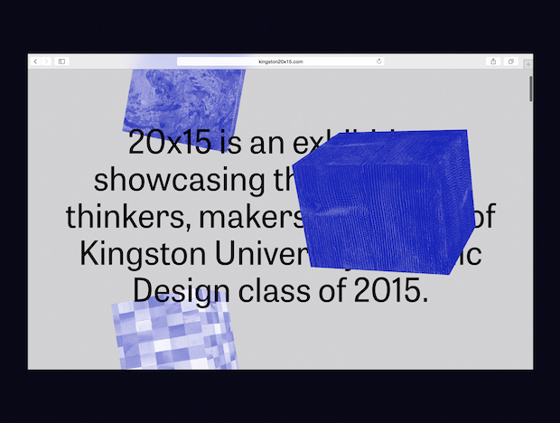
The idea for the blocks used across the identity was suggested in a class meeting, where there was general interest in an identity that was formed collectively, rather than one designed by a select few. Each of us was asked to personalise our own block, with the idea that these would come together, representing the year group as a whole. I got involved to make the website with Nick Reilly, and we also ended up helping with the catalogue, posters and art direction.
Conscious that the identity was a collective creation rather than the work of a small team, and therefore quite different to previous years, we wanted to emphasise this change further. Whereas past identities have been typography-focused and visually-speaking they’ve been relatively conservative, we wanted to use the blocks in a manner that was unashamedly graphic. This led to our decision to colourise and bitmap the blocks, presenting them in dense compositions that allude to the idea of a variety of work being crammed into a small space.
Creating textures from photographs of the blocks and animating these for the show’s website was exciting, as it shaped the way we thought about the identity, and led to the curatorial team projecting an animation of the falling blocks into the show space, made by a peer on the course, Victor Hwang.
What are you working on now and what's next?
I’ve just finished working on a website which explores several understandings of the term ‘vanishing island’, which conventionally refers to an island that is visible at low-tide but not at high-tide. It documents fourteen islands from around the world and, just like the islands themselves, the content for each of them is concealed and revealed with the tides. If you’d like to visit for yourself, you can do so here. As for what’s next, I’m open to new opportunities. I’m planning to remain in London for July – August, and if money allows, I would dearly like to stay here longer.