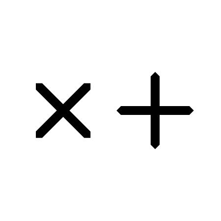
The Museum of Old and New Art’s logo, much like its founder and its architecture, succeeds by emphasising something usually dismissed in branding: ambiguity. MONA is, quite literally, a subterranean world where art reigns supreme, shock is inevitable and minds are moved. So, it makes sense that its perfectly innocent logo, designed by Leigh Carmichael, would contain more than a few hidden meanings.
It could represent multiplication and addition: the idea of growing and developing; of artwork itself adding to and expanding our perception of ourselves and the world; of one gallery’s ability to push Australia to the forefront of the international art world and, as a result, increase the country's artistic worth.
Or, it could refer to enigmatic founder David Walsh, a mathematician who, legend has it, funded the museum with the proceeds of his professional gambling past.
It could signify sex and death with the two crosses standing in for the infamous ‘X-rating’ and a tombstone. Death and sex after all, are two themes the art within the gallery seems to explore almost exclusively, essentially turning MONA into a museum of morality and mortality. (Years after my first visit, the artworks I remember most vividly are a bloated car, the victim of excess, and a lighting instillation that reads and copies our fragile human heartbeat)
Or it could just be something that looks pretty when it spins, as it often does in MONA’s moving footage.
Angular and unbending, the logo seems to reflect perfectly the sharpness and unapologetic bluntness that has made Walsh and his now-iconic MONA so recognisable. Perhaps its stark, geometric simplicity imitates Walsh’s motives. This is a man who collected art and built a museum purely because he could.
Art has a tendency to be both beautiful and confronting. It can mirror the modern world, be an outward expression of our inner musings or just communicate what we never could with words alone. So perhaps the MONA logo is the calm within the artistic storm. An elegant design made up of intersecting straight lines and angles that form familiar mathematical symbols. It is sophisticated, sound and precise. Something MONA also strives to be on the architectural front. Designed to be deliberately underwhelming, the gallery’s exterior is made from concrete and Corten steel panels while three of the building’s four levels are found underground – dug into the Triassic sandstone of Hobart’s Derwent riverbed. With the gallery hidden beneath the earth the focus is placed on the art within.
If so much effort has been put into constructing an ordered, unassuming exterior it makes sense that the gallery’s logo would also err of the side of (highly symbolic) restraint.
lizschaffer.wordpress.com
Leigh Carmichael
Native Tasmanian Leigh Carmichael is a graphic designer and now Creative Director of Dark Mofo, MONA’s winter festival. During his twenties he worked for such companies as Crank Media, G3 and Roar Film. Carmichael met David Walsh when he was thirty, an event that was to transform the graphic designer’s career. He first designed Moo Brew Beers labels for the entrepreneur before being stunned by Walsh’s offer to aid him in branding his nascent private art museum. For Carmichael what ensued was an intense six months of research around the ideas informing the institution and the site: “I would say it was more influenced by art, philosophy and religious ideas than design books and magazines”, remarked the designer, “Raw truth and honesty seemed like values that should be aligned with what I was doing. There is a conscious effort to avoid decoration.”
Deeper Underground
Located on the Berriedale peninsula, the MONA building is remarkably self-effacing by the standards of most contemporary art museums. According to David Walsh, a major reason for depositing the main bulk of the facility below ground was to respect the architectural integrity of two houses on the site by Roy Grounds, one of Australia’s foremost contemporary architects. Walsh has also said that he wanted the building to “sneak up on visitors”. On entering the museum the visitor must descend a flight of massive spiral steps straight to the structure’s lowest level; from here they must work their way back up to the surface — the ascent providing yet another richly ambiguous metaphor.
July 15, 2014 3 minutes read
Simple Arithmetic
The Museum of Old and New Art’s logo, much like its founder and its architecture, succeeds by emphasising something usually dismissed in branding: ambiguity.

