
With an emphasis on colour and form in their purest sense, Sol LeWitt’s beautifully refined work embodies simplicity – here Hector Pottie reveals why the American artist is his graphic design hero.
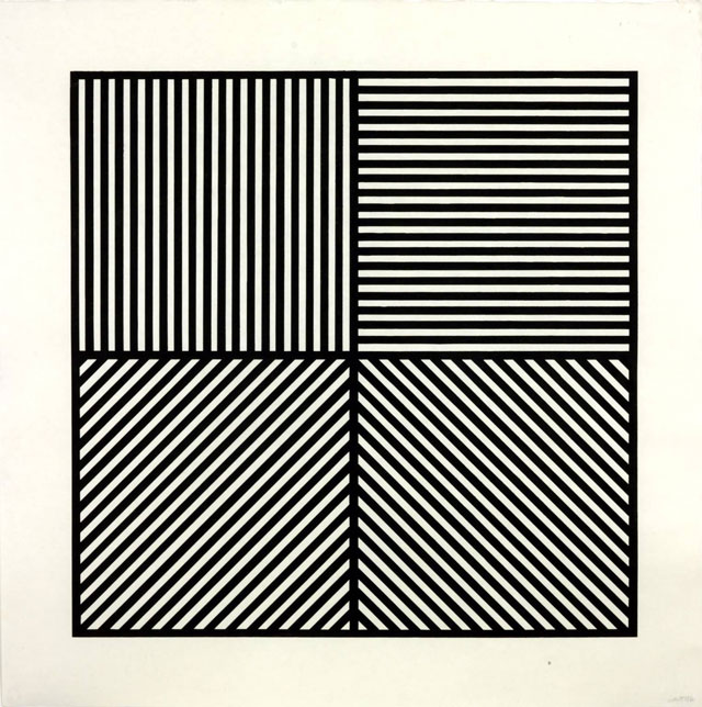
One of my graphic design heroes is the American artist Sol LeWitt. Along with his contemporaries of Donald Judd, Dan Flavin and Carl Andre, his work has been a incredible inspiration and influence on my graphic sensibility. His ability to create beauty and delight with basic geometric forms and primary colour have fascinated me from when I was first exposed to his work whilst at art school.
Although technically not a graphic designer, the influence of his work can be seen across so many designers working today, and we should acknowledge that our visual opinions are formed from a far wider sphere than just graphic design.
Born in 1928 in Connecticut, LeWitt had a long career producing an enormous body of work throughout the 60s, 70s, 80s, 90s, and 00s. He found his vocation while he was working in the bookshop of the Museum of Modern Art in New York in the 60s, where other employees included a number of aspiring artists, including Dan Flavin and Robert Mangold. From there he began to exhibit and grew to become one of the most eminent conceptual artist of the last century.
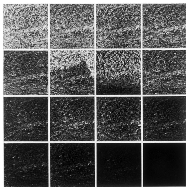
In a world where everything seems to be more and more complex and we are subjected to a relentless stream of information, LeWitt’s work is a reminder that often less is much much more. One of the challenges for any graphic designer is to organise information. To present it to the world in an understandable way. To simplify. To visually compose and bring order to any communication. The purity of LeWitt’s work shows us that the design (and artistic) process is about selection and reduction. The refinement of form and colour into a simple essence. Amplifying what you want the viewer to see by removing the noise and fluff around it.
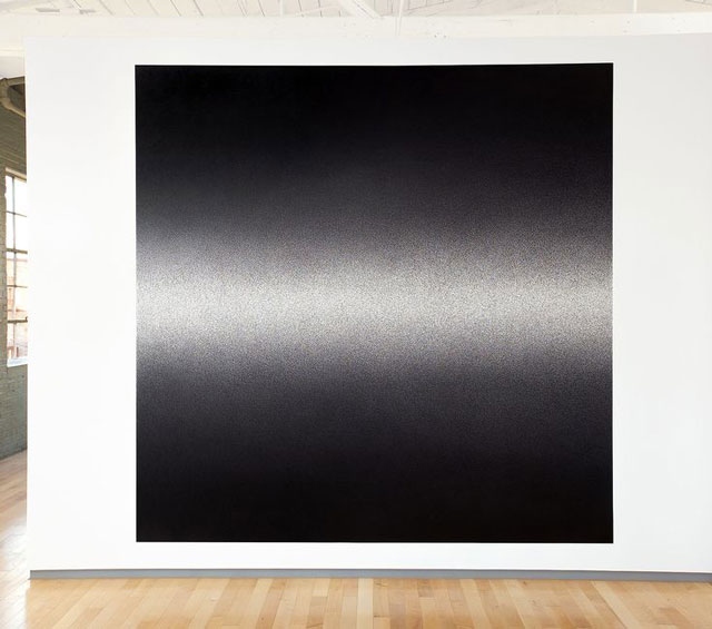
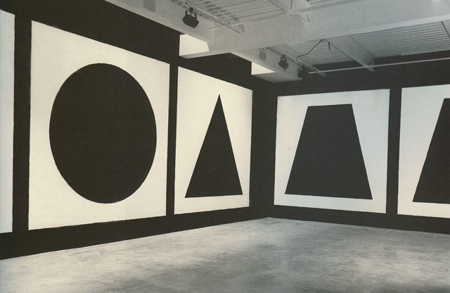
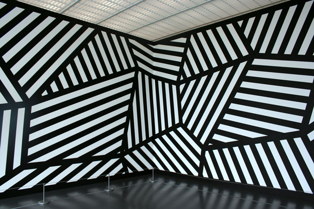
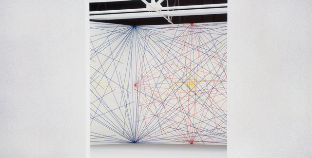
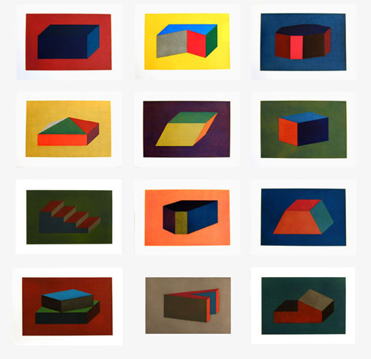
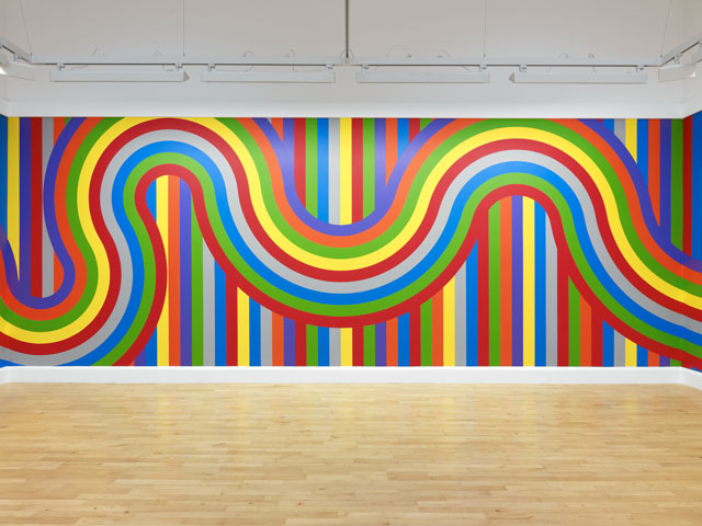
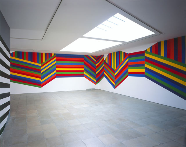
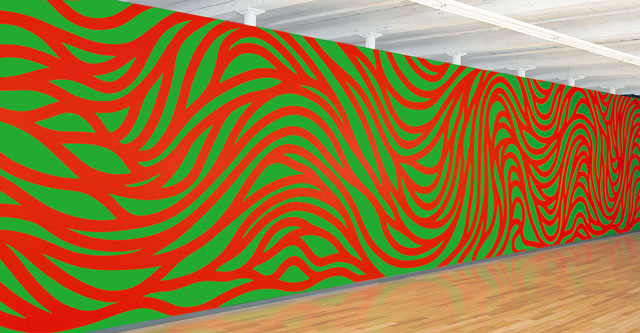
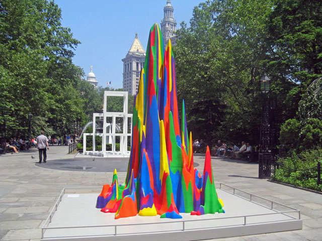
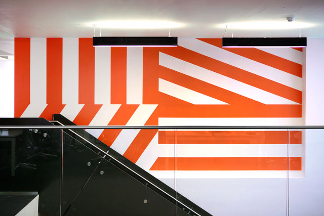
Although often simple in its execution, LeWitt’s work always evokes a sense of fun. Work should be beautiful and engaging. Simple but not boring. After all, who wants to live in an ugly world? His work, in particular his colour sculptural pieces, have a tremendous sense of energy and excitement about them. He was also the master of supergraphic scale, creating wall pieces where the content seems too big for the space, and playing with our senses, enveloping us in colour and shape with work that fills the room. By not being profound, LeWitt’s work is easy to enjoy. But as with any art which is reduced down to a simple essence or truth, it takes a genius to create such simple statements.
Hector Pottie is an Associate Partner / Creative Director at Prophet London