A benchmark for corporate brand refreshes, the glass-like Sky marque by Venture 3 is authoritative, inventive and allows the company to create visuals no-one else can, argues Alphabetical’s Tommy Taylor. When designing a logo I always look for a creative idea to communicate what a company does or how it does it. To find something original is tricky enough, but the ideas process is often much tougher when designing a logo for a sprawling corporate behemoth.
Big ideas in big corporate logoforms are rare. In fairness, there are more obstacles for a brand team to steer their thinking around than with smaller organisations. A corporate giant will have shareholders and an executive committee who need reassurance that their identity is being handled with reverence. Ill-considered ideas can also be misunderstood by different audiences and cultures – big corporations often need to insure international appeal through their logos.
Some corporations do so many different things it’s understandably difficult to communicate what they do in one marque. In this case, rather than focus on how they do it, the logo design is susceptible to abstraction, its rationale unidentifiable outside the boardroom.

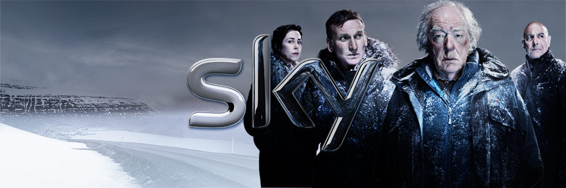
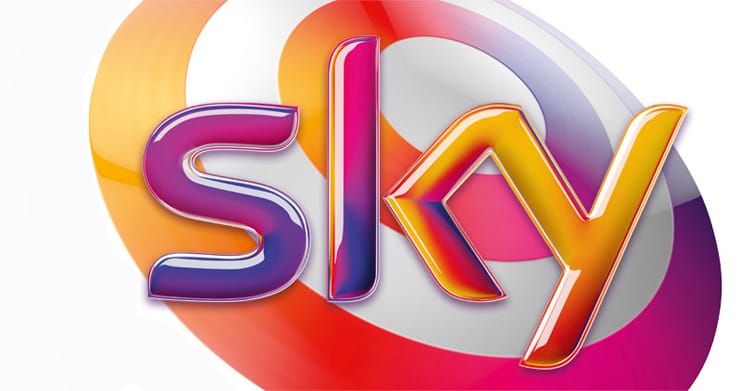
In my view, the Sky marque by Venture 3 is one of the smartest examples of a creative idea for a big corporate logo. Its glassy, screen-like aesthetic is visually driven, unique to its service and well executed. Most importantly, the logo allows the TV company’s film, sport and programme content to shine through it. After all, the main reason viewers subscribe to Sky is access to it’s unique schedule.
Sky is also a benchmark of a good brand strategy. Many incarnations of the Sky logo have emerged since its ascension to TV screens in 1990, but all early permutations embrace an authoritative, technology-oriented aesthetic. But the latest logoform reflects the clear shift from a brand with authority and technology at it’s core - to a brand providing entertainment.
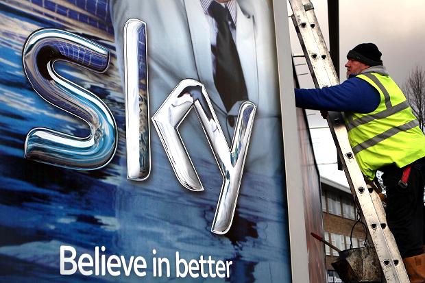
The latest logo has also made it possible for Sky to do things that no one else can do. For example, how many other brands can run a forty-eight sheet poster featuring their logo across the full width of the ad, without compromising the content?

As a designer, Sky also introduced me to the idea of using 3D modelling as a visualising tool for branding. I wasn’t alone. For about five years its glass-like 3D aesthetic seemed a contemporary standard for the big corporation logo re-fresh, from Argos to Glaxosmithkline. Even BirdsEye fish fingers had a shiny veneer buffed onto its brand marque.
For me, the Sky logo is inspiration that creative, relevant, well executed aren’t ideas just for the smaller start-ups. It also pays testament to the power of a good brand strategy to help distill complex corporations down to something a logo can hope to communicate.
alphabeticalstudio.com
Tommy Taylor
Born in London, Alphabetical’s Tommy Taylor studied at Somerset College of Art. In 2003 he was appointed junior designer at creative studio HGV where he had the opportunity to work alongside mentor Pierre Vermeir. After a stint as a hired creative gunslinger at several top London agencies, he formed Alphabetical in 2010 and works with clients such as Royal Mail, Marks & Spencer, British Heart Foundation. In 2010 Alphabetical even created a brand for Santa, as part of brand language specialist Quietroom’s Christmas card.
Sky’s the Limit
With more that twenty million customers, Sky is the largest marketer in the UK. Its Europe’s leading investor in television content (£4.6bn annually) and employs 3000 people that commission or produced programmes for TV – its also the UK’s third-largest TV as sales house. In 2009 Sky formed a professional cycling team (Team Sky), which has won the Tour de France twice already, including as part of Bradley Wiggin’s 2012 victory – the first time a Brit ever scooped the title.

