
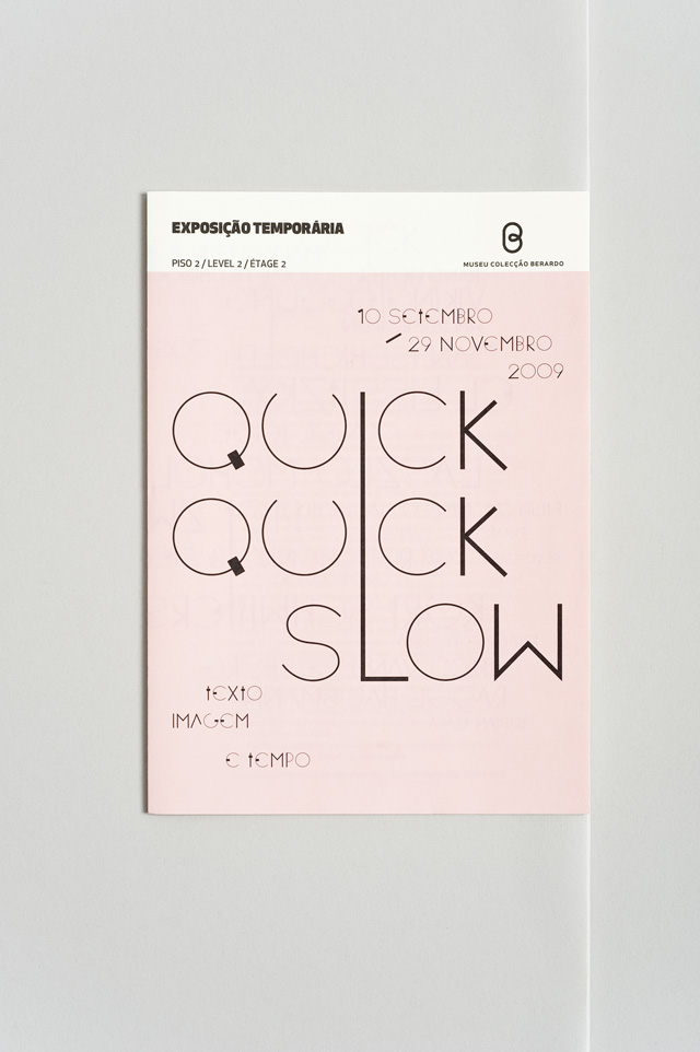
In this Archive piece, we revisit Studio Frith's beautifully designed catalogue created for Emily King's exhibition Quick Quick Slow at the ExperiementaDesign Biennale.
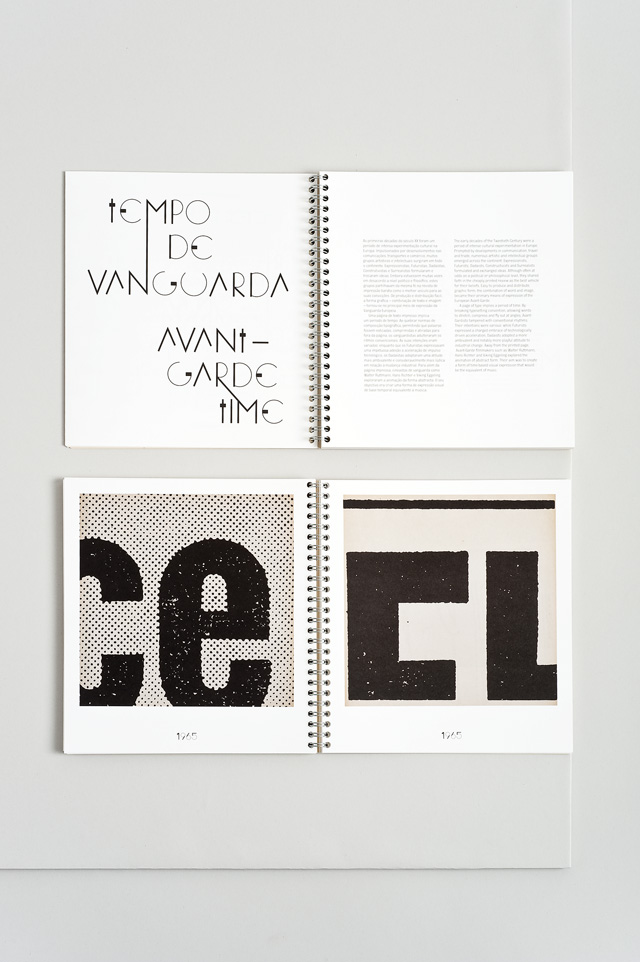
This year EXD’09 Lisboa celebrated its tenth anniversary and, with the passing of time an appropriate theme, Emily King curated an exhibition for the event entitled Quick Quick Slow: Words, Image and Time. King muses: “Time is our most important asset. To be in control of time is to be free.” The exhibition at the Museu Colecção Berardo explored “the way designers have evoked motion and represented the passage of time in still graphics, from the ‘dynamic look’ and early modern typographic experiments to animated type and line images developed for film and advertising”. King wove a picture of how time has been warped by the advent of the computer and how designers are managing a new sense of time and place. King worked with Studio Frith to explore the concept through the exhibition catalogue and related collateral.
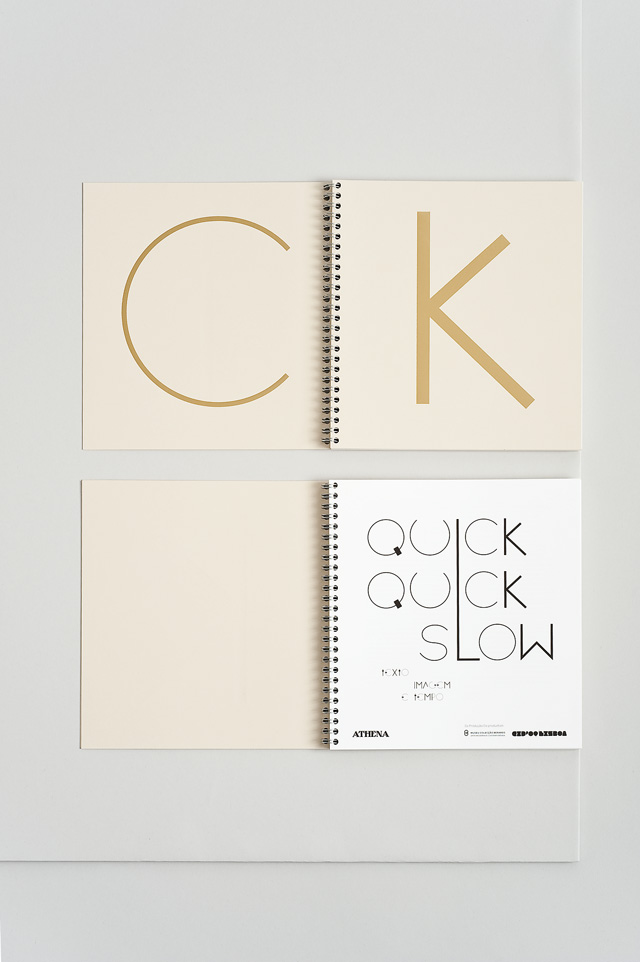
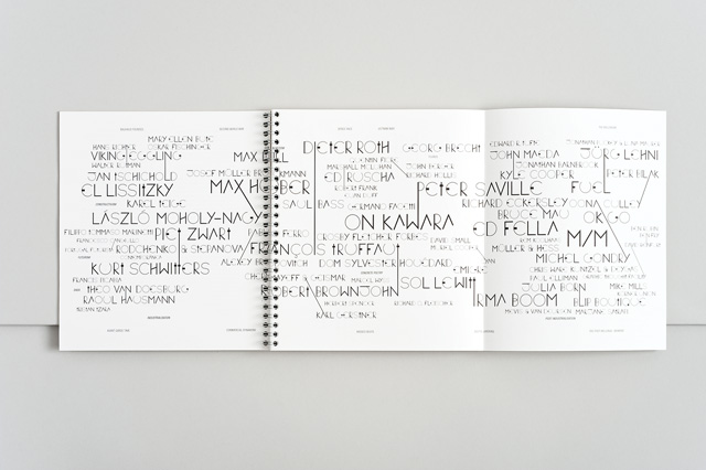
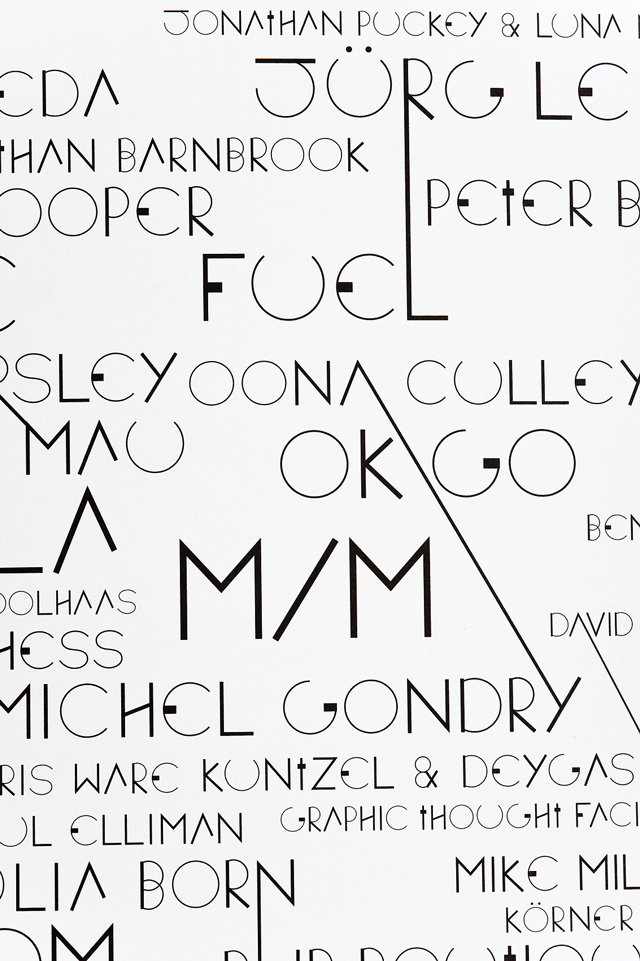
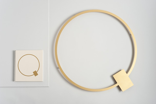
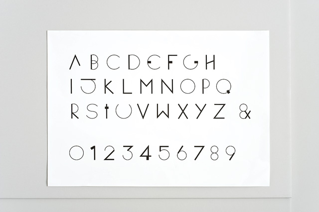
Frith Kerr takes up the story: “The challenge was to create an aesthetic that differentiated itself from the graphic design within the show. Materiality became an important factor in achieving this. We avoided paper and print by using anodised aluminium instead, inspired by the cogs inside a clock. The typeface itself is made up of a kit of parts based on a deconstructed clockface, inspired by the idea that time is not a reality, but a concept.” One of the key motifs is the use of ‘vertical ligatures’, which Kerr used to link the designers and subjects, referencing the spanning of time. By the time you read this, the show will unfortunately be over, but while time once again has the upper hand, the strength of Kerr’s design is certain to ensure its longevity.
studiofrith.com
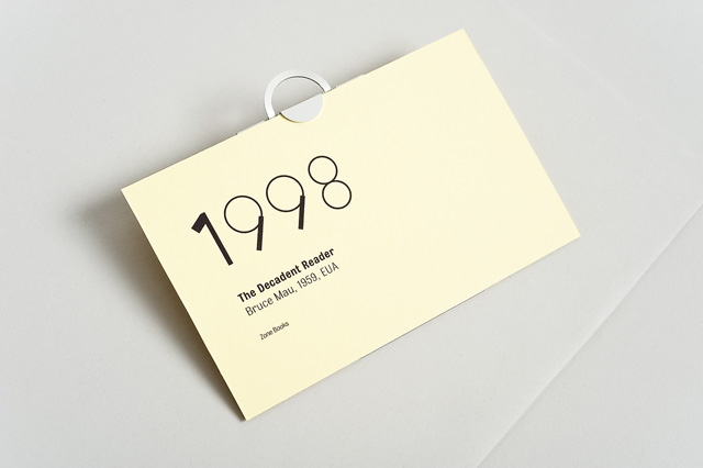
Photography by Ed Park
This article first appeared in Grafik 179, November 2009.