Author and critic Will Wiles spins the tombola of pop-cultural zeitgeist in order to see what happens when the graphic design canon meets the online attention racket.
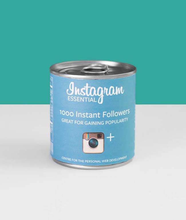
Valerio Loi, Web Popularity Products More than a decade ago, I used to go to a bar called Asylum in Fitzrovia, central London, to listen to music. A friend and I had become fans of a particular DJ night called bAsTaRd, which specialised in what were then called sometimes called “boots”, for “bootlegs”. It's easy to see why this name didn't stick, and the other name did: “mashups” much better evokes the technique on display, mashing one song into another to create something else. Missy Elliott's Get Ur Freak On to the tune of Nirvana's Smells Like Teen Spirit , or the Beach Boys' God Only Knows sung to Michael Jackson's Billie Jean . Those may sound like unlikely pairings, ridiculous even – bAsTaRd had the regular effect, unusual in a DJ night, of making you laugh – but it worked more than anyone might reasonably expect. The surprise as you unpicked the components of what you were listening to, the pleasure of recognition and the more intense delight of hearing something familiar cast in a completely fresh way – it was joyous stuff. The sheer inventiveness of the night, based in making, sharing and enjoying, was a marvel.
VIDEOAsylum was an analogue peninsula of a landmass that mostly
existed online. The same spirit of anarchic creativity and generosity animated
the Photoshop competition and image-manipulation sites that exploded in
popularity in the early years of the new century – sites such as Worth1000,
Something Awful, Fark and (my personal favourite at the time) b3ta. Visual
punning, image mashups, jpg bastardy, something in the style of something else
– this was a good part of the stock in trade on those sites, and still is
today. Everyday folks had unprecedented access to powerful photo-manipulation,
video-editing, animation and illustration tools, by fair means or foul, and
were using them to make each other smile. It was an extraordinary outpouring of
creative energy, one made all the more extraordinary by the fact that it has
since become ordinary, a normal, stable part of the online ecosystem. (The
above-mentioned sites are all still running, with one or two mutations along
the way, which I'll return to.)
The churning torrent of imagery online was sampled and smeared, adding to the torrent, adding to the churning.
Network evangelist Clay Shirky calls this massive increase
in creative activity the result of the
“cognitive surplus” . In his 2010 book of the same name, Shirky argues
that we are using our leisure time in more productive ways, making,
participating and doing. And simultaneously the network is making it much
easier to make and do in collaboration with others, to form communities and
responsive audiences. He focuses mostly on more immediately useful and worthy
projects, such as Wikipedia – but also this flood of what the Situationists
called d étournement ,
“as in to detour, to hijack, to lead astray, to appropriate”, in McKenzie
Wark's definition. The churning torrent of imagery online was sampled and
smeared, adding to the torrent, adding to the churning.
Txaber, packaging concept Txaber, packaging concept
Valerio Loi, Web Popularity Products Valerio Loi, Web Popularity Products Valerio Loi, Web Popularity Products
Benedetto Papi, Change the Perspective Benedetto Papi, Change the Perspective Benedetto Papi, Change the Perspective Many of the users of these sites were amateurs, often using
nothing more sophisticated than MS Paint, but some were professionals using
their free time (or misusing their company's time) – especially on Worth1000,
where competitions were rigorously streamed according to expertise. Jump ahead
to the present day, however, and it's interesting to see how the mashup and the
remix has moved from the hobbyist fringe into the professional graphic design
mainstream. What if Pantone made beers, for instance? Spanish creative agency
Txaber mocked up some packaging. Social networks have been turned into
supermarket products by Valerio Loi. Modern artists turned into modernist
architecture? Federico Babina has an exhaustive collection. Or road safety
signs based on famous movies, or business cards based on famous movie
characters. Or how about Westeros, the fictional continent that is the setting
for the fantasy novel-turned-HBO-hit Game of Thrones , rendered as a
Beck-style rail network map? Designer Michael Tyznik has you covered.
Mod Men: The World of Mad Men Through a 21st-Century Lens, Designs by Jordan Roland and Chad Ackerman Mod Men: The World of Mad Men Through a 21st-Century Lens, Designs by Jordan Roland and Chad Ackerman Mod Men: The World of Mad Men Through a 21st-Century Lens, Designs by Jordan Roland and Chad Ackerman Mod Men: The World of Mad Men Through a 21st-Century Lens, Designs by Jordan Roland and Chad Ackerman Every popular TV show spawns this kind of unofficial
spin-off, particularly if it has a very strong look: Mad Men , with its
impeccable 1960s styling, was a popular target. How would it look, for
instance, if, er, stripped of its impeccable 1960s styling? The blog of stock
imagery supplier Shutterstock tried that one. But nothing beats Game of
Thrones . The opening credits reimagined as Saul Bass-style animation; the
series imagined as 8-bit computer game; state flags imagined as house banners.
This is barely scratching the surface - there are so many Thrones
remixes that The Onion 's Buzzfeedalike, Clickhole, created its own
version: the credits reimagined as an old man eating soup. Rebranding the
show's feuding noble families as modern corporations is a bizarrely popular
activity within this particular Gamut of Tropes, a task separately taken on by
designers Darren Crescenzi (of Nike), Elliott Scott (for, again, Shutterstock's
blog), and Mordi Levi. (DesignCrowd tried the trick in reverse, restyling
modern corporations as Westerosi families.) “The Internet comes up with some
strange tendencies,” wrote Fast Company, remarking on this coincidence of
effort. “Not just memes, but something far more nuanced: memes of memes or
meta-tropes, maybe. We're talking complicated cultural alchemy – a mix of cult
popularity, Reddit dust, and pirated copies of Illustrator.”
Reddit dust, yes, but it's pretty popular with Fast Company
too, and with blogs, news-sites, aggregators and eyeball-sinks from Designboom
to Flavorwire and Buzzfeed. And it's the stuff of Tumblr and Twitter, where it
swirls and swills without respite. It's very hard to know were the transfer
into design-world respectability began – maybe with Olly Moss's hugely popular
repackaging of classic video games in Romek Marber-era Penguin covers (2011).
Certainly that exercise had plenty of followers.
Olly Moss, Videogame Classics But
is it really “complicated cultural alchemy”? Rather, this can be seen as the
pop-cultural phenomena of the moment being thrown into a spinning tombola of
different design languages and getting randomly paired up, over and over again,
until it seems that every possible permutation has been exhausted. Immerse
yourself in these mashups, collect examples of them, and you see a relatively
small graphic design vocabulary forming the basis of the great majority of
them: Saul Bass, Isotype, Beck-style (or Vignelli-style) schematics, 8-bit,
classic Penguin, Simpsons characters, Pantone … so we chuck in the ingredient,
crank the handle, and, I don't know, The Walking Dead as Apple iPhone
apps. There's 2,000 notes on Tumblr for you, gratis.
Michael Tyznik, Game of Thrones Transit Map There's a curious irony at work here. The newly productive
free time Shirky identified in Cognitive Surplus didn't come from
nowhere, and it certainly wasn't liberated from the earning day. It was the
time we used to spend watching television. In Shirky's view, the television
era, 1950 to 2000 or so, was a dark age of the imagination – passive, numb,
uncreative – and we were blessed to be at last freeing ourselves from the
one-eyed tyrant's grip. But it seems that the goggle box is still
operating a fairly extensive licence
on our collective imagination, even if the means of consumption and enjoyment
are evolving, and it's now more of a goggle boxset. The redesigning and
remixing is going on with the set on in the background. Pop-y, snacky, often
rather corny – a lot of this stuff is no more than the design equivalent of
popcorn.
It's not fair criticising popcorn, because there's nothing
wrong with popcorn in itself. They vary, but none of these individual projects
are bad or wrong – often they're pretty, or witty, or even both. And it's all
just a bit of fun, the same joyous smile-sharing it ever was. Popcorn's fine –
just don't gorge on it and you'll be ok.
Anthony BooyayAnthony Booyay, Game of Thrones Sigils Anthony Booyay, Game of Thrones Sigils But how much fun is truly being had? The Situationists
feared that d étournement
would turn, inevitably, to what they called recuperation – a slippery
concept, like a lot of Situationist thought, but meaning something along the
lines of co-optation or appropriation. They feared their tools would be taken
up by the social structures they despised, taken up by the society of the spectacle
itself – and perhaps turned against them. Popcorn design has a whiff of
recuperation. Béhance
is hungry, always. It must be fed. Many of these projects are available as
prints. Careers were founded and reputations made on the Photoshop-competition and
image-mashing sites ten years ago, and what lingers is a sense that this is how
reputations are made, that this was their primary value. It's the
Buzzfeedification or Redditing of the graphic design CV – the portfolio must be
made viral, and tasty popcorn, delicious Tumblr-bait, is one way to do that.
Mordi Levi, Game of Firms Mordi Levi, Game of Firms Mordi Levi, Game of Firms With the remix itself remixed as not much more than a fun way to connect designers and other creatives with employers and clients, it has been corporatised. As mentioned above several of these examples come from the blog of Shutterstock, and it's a shrewd way for the firm to show off what an be achieved with the imagery it can supply. But it's the fate of one of the original Photoshop competition sites that should put the nutrition value of popcorn in real question. In the summer of 2014, Worth1000 was bought by DesignCrowd, the graphic design crowdsourcing platform, “to create a bigger and better marketplace for freelance designers to find clients and earn income” , in the words of the blog post announcing the acquisition. “Whether you’re a seasoned pro or just starting out, you can find exciting contests that will challenge your creativity whilst having a tonne of fun! Keep an eye out for our fun and irreverent community contests!” It's the old song, but not quite to the same tune. willwiles.blogspot.co.uk