We caught up with the second winner of our Ditto Print Camp scholarship, RISD student Sofia Clausse, to delve into her portfolio and quiz her on her inspirations.

What are you working on at the moment?
I just returned to Portugal, where I’m spending my summer. I finally have some quiet time here where I can document previous projects and update my website. I’m also focusing on doing more drawings and illustrations that are just for fun, and can help me develop my personal voice. After working at a big corporation for a year, I want to go back to doing very raw, colourful, and free projects just to see where they take me.
Tell us a little bit about your approach to design.
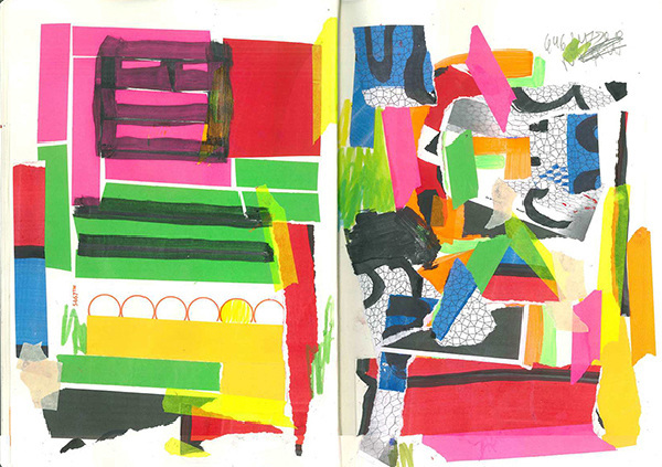
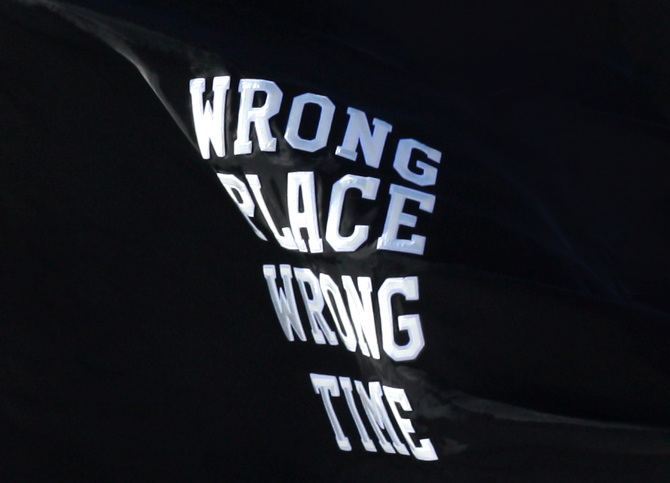
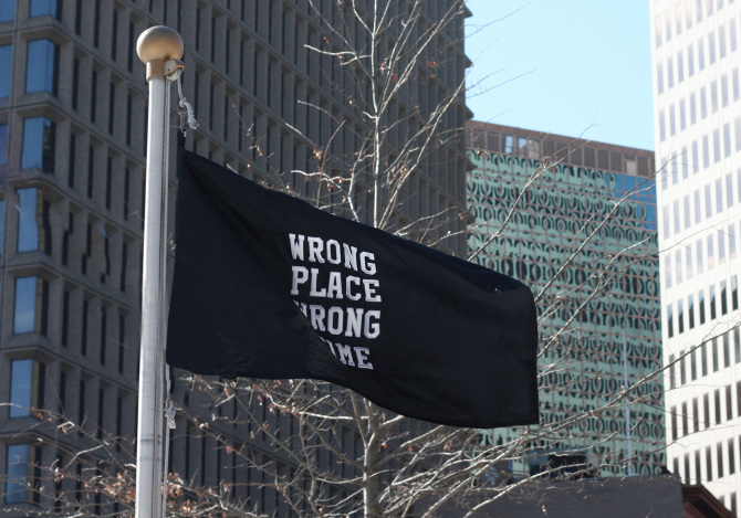
I like to embrace imperfection, whether that is in the marks that we make, the tools that we use, or accidents and discoveries that happen through making. I used to be the opposite of this. I was always trying (and failing) to make things very neat, detailed, and careful every step of the way; but this was very limiting to my ability, or led to being too self-conscious during the process. Now I know that I like things that are ‘wrong’. I like things that are a bit off and unexpected. Those are the things that catch my attention and excite me. And because I can accept and embrace imperfection, it’s easier for me to start by doing things by hand, playing with different tools and materials without thinking too much about where it’s going to lead to.
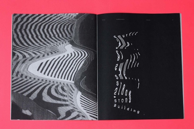
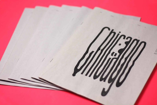
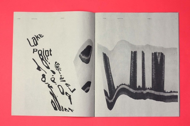
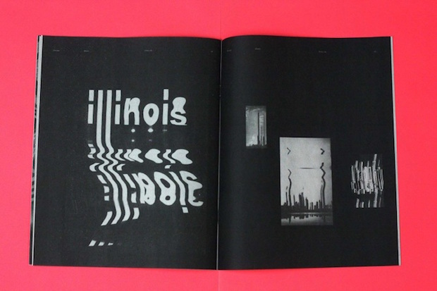
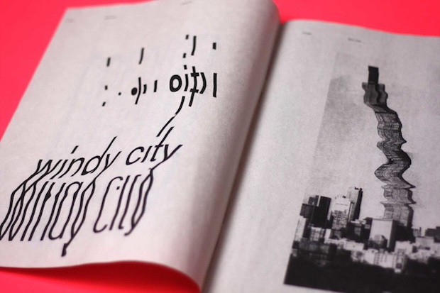
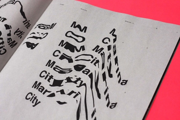
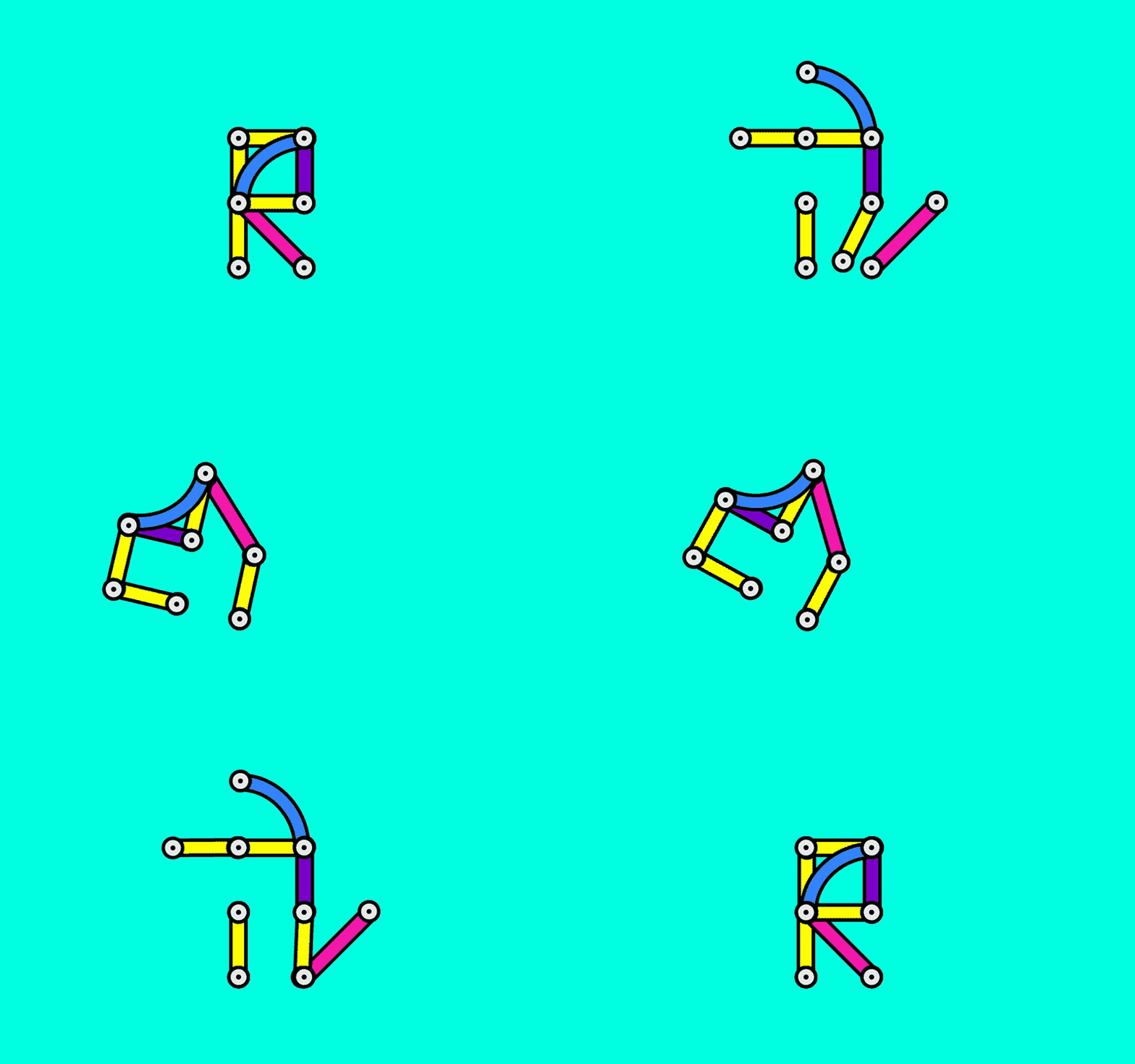
You’ve lived all over (Argentina, Miami, Portugal, London, New York, Providence, and Portland), how do you think all of these very different visual environments manifest themselves in your work?
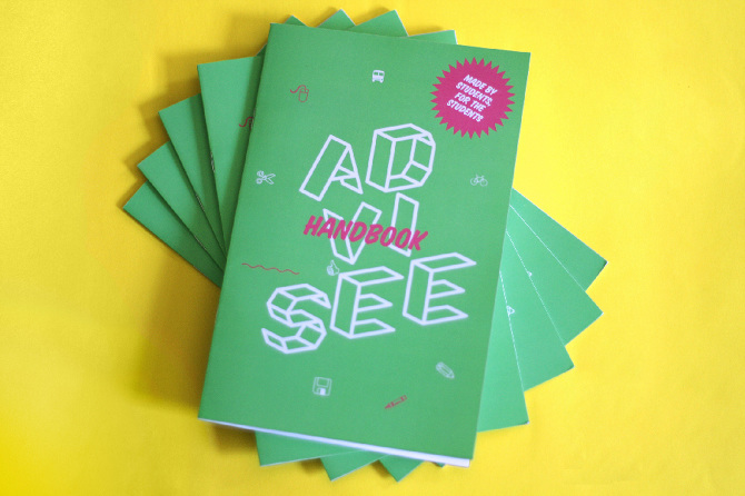
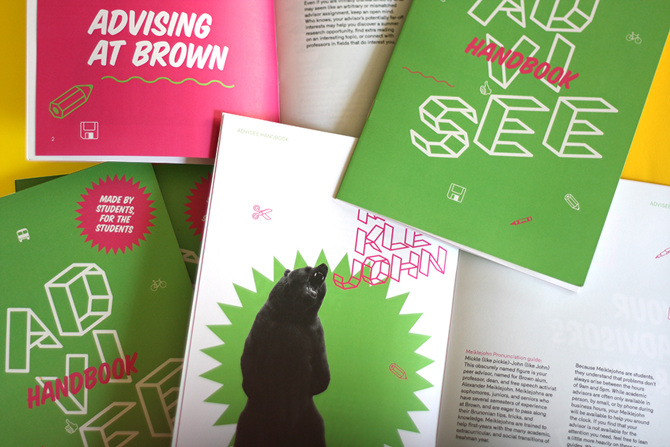
I’m always looking at letterforms and typography everywhere I go. I can’t help it. I walk and I'm constantly seeing and noticing letters on signs, trucks, doors, books, trees, posters, buildings... and with every new city I go, I compare these different styles. For example, in Argentina there are a lot of handwritten signs on fruit stores, or traditional ‘fileteado’ style of hand-painted colourful type. In Portugal, I love seeing painted type on ceramic tiles, or carved letters on church floors. I take all these culturally specific things and I like to bring them into my work, whether it’s in the colours or materials or style.
Tell us a little bit about the thinking behind your Taming of the Shrew project?
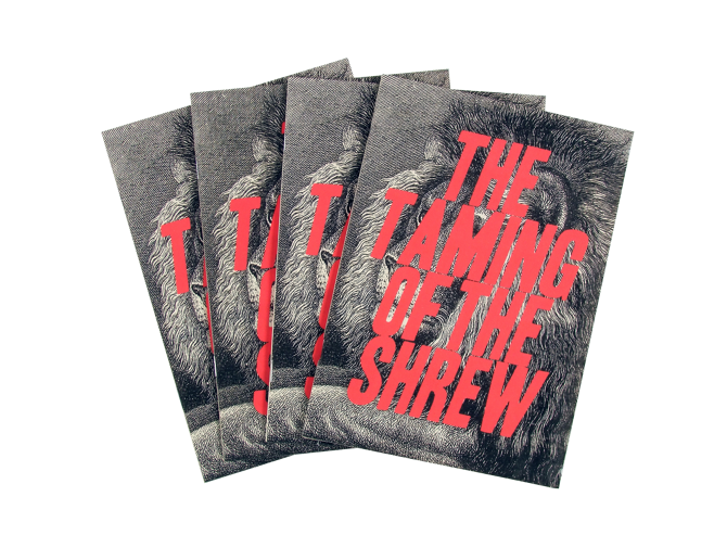
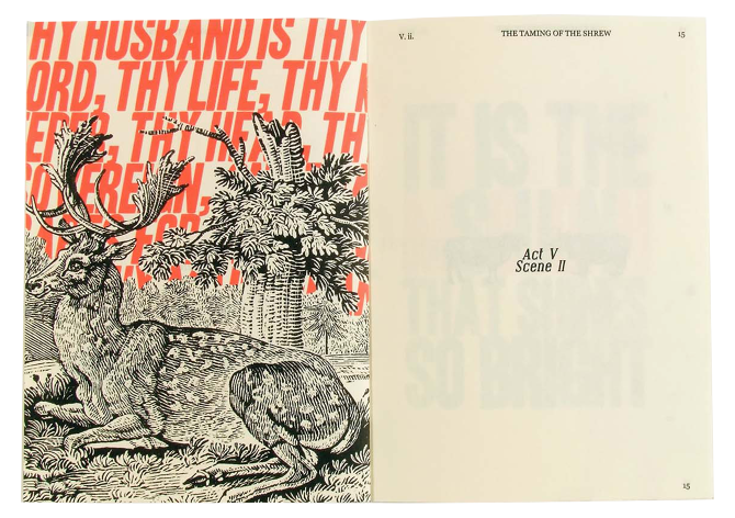
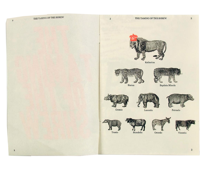
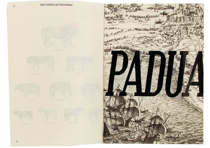
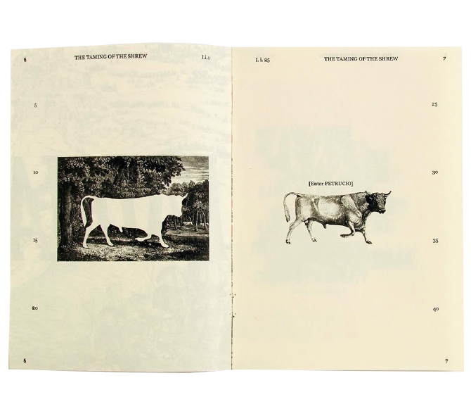
This is a catalogue and program for a children’s version of this Shakespeare play. I like to start researching for projects by physically interacting with the subject I’m working with, so I went to bookstores to look at printed plays. I noticed the specific typography elements and format of plays, such as line numbers on the edges, or character actions, like [Enter] and [Exit]. I photocopied pages from the plays and got rid of all the text except for these specific elements, and this is what makes the main layout of the pages. The catalogue is formatted like the plays, by first establishing the characters, then the setting, then the actions, and then each act and scene. I also found old woodcut illustrations of animals and these are symbols of each character from the play, to help remember who is who.
What’s the most important thing on your desk?
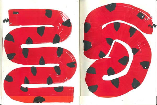
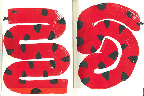
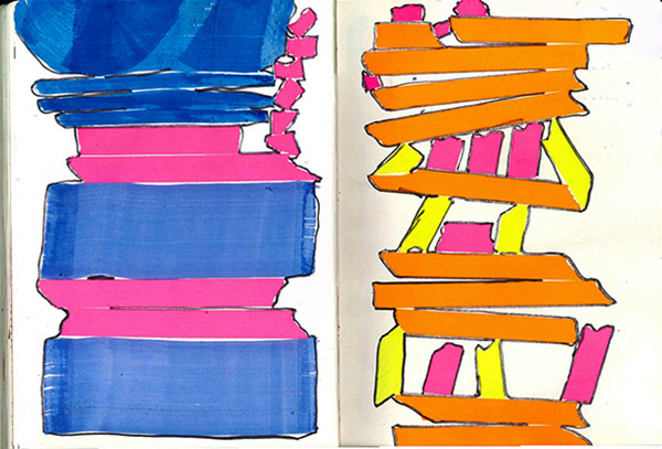
I’ve got these very broad markers with a 6cm wide tip, it’s been really fun to use these to make curvy shapes. They’re so big that I have to use them on the floor and move with my whole body and arms. I also have lots of sketchbooks where I first start with projects. My laptop is of course very important too, as most of the work comes to the screen afterwards.
You’ve already worked for Wolff Olins and Nike, tell us a little bit about what you’ve been doing with those big hitters?
I did an internship with Wolff Olins in New York while I was at university, and I learned and incredible amount being there. I was helping an amazing team on client projects like Google, Nike, or Starbucks. After I graduated from university I went to work for a year at Nike in Portland, Oregon, in the Brand Design team for Football (soccer).
What do you have planned for the rest of the year?
I’m going on a big backpacking trip around South East Asia for four months. My plan is to eat a lot of spicy food, see a lot of temples, and look at the local typography. I’m coming back to Europe at the end of the year, and afterwards I’d like to move to Berlin, I’ve never been there, and I don't know what I'll be doing yet, but I’m very excited about everything that is happening there.
sofiaclausse.com

