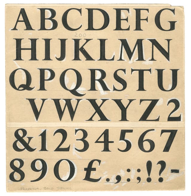
New publication History of the Monotype Corporation provides a fascinating insight into the type and technology industry since the end of the nineteenth century. Here, the book’s co-editor Andrew Boag reveals how this very impressive publication came about.
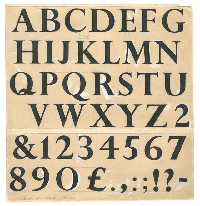
Monotype – the specialist font company we know and love today – makes very high-quality type and type technologies for use in pretty much anything from printers, navigation systems, phones, tablets and cameras to web applications and font rental services. At its core is a classic library of typefaces that was originally developed by the Monotype Corporation to support sales of its typesetting machines. By the end of the nineteenth century the mechanisation of printing was being held back by typesetting, which had remained essentially unchanged since Gutenberg. Two inventions emerged in the 1880s: the Linotype, closely followed by Monotype’s system.
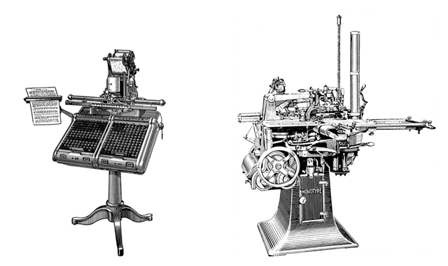
The Linotype machine cast whole lines of type, and was preferred by the newspaper industry. Monotype’s system, invented and patented by its American inventor Tolbert Lanston was in two parts – the keyboard and caster. The keyboard produces a coded paper ribbon, which, when transferred to the caster, provides the necessary instructions for it to cast the required text. It was an engineering triumph and its ability to output individual pieces of type, that could kern, and could be easily corrected, meant it was preferred by book producers.
The UK rights to the American invention were acquired by Lord Dunraven as the result of a chance encounter on a Cunard Line steam ship in 1897 – and I hadn’t appreciated that for the first twenty years or so all the machines were made and shipped from Philadelphia. Board minutes from July 1903 reveal that the Corporation had struggled to survive for so long – the directors themselves not having been paid for several years – that an amalgamation with Linotype was seriously considered.
The company soon recognised the importance of high-quality typefaces – ‘fonts’ as we now call them – to set on its machines and drive machine sales. It set up a Type Drawing Office in 1910 at its site at Salfords in Surrey, and embarked on an extraordinary programme of type design development that is the stuff of legends – documented of course in the many high quality user guides, newsletters, and journals that Monotype has always produced. The type scholar Stanley Morison became typographical adviser in 1923 and Beatrice Warde soon became head of publicity. Her abilities as a speaker and writer helped Monotype occupy an assured confident role: demonstrating the significance of good type and typography to the giants of the communications industry.
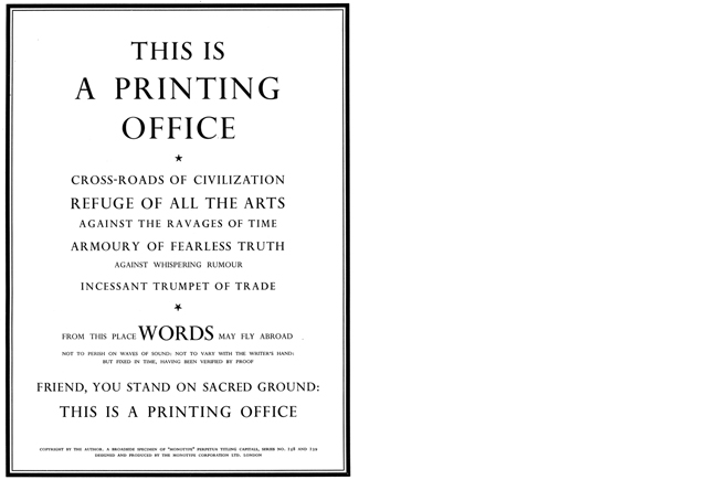
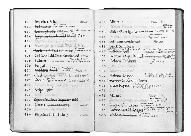
For well over a century it’s enabled The Times, the University Presses, and countless printers and publishers throughout the world to communicate with extraordinary individuality using Monotype typefaces and systems. Monotype found it difficult to respond to the significant technical upheaval wrought across the communications industry in the second half of the twentieth century, but its award winning Lasercomp imagesetting system of 1976 again led the field, and the system it adopted has continued to be used in a wide range of laser printers and imagesetting systems ever since.Before the mid-1980s if you wanted to use fonts from the Monotype library you needed a Monotype system. The computing revolution of the mid-1980s changed that, and since then the typeface library has taken centre stage: its caster of 1899 could output up to 225 different characters; now, of course Monotype’s fonts incorporate almost infinite sets of characters, optimized for any amount of output devices – and though not machine-dependent any more, the continuing centrality of high-quality type to mass communication can be seen in Monotype’s recent optimized fonts for The Economist, and its fonts developed with Sony Design, for example, deliver a consistent customer experience in 93 languages.
Monotype stopped making casters in 1987, and the Corporation existed until 1992, when the Monotype type company was established.
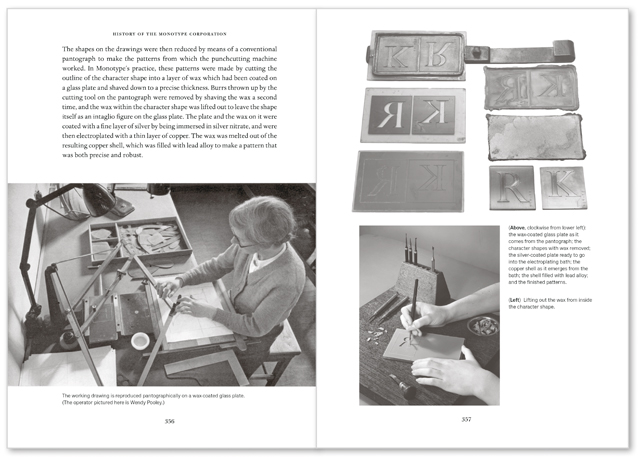
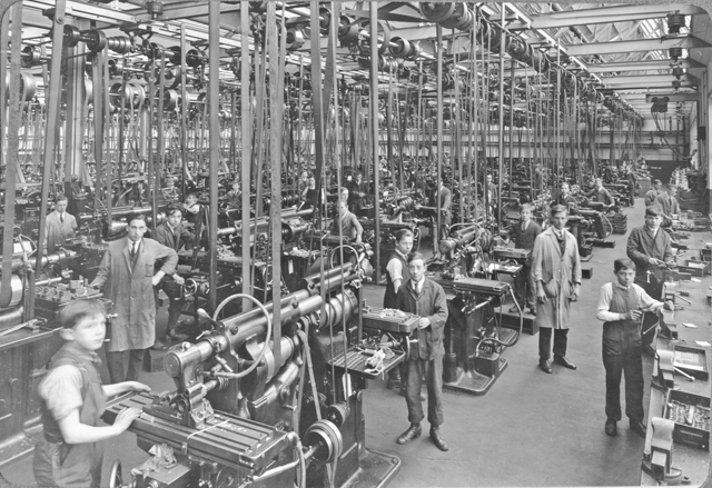
Monotype’s role in the development of the communications industry is so vast, we felt it worthy of being recorded and celebrated, along with its on-going legacy: Monotype itself; and the Monotype hot-metal business rescued by the Science Museum (and operated from the Type Archive in Stockwell, London).
The idea for a business history first came up in 1992, with the intention of celebrating Monotype’s centenary in 1997, and because its business history hasn’t previously been published.
As Monotype has such rich archives and interesting stories to tell about its business, its typefaces, and its technology, I commissioned three specialist authors, to write three histories which I originally intended to integrate. I commissioned the business historian Judy Slinn (who’s worked on a number of business histories, including Bowater the paper company), typeface specialist Sebastian Carter (author of Twentieth century type designers), and technology expert Lawrence Wallis (a prolific writer on type technology). Lawrence – to whom the book is dedicated – retired and stepped down and Richard Southall (author of Printer’s Type in the Twentieth Century) took over. Christopher Burke – who, like me, worked at Monotype Typography in the early 1990s – co-edited and designed the book (setting the text in Monotype’s digital Dante). Sue Shaw, of the Type Archive, co-wrote the book’s epilogue about the rescuing of Monotype hot-metal. Progress on the book since 1992 has been slow, and I’m fortunate, and grateful, that all our sponsors and supporters have been so patient.
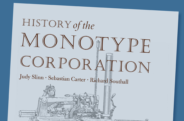
History of the Monotype Corporation is available through Amazon in the UK and Vanburgh Press for international orders, price £50.
ISBN 978 0 9930510 0 5
Dimensions 240 x 170, 432 pp.
Printed by Henry Ling Ltd., on 100 gsm Lessebo Design Smooth Natural
Case bound in Wicotex Brillanta cloth
Published by Vanbrugh with Printing Historical Society (PHS).
Monotype is a trademark of Monotype Imaging Inc. registered in the United States Patent and Trademark Office and may be registered in certain other jurisdictions.

