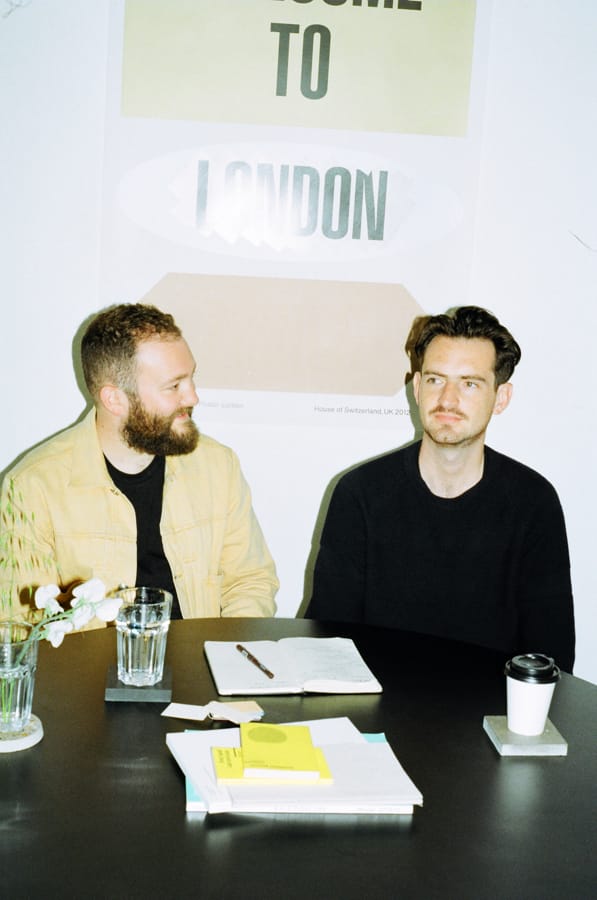
OK-RM's founders' enthusiasm for their craft is as strong as when they first established the studio in 2008. Peter Maxwell went to Hackney to find out about Oliver Knight and Rory McGrath's impressive body of work, generous clients and thoughts on hitting the studio equivalent of middle age.

There’s no standard model for the life cycle of a studio, though there are several indicators of progress that most creative enterprises hold in common: registering your business name, finding premises, landing your first job, hiring an employee, being ditched by a client, winning an award. The early years of practice work the adrenal gland to capacity – but how do you survive that long, and what comes next? These were the questions we wanted to ask London-based studio OK-RM. We chose them, slightly counterintuitively, not because they had recently published a fascinating project, or lately done anything else out of the ordinary to attract attention, but precisely because we felt they had grown beyond that cycle of press release and publicity. This anti-event may well be the most important mark of a studio reaching full creative mass, to becoming fully established within the disciplinary psyche – the point at which you don’t need to continuously proclaim your existence in order to remain part of the conversation; indeed, it is the moment that people start pestering you…because, even if you haven’t mentioned it, by this stage they are sure that you’re bound to be doing or saying something of note. In this case, we knew OK-RM would be the perfect people to tell us about achieving, in studio terms, glorious middle age.
“To be honest I think we still have the mentality that we are just starting,” insists Rory McGrath from the meeting table in the corner of their shared space on Hackney’s Vyner Street. Outside the topography is characteristically contemporary East-End: car bodyshops and art galleries, building contractors and photo studios; Regents Canal stews in the background. “The fact that we are somewhat established is always news to us, it’s not how we feel about our practice,” he continues. In fact, from McGrath’s enthusiasm, it would be easy to believe that he’d started yesterday, still buoyed by the limitless potential inherent in any new venture. What is clear from meeting both him and his partner, Oliver Knight, is their deeply held affection for and belief in their discipline. They’re big talkers, good-naturedly disagreeing and talking over one another; every statement is made with conviction.
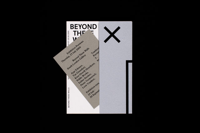
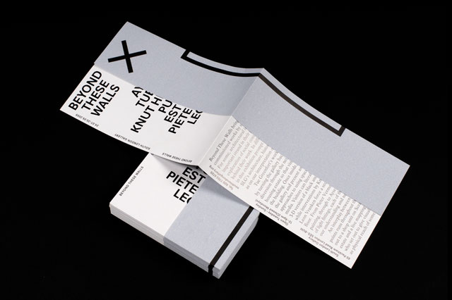
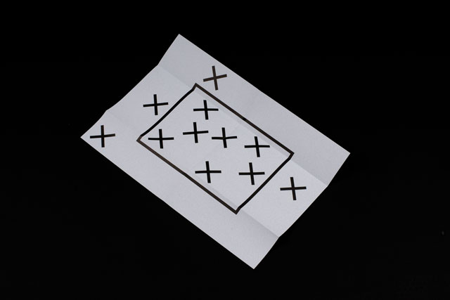
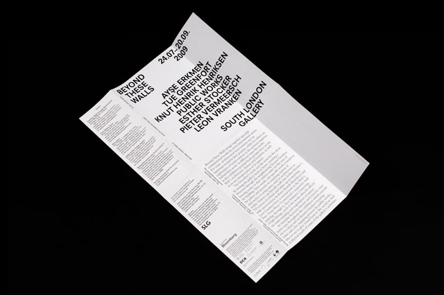
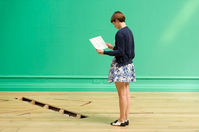
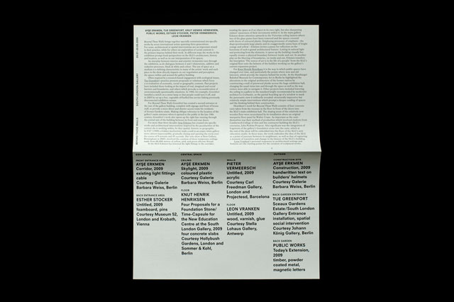
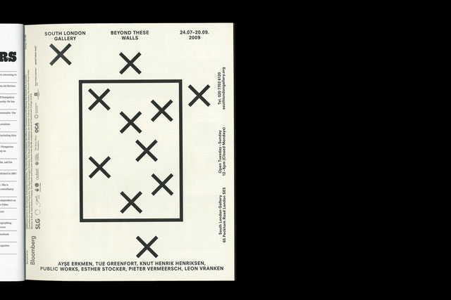
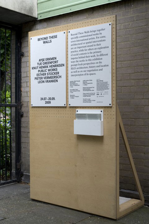
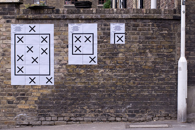
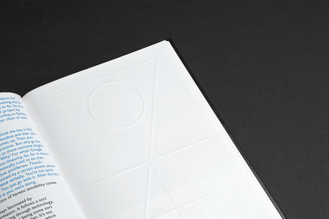
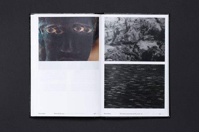
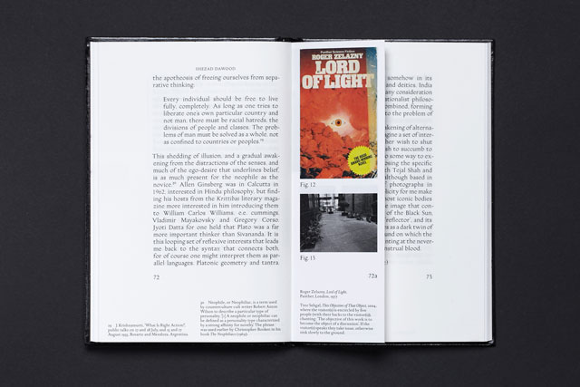
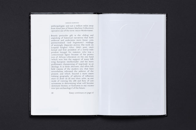
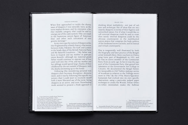
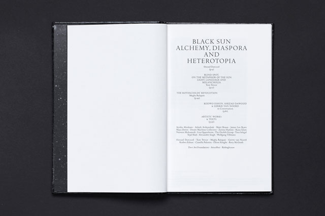
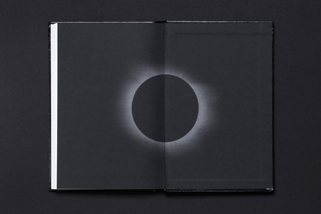
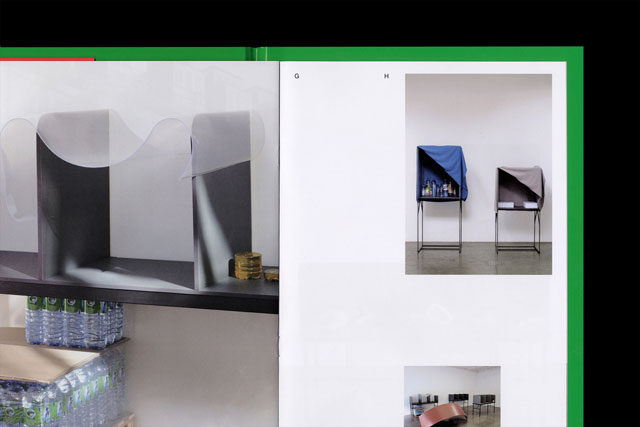
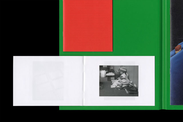
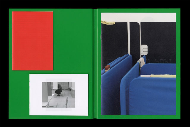
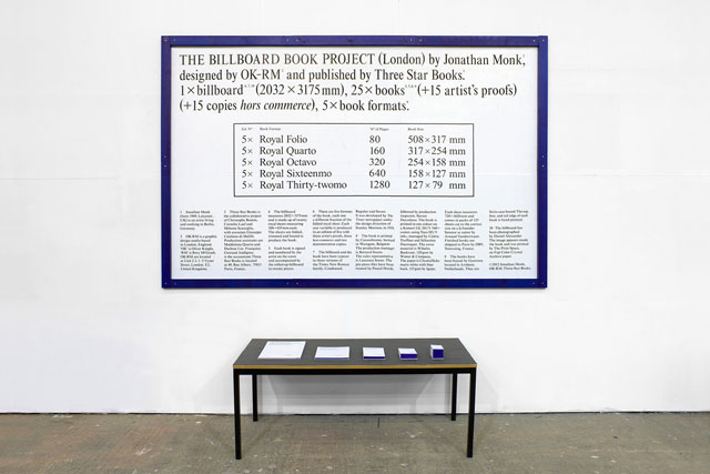
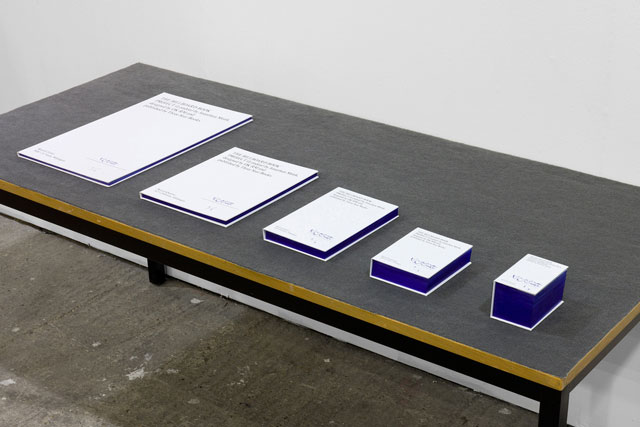
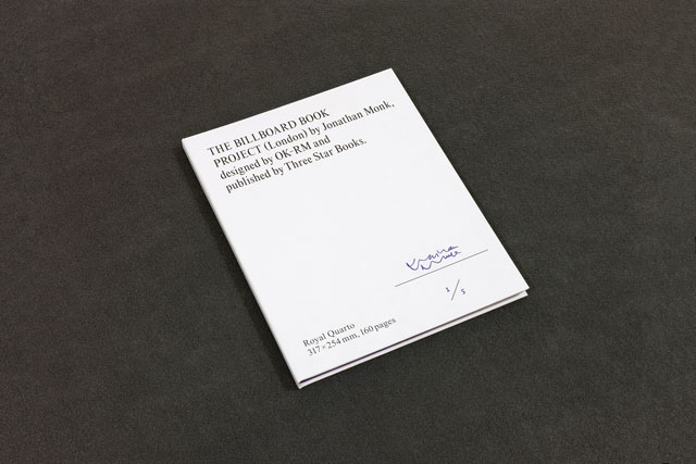
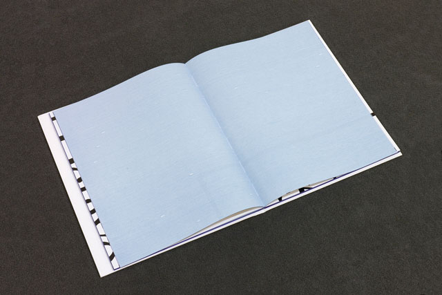
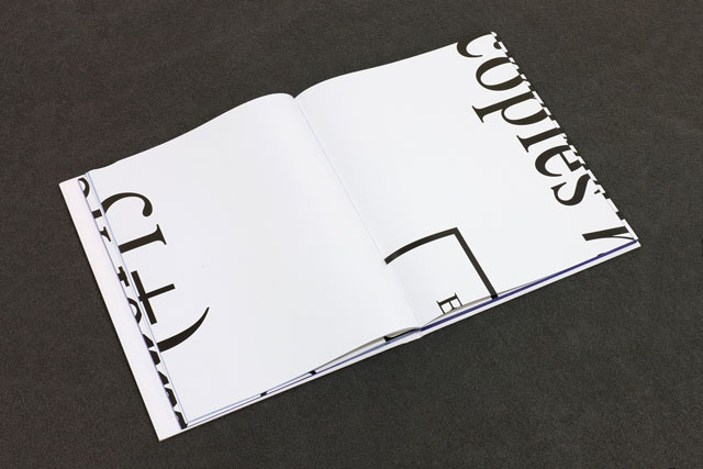
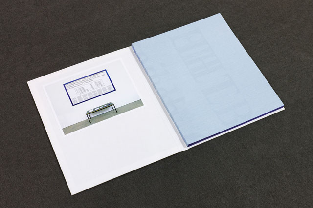
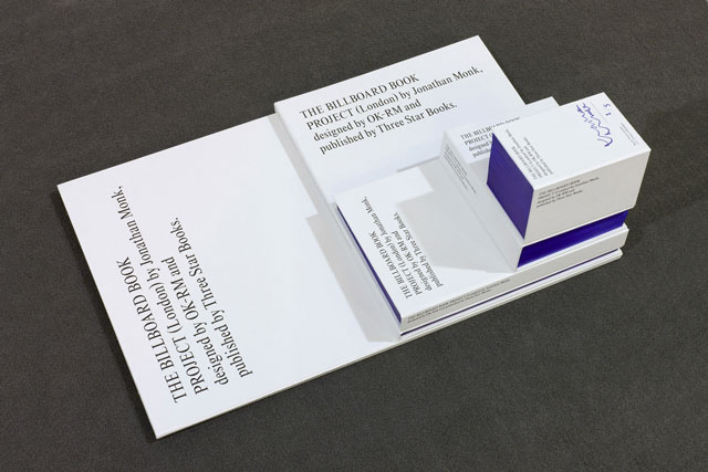
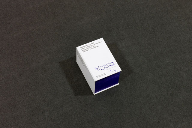
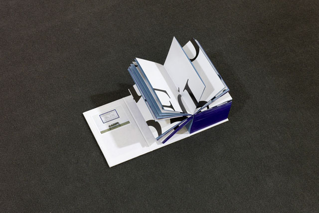
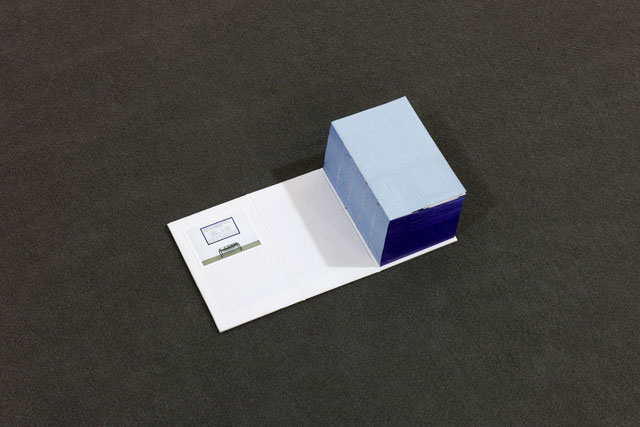
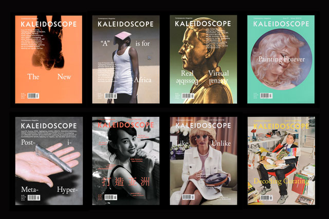
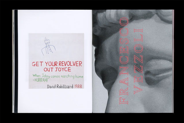
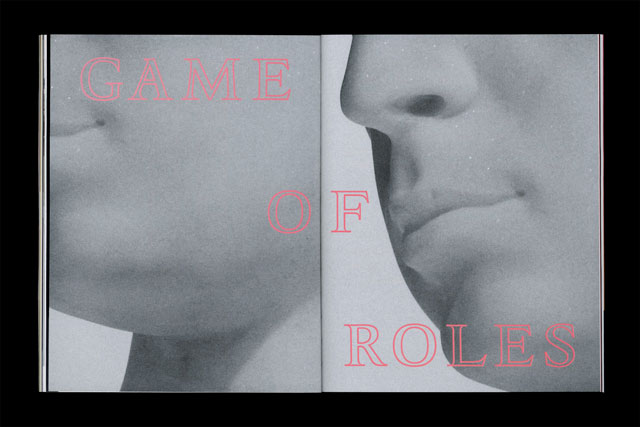
Knight and McGrath founded OK-RM in 2008. The pair met whilst studying at the University of the West of England in the early noughties and, by matriculation, were determined to set up on their own. Since its foundation, the studio has built a reputation for combining intellectualism with accessibility, creating work that is unrepentantly modernist, in the originating, quixotic sense, but which remains generous in its aesthetic sensibilities – joyful, even, in the robustness with which it deploys type and image. Their back catalogue speaks of a particular interest in working on projects that engage with the arts and which require a significant collaborative investment between the pair and their partners (the word “client” feels coldly inappropriate in this context). Books feature heavily, often produced for or in conjunction with fine artists such as Gabriel Kuri or Shezad Dawood, as does work for exhibitions, sometimes in the provision of super-structures, as at the 2014 Designs of Year installation, other times the content itself, as was the case with Jonathan Monk’s Billboard Book Project – in all, six years of practice has produced what feels like a remarkably honed and considered body of work, certainly not the by-product of the ‘take what you can get’ attitude that characterises many start-ups.
That kind of surety seems have marked the pair’s aspirations from the very start, and, as they are keen to stress, those six years only tell half the OK-RM story. “It is important to note that when we started the studio we were already quite experienced; we’d spent considerable time working in other practices and learnt a lot about how to run projects professionally,” explains McGrath. After visiting open days at places like the RCA, the pair made a conscious decision not to progress straight into a Masters degree, the common route for their contemporaries: “You didn’t see much applied graphic design there at that time, partly because that was the period was during which what’s termed ‘critical graphic design’ was emerging.” The BA on which they had studied was, in their own words, “very conceptual, very art biased,” and while this offered them a perfect basis to explore their own creativity, it left the pair, as equally fascinated by the pragmatics of their discipline, eager to get some more hands-on experience.
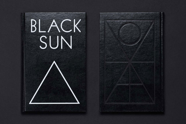
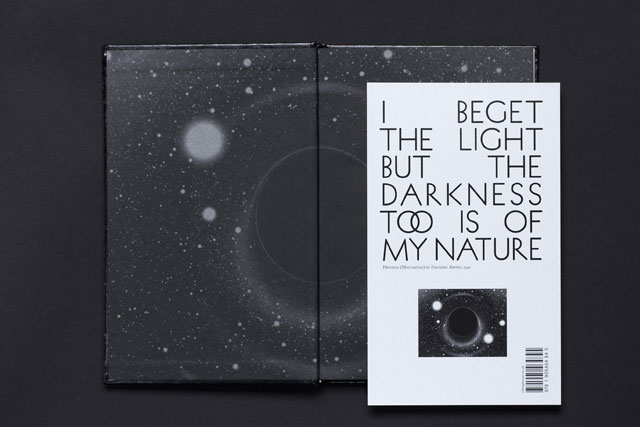
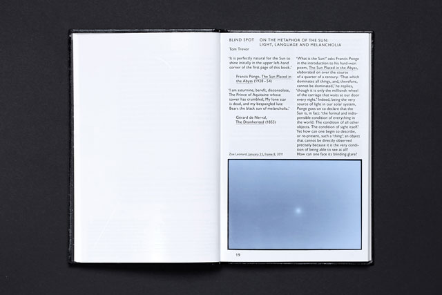
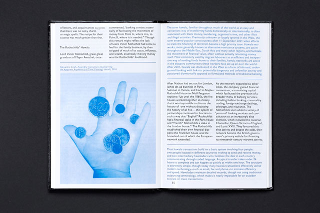
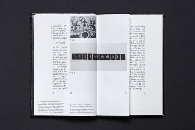
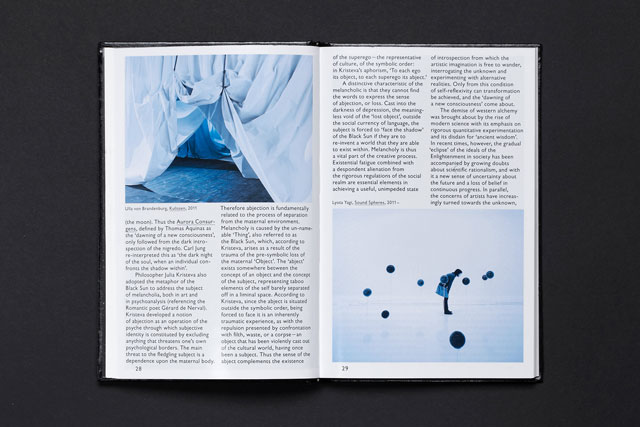
“It was a different culture to now, as there was less independent graphic design going on, and if it was, it was certainly a lot harder to find out about it, so it wasn’t so easy to step into that world.” Between graduation in 2003 and setting up on their own in 2008, Knight worked at Mode and Saturday (now Wednesday), and McGrath at North and then 2x4. They think of this period as form of apprenticeship; as Rory puts it, “we liked that old school industrial idea that you learn your skills before you go off and apply them.” Part of their dilemma at university had been the question of trying to work ideas through without any real content, something which a commercial practice could provide them in abundance.
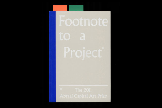
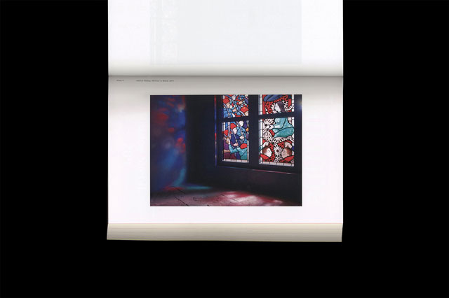
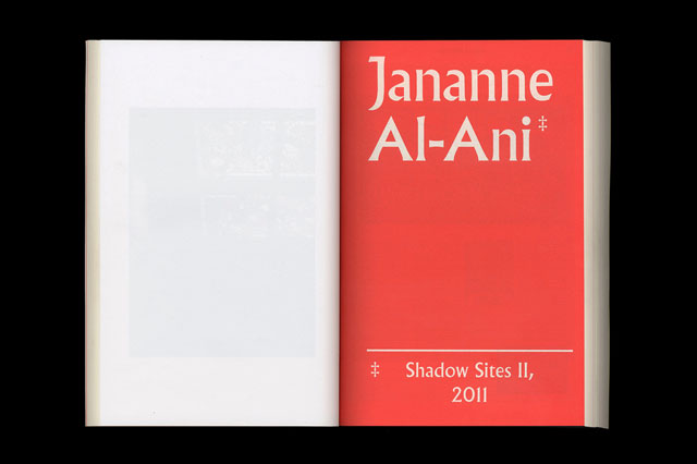
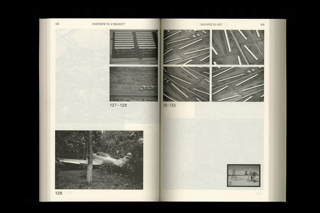
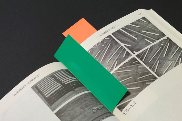
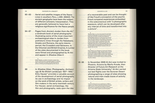
“When we were studying we had our own particular interests, such as Swiss Modernism and The New Typography, but when you don’t have any content you can’t make that work… unless you want to make the poster for your hip-hop party look like it was designed by Josef Müller-Brockmann. You always need to find suitable content.” This creative anxiety was an important formative experience for the studio, and one could describe their body of work as chiefly being both a negotiation of and with content on the behalf of others. (If you want to see the apotheosis of this, grab a copy of Footnote to a Project*, a 536 page paperback created to accompany the 2011 Abraaj Capital Art Prize, Dubai, in which information seems to fold in and over itself as the publication excavates the history of the footnote an epistemological device.)
Though first-hand experience was their primary aim, that doesn’t mean their choice of mentors wasn’t carefully directed. “We wanted an inside understanding of the studios that we’d admired; that period was just about pre-blog culture, so we didn’t necessarily know everything about what those studios were producing – this was the best way to satisfy our intrigue,” says McGrath, “it was a different culture to now, as there was less independent graphic design going on, and if it was, it was certainly a lot harder to find out about it, so it wasn’t so easy to step into that world.”
Of particular resonance was the influence of New York’s 2x4, which the pair credit as showing them how to run a functioning commercial studio whilst maintaining a sense of integrity and a belief in concept. Indeed, the day-to-day expediencies are one aspect they certainly feel they’ve had to work at since 2008, especially in terms of refining how to cost and schedule for a project. They admit that the term ‘business’ didn’t feature in their conversations until four years after they opened. “When that happened, it felt like something of a revelation,” comments Knight, “as we then started thinking about what our future was, how much money we needed to be making to secure it and how that should feed back into how we ran projects.”
At the beginning, however, they adopted something of an anti-business stance, at least in not adhering only to the bottom line. Knight explains: “We made sure we had very few overheads so that we weren’t under pressure to make money straight away, which meant we had leeway to pursue the projects we wanted.” It was a situation that tallied well with their ongoing belief in working in an equitable, collaborative mode over the more mercantile client–creative relationship; McGrath lays his palms face down on the table to secure the point: “This isn’t a service-based enterprise.”
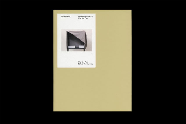
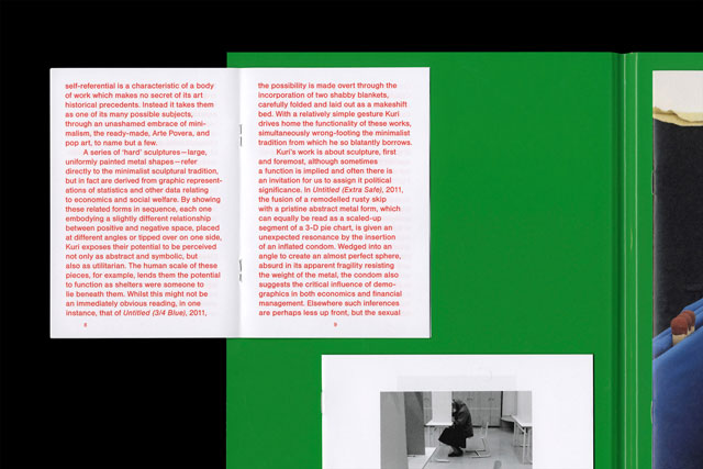
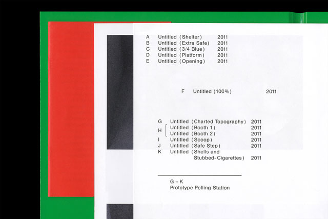
Age brings with it reputation, a positive or a negative attribute based on how it is addressed – the jobs for which you garner the most attention can also narrow prospective clients’ views as to the sort of work you can do, but it can also be a helpful filter, bringing you more of the work that you enjoy. OK-RM’s attitude is to be completely open. The recent re-design of their website saw them in effect publish a comprehensive archive of the studio. “Most studios edit their work in order to showcase a certain side of their personality, but we were adverse to that,” says McGrath, “we used this as a chance to take stock of where we are and what we are doing. It’s not the usual model amongst our contemporaries, so we feel a little bit isolated in the sense of putting ourselves so on display.” The benefits of this clarity outweigh any angst, however, one recent instance being their project with Ditto Press’s Ben Freeman on a new media art book fair called Future Artefacts: “They’d been able to research us very thoroughly and articulate the reasons why we should work together…that allows us to cut down the period of figuring each other and so we can progress much faster,” says Knight.
As much as they’d admired their previous employers, one thing that spending time in other designer’s studios disabused the pair of was the notion of having a methodology. While every graphic designer will try to persuade you that they approach every job afresh, citing each as a unique challenge the elicits an individual response, the fact is that certain working practices become engrained, either through laziness or ideology, whilst the pursuit of an identifiable aesthetic and a certain homogeneity of look can be of definite marketing boost, rendering a studio more easily identifiable and understandable.
What Knight and McGrath instead talk about is an ethos of ‘generosity’ from them towards their clients and vice versa, one that runs parallel to cultivating open-ended partnership rather than means-end commissions. “When it doesn’t have to be finished, so to speak, you can work somewhat beyond the traditional confines of graphic design,” says McGrath, “we’ve actually only fully left a small handful of projects, ever – for instance when you’re working on an identity and you have to deliver it at a certain point along with an implementation guideline to protect the ways it’s used, you also know that because of those guideline it’s also going to have a lot of limitations, which isn’t very progressive.” They cite their work for luxury goods purveyor Foundwell as a case study: starting from just one logo, the identity has multiplied alongside a varied rostrum of content; most recently they’ve employed a scriptwriter to take the project on another new tangent; “It only truly becomes a brand when these sorts of layers are added and it develops its own culture” says Knight.
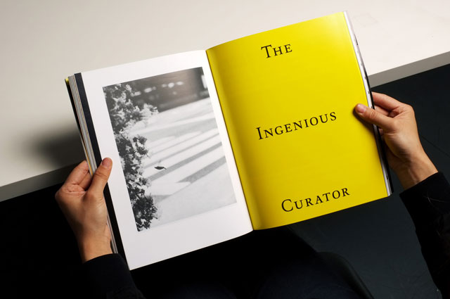
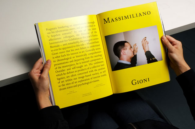
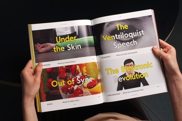
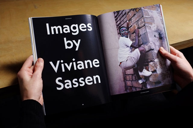
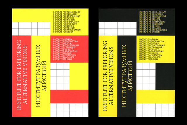
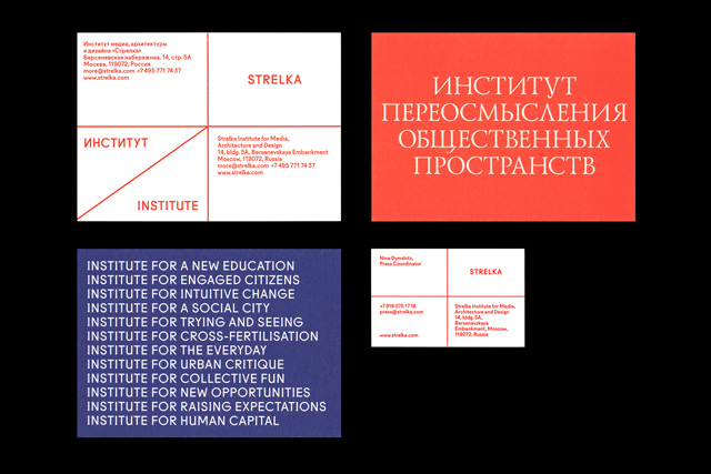
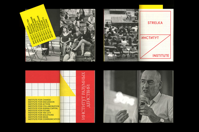
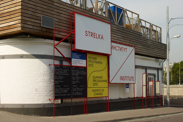
A somewhat larger identity project marked a watershed in the studio’s history, one that had not so much to create its own culture as to harness an outpouring of cultural capital. The Strelka Institute in Moscow specialises in architecture, media and design and was at the vanguard of a renewed drive to reclaim Russia’s radical design heritage when it opened in 2009. “We’d been waiting for a major break,” says Knight, “and we wouldn’t have gotten that type of opportunity in Britain, perhaps because it is difficult to have that same sort of relationship with an institution, because it’s a very travelled path. The positivity of design can feel taken for granted in Western Europe, where as in Russia you can make a small gesture and make a big impact.”
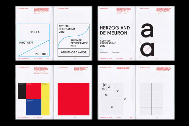
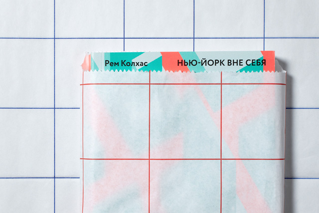
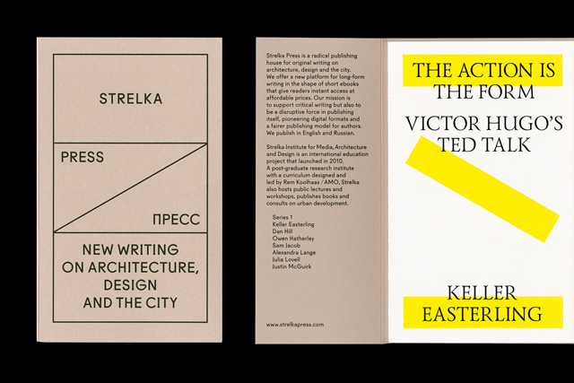
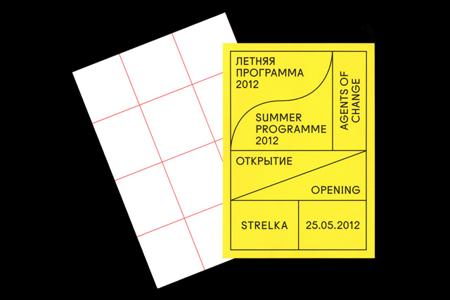
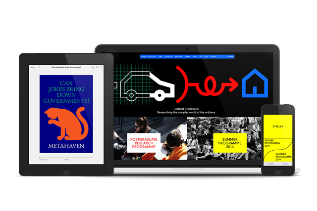
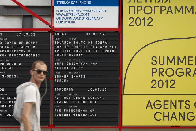
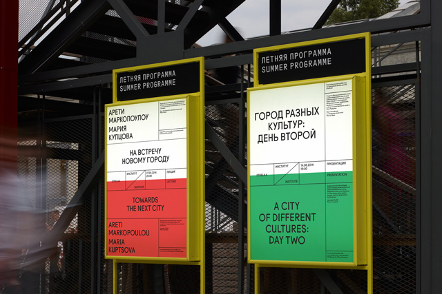
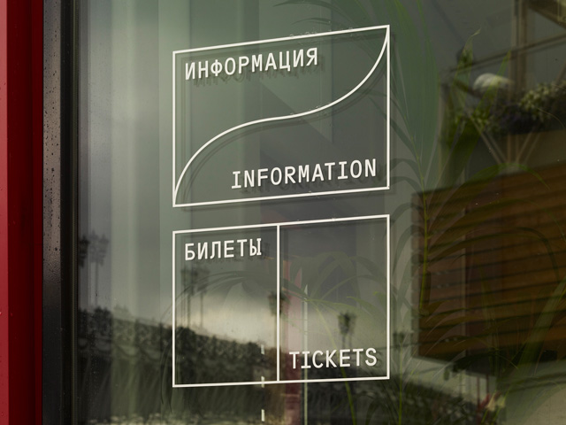
OK-RM were engaged to redesign the identity of the internationally-facing institution, requiring a solution strong enough to match Strelka’s character but fluid enough to cover its wide range of activities. The resultant work relies heavily on a grid into which Strelka’s ever-changing array of content can be plugged and that can adapt across divergent contexts, from web to print to environmental displays. With its saturated colour palette, abrupt compositional style and careful mediation between Latin and Cyrillic glyphs, the identity, which was nominated for the Design Museum’s Designs of the Year award in 2013, gestured at Russia’s visual heritage without ever feeling parochial.
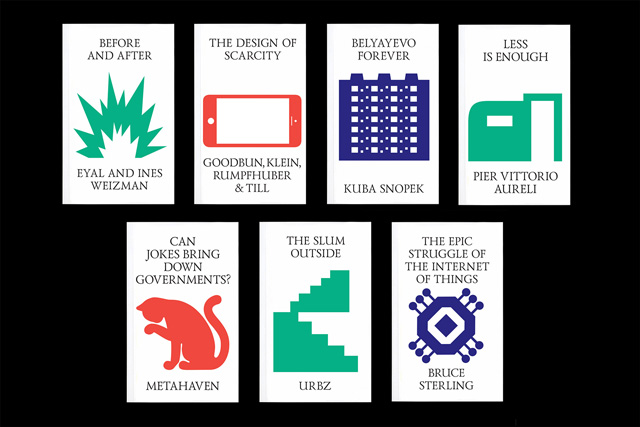
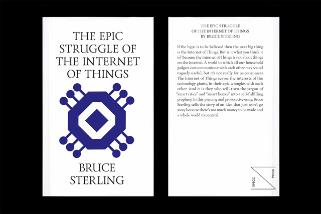
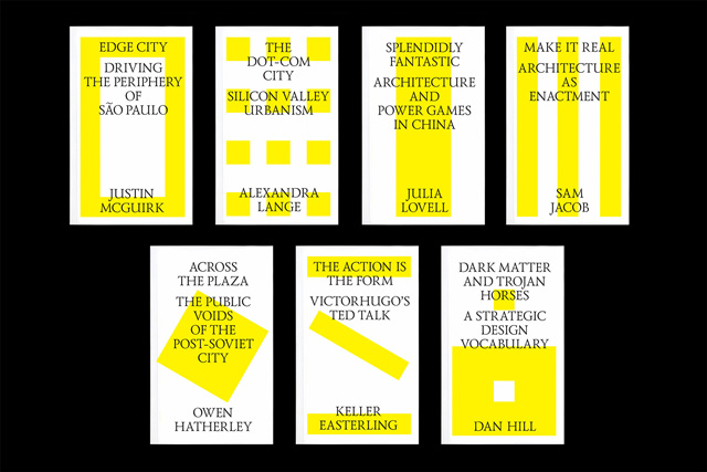
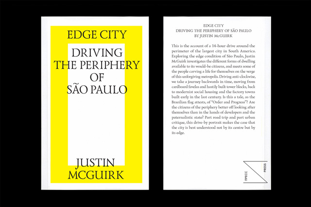
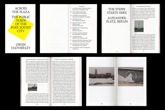
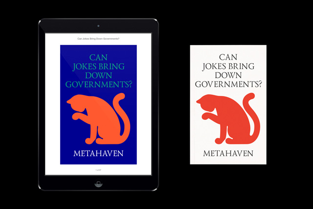
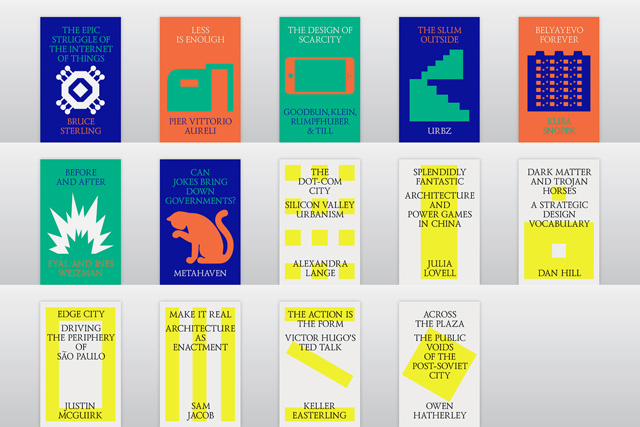
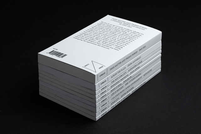
The project advanced again when OK-RM were asked to art direct the institute’s publishing arm, Strelka Press. The aim of the press was to provide a new platform for long form critical writing in an affordable package, producing essay-length eBooks (also now print-on-demand) on a wide range of design-related topics. For the ‘covers’ of the first series, a range of vaguely ideogramatic forms was produced by interpreting each text’s theme within the confines of the Strelka grid system. It still stands as one of the few coherent visual treatments for a digital publishing enterprise, combing the separate texts into a family that feels truly interdependent.
This last job also saw the studio foment the sort of lasting relationship that is often a consequence of their dialogue heavy approach, this time with the press’ director, the design critic Justin McGuirk. “Justin has been especially important for us and remains a close collaborator,” says McGrath, “and through that we’ve started to work with others who understand that side of our practice, taking us onto projects with the Mayor of London, for instance, and the GLA Regeneration Team.” The segue into the world of ‘critical urbanism’ that Strelka offered quickly brought OK-RM eight or nine commissions that deal with that sphere and created kind of scene around the studio, one that has been based on personal engagement with with writers and curators like Shumi Bose, Tom Keeley and Beatrice Galilee as much as on commissioned work.
Within this wider circle of friends and colleague, cultivated by a studio that seems to draw so much of its energy from conversation and discourse, it is perhaps a surprise to find that OK-RM still only constitute five members of staff. This is, says McGrath, a conscious decision, one made in the full knowledge that they could be taking on more work with extra resources; the reasoning is simple – McGrath and Knight wouldn’t be able to talk things out sufficiently if they had to manage a larger caseload. This adherence to language is perhaps the one element through which you can analyse their whole back catalogue. They highlight their early (but on-going) In Other Words project as the Ur-example of this, a series of self-published projects that tackles the instability of the English language. It has been commissioned by a variety of people, from Milan Design Festival to Eye magazine, but regardless of context it clearly explicates the studio’s use of typographic expression as means of investigating and playing with semantics, rather than simply as a means of clarification or out of base aesthetic interest. ‘It’s about the communicative possibilities of the content we’re handed,’ say McGrath and Knight, ‘and typography has always been the most direct way of working that through.’
As much as OK-RM try and maintain a form of independence from the main current of commercial graphic design, preferring to situate themselves in other fields, the traction they’ve gained from from operating outside of normal parameters always threatens to draw them back in, as certain disciplinary bodies try and recuperate that success. One way they are more than keen to contribute to this arena, and perhaps the only normative measure by which might consider themselves ‘established’, in that they’re increasingly asked to teach at places like ECAL or After School Club at the HfG Offenbach University of Arts or more recently at Werkplaats Typografie. “We try and be as open as possible with young designers and avoid playing up the mysterious aspect of being a recognised practice,” says McGrath, “it’s unhealthy to maintain that there’s some kind of illusive difference, which is much more of an issue when we have a screen and blog-based culture that positions itself (and certain studios) as a fount of information.”ok-rm.co.uk

