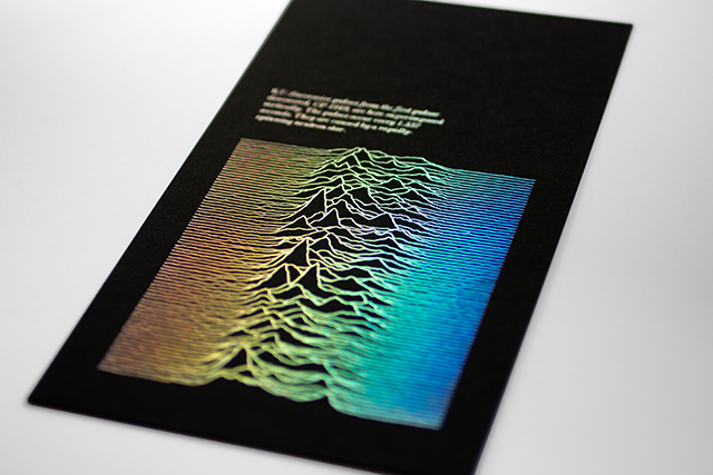
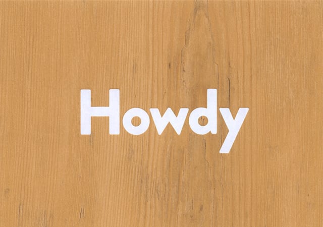
Whether he's packaging snot for the MoS or helping Benwells to say hello, Alistair Hall's thoughtful approach and self-professed love of print always shine through. Anna Lisa Reynolds went to meet him as his studio We Made This enters its eleventh successful year.

In a quiet corner of Alistair Hall’s studio, tucked away on a side street just off London’s Clerkenwell Road, I’m rifling through a pile of beautiful print. It’s a treat to see such a range of processes and finishes being put to good use – and placed at the fore, through an economical approach to typography and layout that places each item’s object qualities on an equal footing to the design itself. The work on the table today is just a small portion of the plethora of print produced over the past eleven years by Hall, working under the banner of We Made This – the practice he founded back in 2004, after a BA in Graphic Design at Central Saint Martins and a spell spent working at CDT Design.
Hall didn’t always want to be a graphic designer. He originally studied Art History and English and spent a year or so working for a company that made TV commercials before the graphics bug bit and he decided to pursue it as a career. The plan, after cutting his teeth working in another agency, was to set up his own studio – indeed, the ‘We’ in We Made This reflects an early ambition to bring others on board. Hall wanted his future colleagues to be able to build their own profiles, and envisioned a working culture in which the designers of We Made This took ownership of projects they had worked on, under a common banner. But the name became a bit of a misnomer once work started coming in, and he realised he could take on the kinds of projects that interested him without having to employ anyone else.
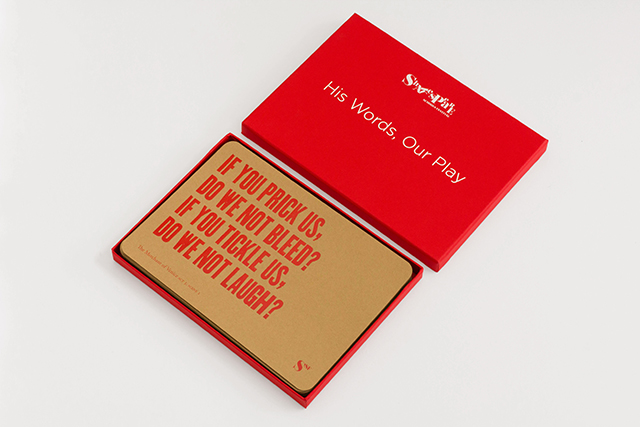
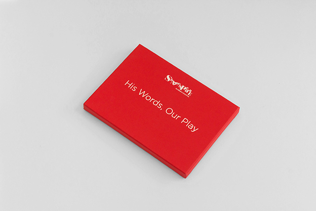
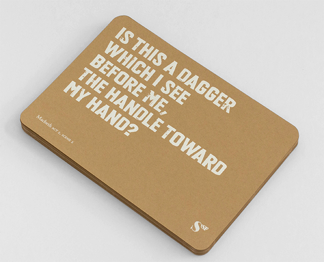
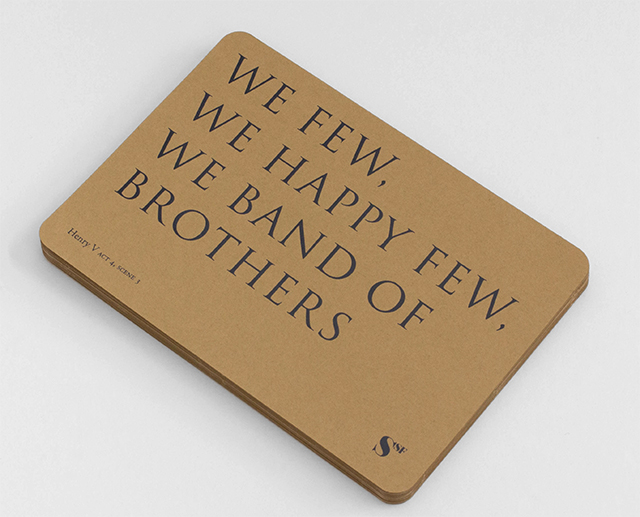
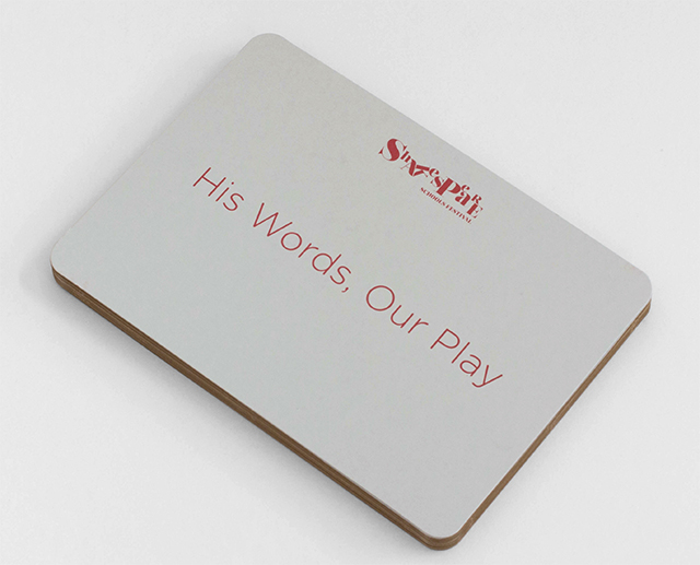
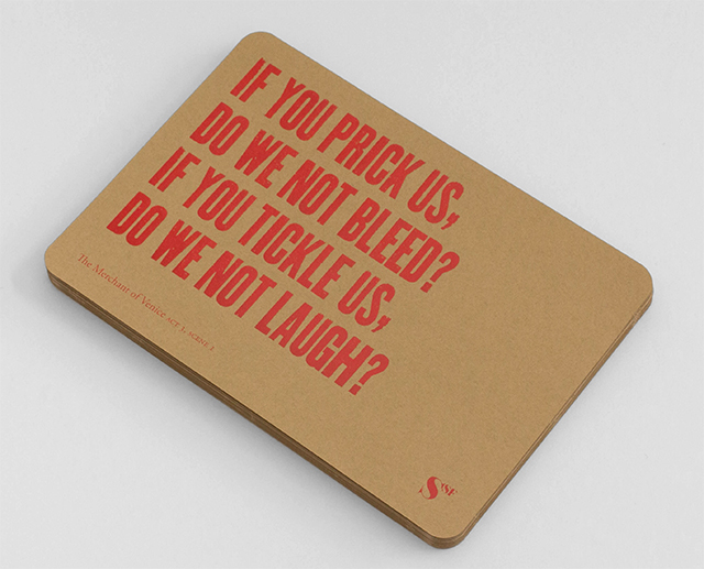
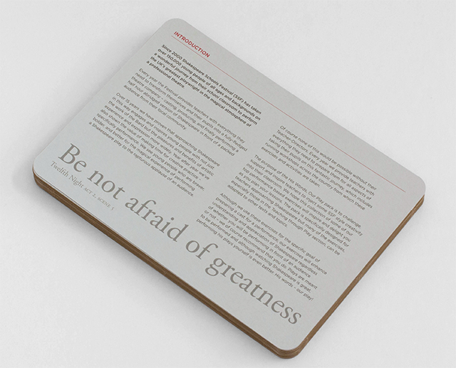
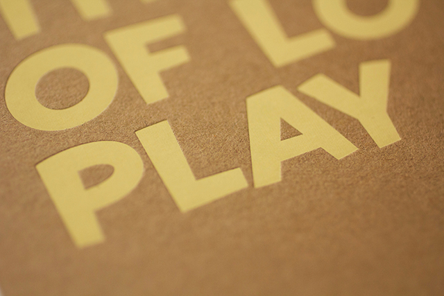
Hall is aware of the potential for confusion regarding his chosen epithet. “I didn’t want to become a business manager,” he explains, “but I realise the name can make it sound like I’m pretending as though I’ve got thirty people up here. So I try to focus on the idea that all design work is a collaboration between client and printer and designer, and that’s where the ‘We’ comes in.” Post-rationalisation it may be, but the sentiment holds true when applied to his way of working, which often sees him step up to initiate, and then fully immerse himself in, the realisation of a project.
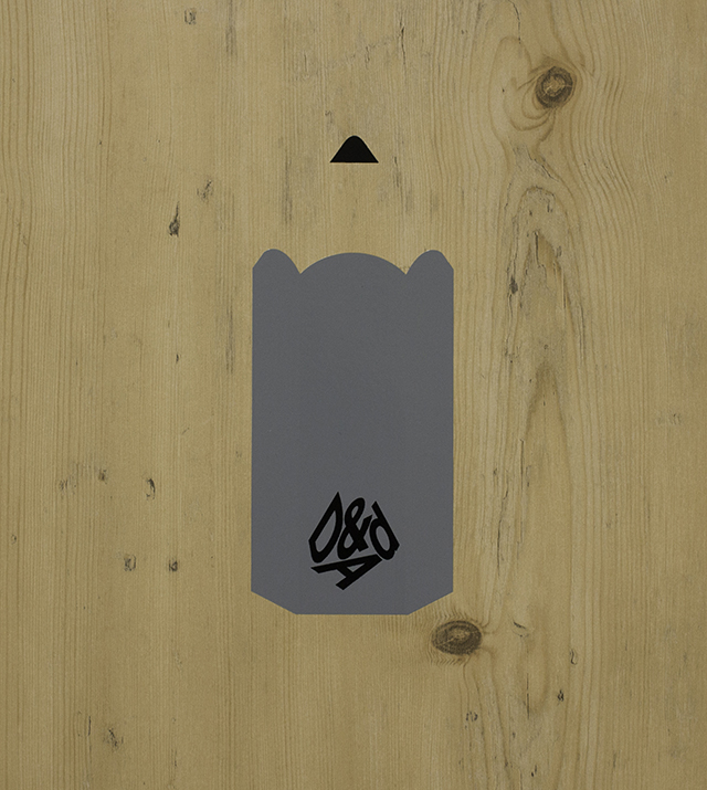
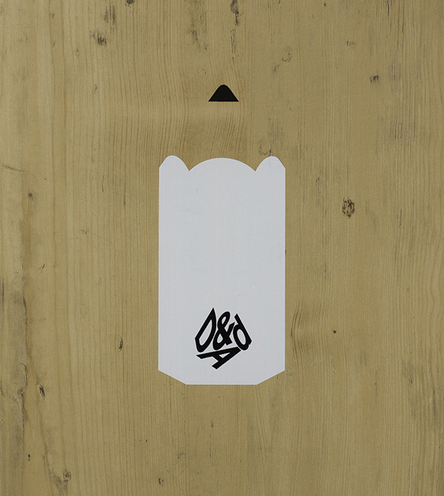
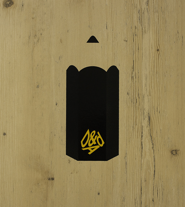
While he is in effect a sole trader, Hall doesn't work on his own – for the past six years he has shared a lively Clerkenwell studio with fellow designers David Pearson and Paul Finn. One of the trio's most recent collaborations has been to create a series of covers for this year's D&AD annual. The brief was to celebrate the range of five awards - wood, graphite, yellow, black and white. The result cleverly utilises a wood-effect GF Smith stock, and is a witty yet understated take on D&AD's iconic pencil-shaped awards.
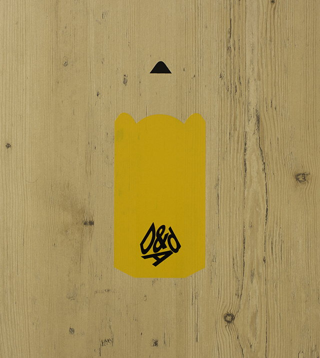
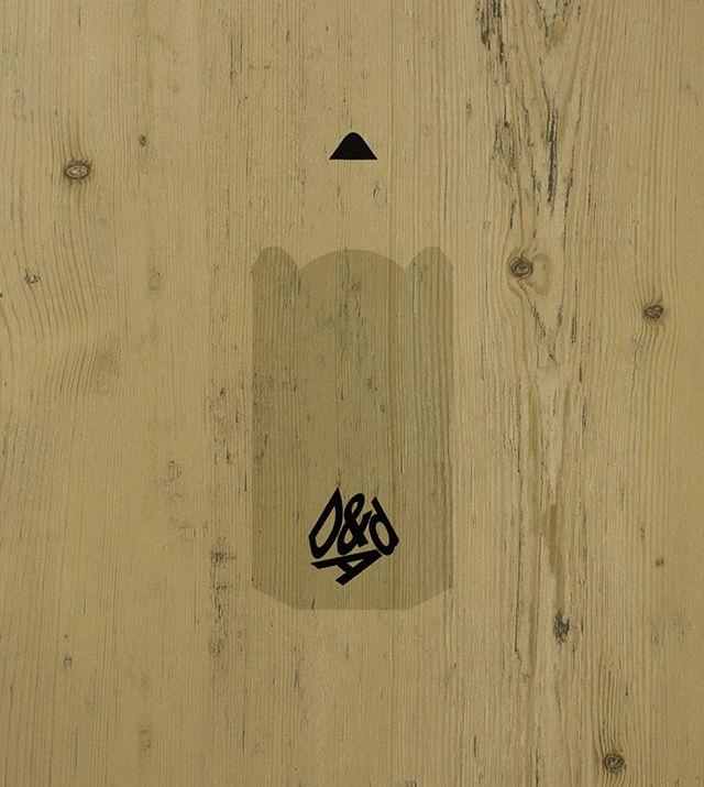
We Made This specialises in print design – a medium that has always held a special interest for Hall. His first client out of art college was Benwells, the Bermondsey-based print finisher, after they produced the catalogue for his graduation show: an ambitious screw-bound book, with rub-off foil on the cover that revealed a lasting message as it wore down over time. “It was a lot of work – we sort of threw everything at it,” he recalls, “but we didn’t have much budget, so about fifteen of us went into Benwells in the days before the show to bind them all up ourselves, by hand.” That hands-on enthusiasm made an impression, and they’ve maintained a working relationship ever since, enjoying the opportunity to play around with different materials and techniques on the materials Benwells uses to promote its expertise.
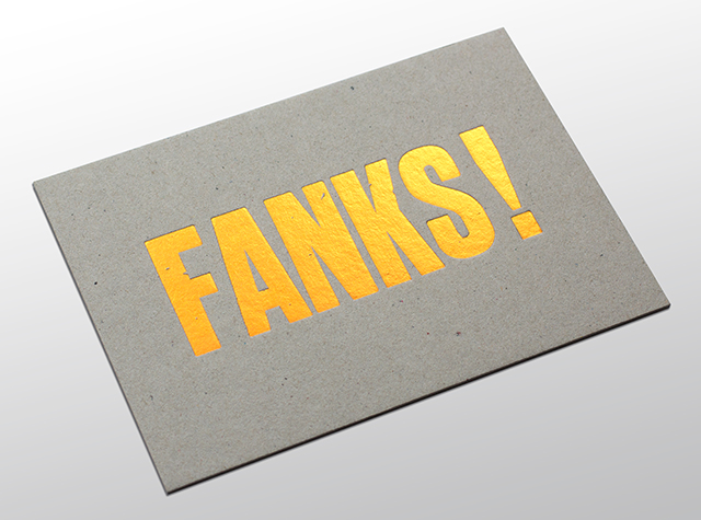
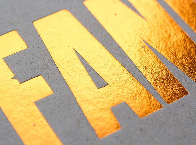
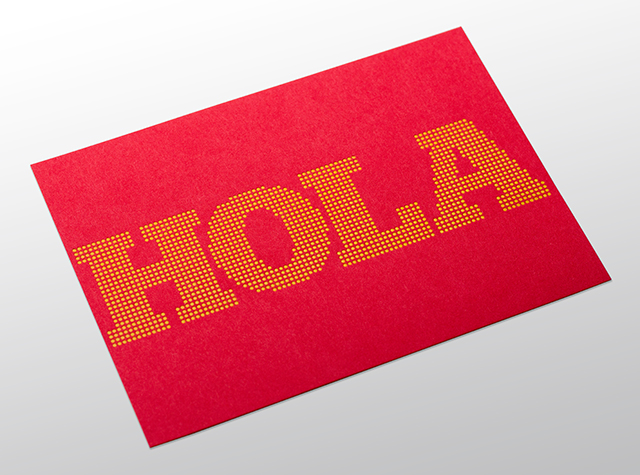
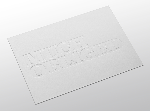
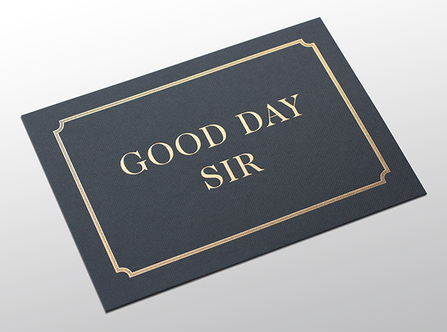
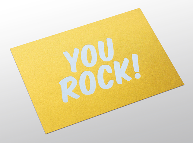
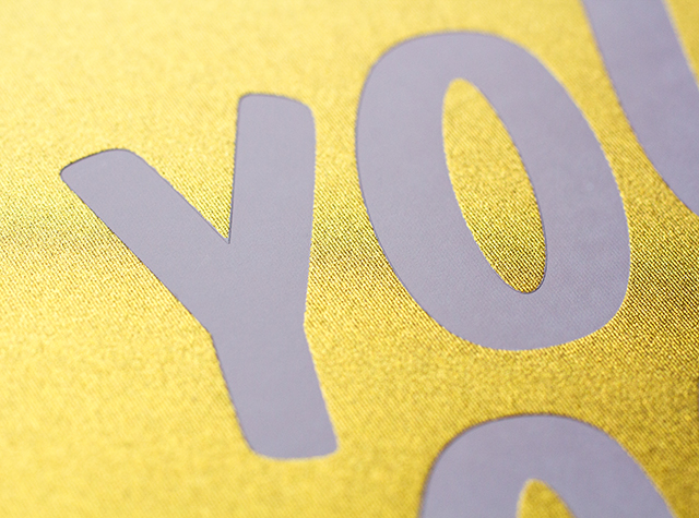
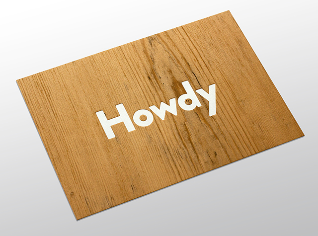
The latest of these, still at the dummy stage when we meet, are two sets of postcards – ‘hello’ for prospective new clients, and ‘thank you’ for existing ones – that make use of a range of interesting card stocks and finishing methods. They seem refreshingly simple and playful in comparison to the everything-but-the-kitchen-sink approach of so many other printers’ promo items; rarer still, they look like they might feasibly be usable as postcards in their own right, rather than being destined for the sample drawer or the bin. Given the form much of his work takes, Hall is conscious of the need for print nowadays to justify its own existence. “You get so much promotional stuff that’s quite useless,” he says. “It arrives and you think, ‘that’s lovely’, but then what do you do with it? And you just feel guilty for throwing it away – whoever sent it to you has given you guilt. There’s got to be a point to stuff like this.”
I’m interested to hear Hall’s thoughts on the way that attitudes towards print have changed over the eleven years of We Made This. It turns out to be a topic he discussed only recently during a workshop with students at Kingston University. “We ended up comparing it to the music industry,” he recalls, “and how when CDs came out, vinyl started to be valued for its distinctive qualities as vinyl, rather than as the only way of listening to music. I think that’s what’s happening with print now. These days, you have to ask why anything you design should be printed, rather than emailed or turned into a pdf or put online, which leads into the question of what print is great at. And it’s about being persuasive, and tactile – all the things that we love. So it’s much easier now to explain to a client why we should print something, rather than just sending an email.”
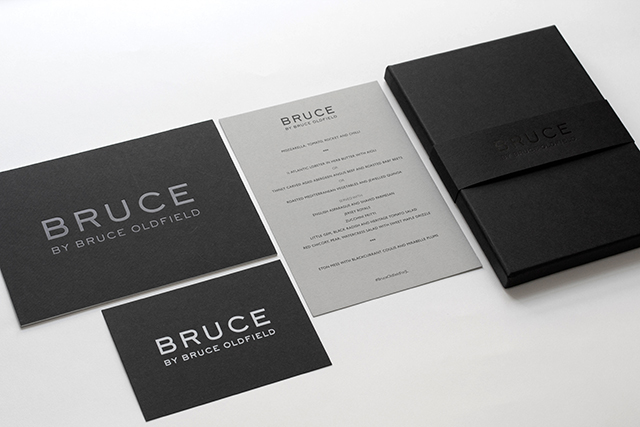
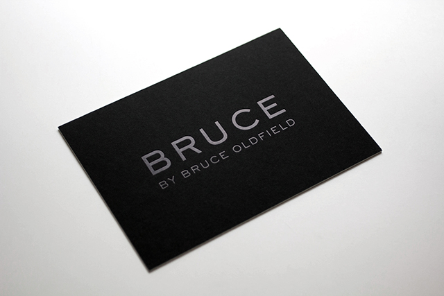
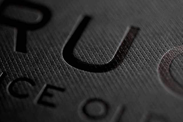
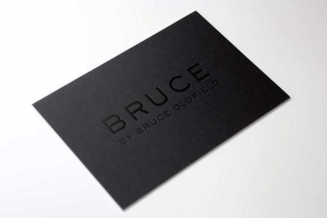
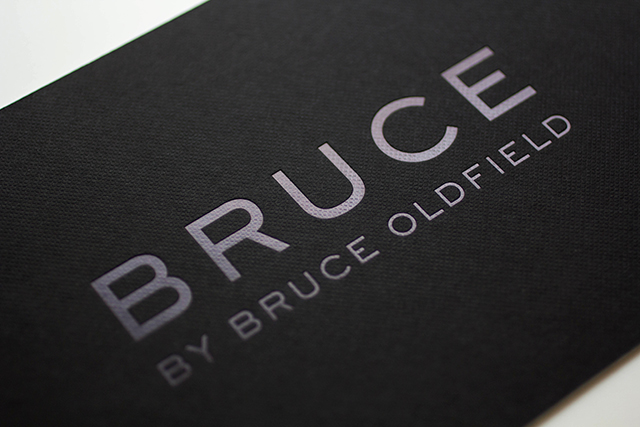
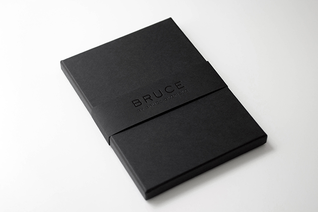
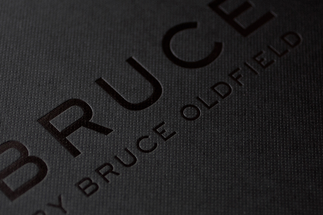
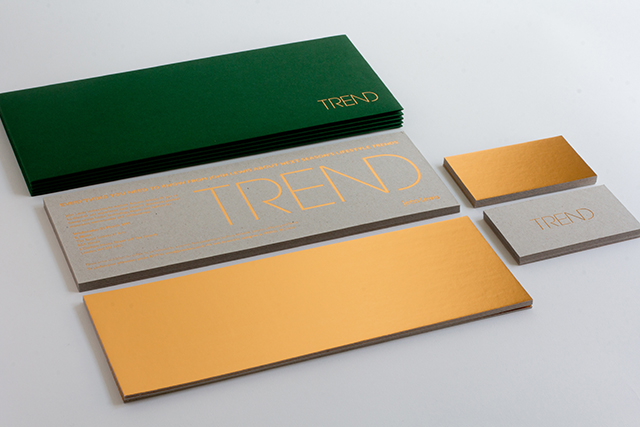
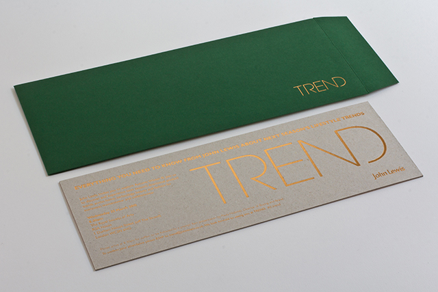
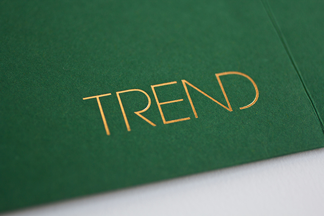
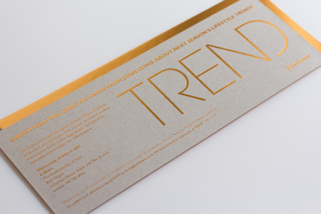
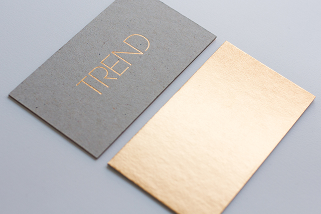
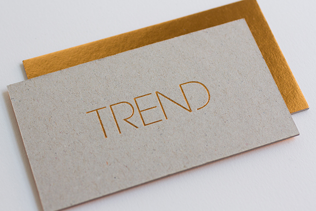
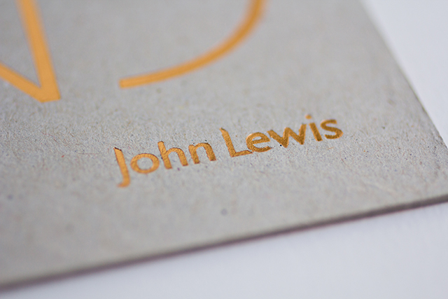
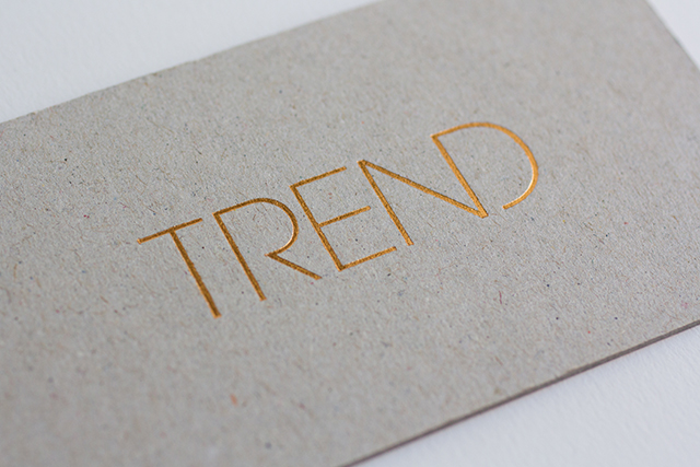
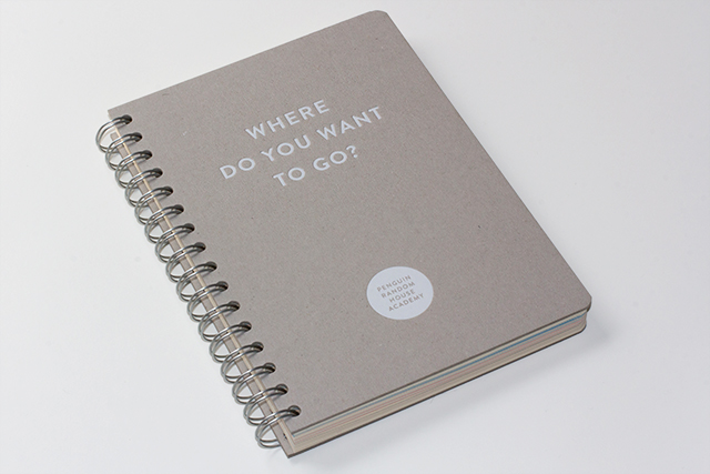
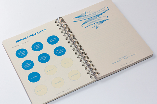
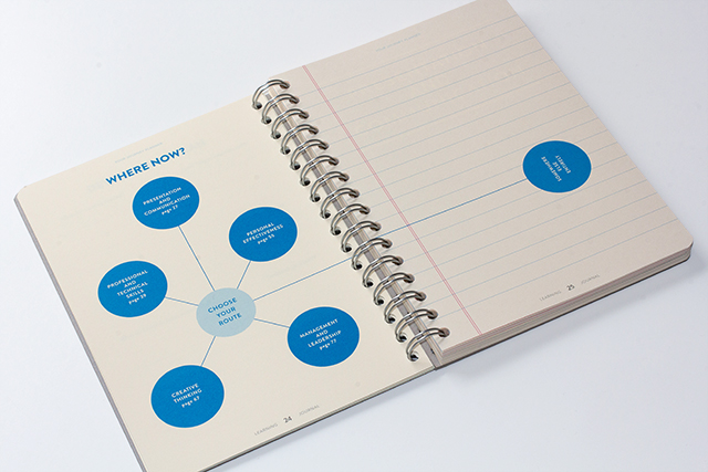
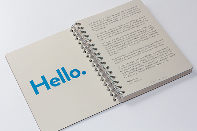
The drive to interrogate each eventual outcome in this way has led to the accumulation of a broad range of beautiful, considered pieces of print in Hall’s portfolio. His keen typographic eye is evident throughout, partnered with a characteristic visual and tactile economy that ensures each piece seems somehow more than the sum of its parts. His recent client base is characterised by a similar eye for quality, but also a sense of established respectability – whether it’s John Lewis in the retail sector, Penguin Random House in publishing, or indeed Benwells in print and finishing. Which is not to say that he’s opposed to the idea of working with new or emerging enterprises. Indeed, one of his biggest projects to date was little more than an idea in the heads of a few like-minded individuals when he got involved.
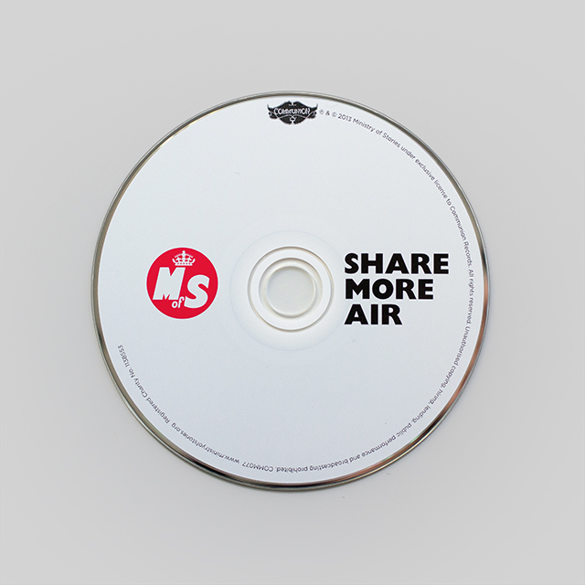
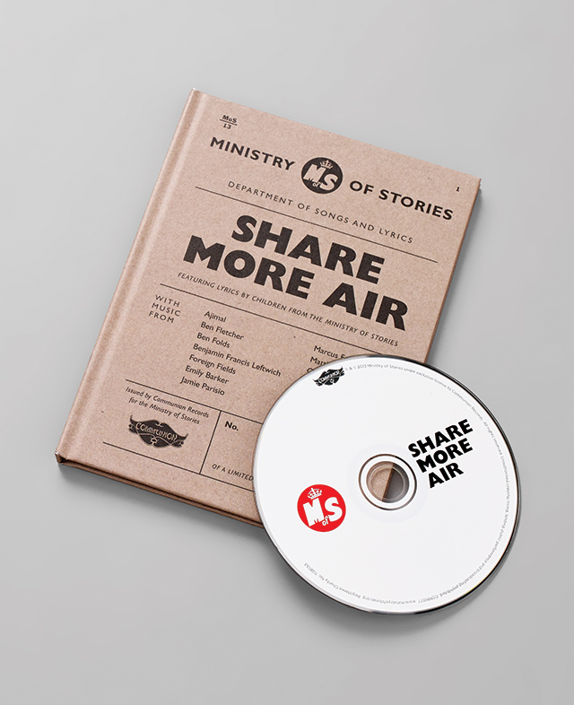
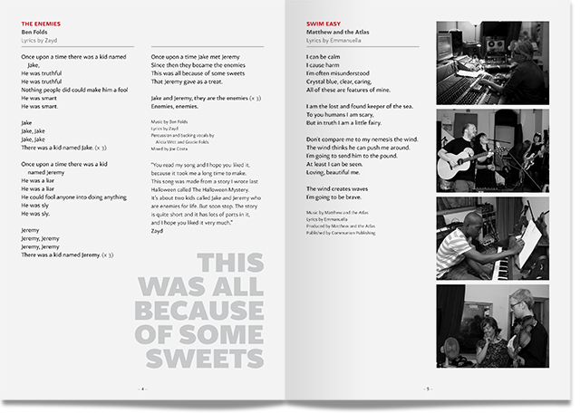
It’s fun, lots of very serious conversations: ‘Does this look real?' 'Would a monster really buy it?' The Ministry of Stories, based in East London, is a non-profit enterprise that helps children and young people develop their creative writing skills. Founded in 2010, it was inspired by a similar venture in San Francisco, 826 Valencia, set up by author Dave Eggers as a writing workshop for children, hidden behind a ‘front’ – a pirate supplies store, selling straight-faced merchandise for the discerning swashbuckler, to raise funds for the workshops and fire the imaginations of children who visited. It struck a chord with Hall, who wrote a blog post about it and asked if anyone in London had thought of setting something similar up – and through a friend, he was introduced to Lucy Macnab and Ben Payne, who were already thinking the same thing. A serendipitous meeting with Eggers shortly after put them in touch with author Nick Hornby and, as Hall puts it, “it all sort of exploded from there.”
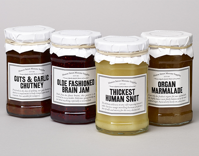
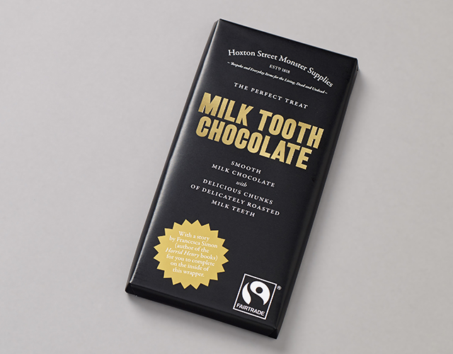
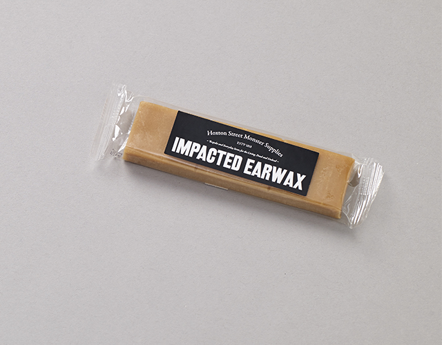
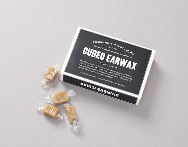
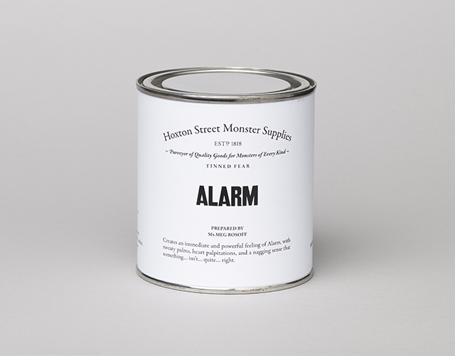
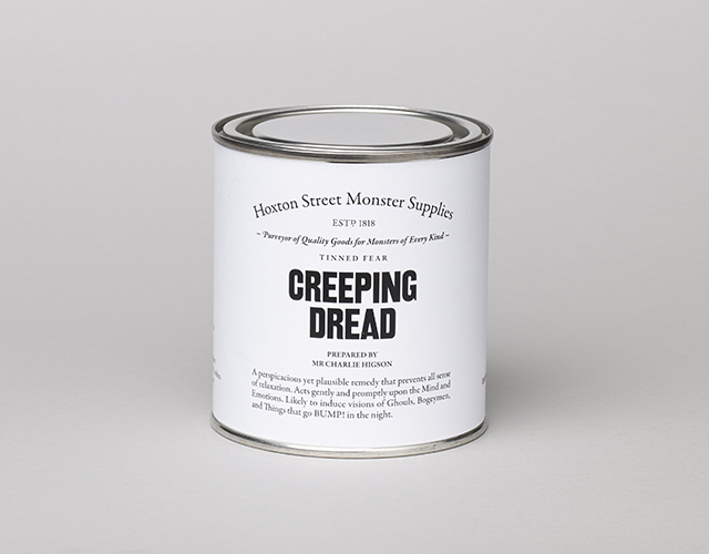
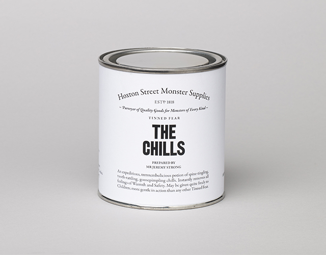
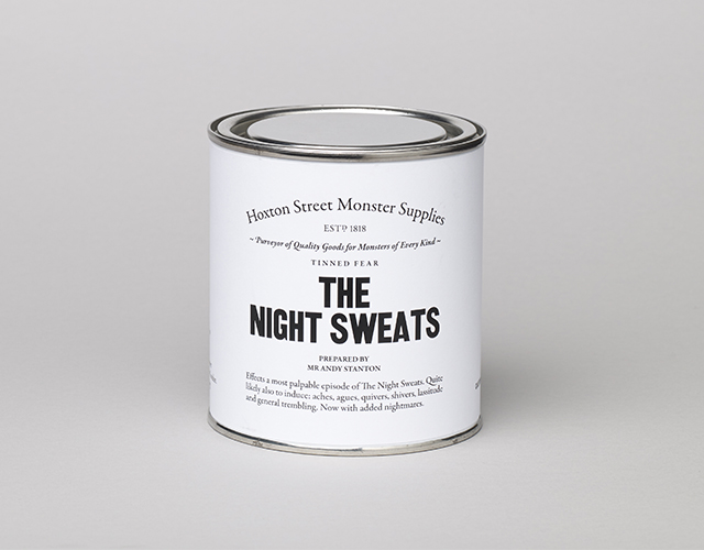
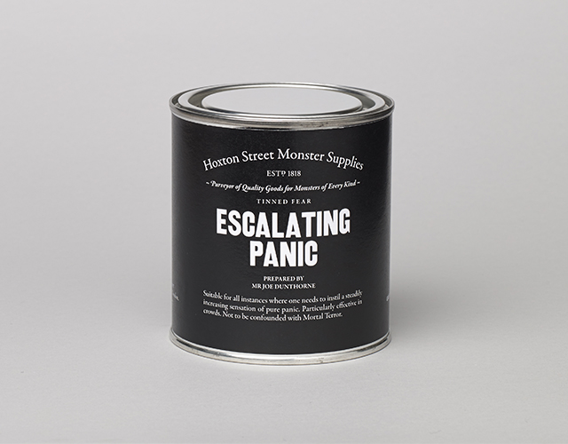
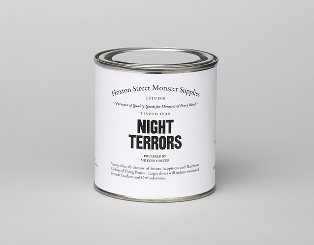
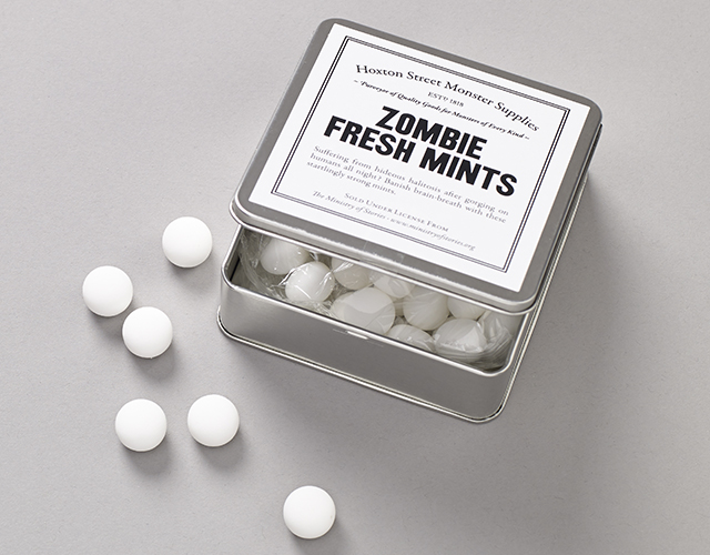
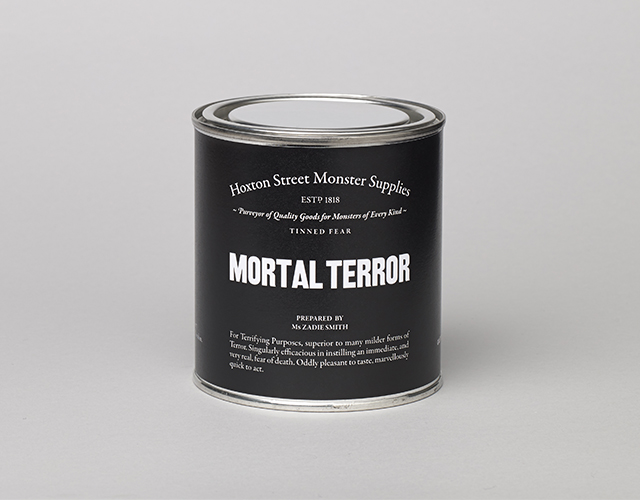
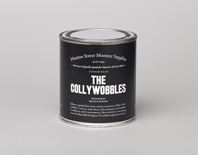
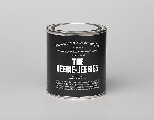
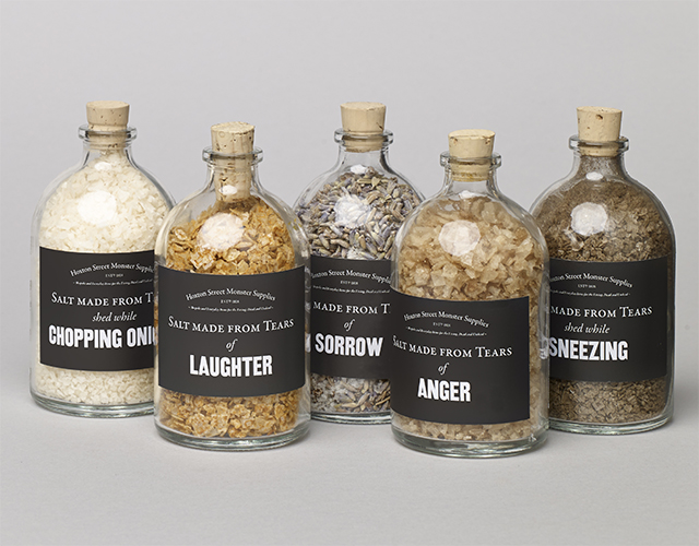
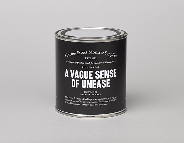
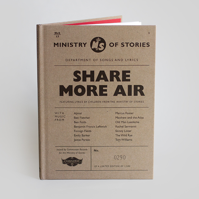
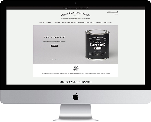
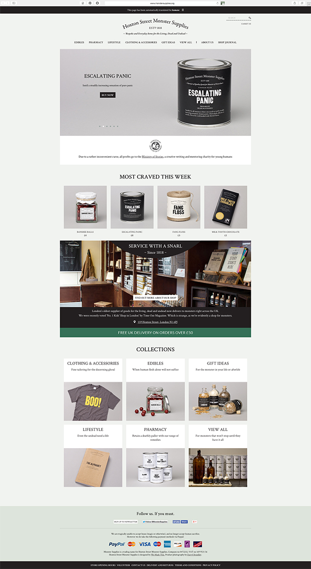
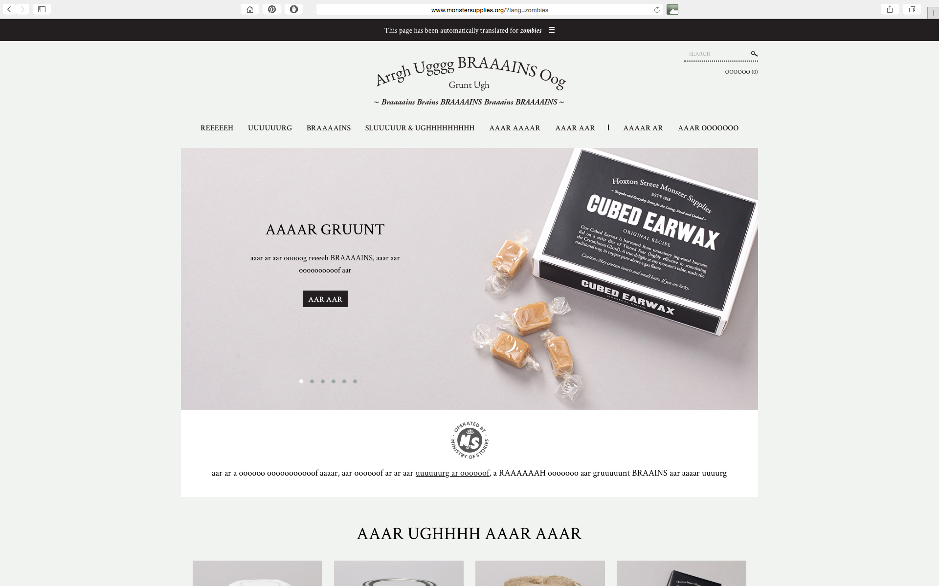
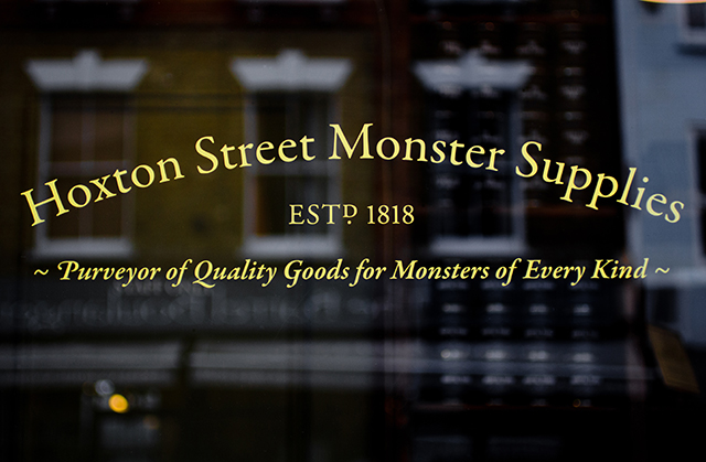
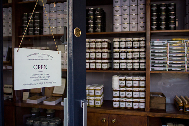
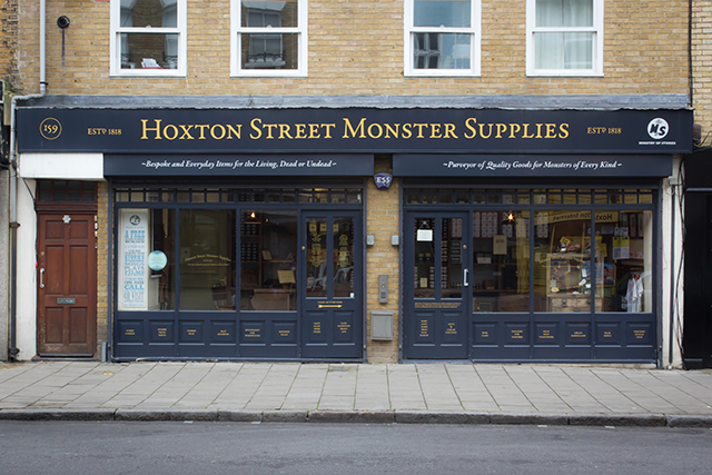
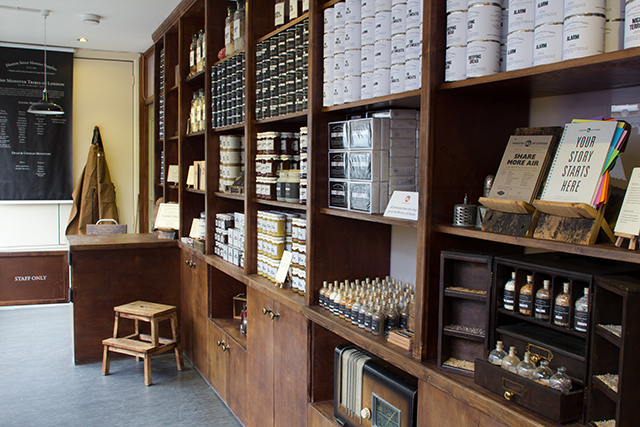
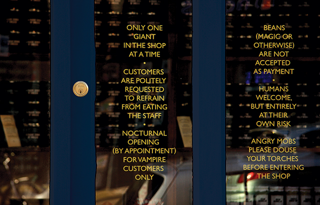
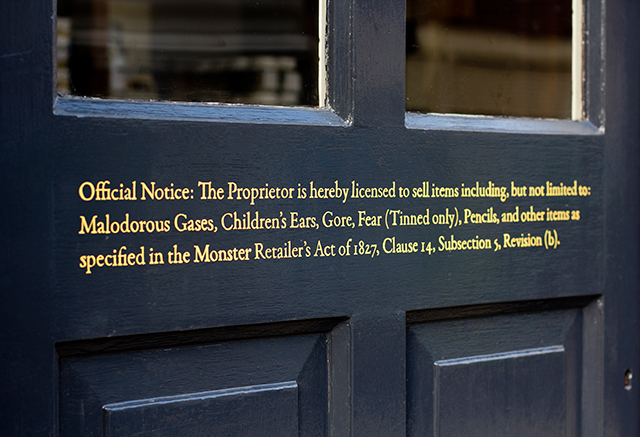
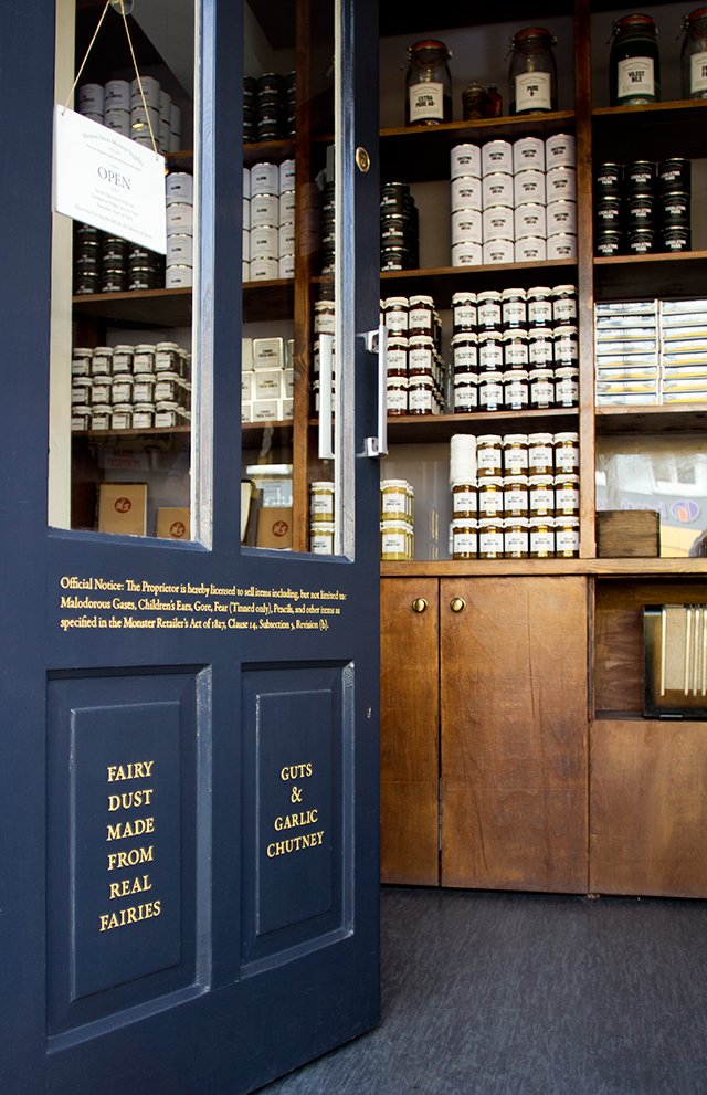
The Ministry now operates out of a workshop space hidden behind its own riff on 826 Valencia’s pirate store: Hoxton Monster Supplies, ‘Purveyor of Quality Goods for Monsters of Every Kind’. Its shelves are lined with delights such as Thickest Human Snot, Cubed Earwax, Fang Floss and a range of tinned fear – packaged in smart, serious monochrome with a notable absence of ‘child-friendly’ flourishes – and a hidden door leads through to the workshop beyond. Hall designed the identity both for the shop and the Ministry itself. He was keen from the outset for it all to appear, on first glance, entirely believable. “It’s so important that it doesn’t feel really kiddie-ish and stays quite straight,” he confirms, “and that’s something that we keep coming back to even now when we’re coming up with new products. It’s fun, lots of very serious conversations: ‘Does this look real? Would a monster really buy it?’”
They started out with only five products and eight hundred pounds to stock the shop, and have steadily expanded ever since, working with brands like Tatty Devine, Halen Môn (suppliers of their range of salts made from human tears) and Divine Chocolate to add to their roster of monstrous consumables. “It’s a joy of a project, really,” Hall concedes. “It’s been five years of working with one client – even though they’re not really a client, I guess – and after that long, you start asking yourself whether someone else should have a go. But I still really enjoy it and I’m able to give enough time to it, so it doesn’t feel like it’s detrimental to still just have one person as art director. I think your best work is always for the clients where you genuinely believe in what they do, but you have a fascination with what they do yourself. And of course in a corny, and slightly self-serving sense it just makes you feel good – you get the feeling that in some small way it’s making the world a bit better, rather than just selling junk just for the sake of it.”
The common thread running through Hall’s work, aside from a self-professed love of print, is summed up well in that last sentence. Less the self-serving part, and more the sense that graphic design and its objects can and do have a tangible impact on the world, ephemeral as they might seem, and that this might as well be put to positive use. It’s influenced perhaps, in part, by a fascination with the graphic ephemera of eras past, and a keen understanding of the enduring power of design, good or bad.
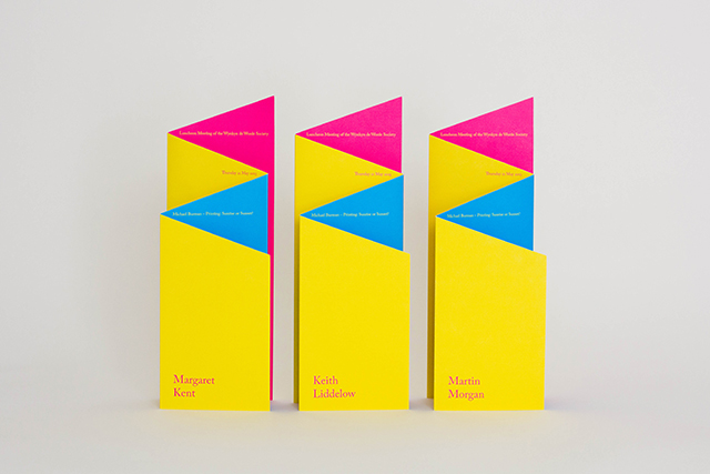
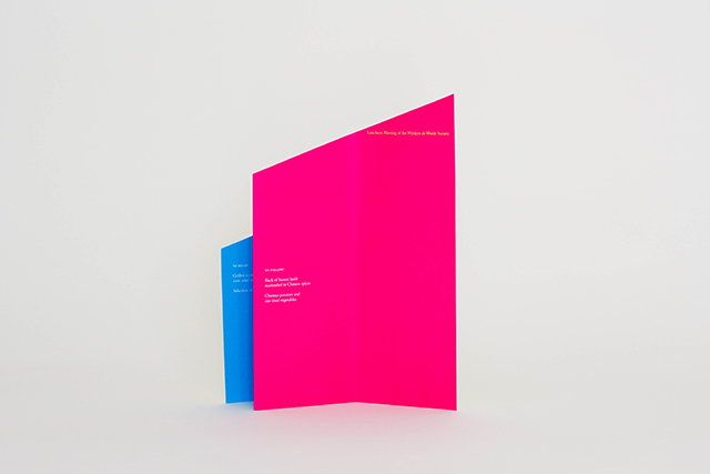
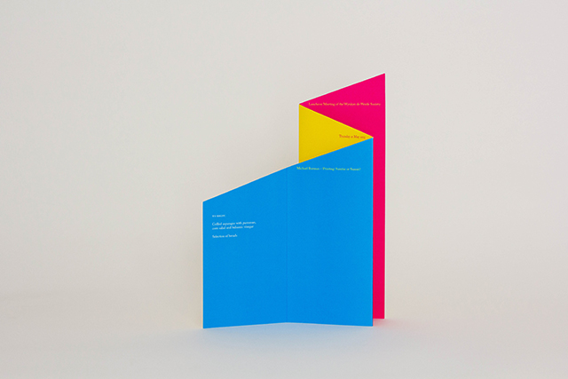
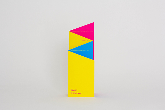
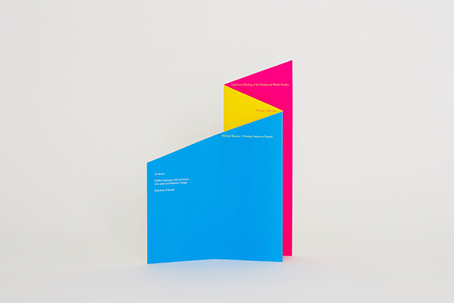
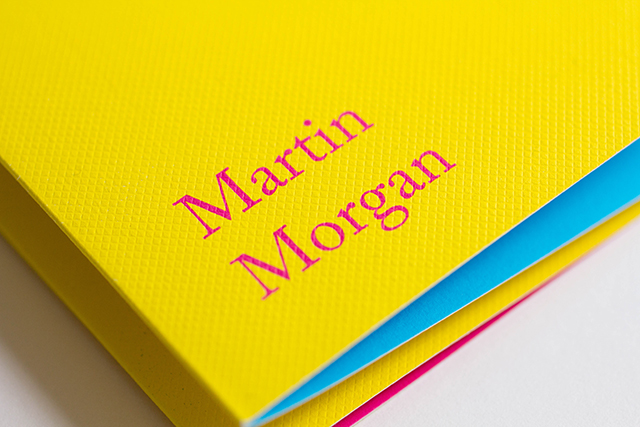
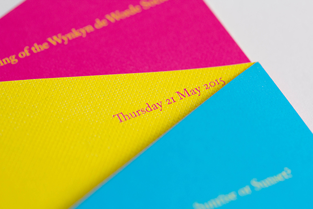
This engagement with the history and legacy of design and print extends into his extra-curricular activities. Hall can often be found at the monthly outings of the London Ephemera Fair, “on a Sunday morning, a bit hung over in a slightly overheated room, trying not to touch all the really expensive bits of paper,” and he’s an active member the Wynkyn de Worde Society – a group of people brought together by personal and professional interests in print and design – where he’s recently taken on the mantle of print designer for the year. Not forgetting the We Made This blog, of course, through which he’s been an active voice in design’s online community for the best part of a decade
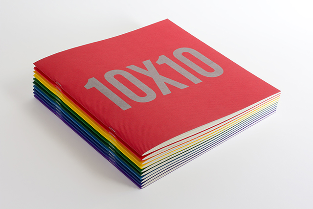
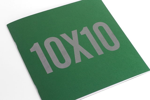
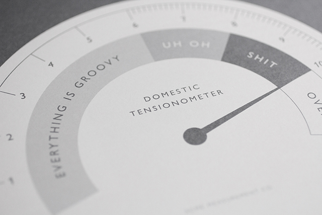

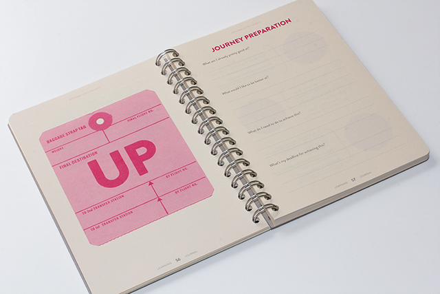
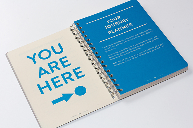

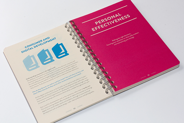
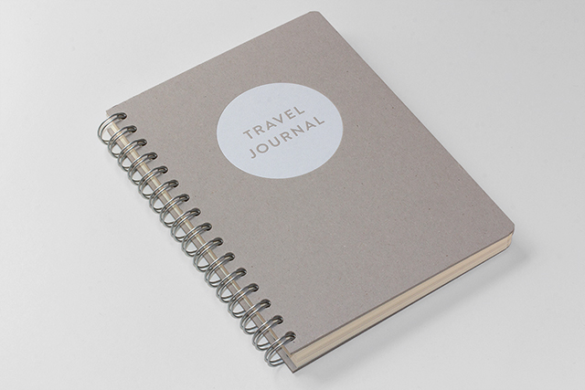
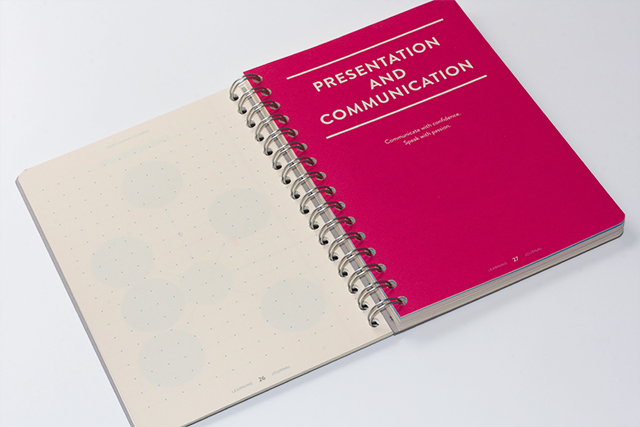
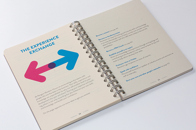
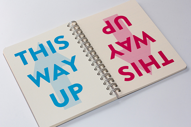
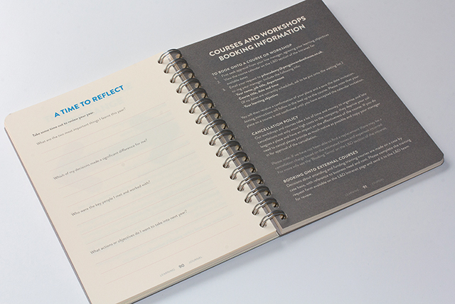

As our interview draws to a close, talk turns to what the future might hold. It feels as if I've caught Hall at a moment of mid-career reflection – with the tenth birthday of We Made This just behind him, and several long-running projects under his belt, he sounds ready for a new venture; the next big endeavour to get his teeth into. “Ten years feels like a big marker,” he admits, “and it definitely gets you wondering what that vast open space in front of you before retirement might be filled with. I always used to have a plan of where I was going, and then I suppose I got to where I was going, and so now I’m asking what happens next?” In his career so far, he’s managed successfully to bring together his interests and passions with projects and clients whose goals align closely with his own, a sound foundation from which to start something new when inspiration or opportunity strikes. Watch this space – or better still, keep an eye on his blog.
See more of Alistair's work here, and read his excellent blog here.
