
New book Supernew Supergraphics explores the work of the modern day architects and designers using typography and graphics to dramatically alter, challenge and disrupt environments on a large scale.
“Supergraphics are so gigantic that they cannot be contained within the frames of a single architectural plane,” wrote critic and historian C Ray Smith when describing the work of the fleeting radical architectural movement, the Supermannerists, which like the term Supergraphics he coined as it emerged in the 1960s. “Either they extend onto adjacent planes - from wall to floor to ceiling if their forms are painted in toto, or they appear as fragments of an overall graphic image.”
This description, as quoted in the Adrian Shaughnessy-penned essay that accompanies new Unit Editions publication Supernew Supergraphics neatly sums up the scope of the book’s contents. It features solely contemporary projects, yet its spirit is inspired by this small group of counter-culture architects who abandoned Modernism, breaking the unwritten rule that you don’t paint on architecture, to embrace interiors, buildings, even entire streets as canvases for large-scale graphic and typographic works. More than just decoration, these Supermannerists used graphics to challenge spaces, destabilising a building’s visual appearance and gravity with bold, colourful stripes and geometric shapes. As Shaghnessy points out in his essay: “There are no no-go areas in Supergraphics.”
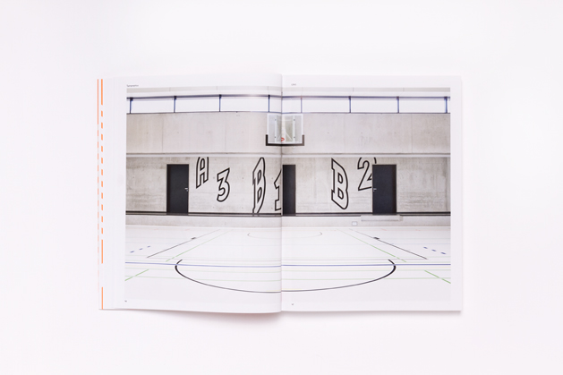
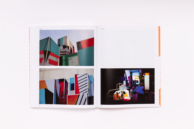
With this ambitious premise in mind, the book, oddly, begins on quite a tame note, leading with some of the projects where way-finding systems or environmental signage have been interrupted with the assistance of unexpected visual cues. There are some notable highlights, including P-06 Atelier’s psychedelic intervention at Portugal’s Pavilion of Knowledge, which involved placing coloured transparent films over windows and creating wayfinding out of suspended plexiglass panels to create a colourful ambience in the main entrance that mutates throughout the day. Interesting too is L2M3’s project for the Alfred Kärcher Sporthalle (pictured above), which features distorted letterforms and numbers that seemingly bounce around the basketball court and correlate with other glyphs when doors are opened and shut.
L2M3 make a second appearance in the book, in the form of an in-depth interview with director Sascha Lobe. Whereas the words to support each project are kept short and concise, the book is dotted with these long-form interviews (also featuring Boa Mistura, Felice Varini and Sara De Bondt), which effectively shed light on some of the practice’s interesting concerns as well as getting insight from these leaders of the discipline.
It’s toward of the middle of the book that the pace really picks up in terms of show-stopping projects. Luz Nas Vielas (a film of which you can see below) by the aforementioned Spanish urban art group Boa Mistura was a community project based in the favelas of São Paulo that investigated the spacial complexity of the winding alleyways that weave through these dense urban areas. By colouring walls and floors of different materials, the project reduced the mishmash of textures to a flat block of colour which then created an excellent background for typographic interventions. Words such as ‘Orgulho’ and ‘Amor’ were carefully traced onto different surfaces so that from particular vantage points, they perfectly line up to create a flat image.


