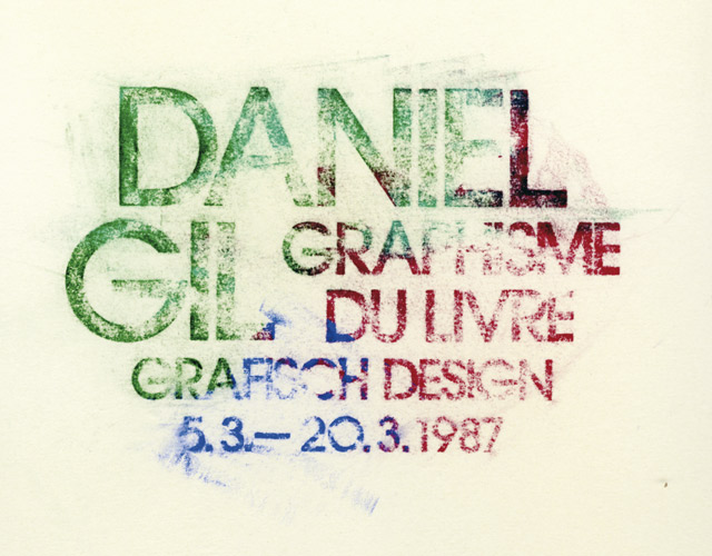
Despite the main body of his work spanning just two clients, Daniel Gil is considered to one one of Spain's foremost graphic designers. Here Emilio Gil (no relation) introduces his graphic design hero.
Daniel Gil is one of those design figures who is capable of influencing professional vocations. In my case, whenever I attempted to respond to the question of why I chose to devote myself to graphic design, his figure always appears. He influenced my youth as a result of both his talent and the extraordinary impact of his work on the Spanish design scene in the 1960s.
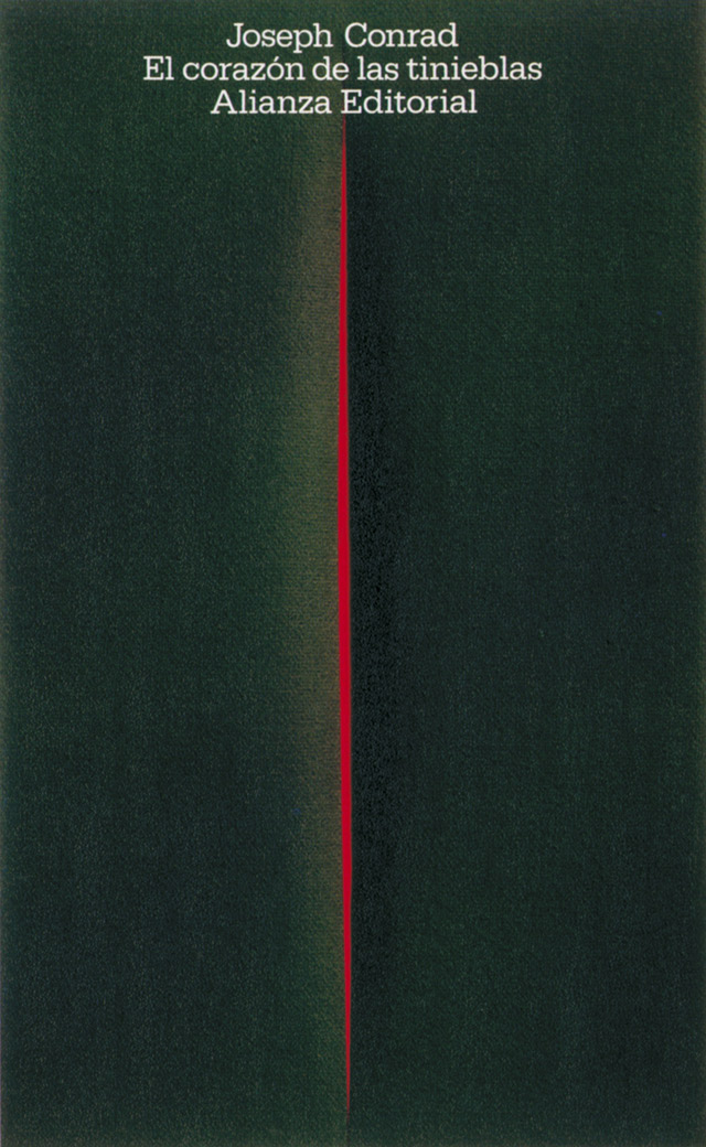
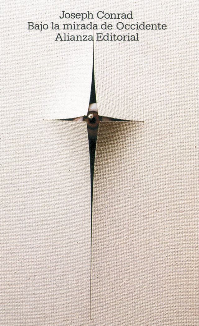
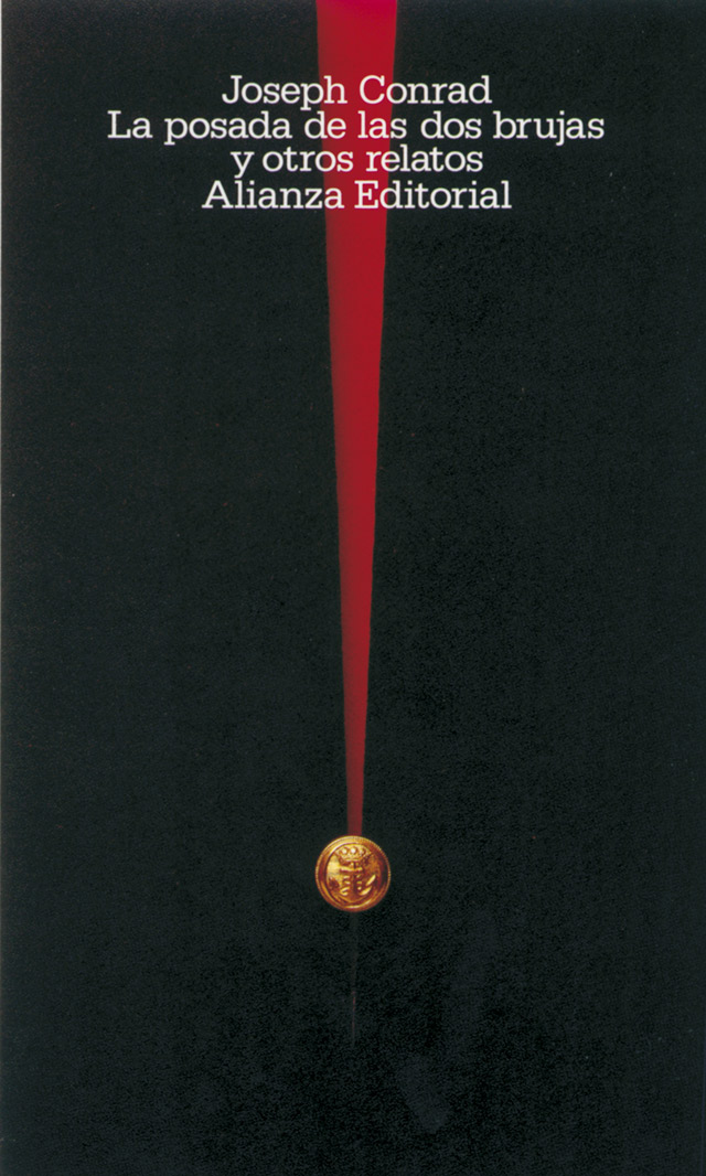
Daniel Gil is one of the fundamental figures of Spanish graphic design although, paradoxically, he was a designer who worked almost exclusively for two clients throughout his professional career: the Hispavox record label and the Alianza publishing house. When, at the end of the 1970s, Daniel Gil left his position as art director and designer of Alianza's covers, he only produced relatively few pieces of work, these were for clients such as the Thyssen Bornemisza Museum in Madrid and the Lower House of the Spanish Parliament.
Daniel Gil belonged to a generation of designers whose work spread over a number of decades, throughout which the cultural and political conditions in Spain did not make creative work easy. The economic climate was not the most favourable, nor was there a social, industrial or business climate which facilitated the work of designers. Given these circumstances, Daniel Gil takes on even greater importance.
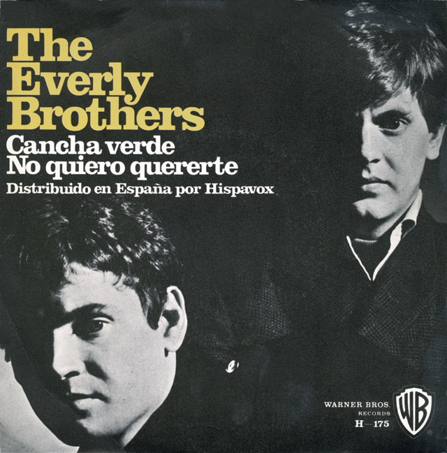
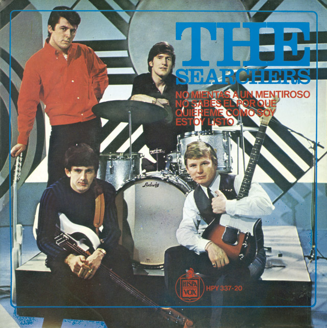
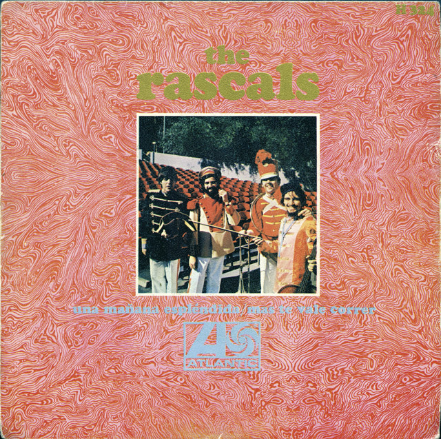
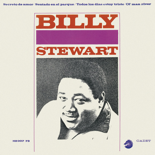
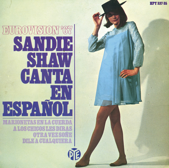
Hispavox was a record label which published recordings made by Spanish pop artists, and marketed international labels such as Pye, Reprise, Atlantic or A&M Records. Daniel Gil’s designs for Hispavox in the 1960s could basically be classified into two groups: adaptations of the corresponding original versions for the Spanish market and new creations for the Spanish label's own productions. In the first case, the most outstanding item is the typographic treatment of the blocks of text in which it is possible to detect from the recurrence of their use some of his preferences: Bodoni Bold, Clarendon and Cooper Brass and Egyptian-style or condensed typographies. Daniel Gil was fortunate enough to work with the best Spanish photographers of the time such as Francisco Ontañón.
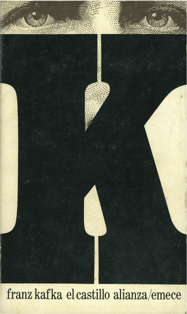
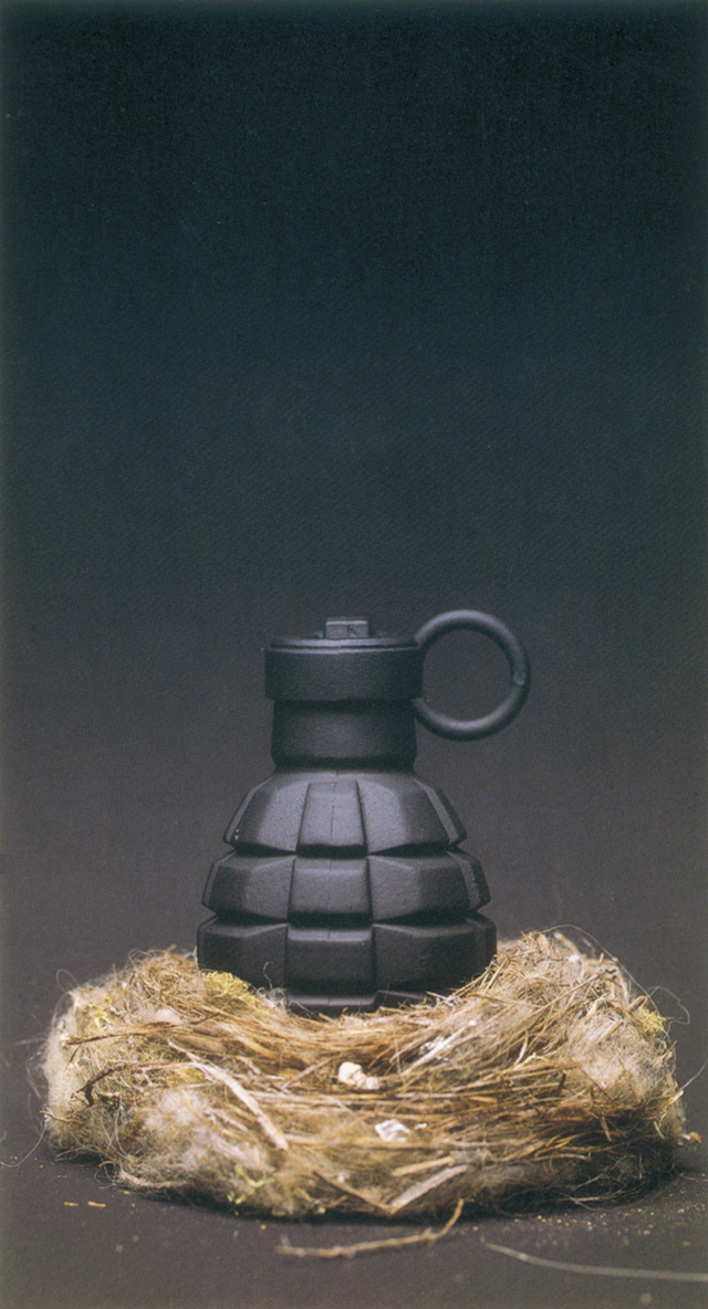
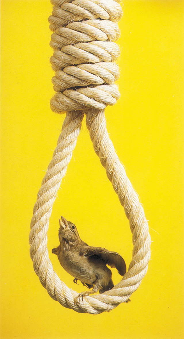
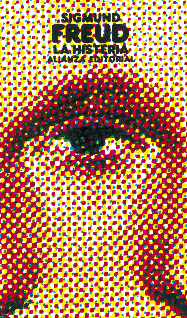
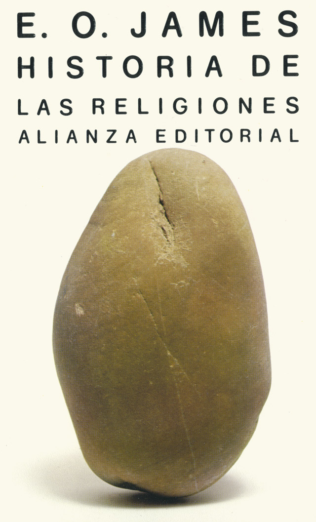
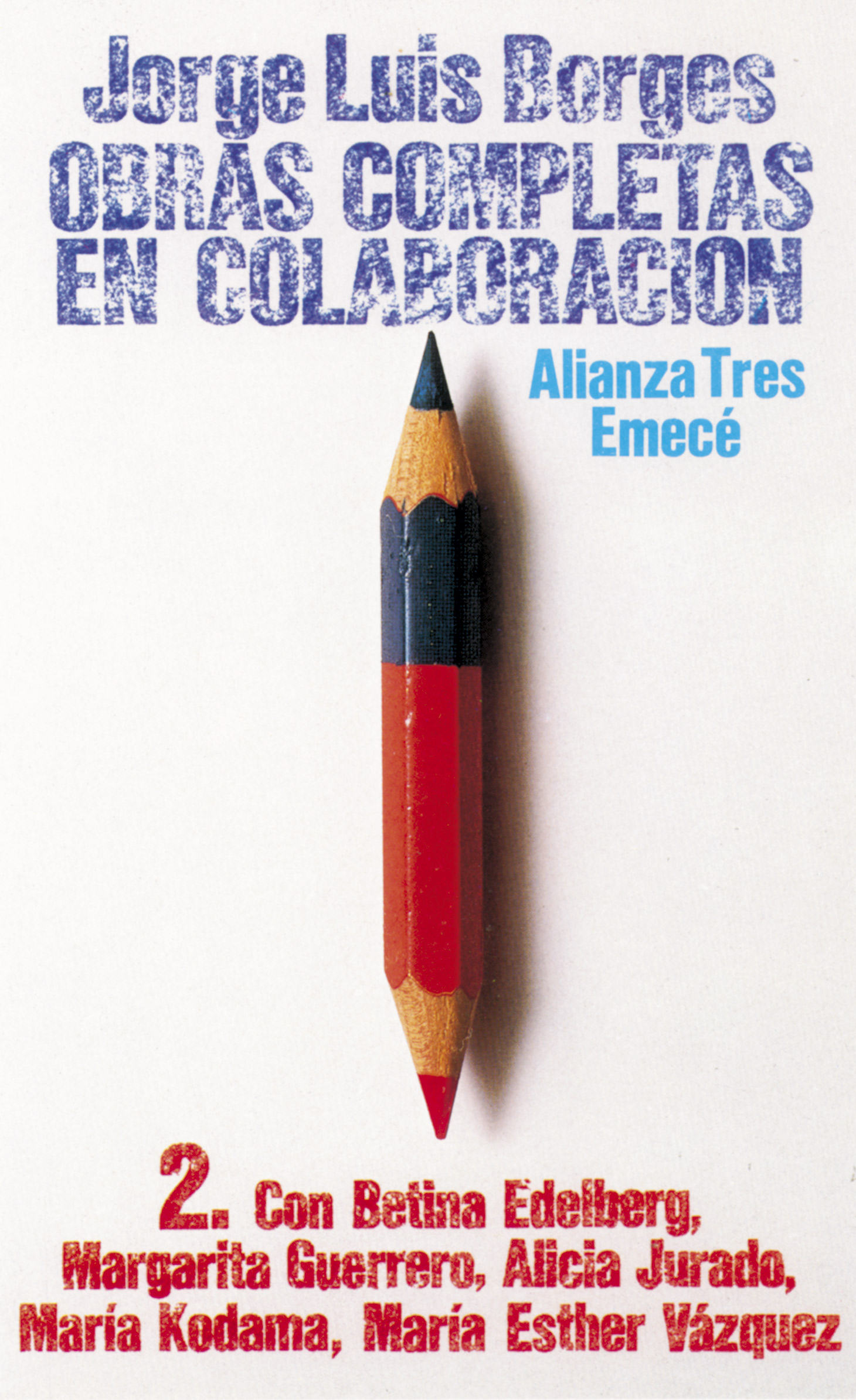
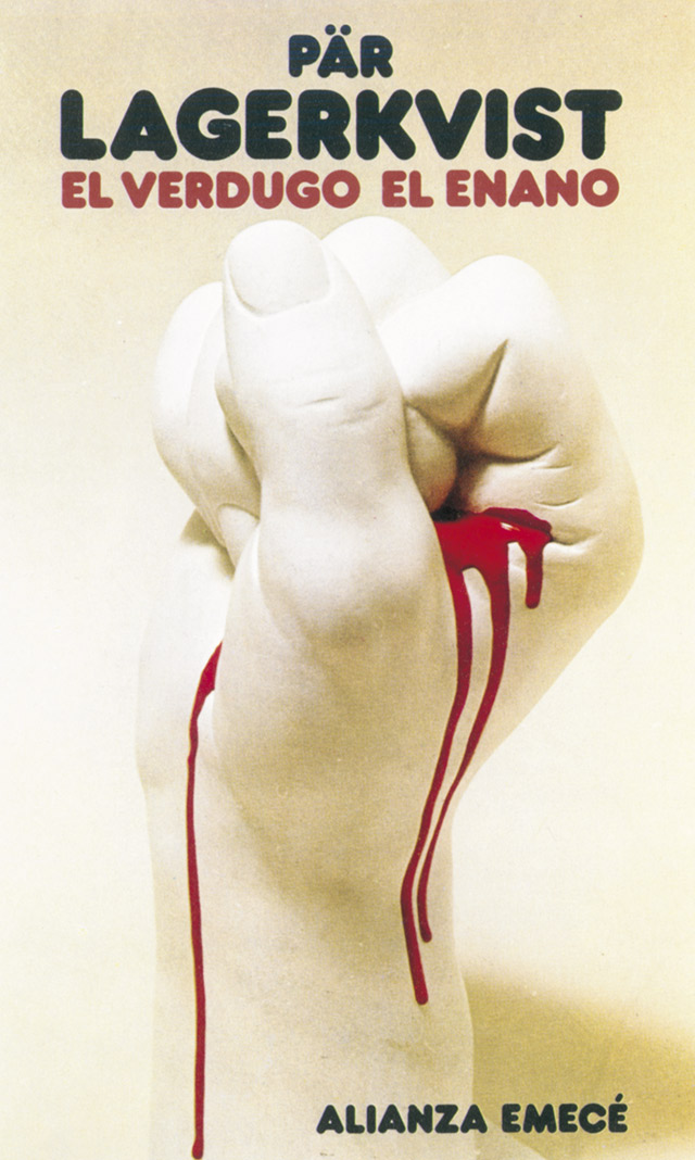
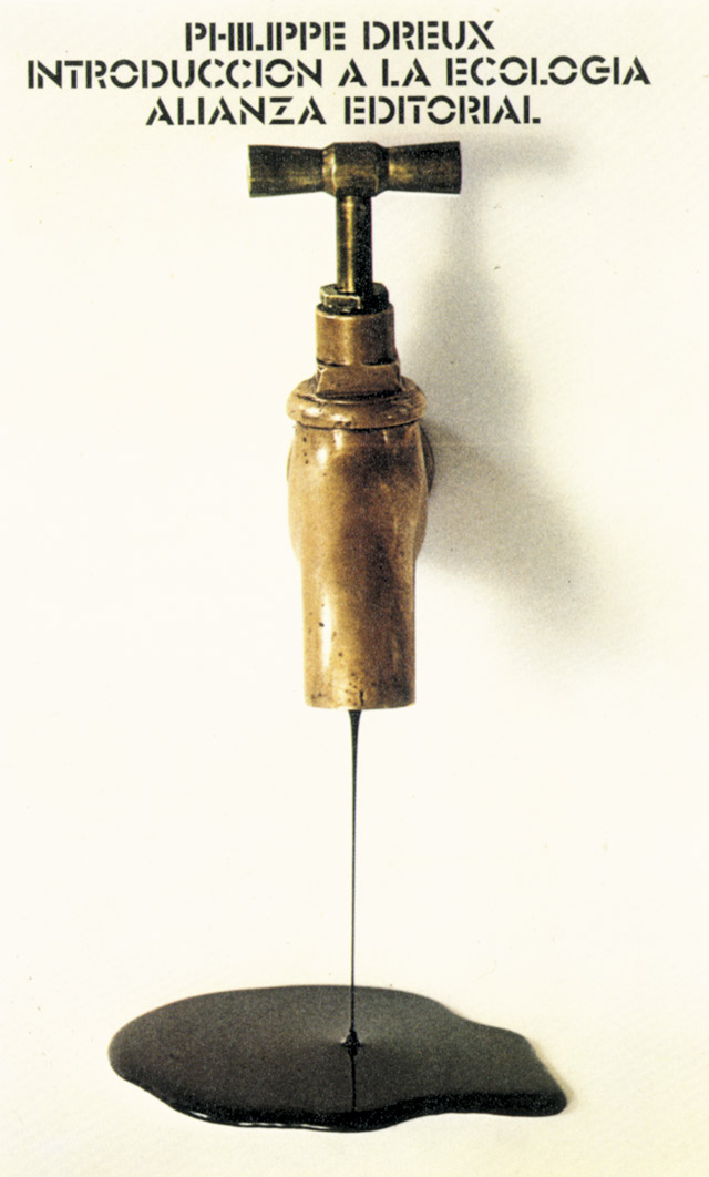
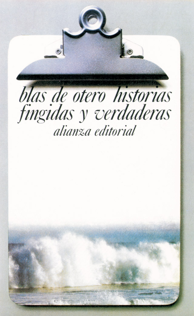

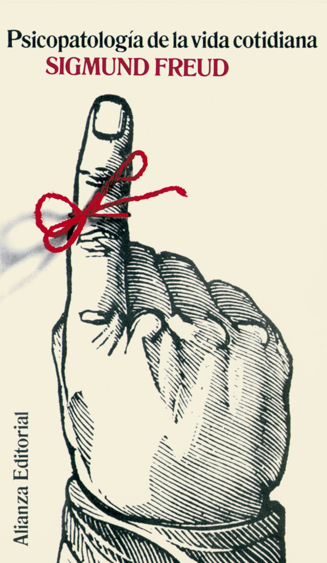
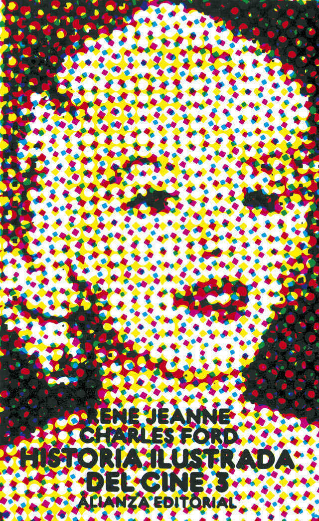
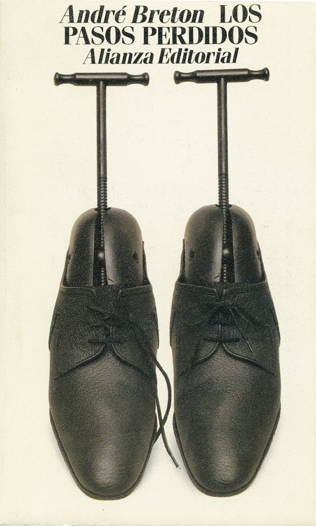
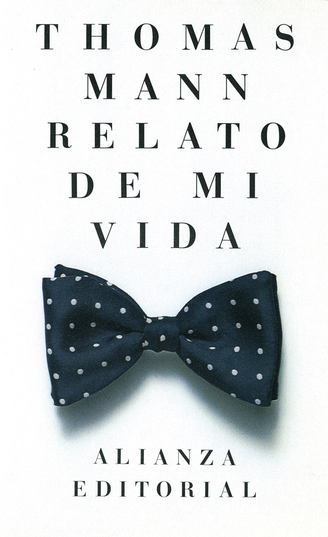
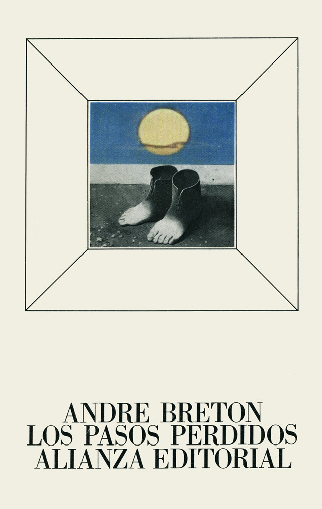
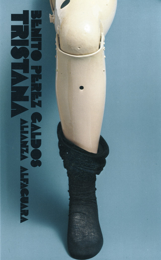
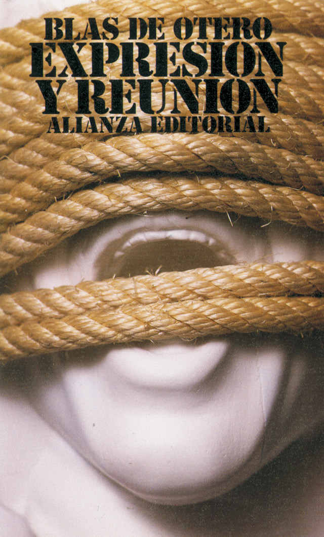
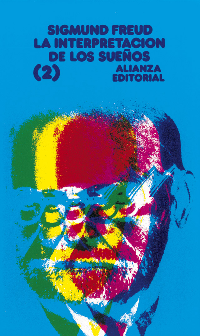
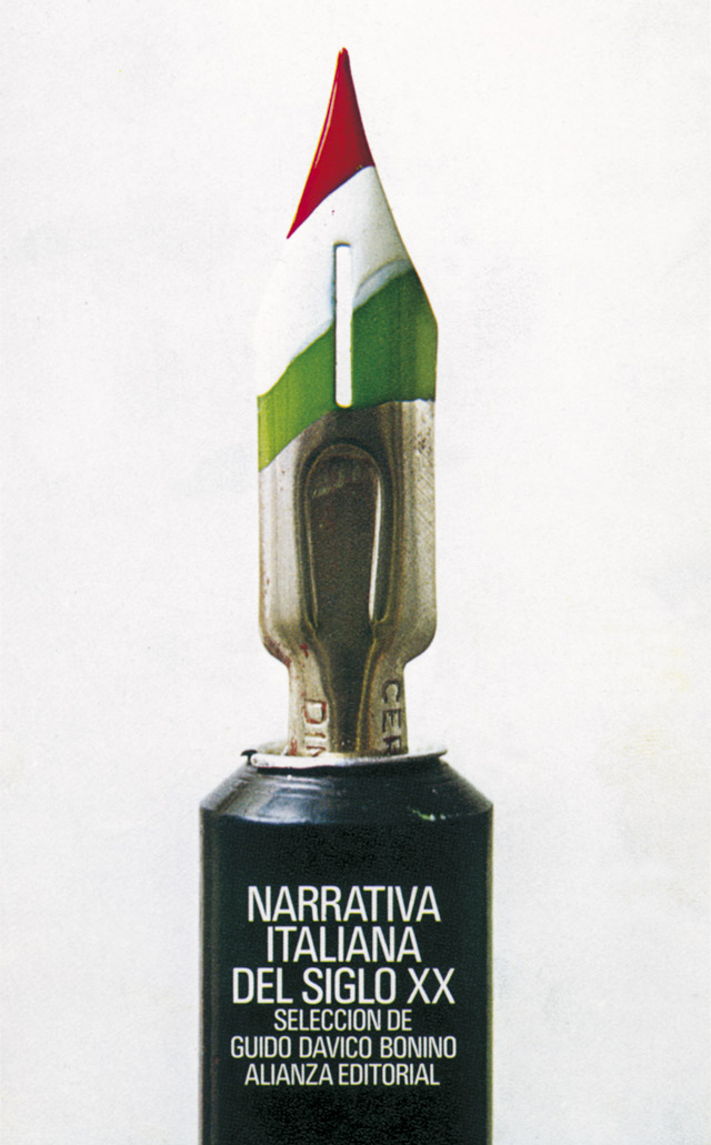
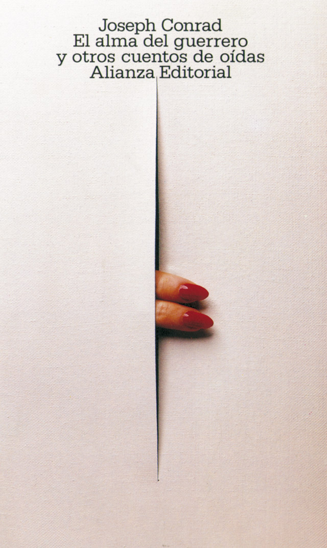
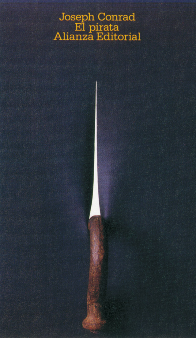
The work that Daniel Gil carried out over his twenty-five years with Alianza Editorial was a landmark in Spanish graphic design. Gil was capable of creating one of those rare exceptions in the world of graphics by achieving a visual identity from diversity using a wide repertoire of resources. The covers designed for Alianza by Gil had no uniform typographical treatment; not even in the way that the publisher's logo was composed. In fact there were no fixed elements on the covers at all – everything, including the logo, title and author's name, was up for grabs.
Daniel Gil made use of any resource which allowed him to put forward his own interpretation of the contents of the book. He created exclusively typographical covers, with the 'ready-made' technique, with resources taken from the techniques of graphic arts such as the characteristic halftone of four-colour printing, paper textures, repetition of objects, and variations on human faces or hands.
Despite this lack of fixed rules and the absence of a rigid use of elements, Daniel Gil still managed to achieve an identifiable style for the different collections of Alianza Editorial. This only adds to his reputation as a designer with enormous brilliance.
Read more about Spanish graphic design on Emilio's blog Graphic Pioneers.