
Fledgling writers from the RCA made a book of essays about London’s Butler’s Wharf, exploring its chequered history from giant tea warehouse to luxury flats. Peter Maxwell takes stock of its assets.
The definition “writer” is wildly non-specific — today, the skills required to be successful in that position stretch far beyond the obvious. As the established outlets for writing dwindle, practitioners have to take on multiple roles, from editor and publisher to distributor and marketer, if they are to present their work to the world. That is partly the thinking behind the collaborative project that students on the Royal College of Art’s MA in Critical Writing undertake in their final year; here they are given a considerable budget and allowed the freedom to produce a collective statement in whatever manner and medium they feel appropriate. The process provides a range of practical experience and the result works as a vehicle for each student’s skills post-university.
“We wanted to do something on London, as it was something that we all had in common” Last year’s graduates produced a small hard-bound book titled After Butler’s Wharf, which contains diverse texts from essays and histories, to interviews and fictions, that together perform a fascinating critical reenactment of the titular Thames-side warehouse. According to the book’s editors, the group wanted a topic that could carry weight in addressing contemporary issues (political, social and economic) and the building’s mercantile past, as well as the story of its subsequent artist-lead repurposing and eventual gentrification. One major challenge was finding a subject under which such a large group with assorted interests could operate — “we wanted to do something on London, as it was something that we all had in common”. Over the past decade, the task of writing London has largely fallen to a small group of psychogeographical writers who prefer to drift along its peripheries; whether with explicit or implicit intention, After Butler’s Wharf stands securely at its center. As a declaration of where the group feels criticism should be in 2013, it argues for a heightened level of attention to material and personal detail, for working at depth, and for the kind of writing that makes rich use of language, both narrative and descriptive.
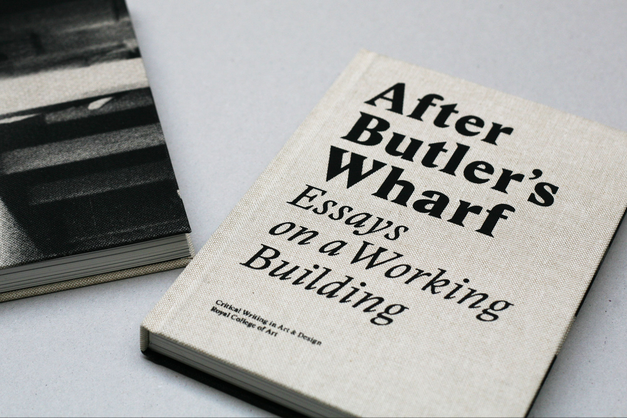
"We had to discover the range of possibilities without losing the wholeness of the book.” This richness also extends to the book’s design. The group decided to work with fellow students from the college’s communications department. For first-year designers Antonio Bertossi and Jörg Schwertfeger this was their second collaboration, and they were keen to be involved from the very earliest stages in order to understand and respond to the content. “It was clear from the beginning that there were going to be different types of texts, and that there was a desire to have these texts treated differently. We had to discover the range of possibilities without losing the wholeness of the book.” One of the most compelling aspects of the pair’s treatment is the use of typography. Serendipitously, both decided independently of the other that Ludovic Balland’s Stanley, a recent derivative of Times New Roman, was the correct and only font for the publication. While its sharp serifs have been designed to provide excellent contrast and so a high degree of clarity at smaller scales, the designers have also used it to create over-sized titles for each essay. It’s a conceit that works closely with the book’s subject, playing on the wharf’s industrial past – “when you enlarge [Stanley], it reveals all those strange little details that give it that legibility, you see that proof of quality and craftsmanship in font making”.
"[After Butler's Wharf] stands outside of time, both an elegy to the building’s past and a prescription for future histories as yet unwritten. "
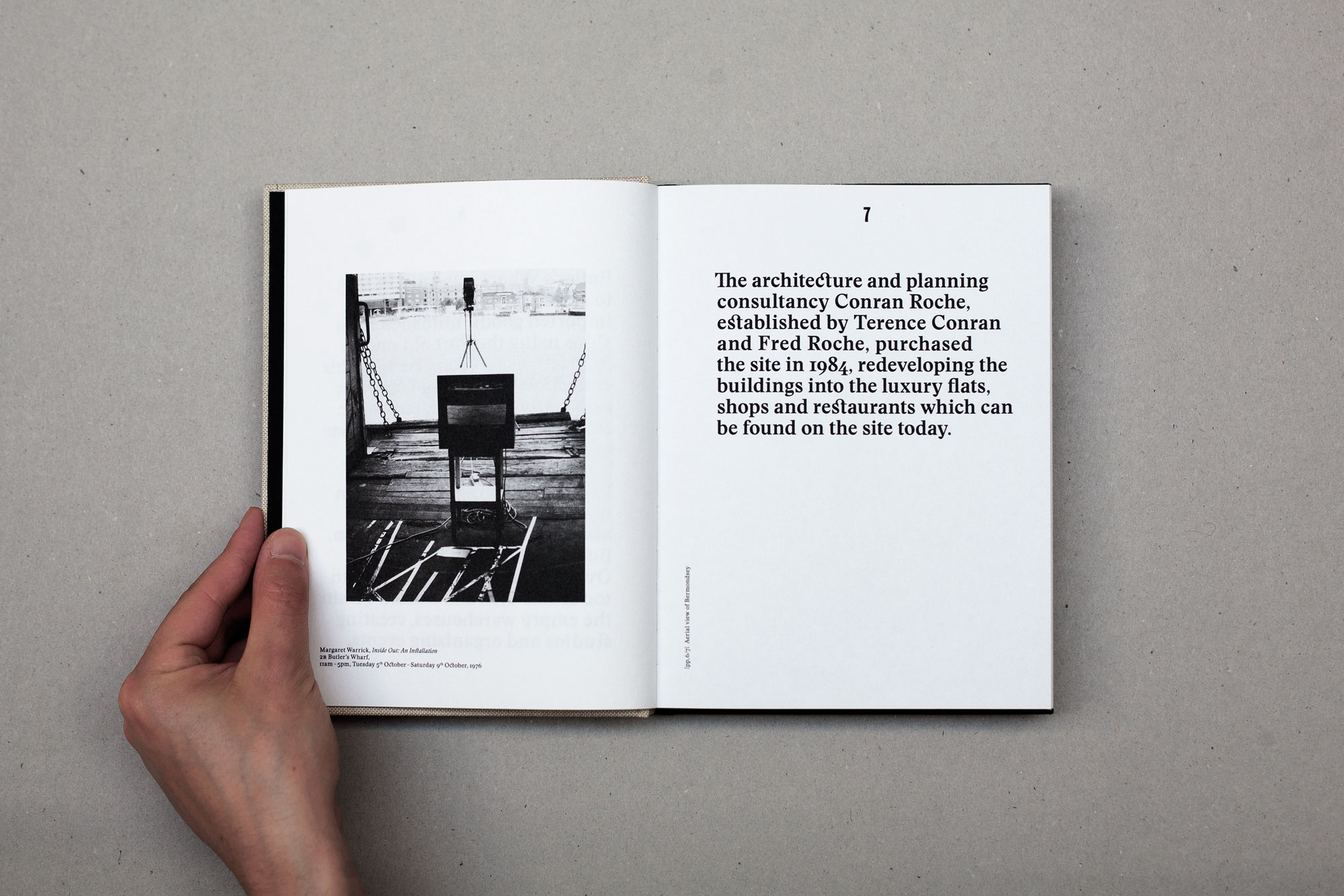
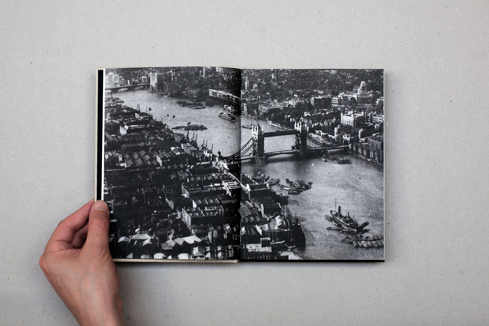
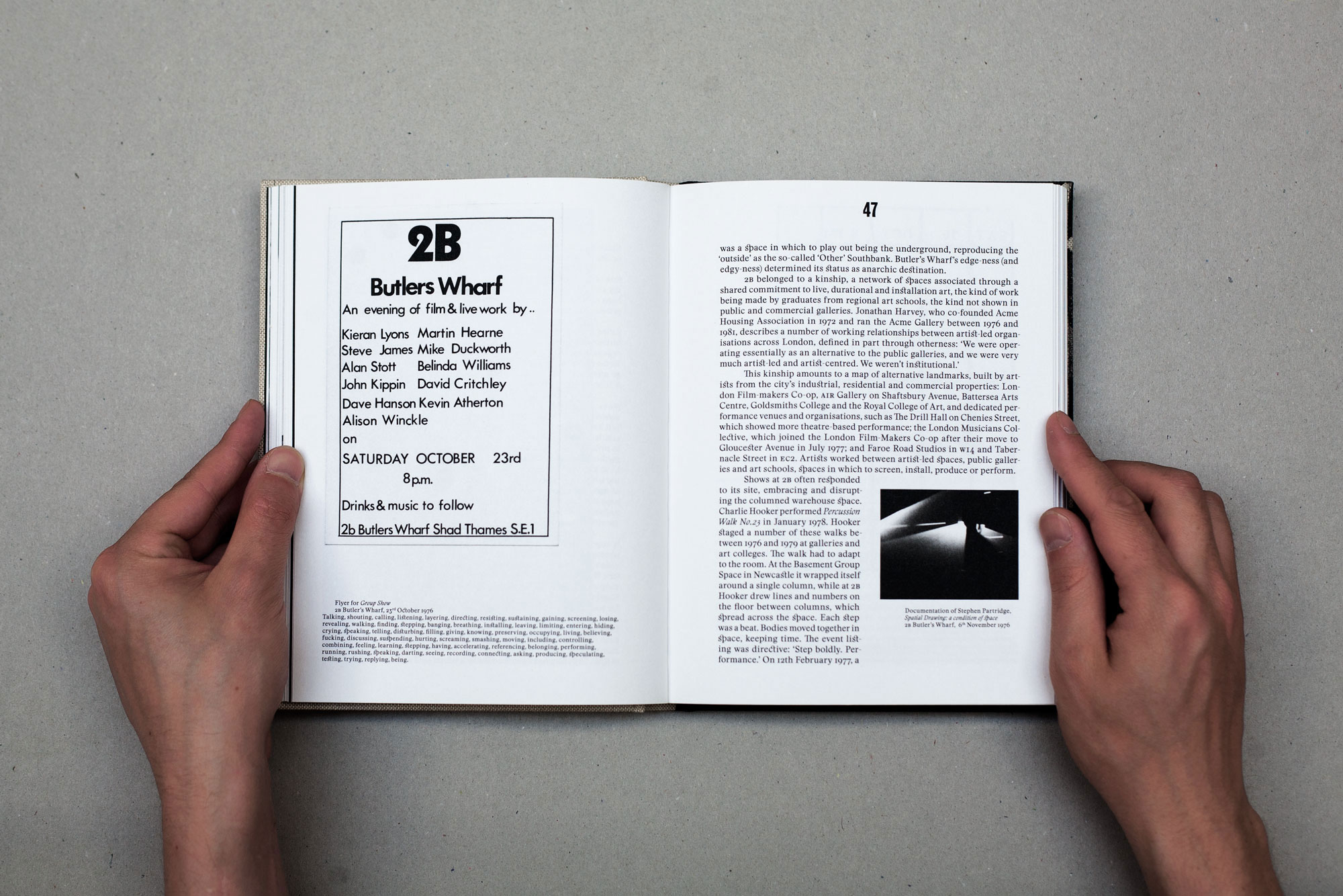
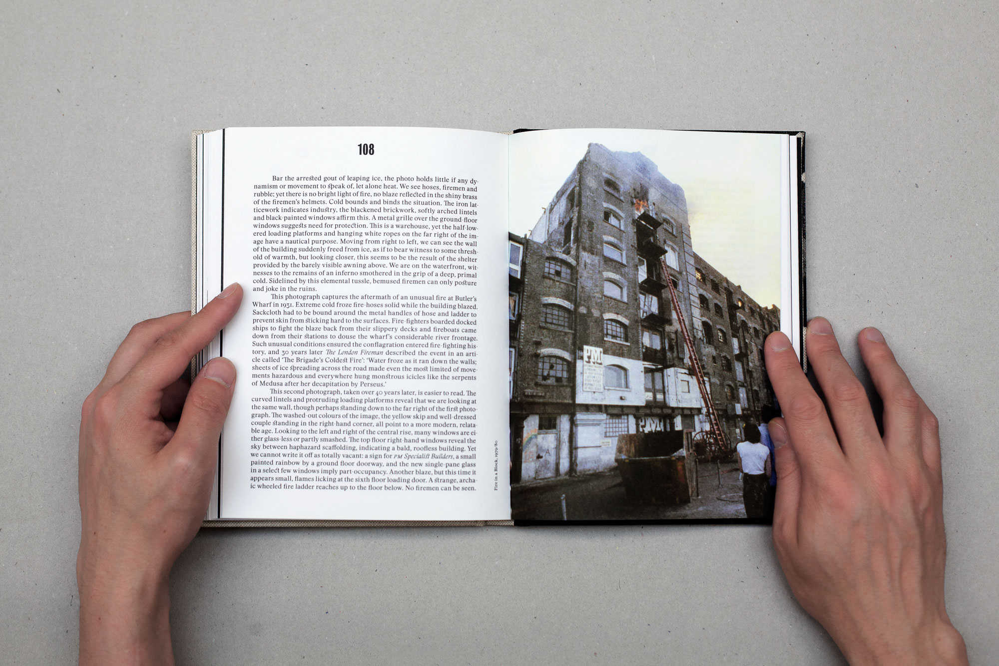
Occasionally, however, it has to wrap itself around some intentionally disruptive citations, creating squared-off pockets of white space that hold the book’s multifarious reference points, much like the building’s storerooms once housed a global assortment of spices and oddments. Likewise, the cover treatment works to reinforce the sense of transhistorical endeavor of the writers’ contributions: brown linen screen-printed with the title in the faintly Victorian geometries of Stanley Poster.An ambiguous image, one that could be from any period in the building’s history, adorns the back cover. Images are also key to the success of the interior layout: taken from a variety of archival sources, their presentation ranges from full-bleed double spreads to precisely offset photographs that lean knowingly on the surrounding empty page; each feels like it was positioned with forensic care. Most images are black and white (a cost consideration) with colour used only when it was deemed crucial, but this predominately somber tonal rhythm with its brief colourful interruptions is well-suited to a publication that stands outside of time, both an elegy to the building’s past and a prescription for future histories as yet unwritten.
According to the editors, the group “wanted there to be a reason for this book to be made other than ourselves, we didn’t just want it to be a showcase for us, we wanted be able to argue the market pitch.” As a testament to both the building it addresses and the collaborative process, After Butler’s Wharf certainly has a clarity of concept that belies the experience of its student makers. Copies of After Butlers Wharf can be purchased at cwadrca.bigcartel.com