
Sarah Boris's new book Le Théâtre Graphique isan ode to visual story telling and beautiful craftsmanship. Here, the author describes a tale that began in the dramatic setting of a theatre in Le Havre....
This book project began life as an exhibition in a theatre - could you tell us about that first chapter?
From May to June 2015, I was invited to exhibit at the graphic design festival Une Saison Graphique in Le Havre, France. The particularity of the festival is that around six graphic design studios (in the past from France, UK, Switzerland, Holland, Korea etc.) are invited to exhibit in different spaces of the city. Each designer is given quite lot of freedom as to how they wish to present designs within the exhibition space and works closely with the venue hosting the exhibition.
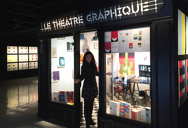
Some studios focus on presenting a retrospective or create a new body of work, while others create a site specific installation. The space I was allocated was the exhibition space of the city's main theatre, a very big space with a large footfall. Having my exhibition in a theatre space was a true invitation for me to create a theatrical presentation of my work as designer.
I came up with the idea of staging a representation of my design practice and worked closely with the theatre's scenography team to build a design studio within the exhibition space. The idea was to base myself in the studio for the duration of the festival, inviting people to discover how graphic designers work, what their job involves, how to commission a designer and for people who already knew simply come in to discover work in the studio or chat about design.
The other 'theatrical' strand of my exhibition was that I installed a design confessional in the space where people could come and confess their worst design sins and addictions. This is a project that I hope to stage again somewhere else at another design festival as well as in a virtual capacity.
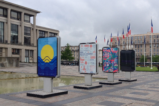
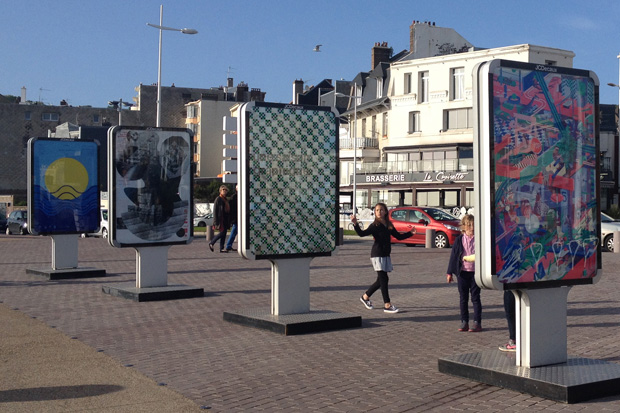
The second particularity of the festival is that each studio is invited to design one poster which is printed by Lézard Graphique, one of the best screenprinters in Europe, based in Brumath. The posters of all the designers are then placed in JCDecaux frames around the city to advertise the design festival.
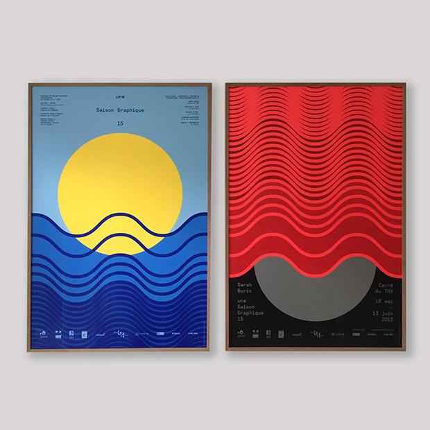
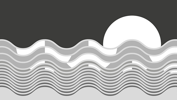
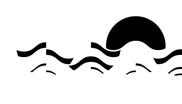
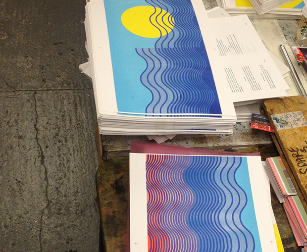
I created the poster of the sun and waves, simply as a ‘pied de nez' to a city often perceived as grey by people from the outside, and going for curves as a stark contrast to Auguste Perret's city centre architecture for which the city is so well known. It's also part of my optimistic, hopeful spirit, to put 'sunshine' wherever I can in one form or the other and deploy simple graphic symbols to lift people's spirit up. People living in the city were taken by the poster from what I heard, many people were talking about it and feeling more positive about their city. I am not sure if the symbol remains but I am happy it gave a positive outlook then. I feel in this sense the design was successful.
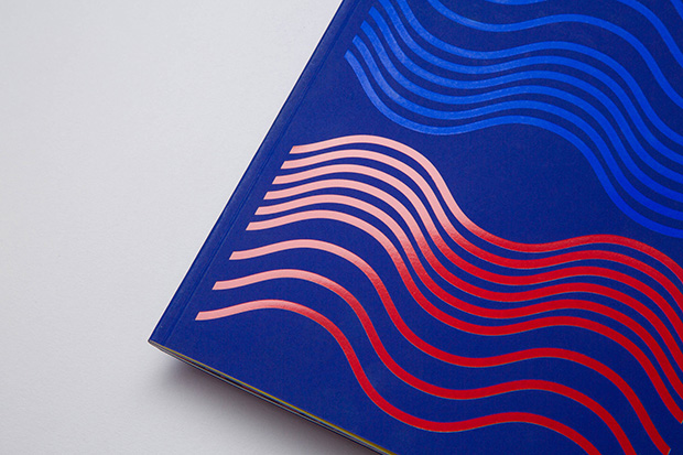
The space I was invited to exhibit in then asked me to also create a poster to solely speak about my exhibition. This is when I created the poster with the waves flipped around in red realising the sea could also look like a theatre curtain by simply changing the colour coding.
How does the visual concept from the exhibition posters unfold in the book?
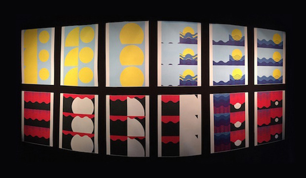
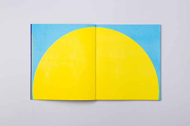
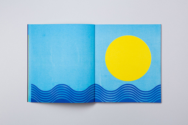
From designing one poster, to another, it felt natural to do a book. It became an urge. I had less than two weeks until the beginning of my exhibition to design and produce the book, but I knew it would be a key part in explaining my practise as a designer, my love for print, how I think, work and create, and how an idea for one project can lead to another. I could imagine the pages and sequences. The posters each become one sequence (spread) in the book. The original book is made of twenty-four sequences (over forty-eight pages).
I was very luck to work with Hurtwood Press who produced the first version of the book and were completely on board with my idea to show the book in the exhibition space at different production stages, hanging the flat sheets in the space prior to trimming. I was keen to explain to visitors who are not familiar with the design process how a book is made and the various stages of the making. Showing the physicality of it triggered lots of questions from the visitors on the process. This is exactly what I was looking for, a dialogue, exchange and sense of engagement, I wanted to raise discussions on what graphic design is and it's different facets with a wide public.
I naturally wanted to call the book by the same name as the exhibition: Le Théâtre Graphique it felt like the perfect title to describe graphic design in motion within a book through colour and shapes and explicitly referring to the theatre figured by the red curtain.
Taking the form of a large flipbook, Le Théâtre Graphique is an exercise in form and colour, where the theatricality of a rising curtain is reimagined through the performative cycles of nature; night and day, sun and moon, the shifting tide.
Tell us about the book’s production – how has it been made?
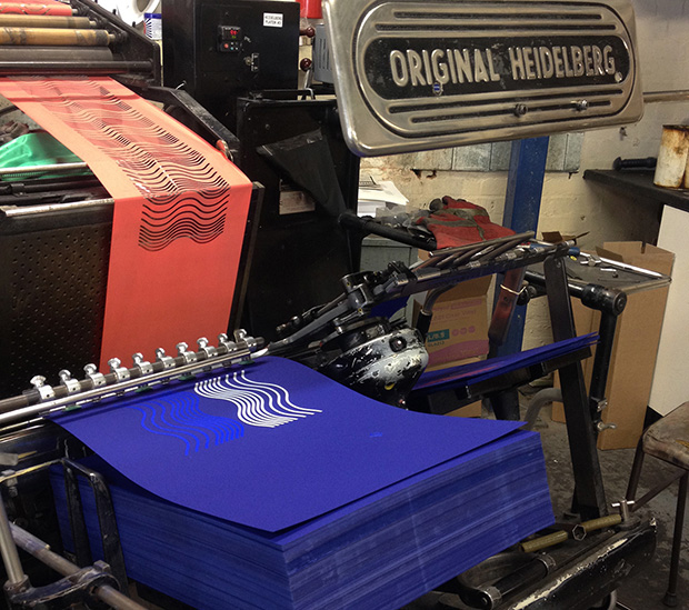
The new edition of the book has been riso printed. I am really happy that the book is published with a completely different print method. That in itself was an interesting challenge and a great learning on the riso technique. It meant re-doing the entire artwork for the book, rethinking the format, rethinking colour mixes. I had to separate out each layer in black and white and it's really hard to imagine how colours will come out. The two images above show different layers for different colours. It's interesting to see the artwork this way and it gave me new ideas.
The inside is riso printed by Hato and the cover has been foiled on a beautiful paper by Arjowiggins. The foiling was also done in London so I think we are all happy to have a book crafted and made locally by lots of different specialists. The human aspect and 'not massed produced' element definitely contributes to the personality of the new printed version of the book. Each book is unique due to the riso printing factors.
What has been the most interesting challenge you encountered throughout this project?
Re-doing the book and preparing layers for riso has definitely been a challenge as I was not familiar with this and I sometimes find it hard to go back on a project which has already been done in one form. It's also very challenging to communicate about a project that has already been out there. Sometimes I worry that I have shown it too much and that people are going to get bored to death with it. So it's all about finding fresh ways to engage with it and it's also about remembering that only a small network of people initially saw the project. The idea is to share it more widely and remember that lot of people have not seen it yet and are happy to discover it still. Initially too, it was not available to buy (it was an edition of two) and publishing it with Hato was also a way of sharing it physically with a wider audience.
What is special about a book with no words?
A book with no words is an invitation to meditate and contemplate. What's special is the imagination it triggers, the reader becomes the storyteller. I like to think of the words that can emerge from 'reading' no words, the thoughts one has when flicking through it. You can invent your story, you can take what you want from it and put your own words to it. It can also generate discussions.
Le Théâtre Graphique by Sarah Boris, published by Hato Press. Buy a copy here.
The book is launched tonight, 5 May 2016, at The Whitechapel Gallery London.
There are further launches at— Librairie du Centre Culturel Suisse, Paris, France on 11 May 2016Librairie La Galerne Le Havre, France on 12 May 2016
Find out more about Sarah Boris and her work.
Read our a Heroes article by Sarah Boris for Grafik.


