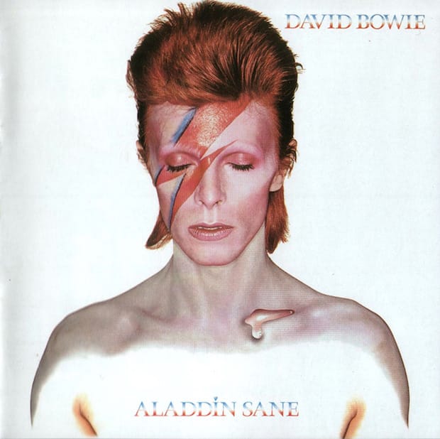
With his flame-red hair and lightning bolt make up, the Brian Duffy-shot cover of Aladdin Sane is perhaps the most copied of David Bowie’s iconic looks. Elsie magazine’s Les Jones unpicks its power.
I was thirteen and a half when David Bowie released the album Aladdin Sane in April 1973. It was the first album I ever bought. It was also the first album Bowie had released from a position of stardom – his previous album, The Rise and Fall of Ziggy Stardust and the Spiders from Mars having catapulted the singer-songwriter into interstellar space, where he and most of his music seemed to emanate from.
It’s a very famous album cover, one that most people will be familiar with. The image was shot by photographer Brian Duffy and features a flame-haired Bowie, eyes closed, mouth slightly open with the iconic red and blue lightning bolt streaking across his face. For me, it’s an era-defining image, a statement that helped to drag pop music out of the long-haired, denim-clad era into the colour and spectacle of glam rock and the fusion of music and performance.
Of course, I was unaware of that historical context at the time. In 1973, I was just an impressionable kid. But I was utterly captivated by Bowie’s music and image; both were like nothing that I’d seen or heard before. Within weeks of buying the album my bedroom walls had been transformed from a feast of football greats to a shrine to my new idol.
The cover itself is striking in its simplicity, yet filled with ambiguity and intrigue. Shot on a clinical white background, there’s nothing to distract the viewer from the artist, except that is, for the strange, clear liquid that drips from Bowie’s collarbone. That’s always intrigued me. I’m not sure there’s ever been an explanation as to what it is supposed to be or what it represents.
The sense of ambiguity is added to by the fact that Bowie’s eyes are closed. Is he alive or dead, human or alien, accessible or withdrawn? It’s a fascinating piece of alienation, an intriguing barrier between the artist and the viewer.
Looked at in the social context of Britain at that time – power cuts, the three-day working week, the oil crisis, a miners' strike (these were gloomy, pessimistic times) – the album cover is a startling statement of colour, individuality and otherworldliness that fascinated and inspired young people across the country, myself included.
It’s no understatement to say that this album cover and its musical content had a massive influence on my life. It opened my eyes to the art of the possible and generated a love of music and creativity that are both still as strong today as they were in the months after I bought the album.
elsiemagazine.com
Les Jones
Designer and photographer Les Jones runs Elsie magazine from his studio in North Shropshire. Focusing on type, design and photography, Elsie has just launched its third issue which is themed around stickers. The nub of the idea came from a trip to London, where Jones filled some spare hours with some street photography and was fascinated by a sign for Bankside Gallery that was covered in stickers. In the issue, Jones investigates some of the artists behind those stickers, taking him all across the globe.
Aladdin Sane
Described by Bowie as “Ziggy goes to America”, the Aladdin Sane character was a progression of Ziggy, who was retired from live performances three months after the record’s release. Much of the album was recorded during Bowie’s 1972 US tour, hence why the artwork features place names after each of the titles. Bowie’s lighting bolt make-up, which directs his face, was conceived by the artist himself and was meant to express the duality of his relationship with America – at once loving the opportunity to perform but finding life on the road a bit of drag. He admitted later that the album’s title was also a nod to his brother Terry, who was diagnosed with schizophrenia.

