
Conceptually driven and politically minded, Glasgow School of Art graduate Stephanie Roden combines fun, meaningful ideas with an inventive approach.
How would you describe your approach to design?
It depends whether I'm working as part of a team or alone. When I'm working on my own projects, I work through all my thoughts and ideas by writing them down and documenting them rigorously until I reach a concept that I am happy to work towards. To me it's very important to establish the objective and personality of each project and so often it works best for me to develop this first then pursue the visuals and details afterwards. I don’t like work which appears visually interesting at first, but on closer inspection it seems hollow or ill-thought-out.
When I'm working in larger groups my approach differs, often I find workshop based activities and brainstorming sessions are the best starting point. While branding our Degree Show (Assembly), we agreed that if at any point we found the project was growing tiresome or was no longer fun, we would change tactic. I think this is a good way of working within a group; when a project is done under strain it really shows.
What was the concept behind your Assembly Degree Show identity?
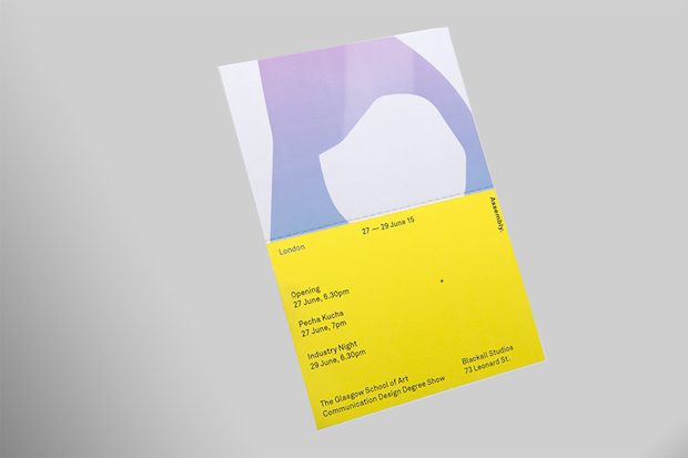
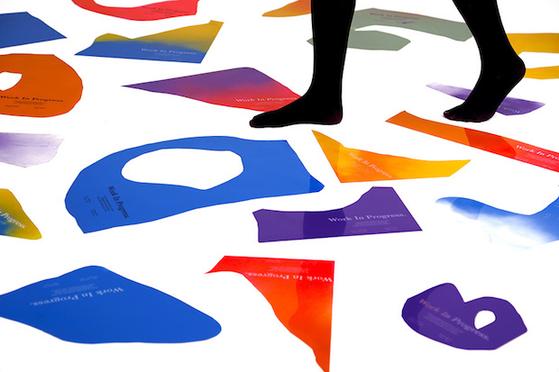
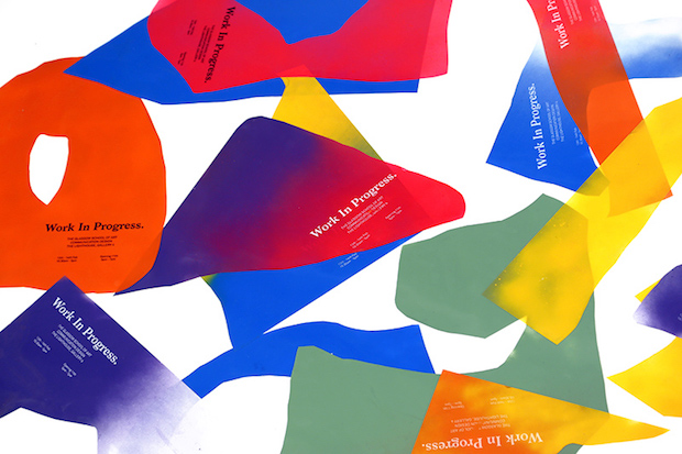
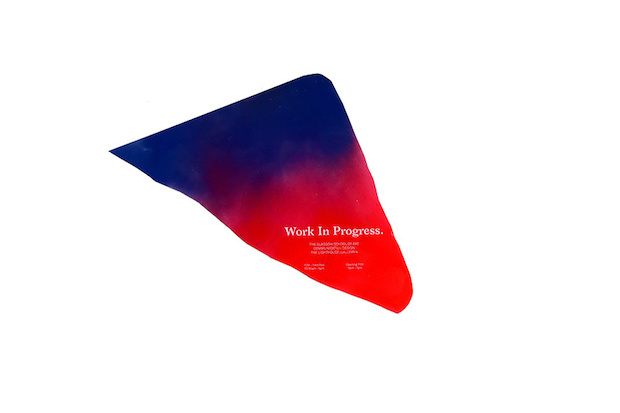
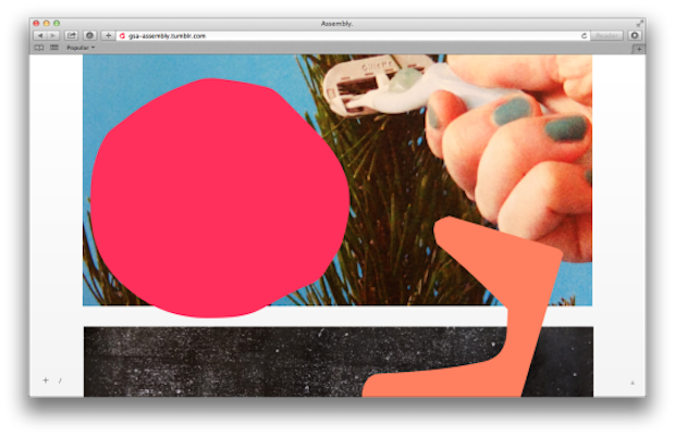
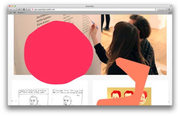
I worked on this project with four other classmates (Michael Bremner, Sarah Bethan Jones, Amy Hinchliffe and Sam Rowe). We wanted to reflect the energy of a group of soon-to-be graduates, as well as the experimental quality of our course. We initially wanted to make a logotype from large, freeform letters we had cut out of paper during a workshop we held one morning. Eventually we realised that the offcuts from this workshop were far more interesting than the letterforms themselves, and so we began to implement the shapes throughout the brand identity. This felt appropriate as we wanted to emphasise the process-lead approach within the course, which puts great focus on development work being as important as final outcomes.
This idea of ‘showing the process’ was also reflected in our blog, which posted snapshots of the studio and show-builds throughout the year, slightly obscured by the abstract shapes.
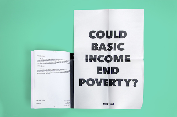
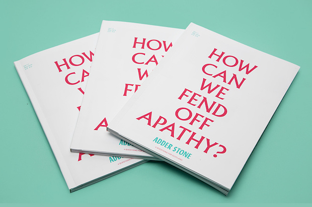
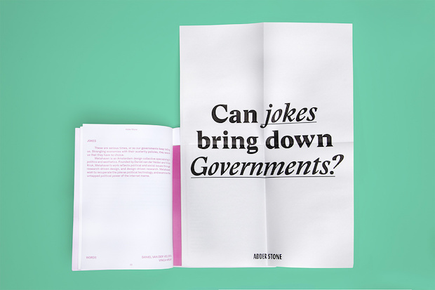
A lot of your work has a strong political element, what responsibilities do you think designers have? And how does that manifest itself in your work?
I’ve been interested in political and social justice discourse for years, but it was only really in my final year that I chose to make work to reflect this. Jonathan Barnbrook was one of the first graphic designers I became interested in when I first went to art school, I remember reading in Barnbrook Bible that graphic design is a ‘culturally valid form of expression’. This resonated with me and I feel it’s important to consider design in this way; though graphic design can have very commercial functions, it’s important not to underestimate its potential to promote political change. I’m certainly not under any illusions that a graphic designer can do this single handedly, but if visual communication is about making information engaging and accessible; graphic design does have the ability to educate and mobilise people into making the changes themselves.
Of course designers shouldn’t feel obligated to only make politically-minded work, but I would say whilst working in industry designers have a responsibility to consider the impact their work has on the audience it targets.
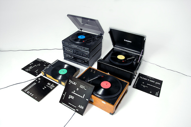
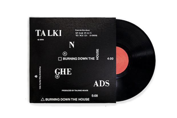
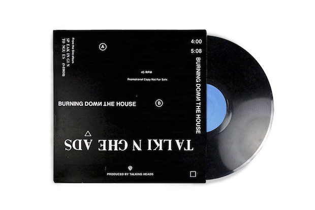
Tell us a little bit about your StemDeck project.
StemDeck was a project I worked on with my classmate Imogen Ayres, which explores the role of the physical object in music distribution now that purchasing digital music is the norm. We were interested in designing a new way of releasing music; something to encapsulate the physical, social and interactive experience of seeing a live band. What we came up with was the idea of releasing an album with the tracks from each instrument pressed on separate vinyl records. This would mean for the album to be played with all the instrumental parts, many record players would have to be sourced, turning it into something of a social experience - almost like a live performance, or band rehearsal, of vinyls. This also allows the music to be more dimensional, it takes up a physical space within a room. We chose Talking Heads due to the conceptual relationship between this idea and their Stop Making Sense tour (which involved each musician coming onstage incrementally with each song) as well as David Byrne being outspoken on the changing landscape of the music industry with the rise in popularity of services such as Spotify.
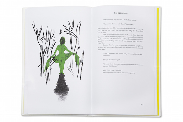
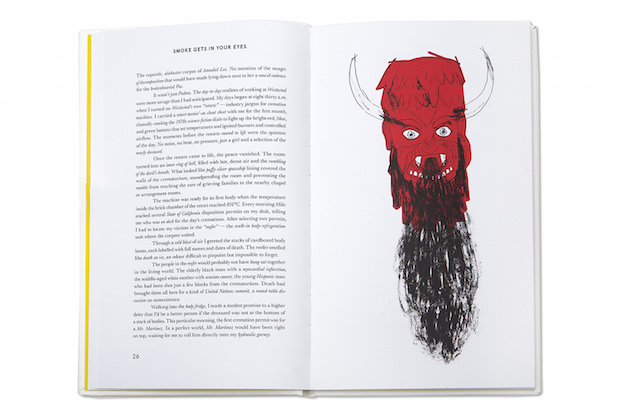
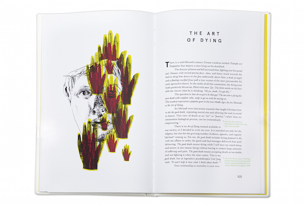
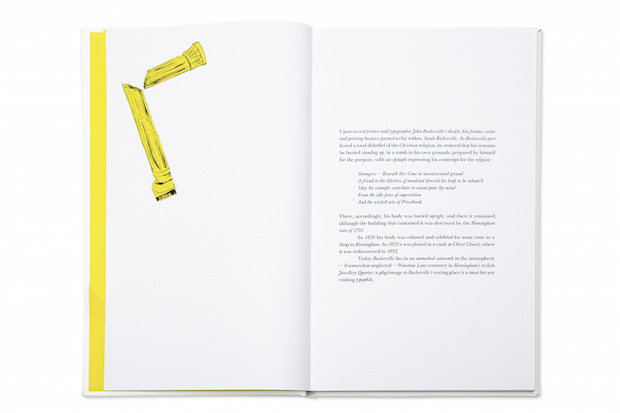
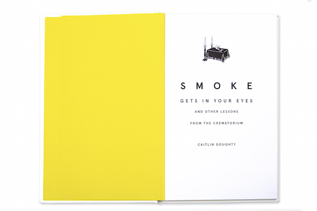
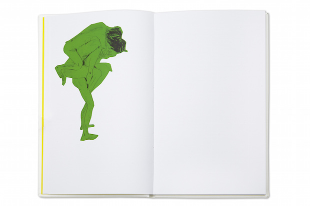
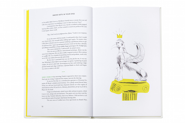
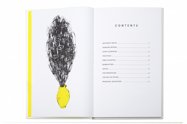
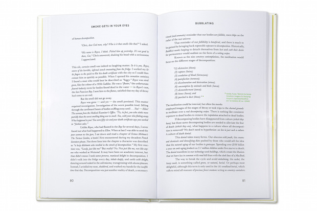
Tell us a little bit about the process of collaborating with Sam Russell Walker for the book Smoke.
Working with an illustrator always makes for a really enjoyable project. We both had our own skill sets to bring to the table and could rely on each other to carry out our own tasks, which meant we were able to take this project from start to finish within a very small time frame. Sam’s illustrations are great to work with in a book format, so from the start, the whole process of choosing layouts and typographic elements to compliment the work was great. We found it only took a couple of conversations to establish exactly what it was we wanted the book to be like, we have very similar tastes so it worked well.
What’s next?
Right now I’m working on small freelance jobs in Berlin, and I have an internship lined up with Graphic Thought Facility later in the year. Thinking about ‘life after art school’ is pretty daunting, but I’m trying not to worry about it.
stephroden.com