
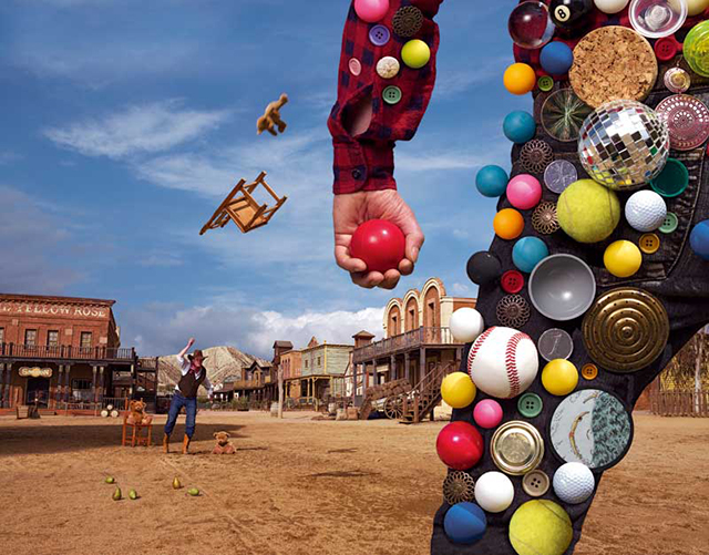
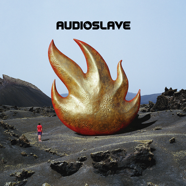
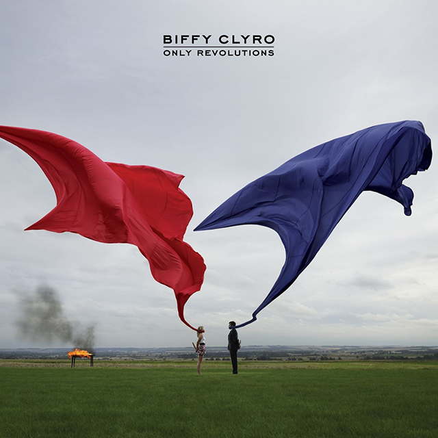
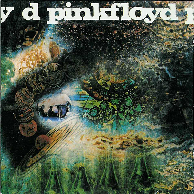
Responsible for creating some of the most iconic LP covers of all time, Stuart de Rozario sings the praises of a unique talent – the late, great Storm Thorgerson. I thought choosing my design hero would be an easy one, although not wanting to do the Crouwels, Müller-Brockmanns and Rands of the design world, I’ve chosen an equal not often mentioned in creative circles – the great album cover designer and video maker Storm Thorgerson. If you’re not familiar with his name or work, you will instantly be able to visualise his striking surrealistic style on albums for artists/bands such as Pink Floyd’s Dark Side of the Moon to Biffy Clyro’s Only Revolutions, Audioslave’s Audioslave, to Steve Miller Band’s Bingo, to name just a few.
I’ve chosen Storm Thorgerson as my hero for many different reasons, mainly due to the fact that he had complete conviction in what he believed in, undeterred by record company big-wigs who wanted boring photographs of musicians on LPs, he revolutionised album design by creating wonderful imaginative art, photography, design and performances. Thorgerson changed the game.
Of Norwegian descent, Storm Elvin Thorgerson was born in Potters Bar, Hertfordshire, in 1944. He grew up in Cambridge and studied at the Cambridge High School for Boys where he shared the same school with Pink Floyd founding members Roger Waters and Syd Barrett (Barrett was a year younger and Waters a year older). Thorgerson went on to study English and Philosophy at the University of Leicester before studying Film and Television at the Royal College of Art.
During his studies at the Royal College of Art, Thorgerson shared a flat with fellow student Aubrey Powell, who at this time worked as a scenic designer at the BBC, rubbing shoulders with artists, musicians and other creatives of the time, including Pink Floyd's familiar faces Waters and Barrett. In 1965, Thorgerson and Powell started Hipgnosis, a design company specialising in creating artwork and packaging for rock bands and musicians. Thorgerson’s big break arrived when he persuaded old friends from Pink Floyd to allow him to design the band's second LP, A Saucerful of Secrets in 1968. It was a masterstroke and the beginning of a collaboration of outstanding creative genius spanning over forty decades for Thorgerson and ‘The Floyd’. A Saucerful of Secrets is a visual psychedelic whirlwind of colours, patterns and blurring boundaries of objects which Q magazine described as the designers attempting “to mirror three altered states of consciousness: religion, drugs, and Pink Floyd music”.
Thorgerson’s inquisitive, often tongue-in-cheek approach towards design (influenced by surrealist artists René Magritte and Man Ray), was predominantly photographic or film orientated (admittedly due to a lack of drawing skills). Preferring to capture an unusual moment in time with props by creating the unexpected on an elaborate photographic shoot rather than depending on any special effects wizardry or computer manipulation, he revealed that “I prefer the computer in my head to the one on my desk”.
Thorgerson mainly used a Hasselblad medium format camera for his work, which gave a square film format more suited to album cover imagery. He went on to develop unique photographic techniques using Infra-Red technology via a makeshift darkroom in Powell’s bathroom, manipulating photos through multiple exposures, airbrush re-touching and cut and paste techniques to create his desired vision.
He was fascinated with oppositions and confrontations such as digital vs analog, photography vs painting, music vs art, art vs product, and normal vs strange. Thorgerson strived to create mystery with reality by combining illusions and trickery, stating that to be a great in his field was to capture the imagination of ‘the punter’ (Thorgerson’s term for viewer) with the effect of realism, capturing the imagination. He once remarked, “The camera never lies, or does it?”
Thorgerson described in an interview his approach to a new project: “I listen to the music, read the lyrics, speak to the musicians as much as possible. I see myself as a kind of translator, translating an audio event the music – into a visual event – the cover. I like to explore ambiguity and contradiction, to be upsetting but gently so. I use real elements in unreal ways.”
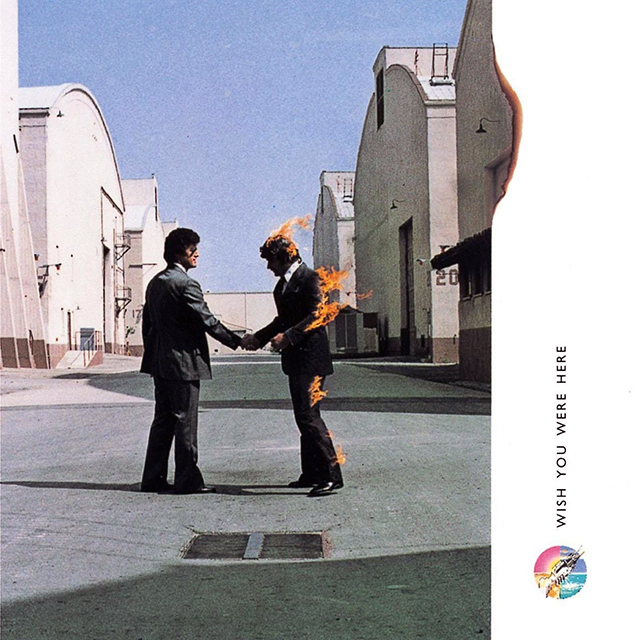
A classic example of this approach and my favourite Thorgerson piece is also his strongest most elaborate artwork for Pink Floyd’s Wish You Were Here (1975). Thorgerson summed up the title of the LP by using the word ‘absence’ as a concept throughout the album's packaging, it was a stroke of genius – this allowed Thorgerson to translate his visions of absence with the music in a daring and provoking way. The title of wishing that somebody is in the present itself is a form of absence.
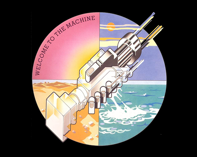
Thorgerson used the ‘absence’ theme and created four photos for the LP’s front, back, inner sleeve and outer packaging. Also, illustrating the four basic elements: earth, fire, air and water (representing the four members of the band) and a robotic mechanical handshake (a gesture that should be filled with warmth and meaning, but is often reduced to a cold, empty ritual). The illustration also represents a song on the album: Welcome to the Machine.
A double gatefold LP, the cover photograph was inspired by a conversation Thorgerson had with the band about people tending to conceal their true feelings, for a fear of getting burned. ‘Getting burned’ was also a common phrase in the music industry, often used by artists who were denied royalties. Thorgerson thought that it would be neat idea to actually set a man on fire by depicting two businessmen shaking hands on a deal (an empty gesture). The businessman who is getting burned is theoretically the musician having his royalties taken.
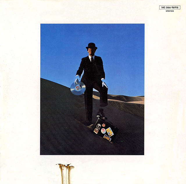
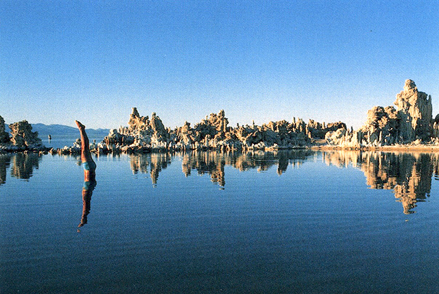
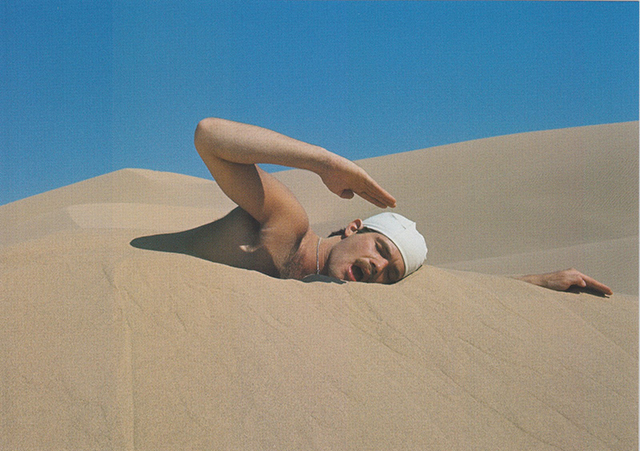
The image is iconic, real and surreal at the same time, an outrageous, ballsy thing to achieve, but that was Thorgerson – a man with infinite ideas, vision and the sheer determination to create a breathtaking visual masterpiece regardless of lengths he’d go to achieve them. The absence theme continues on the back cover, a faceless man in a suit with no wrists and the inner sleeve has a swimmer diving into water with no splashes or ripples around him. There's also the absence of water as a swimmer swims in sand.
At the time of the album's release, Thorgerson added one final element of absence by insisting that the entire LP should not be seen but shrink-wrapped in a black opaque plastic sleeve with the illustration of a robotic mechanical handshake sticker (by George Hardie) to bind the packaging. It's an incredible piece of graphic design that has been etched in album art history.
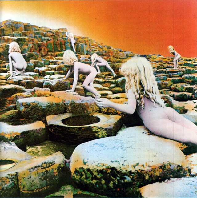
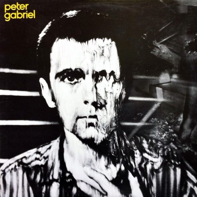
Other special mentions go to flying a giant inflatable pig over Battersea Power Station for Pink Floyd’s Animals (1977) and the unforgettable striking black background reflecting triangular prism for Dark Side of the Moon (1973) – probably the most recognisable artwork of all time. Also the eerie blonde naked children climbing the Giant’s Causeway for Led Zeppelin’s House of the Holy (1973) and Peter Gabriel’s melting face on his self titled 1980 LP.
There are so many artworks and videos of Storm Thorgerson’s genius that it’s hard to stop myself writing about them all. I never came close to meeting Storm Thorgerson, I found out through various media sources he was an incredibly compelling man, totally immersed in doing things his way or the wrong way – a perfectionist. He was a thought-provoking and an intellectual designer, never shying away from confrontation, whilst having the balls to do the outrageous.
One thing that can be said of Thorgerson’s artwork is that he is synonymous with the bands he worked with. He had a knack of creating extraordinary imagery out of simple objects, places and situations and giving the music another dimension – encapsulating their sound with his vision. Thorgerson revolutionalised the album cover industry, creating surreal dislocations and disturbing juxtapositions, radicalising the stuffy grey-suited recording business hierarchy into his way of thinking. A prolific designer, he created nearly 200 album covers and a staggering amount of pop videos – a phenomenal output. His ground-breaking work spanned over forty years and was nominated for seven Grammy Awards. Since his passing in 2013, a creative absence has been left – I’m still wishing you were here, Storm Thorgerson.


