Flexibility and accessibility were integral to Maddison Graphic’s designs for The Streatham Street Manual. We talk to the studio about how to make a report about South London regeneration projects fun.
Can you begin by describing the project in basic terms?
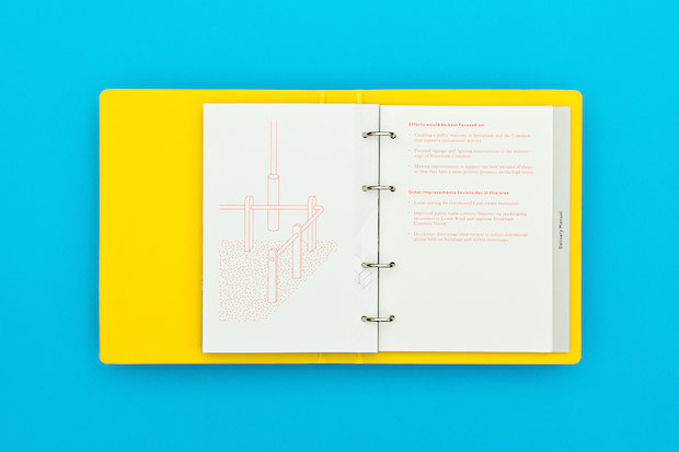
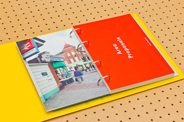
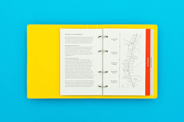
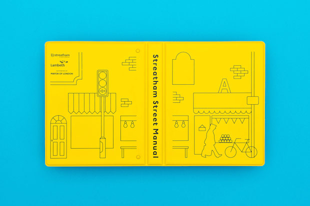
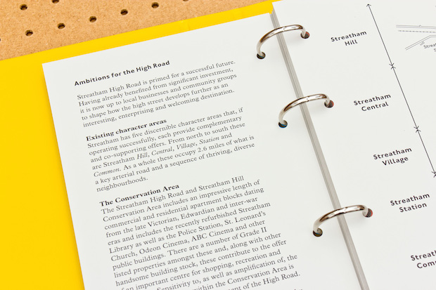
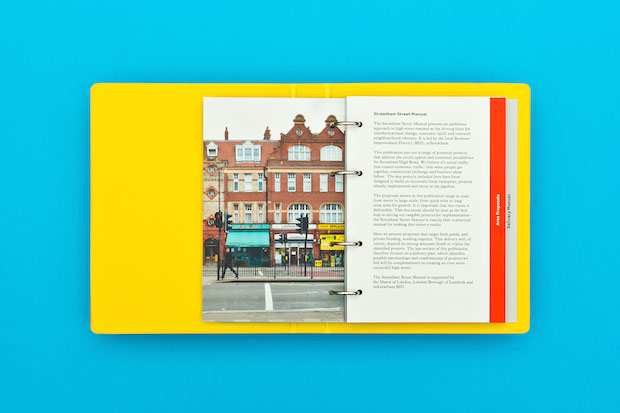
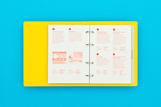
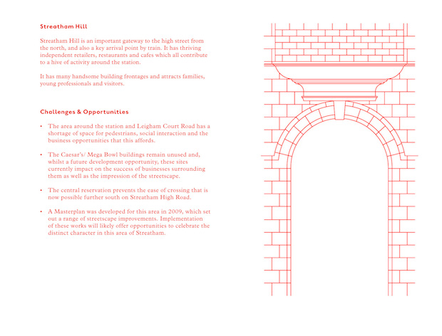
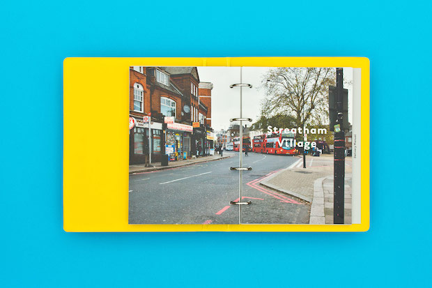
The Streatham Street Manual, commissioned by Lambeth Council and InStreatham Business Improvement District, is a document that promotes the regeneration and renewal of the Streatham High Road. It sets out a large number of potential projects ranging greatly in scope, that would contribute to the improvement of the area. Each project is rated by cost and impact and there are suggested options for funding.
How did the project originally come about?
We Made That architects made contact earlier in the year having bought one of our prints, and asked us if we would like to be involved. They work with a variety of designers carefully choosing who they think will be most appropriate for each project.
What was the original brief and did it change at all?
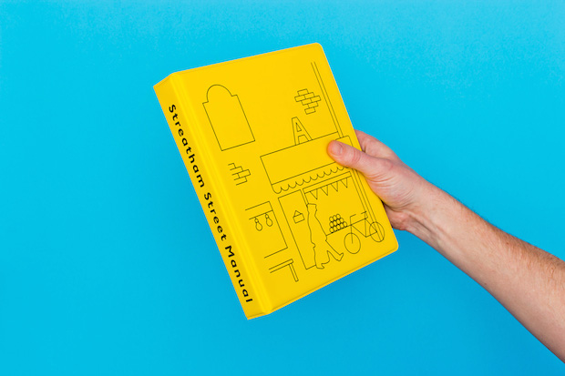
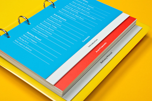
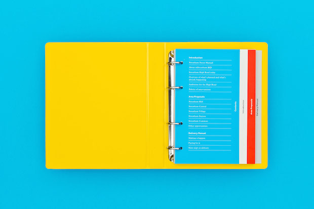
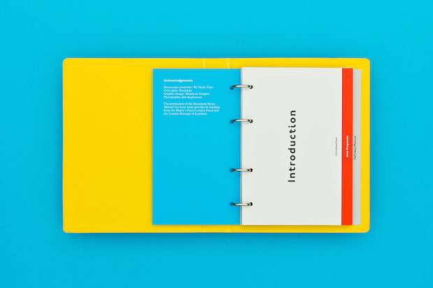
The brief was to design a printed document that had its own identity and would work as a usable manual. One of the first things WMT said is that they didn't want it to be the standard perfect bound A4 document, that it ought to be flexible and functional, allowing new potential projects or funding options to be introduced at a later date. We suggested the addition of illustration for the cover and as a marker for each of the five distinct areas of the High Road.
Did this project present any particular challenges and if so how were these overcome?
The budget for print was quite small and the turnaround was tight (when isn't it?). Together with WMT, we looked at examples of flexible documents, folders, spiral bindings, etc. And in the end, inspired in part by the excellent Camden Arts Folders designed by Sara De Bondt and James Goggin, and the Unimark Graphic Standards Manual for the New York City Transit Authority, we settled on a simple A5 ring binder. The folders and inners were produced separately and coordinating the production was something of a challenge; testing and measuring different ring mechanisms, calculating paper bulk etc – these were all things that required careful consideration.
Are there any aspects of the finished work that you are especially happy with? Were there any frustrations?
We are really pleased with the way that it all came together. WMT worked really closely with us on the project and credit needs to go to them, it is great to have a client that is so engaged, we only ever had productive and thoughtful feedback from them. I think it is as a consequence a really useful and usable document, and we hope that it engages and informs in equal measure.
Did this project involve sourcing any new materials or using any new processes?
Yes, the screenprinted binders were new for us, and I think the binder system is a great option for flexible documents, the potential applications are so varied. If used imaginatively it can escape its school stationery connotations.
What was the client's feedback?
The feedback from the client has been really positive, working with them has meant that the finished product was never going to be a surprise, but it was one for its audience and was very well received.
Technical spec.
Typefaces : ITC Johnston, Plantin Paperstock: Fegrigoni Freelife Cento 300gsm, Sirio Perla 280gsm Processes: Digital (HP Indigo), Screen printed pvc ringbinder
maddisongraphic.com