London studio Plaid specialises in immersive spatial design that transforms top museums into fun (and democratic) temples of discovery. Liv Siddall went to meet Plaid’s Brian Studak and Lauren Scully to unearth their engaging approach.
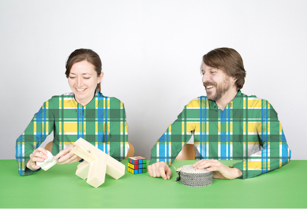
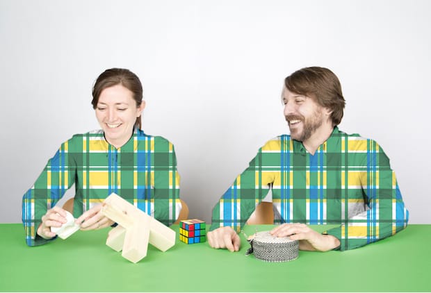
Plaid is Brian Studak and Lauren Scully, a north London couple hailing all the way from Canada, hence the name. “Plaid is a very Canadian word for tartan and is really associated with workwear shirts like the ones I wore building houses,” Studak says. “It’s a worker aesthetic and we like that accessibility. We try and explain it as a graphic metaphor for collaboration, and I think that’s a strong part of what we do.” “There’s an informal-ness to it,” adds Scully.
It’s true, plaid is a perfect symbol of what the pair are about: collaboration, heritage and a friendly togetherness. Founded in 2012, it’s one of only a handful of studios that focus almost exclusively on exhibition and museum spacial design. “Often a 3D studio will connect with a 2D graphic studio for this type of project,” Studak says. “But what we’re developing now is the complete design in-house, 2D and 3D. There are not that many studios that have that.”
Plaid material has a worker aesthetic and we like that accessibility. We try and explain it as a graphic metaphor for collaboration.
The duo work with their small design team in a bright, high-ceilinged room in Highgate’s Bickerton Studios – an old Victorian maternity home that is now filled with a cluster of writers, architects, designers and other creatives bustling through the boarding school-like corridors. As well as the ubiquitous flatscreen computers and Anthony Burrill prints, Plaid’s small studio is also their workshop, housing odd fabrics, materials, maquettes and prototypes from projects completed or still under-way. It’s so refreshing to see this: so many studios rely so heavily on what Creative Suite can do, but Plaid believe wholeheartedly in hands first, computers second.
There’s even a whole section of Plaid’s website dedicated to what they call “play”: mockups of spaces, renders and unused work is interspersed with innovative stools and chairs they’ve created inspired purely by sporadic bursts of inspiration. Included in this section is a beautiful, wooden outdoor studio designed for a Tai Chi master. “A shed we never built,” it states. “But would like to.”
“It’s the stuff that bubbles up in the office that you think, ‘This is great, how can we show this?’ Studak says. “It’s a way we can show people how we process and develop, whether it’s a maquette in a studio or a prototype or a final piece onsite. We do a lot of mock-ups and models ourselves. The ‘play’ thing is getting back to this idea of collaboration as well, be it internal or with a client or other agencies.”
So many studios rely so heavily on what Creative Suite can do, but Plaid believe wholeheartedly in hands first, computers second.
Plaid got their first break back in 2012 when their eagerness to begin collaborating landed them a big job almost by accident. “We called up the British Library to ask quite a mundane question and they said ‘what are you doing nowadays?’” Studak says. “I explained we were starting a small studio and they were like ‘well, come on in!’ So we bid on two projects and we landed the big one, which was great.” This method of calling people up and boldly reaching out to anyone who they want to collaborate with is something they value intrinsically, and are working hard to expand their network further. Studak explained that the hard sell doesn’t always appeal to a lot of designers. “But you’re really good at it!” Scully laughs.
Plaid tend to introduce themselves to people via a lot of imagery, a background story and what they’re about. “Sometimes we get a call and they want to meet with us and then maybe six months later, if we’re lucky, we get to pitch on something and then, if we’re lucky again, we beat out the rest of the talent in London then we get the project,” Studak says. “You have to get out there and plant all these different seeds in order to reap them.”
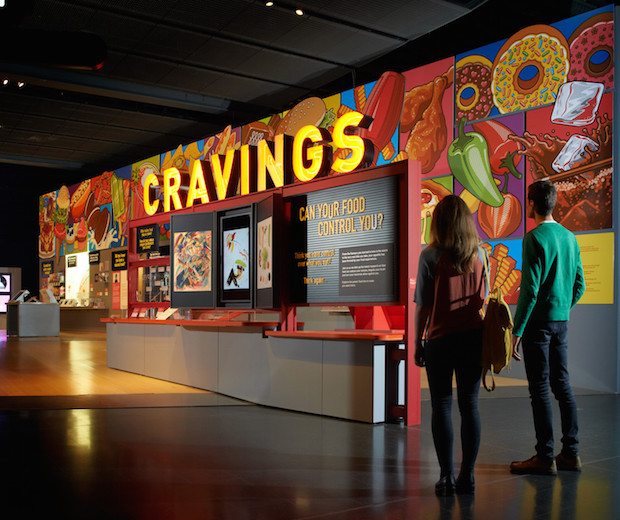
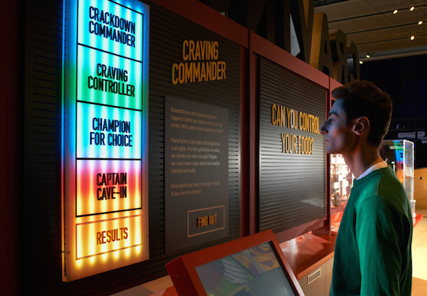
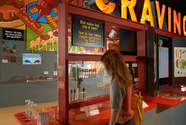
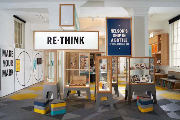
It’s an approach that seems to be working. In only three years the studio has transformed exhibitions and galleries into intelligent, desirable spaces that invite the general public to fully engage in what the institution is offering them. So far they’ve worked with The Science Museum, The Design Museum, The Southbank Centre, The National Maritime Museum and, most frequently, The British Library. Once they had created one or two projects, word started spreading in the relatively small industry of exhibitions and museums that these guys were good, and work started flooding in. “The museum exhibitions industry is kind of closed in a way, they talk to each other so one job sometimes leads to another in the same institution,” says Scully. “Also people move around within the field a lot and spread the word.”
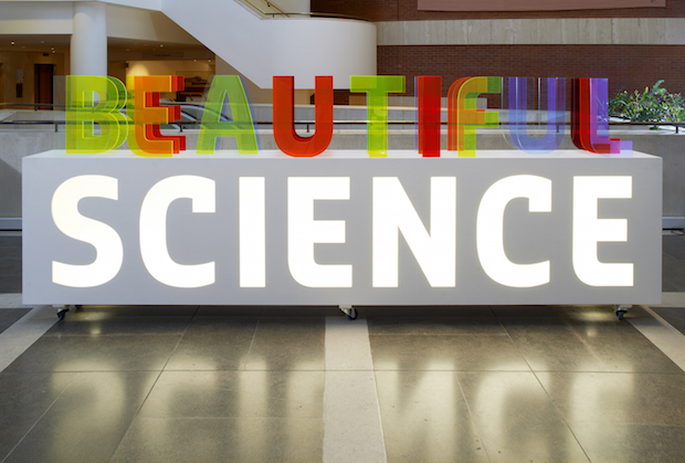
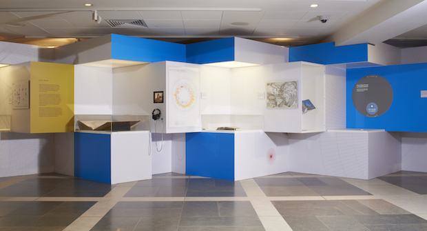
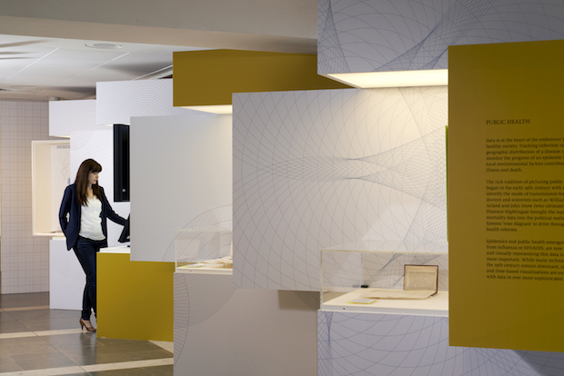
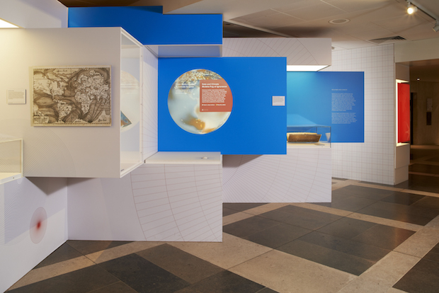
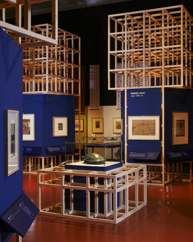
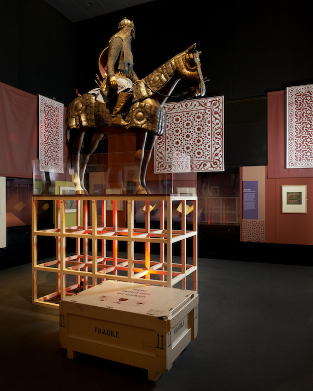
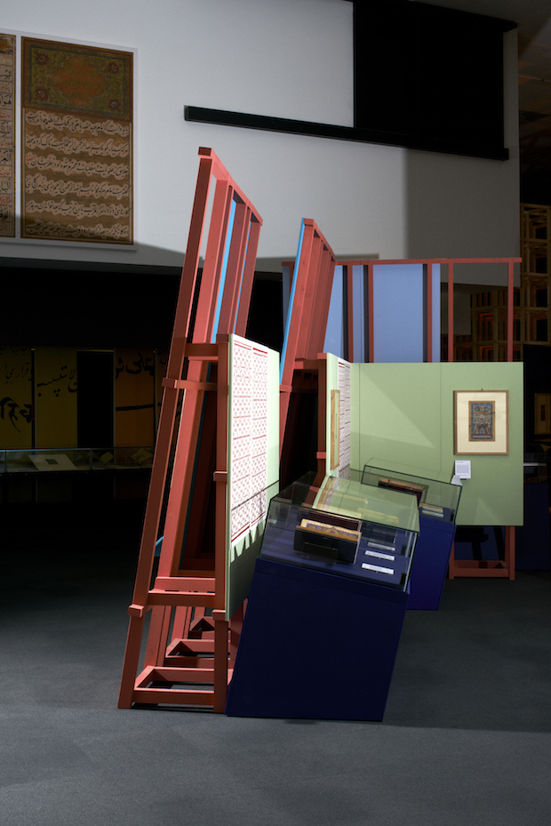
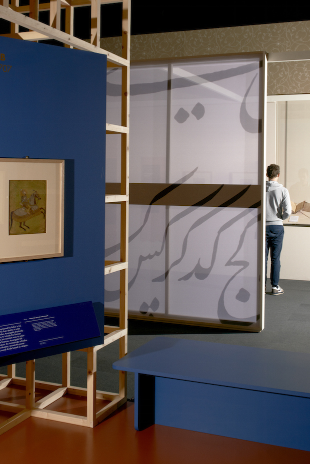
Since giving Studak and Scully their first break back in 2012, The British Library has been returning to Plaid for a number of exhibitions. In 2012 they displayed prints revealing the opulent history of India in the library entitled Mughal India. Plaid wanted to utilise the rich, iconic graphics embedded in the subcontinent’s culture and play on staples of modern Indian culture. They collaborated with Bibliotheque and together designed lightweight, geometric structures that would exhibit the prints, as well as designing pathways through the show that were created entirely from a visitor’s perspective. The geometric timber frames mirrored the beautiful symmetrical wooden carvings found in India, while simultaneously echoing the hodgepodge of teetering scaffolding to be found on its crowded streets today. In May 2014 they collaborated with Anonymous Studio to work on Beautiful Science, the British Library’s exhibition of scientific diagrams, data and the recording of discoveries. For this, Plaid used the concept of the “eureka!” moment, in their words, “the moment when an idea or concept becomes clear and suddenly seems obvious when once it was just a mass of various bits of information.”
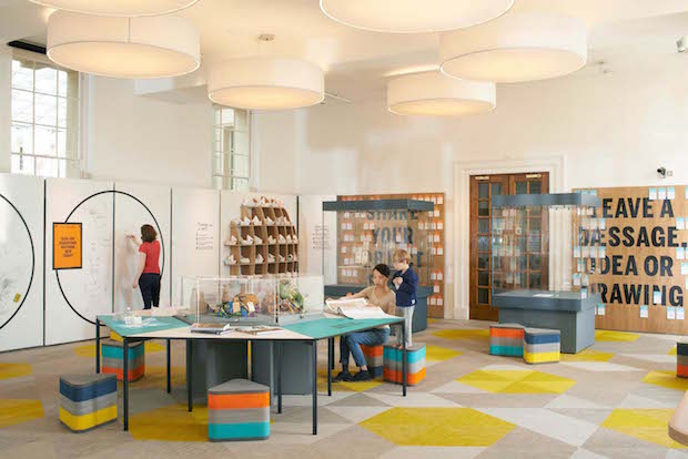
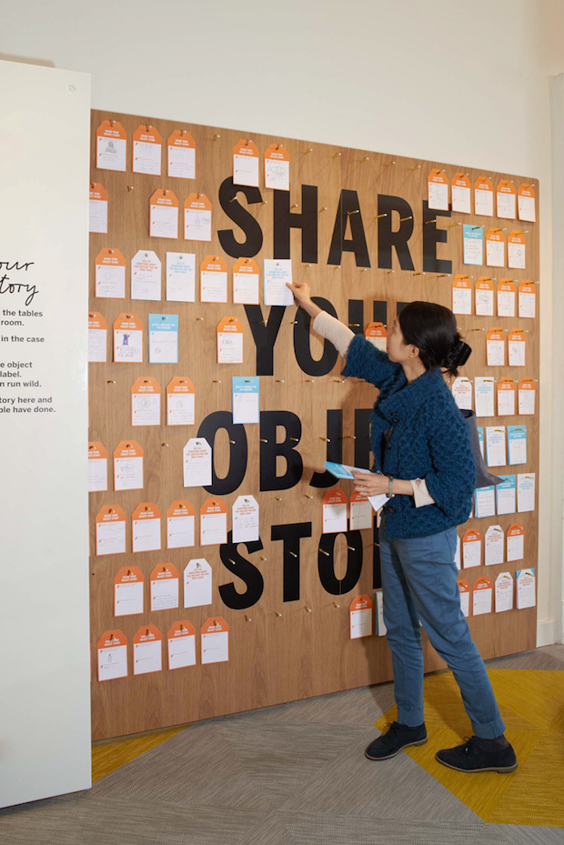
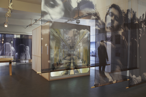
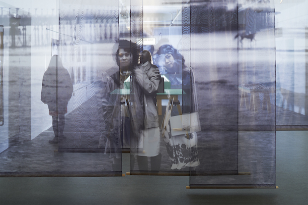
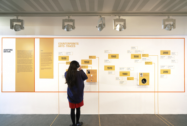
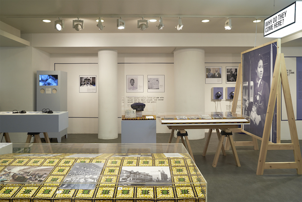
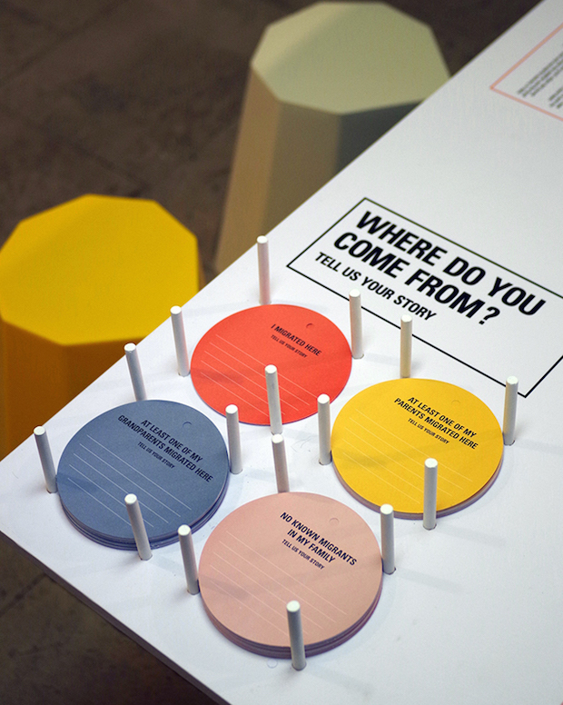
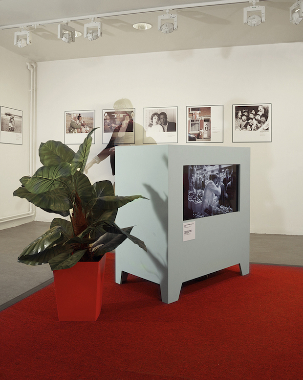
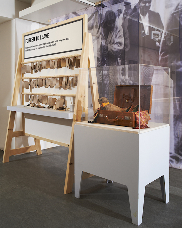
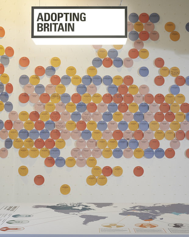
More recently Plaid have worked on Adopting Britain: 70 Years of Migration, a show at London’s Southbank that explores the history of immigration in the UK and invites members of the public to submit their own personal experiences which, in turn, become part of the identity of the show itself. Faced with an opportunity to actually collaborate with the general public is where Plaid really come into their own. “Participation is allowing a two-way conversation to occur,” Studak says. “It’s not just allowing someone with a piece of chalk to make some marks, it’s also understanding what those marks are and taking that feedback on board.” As the visitors walk in to the show they are greeted with a wall to which they can add coloured circles of paper which describe their own personal ancestry and migration history, creating an enormous colourful map. “You’re hitting a lot of points all at once with that,” says Studak. “You’re creating a spectacle at the front, you’re creating a visual graphic for the stories people are putting up. People want to tell their stories and they want to have that platform to do that and I think that when people can sit down and actually write down their own background then they’re totally immersed in the topic. You’ve got them.”
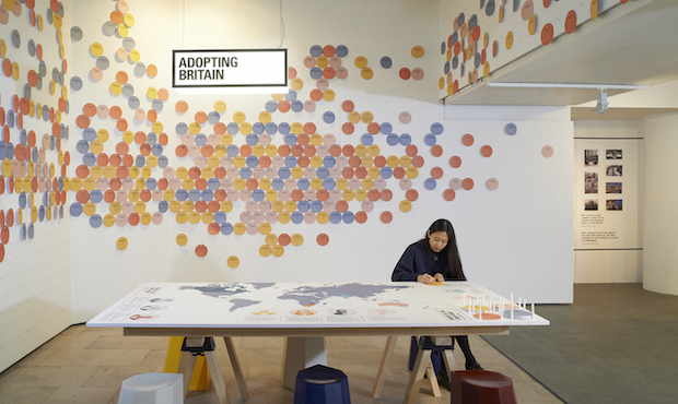
People want to tell their stories. Provide that platform and then they’re totally immersed in the topic. You’ve got them.
That’s what Plaid are really after, for the audience to become immersed within the space in order to connect on a personal level to the content on show. Occasionally they invite their five-year-old son into a space they have designed to test its interactive appeal. If he enjoys the space and wants to touch it, listen to it and be a part of it, then they’ve done the job right.
At the moment Plaid are working on a large temporary exhibition at Wellcome Collection. Known for their fascinating shows that delve into the less-talked about but hugely important aspects of life such as death, dirt and drugs, Wellcome Collection is now developing an exciting new exhibition exploring our relationship with voice production and perception. Plaid studio is currently filled with an array of multicoloured, squishy materials used to coat the walls of sound booths and recording studios all over the world. Plaid’s aim is to create a space that will be less of a gallery full of headphones and more of an interactive, experiential world that invites visitors to become aware of all of their senses and leave with a heightened notion of their relationship with sound and their own voice. “People don’t use their ears in the same way that they use their eyes,” says Brian. “When was the last time you actually listened to something? Even music, when was the last time you actually sat down and listened to a song? So an aspect we have to deal with in the design is how to create that level of engagement.” Working with an array of fascinating artists and creatives who use sound as a tool to express ideas - including animal mimicking, non-verbal communication and the role of voice in social bonding - the exhibition looks to be a sensual voyage of audio discovery.
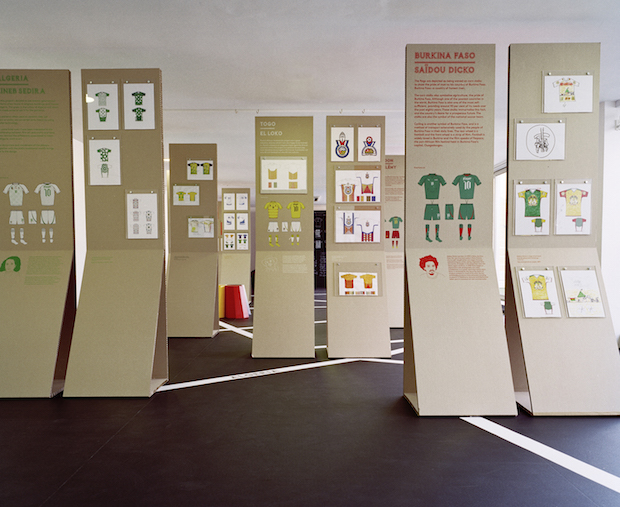
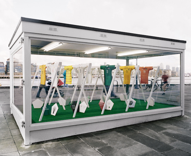
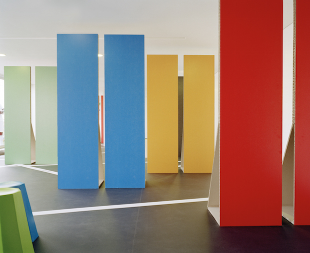
That’s what’s so special about Plaid. They’re genuinely trying their hardest to make the spaces we enter on weekends, bank holidays and during solitary lunch breaks engaging, fascinating and immersive. They wholeheartedly believe that audiences should be treated to a visceral, sensual experience and take something away at the end with them that isn’t necessarily from the gift shop. “When you walk into a gallery and there are beautiful paintings, people will walk in and be engaged with those,” Brian says. “But this is a matter of getting people to actually engage with things, rather than just walking through, leaving and going, ‘What was that?’”
All project photography by Leon Chew

