When designing the catalogue for publishing prize The Most Beautiful Swiss Books 2014, Zurich’s Studio NOI tasked seventeen photographers to create an artistic portrait of each winning tome. Here are our favourites.
The Most Beautiful Swiss Books award does what it says on the tin by offering annual recognition of the country’s top publishing endeavours. From books about experimental musicians to catalogues for the Bahrain pavilion at Venice’s Architecture Biennial, this year’s winners demonstrate excellence in both concept and execution.
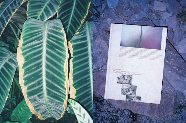
The prize’s accompanying catalogue (this year designed by Zurich’s Studio NOI) also goes out of its way to showcase the ingenuity of these publications by similarly thinking outside of the books in terms of how it showcases the winners. This year Studio NOI asked seventeen photographers to present a portrait of each of the winning entries, inspired by the book’s content, concept and design. Here are five of our favourite images accompanied by some words from the judges, kindly recorded by Tan Wälchli.

Andy Guhl. Ear Lights, Eye Sounds. Expanded Cracked Everyday Electronics
This book about the experimental musician Andy Guhl at first looks loud and somewhat confusing, but this is part of its programmatic intent. It is a reference to Guhl’s musical credo: for four decades he has often moved on the border between music and noise with his disassembled and rewired everyday electronic devices. In addition, two important design decisions remind the reader that a book, like live music, has a temporal dimension: the left-hand pages show full-bleed still images from audiovisual performances by Guhl, creating a strong rhythm as one of leafs through; and on the right-hand pages, a continuous stream of various images and texts flows from top to bottom in a seemingly mechanical layout. On these pages, the unusual paper, reminiscent of carbon paper, is extremely susceptible to the traces of being touched and scratched. The inevitable rapid wear on the volume, particularly on the cover, transforms each book into a unique art object.
Editors: Andy Guhl, Tabea Guhl, Flurina ans Gianni Paravicini; Design: Krispin Hee and Salome Schmuki; Publisher: Edizioni Periferia; Photographed by Jiajia Zhang.
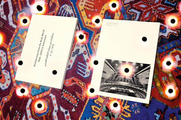
Fundamentalists and Other Arab Modernisms. Architecture from the Arab World 1914–2014
The catalogue for the Kingdom of Bahrain’s pavilion at the Venice Architecture Biennial creates a convincing effect thanks to a nonchalant manner of handling heterogeneous picture material: 100 buildings are presented in chronological order on 100 pages. They are documented with one to four black-and-white illustrations of widely varying types and origins, each printed on a light yellow background rectangle and arranged non-hierarchically on the page. Although the varying formats and arrangements are oriented on a grid, this is done so subtly that the predominant impression is one of intuitive composition. The pictures almost appear to be dancing and each double-page spread is both surprising and successful. In the text section that follows, with Arabic on the left-hand page and English on the right, the typography of the two writing systems seems surprisingly similar. One spectacular detail is the only four-colour photo in the book, which appears as if at random on one of the picture spreads. The book’s spine, which is completely covered with smalltype text, is also very fine.
Editor: Noura Al Sayeh, Bahrain Ministry of Culture; Design: Jonathan Hares; Publisher: Bahrain Ministry of Culture and Arab Center for Architecture. Photographed by Jason Evans.
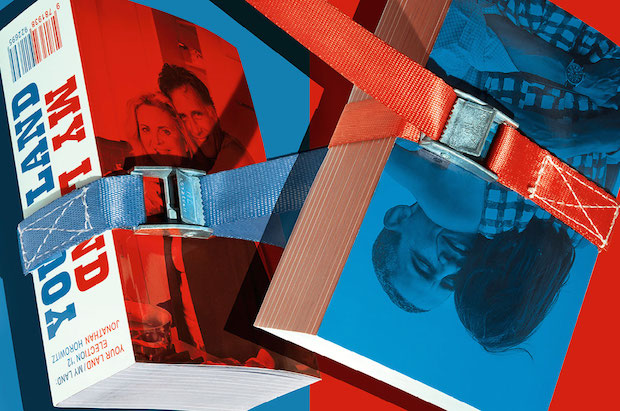
Jonathan Horowitz. Your Land / My Land: Election ’12
An interactive installation that Jonathan Horowitz exhibited in seven cities during the 2012 United States presidential election campaign is vividly documented in this thick paperback. The museum rooms were divided into two by a blue and a red carpet ─ the colours of the Democratic and Republican parties ─ and computers ran a website with a blog showing several news feeds from each of the two parties in real time on red and blue halves of the screen, inviting comments by the visitors. The book directly follows the design of the blog, with the Democratic channel on the left on blue pages and the Republican one on the right on red pages. All of the typography is executed very precisely. The streams of picture and text flow down to (and over) the page edge and continue on the next corresponding page, creating a sense of ‘scrolling’. The fleeting documentation of the blog is thus convincingly translated into book form and made accessible for future reading. Ten inserts in the book feature exhibition views and essays.
Editor: Jonathan Horowitz; Design: Laurenz Brunner and Geoff Han in collaboration with Fabian Harb and Malin Gewinner; Publisher: Gavin Brown’s enterprise. Photographed by Andrea Grambow and Joscha Kirchknopf.
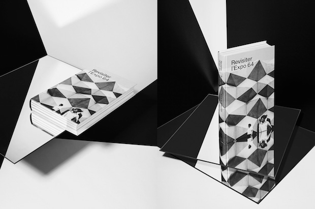
Revisiter l’Expo 64. Acteurs, Discours, Controverses.
This illustrated scholarly anthology appears deceptively simple at first glance, but when examined several times it becomes increasingly captivating. The design is characterised by careful picture editing and typography. The four picture inserts on heavy paper that form the introduction to each section of essays are particularly attractive. Historical images of great diversity are presented bled off and combined in fresh, surprising ways. The book thus never seems boring but rather lively and open. Other aspects worth emphasising are the fine. simple cover design and the rather narrow format. The format is vaguely reminiscent of a guide-book, and as such the book is very comfortable to hold when exploring the ‘temporary city’ that Expo 64 represented.
Editors: Olivier Lugon, François Vallotton; Design: Robert Huber Grafik; Publisher Presses Polytechniques et Universitaires Romandes. Photographed by Jennifer Niederhauser-Schlup.
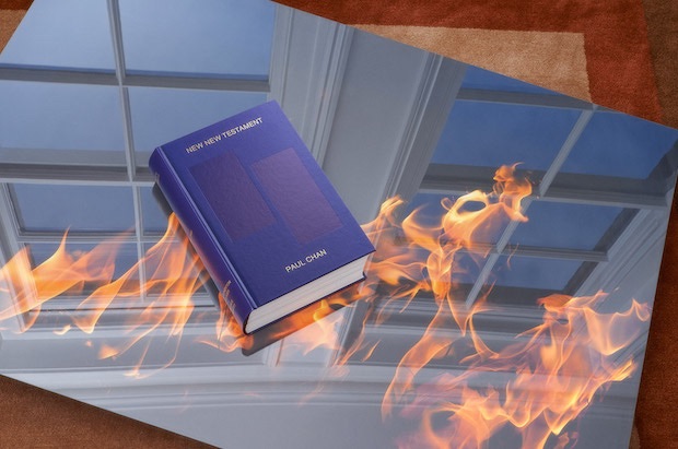
Paul Chan. New New Testament
This heavy, leather-bound book on Paul Chan’s Volumes series of artworks has the outward appearance of a bible or book of statutes, while inside it looks mysterious or even confusing. The 1,005 works illustrated consist of one volume each from which all of the pages were torn out before Chan decorated their covers with small, mostly abstract or monochrome ‘paintings’. The illustrations are all set on the right-hand page and are contrasted on the left with short cryptic texts by Chan with numerous gaps and special characters that make them seem at times like concrete poetry and at others like text puzzles or decomposing text fragments. The content thus undermines the printed book’s traditional claim to authority in several ways, while the publication still cultivates that claim in a purely external way ─ through its classic design, size and masterly manufacture in a centuries-old Swiss printing house. The result is a ‘testament’ to book culture in the digital age, and it is not incidental that it is also available as an e-book from Paul Chan’s publishing house, Badlands Unlimited.
Editor: Paul Chan; Design: Kloepfer-Ramsey Studio. Publisher: Laurenz Foundation and Badlands Unlimited. Photographed by Matthieu Lavanchy.
To read more about the other winners, visit swissdesignawards.ch
studio-noi.ch

