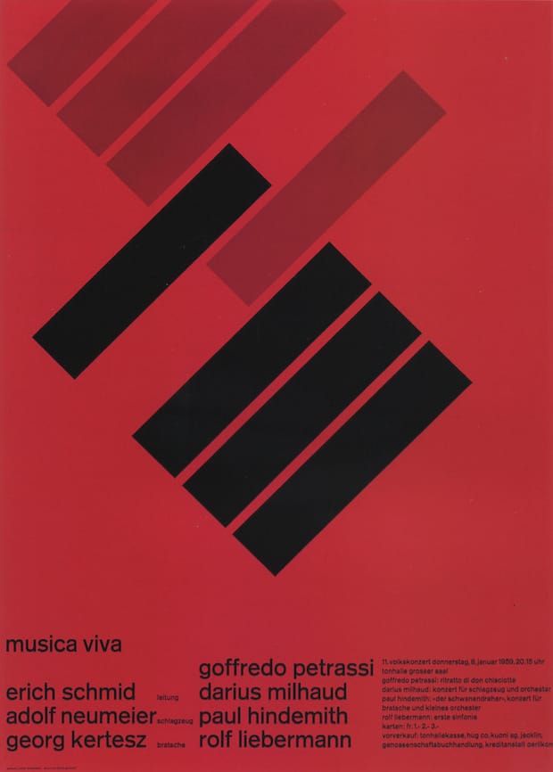
From ground-breaking magazine Neue Grafik to posters for the concert series Musica Viva at Tonhalle Zurich, Josef Müller-Brockmann’s balanced grids and mathematical ratios spawned the International Style. Marcus Kraft pays homage.

OK, I have to admit, being a graphic designer in Zurich, Josef Müller-Brockmann is probably the most obvious choice for a column about my design hero. But somehow he is also the right one. There are of course many other inspiring personalities who I would like to write about, but together with other brilliant Swiss designers of the ‘old generation’ (like Emil Ruder and Armin Hoffmann), Müller-Brockmann has always been a great reference in my own work.
Born in 1914, Müller-Brockmann was a leading theorist and practitioner of the renowned Swiss graphic design movement, also called ‘International Style’. He worked as a graphic designer from 1952 and taught between 1957 and 1960 at the Kunstgewerbeschule (the design and art school) in Zurich. In 1963, he also taught at the Hochschule für Gestaltung in Ulm, Germany. He influenced generations of subsequent designers and even today Swiss graphic design students still say his name in awe.
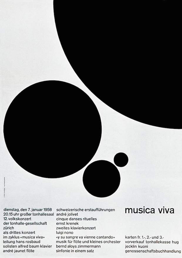
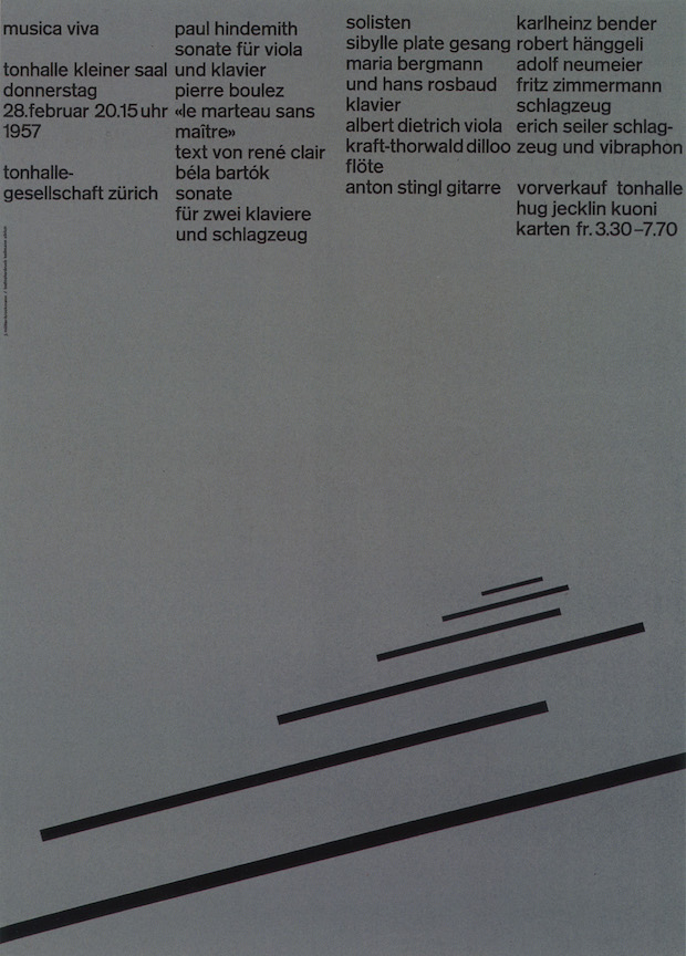
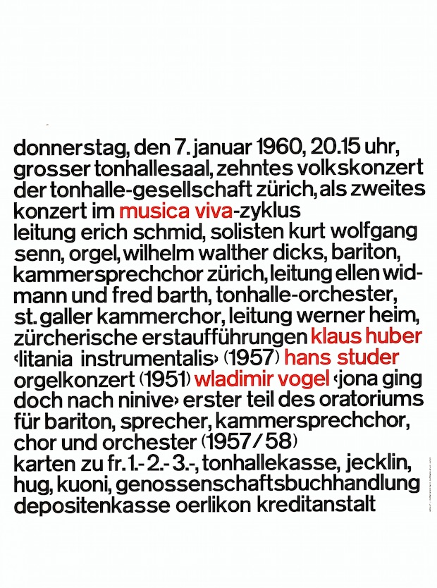
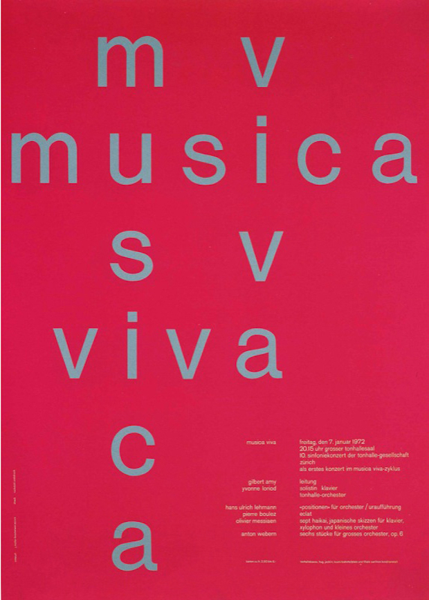
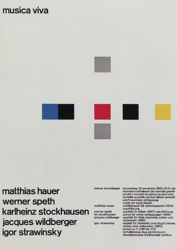
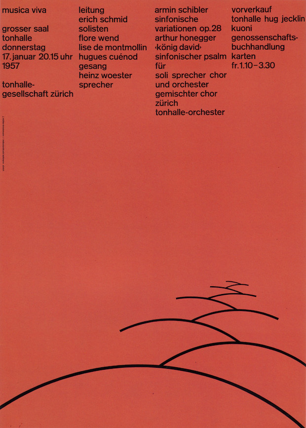
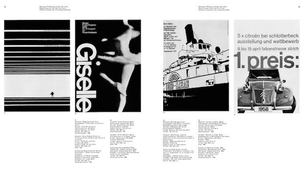
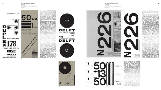
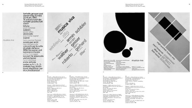
His method of working always adapted to the needs of each project and he favoured a no-nonsense approach, where the first port of call was to translate and give shape to ideas before being ‘artistic’. The graphic form had to subordinate to the content. This can most clearly be seen in his numerous posters for the concert series Musica Viva at Tonhalle Zurich. One of the posters even served as inspiration for my studio’s stationery.
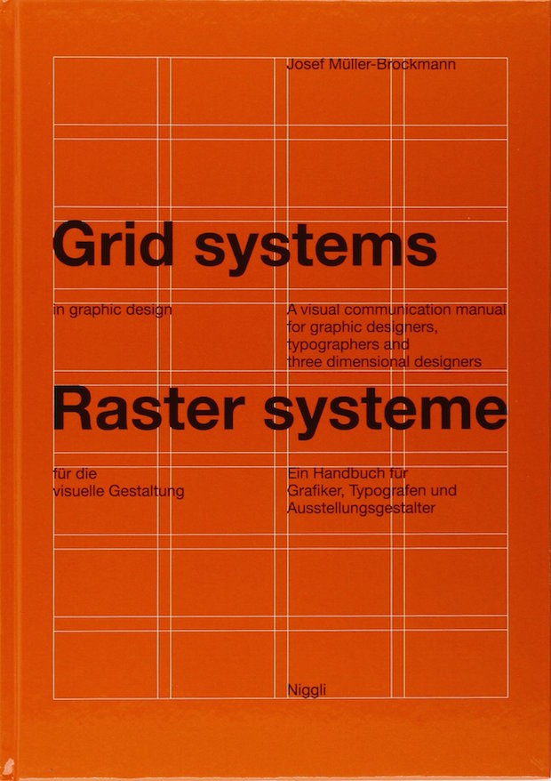
Müller-Brockmann constructed his works mainly out of geometric forms, where proportions and spacing were balanced with strict mathematical ratios. He used sans serif typefaces exclusively and avoided ornament in order to achieve consequential objectivity. To compose the elements he used a grid system, which he specified in his book Grid Systems in Graphic Design.
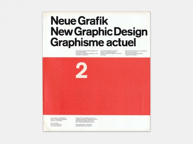
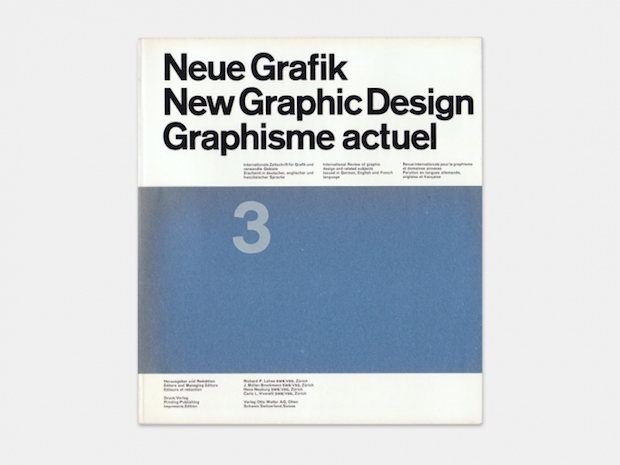
In 1958 he founded the magazine Neue Grafik - The International Review of Graphic Design and Related Subjects, and was soon joined by Richard Paul Lohse, Hans Neuburg and Carlo Vivarelli. In the magazine they published their game-changing theories about design and influenced the progress of the Swiss Style with the publication’s innovative layout. From a historical point of view, Neue Grafik can be seen as a programmatic platform and effective publishing organ of Swiss graphic design. For me, the publication is still very inspiring in terms of its clarity and straightforwardness, with its complex and flexible grid system in the background.
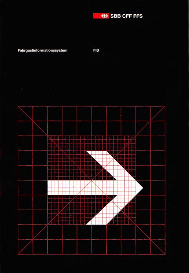
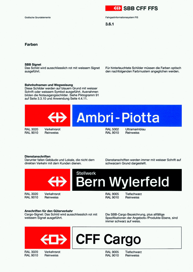
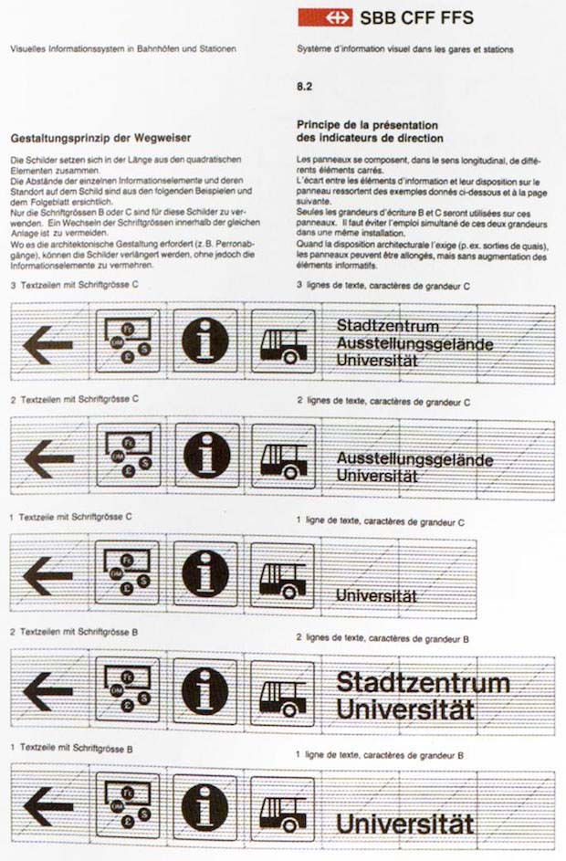
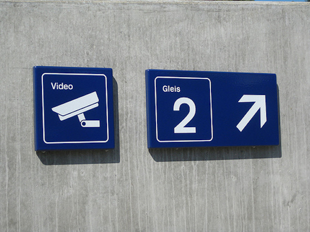
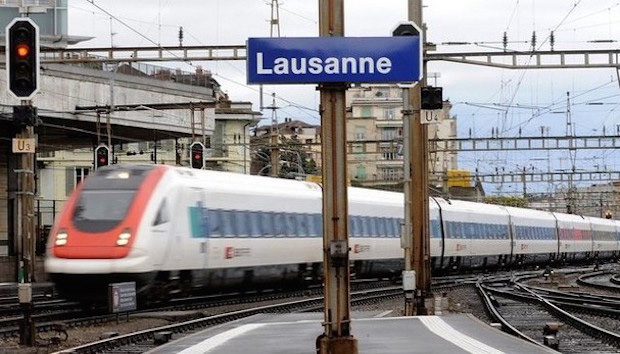
Let me also point out the corporate design and wayfinding system which he created for the SBB (Swiss Federal Railways). It was designed by Müller-Brockmann together with the SBB chief architect Uli Huber in 1982. It’s based on a rather simple toolbox of various elements: the logo, Helvetica as the corporate font, as well as the colours blue, white, red and black. It always astonishes me how fresh and modern the whole design still looks today. The wayfinding system is – with a few marginal adaptations over the years aside – still in use today and always works perfectly. It’s a great example of sucessful, sustainable design. As a side note: graphic designers in Switzerland are now and then confronted with the problem of multilingualism of the country. Müller-Brockmann solved this issue very elegantly with his progressive “SBB CFF FFS” logo (German – Italian – French).


Unfortunately, I never met Müller-Brockann in person before his death in 1996, but now and again I think about how he would have solved this or that problem. His designs always seem to be very simple and obvious, but if I try to create something similar in my own work, I realise that it is really difficult. My guess would be that Müller-Brockmann was truly a talented man, but at the same time a very hard working designer.
marcuskraft.net

