Winkreative Creative Director, Maurus Fraser, lets us in on the back story behind the reimagining of Z Magazine, a supplement focusing on style and luxury living from Swiss daily newspaper NZZ.
Tell us a bit about NZZ and what its hopes are for Z Magazine?
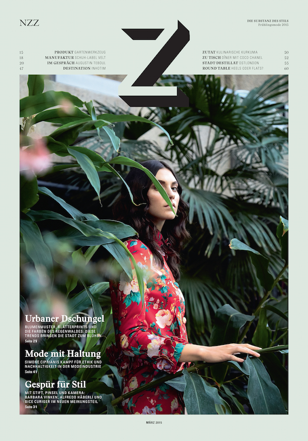
Maurus Fraser: NZZ, the Swiss daily newspaper from Zurich, has been an emblem of outstanding journalism for over 230 years. Z Magazine was originally launched in 2007, as a style and luxury living supplement, distributed eight times a year with the NZZ Sunday title, NZZ am Sonntag.
We were approached by NZZ to refresh the publication from the ground up, building on its current success, to define a confident new look, targeted at a globally aware creative audience rooted in Switzerland.
What did the initial brief entail?
MF: The initial brief was quite open – NZZ wanted us to work on a full redesign of the title, so that the magazine will ‘stand-out’ from the competition, with a clarity and modernity, offering a strong point of difference for both the reader and the advertisers.
What were your initial concepts for the design?
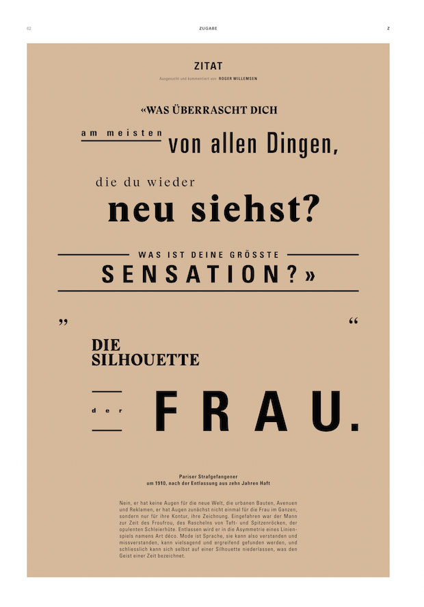
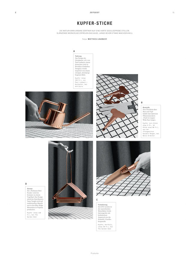
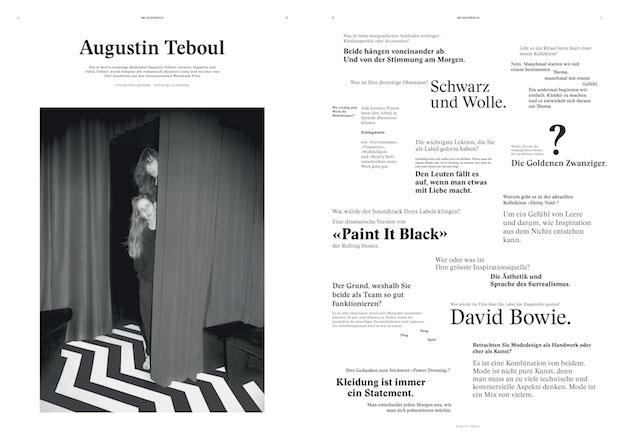
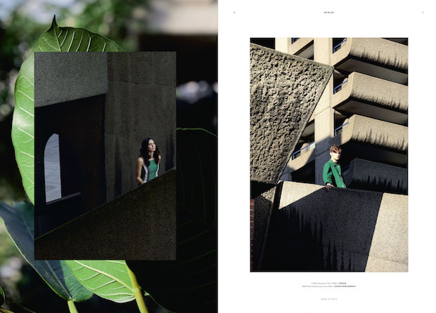
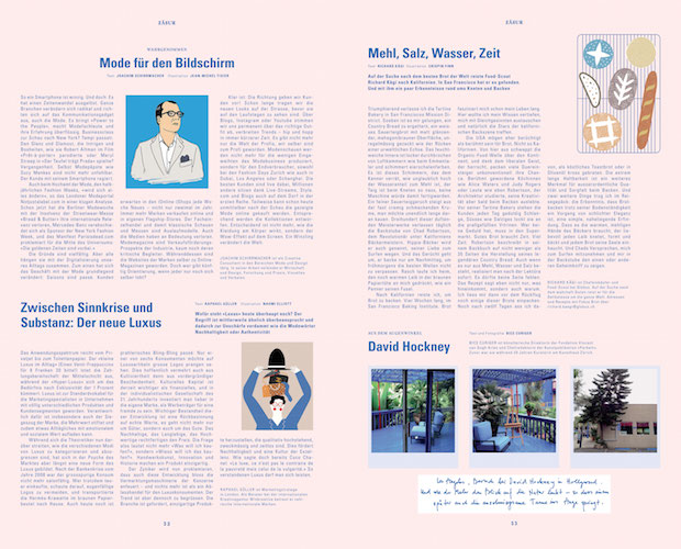
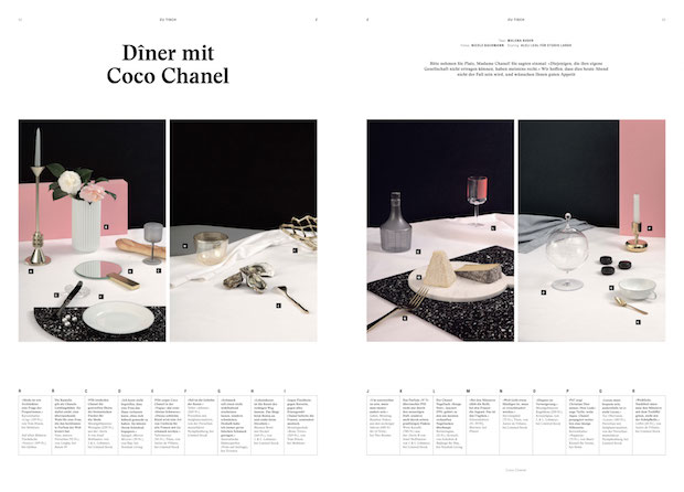
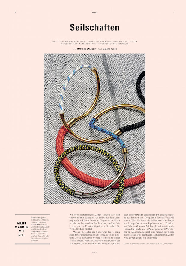
MF: We began work on the designs once we had defined our overall editorial direction. Initial concepts were based on our ambition for the magazine to present a confident, modern Swiss aesthetic, working with a palette of Swiss typefaces, and collaborating with a complimentary mix of new and established international photographers and illustrators.
Did the project present any particular challenges, and if so how were these overcome?
MF: Our design process and ambition to make the magazine stand out meant that we were constantly challenging ourselves and NZZ. We pushed the layout designs in order to achieve a magazine aesthetic that is fresh, distinctive and highly readable.
What particularly pleases you about the final result?
MF: I’m more than satisfied with the result. I think we’ve genuinely created a magazine that redefines how we write about and present a modern aspirational lifestyle in a unique and playful way that engages a highly desirable, but ultimately very demanding reader.
How do you see the project developing?
MF: We have been working very closely with the in-house team at NZZ, to make sure that future issues will continue to evolve and to build a strong loyalty with both existing and new readers.
What was the client feedback?
MF: Our client at NZZ have been incredibly supportive throughout the entire production, and are very excited about the future of the magazine.
Technical specs
Typefaces: Univers, Stanely and Akkurat Mono.
Format: 278 x 400 mm
z.nzz.ch
winkreative.com