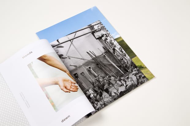
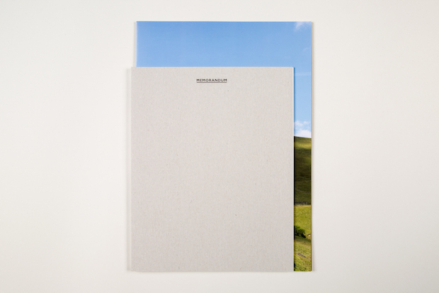
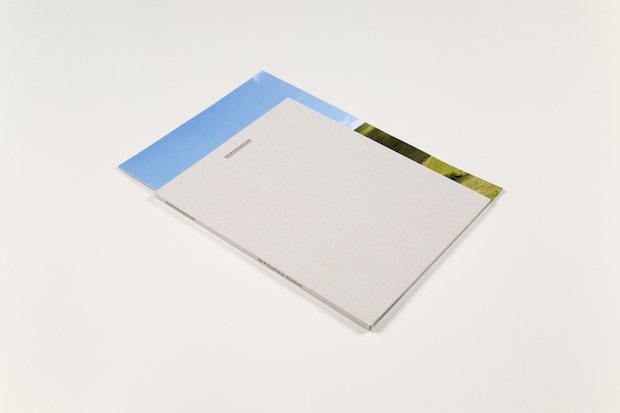
With stunning large-format photography of the Yorkshire Dales, delicate, unfussy type and layers of different stock textures and sizes, APFEL’s publication Memorandum for British clothing company Sunspel reflects the brand’s level of care and quality.
Tell us a little bit Sunspel and what it wanted to do with Memorandum.
Sunspel is a British clothing company that has been in operation since 1860. It’s known for what you might call luxury basics, specialising in men's underwear and t-shirts but branching out in more recent years into womenswear and a broader range of apparel. Everything it produces is handmade, much of it still in their factory in Long Eaton, Nottinghamshire, with a great deal of care taken and with a special attention paid to using really beautiful materials. It's all very understated but extremely beautiful and considered. We were big fans before they ever approached us for the project.
With Memorandum, they wanted to produce a publication or journal that would explore and celebrate Sunspel's heritage, as well as themes close to the brand, without feeling like a solely sales-driving exercise. It was presented to us much more as a side-project and creative experiment than a conventional brand magazine.
What did the design brief include?
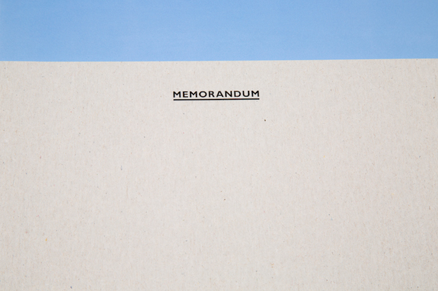
The editorial team behind Memorandum were keen to create something that felt contemporary, while incorporating elements from the amazing archive of materials Sunspel still holds in Long Eaton. They picked out a huge selection for us and sent it over, which was really fascinating to go through in the studio. The name Memorandum and the typeface for the masthead are both taken from some of the old business stationery we found within the archive.
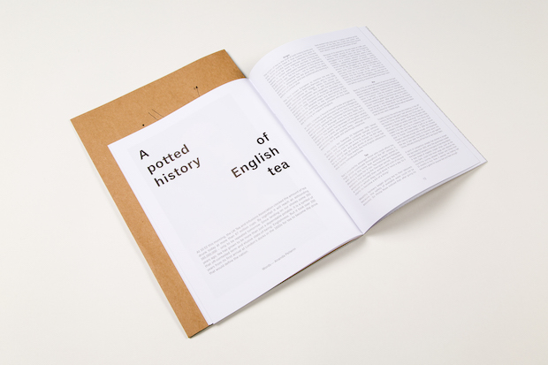
They were keen to use different papers and formats in the journal, to encourage the feeling of a set of materials collected and put together, rather than a traditional single-format magazine. The content ranged from editorial fashion photography through to a series of interviews with craftspeople and a set of beautiful large-format images of Yorkshire moors.
Talk us your initial ideas for the concept.
We wanted Memorandum to have a strong, tactile object quality to it, and to feel more like a collection of different component parts brought together, where the format of each section responds to the content and emphasises its diversity. It was important to echo Sunspel's characteristic understatement and attention to detail, so the typographic treatment we chose was unfussy but delicate. For the cover, we wanted to create a sense of ambiguity, so it wasn't immediately obvious to the reader what they were looking at. The pattern on the inside cover is a drawing of the structure of one of Sunspel's lace knit patterns, which they devised in the 1930s to spin their famous cottons.
Photography was a crucial part of the project. Who did you work with and what sort of atmosphere did you want to achieve?
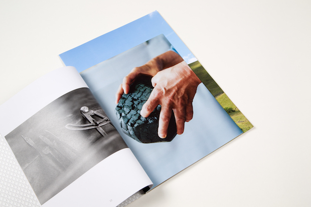
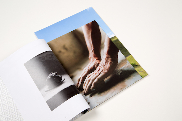
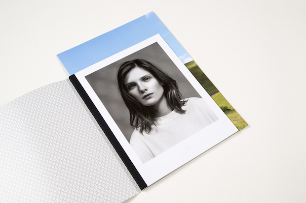
There was a clear vision of the kind of photography that the team wanted to appear in the magazine, and they chose some amazing photographers to work with. Harley Weir shot a really evocative feature documenting the lives of Sunspel factory employees and their families; Tess Hurrell produced a series of shots of craftspeople's hands; Rory van Millingen shot a graphic series of abstract compositions out of Shetland wool and Kasia Bobula took a stunning set of photographs of abandoned British factories. The atmosphere varies from feature to feature, but it's drawn together by a sense of familiarity that comes from an experience of English life. It was quite subtly art-directed by Sunspel's creative director, to fit with their aesthetic whilst retaining a sense of individuality when brought together as a set.
What was the thinking behind the differing paper stocks (both in texture and size)?
We wanted to reflect the tactile quality of both the clothes and the archive of materials that we were sent. It was very special to see such a quantity of material from Sunspel. It has kept almost everything from receipts for the lacemaking machinery, correspondence from customers, the original contract for their first premises... The intention with Memorandum was that this ephemerality was reflected in the publication – the different sizes and papers are like part of a collection of these different materials. The formats we chose were also in response to the content, for example the manilla board we used was like the folder for the contract, and the largest size on coated paper made the most of the large format landscapes.

What do you think was the most successful part of the project?
We're pleased to have created something so ambiguous and almost odd in response to the brief – there's a sense when you first encounter Memorandum of not quite being sure what it is you're looking at. It's not really a magazine, or a catalogue, or a journal, or a book; it feels like something all its own and we're quite proud of achieving that, strange though it might sound.
Is there anything you’d do differently?
The great thing about working on periodicals for clients like Sunspel is that you have the opportunity to evolve ideas from issue to issue, so hopefully we have further opportunity to experiment and test ideas next time – responding to new and different content is part of the fun.
What was the client feedback?
Everyone's been really pleased with it so far – and it's been exciting to drop into the Sunspel stores and see it on the shelves. One of us actually went into the Soho branch to have a sneaky peek at it 'in situ' and the reaction of the shop staff to it was really positive, which was great to hear.
Technical spec
Masthead: Gill Sans
Body text: Classic Grotesque Standard Book
Cover/Titling: Grotesque MT Std
Cover: Uniboard S One-sided coated greybeard 300gsm
Text pages (main): Regency Velvet 115gsm
Larger insert section: Symbol Freelife Satin 170gsm
Card insert (single page): Manilla Board 300gsm
sunspel.com

