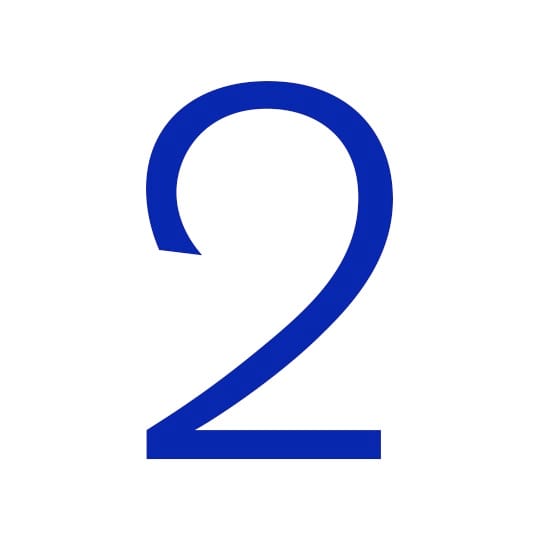
Able to denote both clarity and warmth, Berthold Akzidenz Grotesk Light’s ‘2’ wins over designer Becky Chilcott with its swan-like elegance. At first glance Akzidenz Grotesk looks like a clean and highly functional sans serif typeface. But look closer and its simple geometric forms have characteristic idiosyncrasies. The terminals of the ‘s’ and ‘c’ are not horizontal, and the upper case ‘R’ has a straight leg.
An early sans serif, and undoubtedly an influence to many following it, Akzidenz Grotesk was designed by Ferdinand Theinhardt and released by Berthold in Berlin in 1896. Berthold kept adding weights, some of them from other faces, acquired from other foundries. This would explain how some characters change quite dramatically through the different weights.
As with many typefaces there is much discussion about its origin, but there is no denying its influence on typographic design from then on. Josef Müller-Brockmann and his Swiss contemporaries favoured Akzidenz Grotesk and it is now synonymous with the Swiss or International style.
When students ask me about choosing a typeface for a particular project, without hesitation, I quote one of my typography lecturers: “There are three things you need to do – read the copy, read the copy and read the copy.”
We are all seduced by charismatic letterforms, with their elegant curves or strong geometric lines but what about the numerals, punctuation and other glyphs? Do these feature heavily in the copy and warrant consideration in this decision making?
When I was asked to choose a character, I was working on a book with a lot of tabular matter at the time, which is why my character choice is not a letter but a number, Akzidenz Grotesk Light ‘2’. I have become quite fond of it – it looks to me like a swan and it’s fascinating how out of place it seems with the other numbers, apart from a very handsome ‘7’.
I find Akzidenz Grotesk so engaging, not so much because of its solid history, but more because it manages to convey information with beauty and clarity while at the same time emitting a certain kind of warmth and personality.
The number two
The first and only even prime number, the glyph that represents two can trace itself back to the Brahmin Indians who, rather understandably, expressed the number with two horizontal lines. Both the Chinese and Japanese languages still use this method. Having been rotated and joined over time, these two marks finally came to resemble what we would understand as ‘2’ during the era of the Ghubar Arabs, who constructed much of our present day alphabet. In China, two is a lucky number and it’s common to use the word ‘double’ in brand names (think Double Coin or Double Elephant) because of its fortuitous significance.
Becky Chilcott
…is the founder of Perth-based studio Chil3 and a fellow of the International Society of Typographic Designers. Previously a designer at the National Film Theatre, Chilcott has worked with leading publishing houses, newspapers and designers in Australia and the UK, and art directed several cultural events and fest
October 2, 2014 2 minutes read
Take Two
Able to denote both clarity and warmth, Berthold Akzidenz Grotesk Light’s ‘2’ wins over designer Becky Chilcott with its swan-like elegance.

