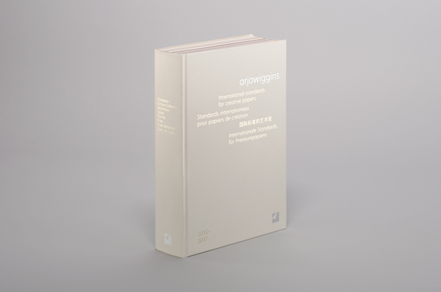
With an elegant design by North, top notch print by Lecturis, and nearly 300 different paper stocks, Arjo Wiggins's new Paper Book certainly is a thing of beauty.
How did this project come about? The paper industry has been dramatically impacted since 2000 with the expansion of the internet and social media. This had a massive impact on the way Arjowiggins communicated to its customers. Furthermore the financial crisis of 2009 brought new challenges and they had to adapt their products and services to their customers new ever changing needs.What was the original brief and did it change at all?
The brief was the result of a thorough piece of research - as such it had a clear focus and didn’t change throughout the project. The goal was to make Arjowiggins the preferred paper industry brand and to improve their reach to key influencers including designers, printers and other brands. Quite a tough challenge in a hugely competitive industry.What was the thinking behind your design approach?
Arjowiggins have been making fine papers since 1770 and are recognised for their high quality, performance and innovation. It was important that designers, printers and brands realised that they are paper makers not a merchant. Their paper is now treated as ‘product ranges’ of Arjowiggins and not separate brands with their own marketing strategies, websites etc.We get numerous marketing materials and swatch books sent to us. We questioned the effectiveness of this in today’s market, so we worked to simplify the process.
The aim was to create the ultimate reference tool, so that all a designer would need is a notebook and pen, computer, Pantone swatch book and The Paper Book.
We aimed to a create a functional, intelligent and inspiring tool that can be used by designers and printers alike. We wanted an object that demonstrated Arjowiggins’s knowledge, passion and expertise. A tool that allows the paper to be the hero.
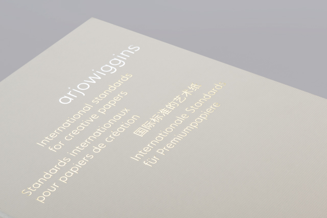
The book was designed to be the embodiment of a promise – International standards for creative papers. Arjowiggins apply these standards to everything they do - a measure that they use for every part of their business. They aim to be the international standards for colour, texture, embossing, range, innovation, global supply.
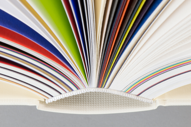
Did this project involve sourcing any new materials or using any new processes? We worked closely with Lecturis who are based in Eindhoven. They sourced and managed the production stages of the book, working with three separate binders across the Netherlands to test and sample multiple binding techniques. Rik van Leeuwen from Lecturis explains, “The key aspects of making this book to a good end were the dedication and communication between designer and printer, printer and binders and paper supplier, designer and printer.”He also explained that there was a lot of logistical planning needed for a book of this run and complexity, “There are 300 different kinds of papers, all needing to be in the right place, at the right moment, in the right order with the right text printed on it, on the right side of the paper.”
The cover material is another Arjowiggins product called Guarrocasas Guaflex. We had square embossing applied to the stock. The waterfall was manufactured separately by AB Druka who are based in Rīga, Latvia.
Are there any particular challenges involved when working for a paper client? Not playing the same game as everyone else.
Simplifying such an extensive family of brands and allowing Arjowiggins to take ownership of their product ranges.Which aspects do you think have worked particularly well?
Teamwork, collaboration and belief. By keeping good lines of communication between North, Arjowiggins, Lecturis and AB Druka, this allowed for great attention to detail and a passionate belief in what we were all trying to achieve.Simplicity and functionality of the object. Everyone involved understood the importance of this project to help improve the company’s reach, but more importantly they were willing to help instil a focus on quality, not timing.
What’s been the response from the client so far?
Very positive. We hope that The Paper Book improves their standing within the creative industries and that their experience, knowledge and expertise show through in the final result.
Technical SpecCover
Guarrocasas Guaflex Intenso Arena (Embossing CR)Binding
PUR Format
A4 portrait
PrintingPMS 877 silverPMS Black
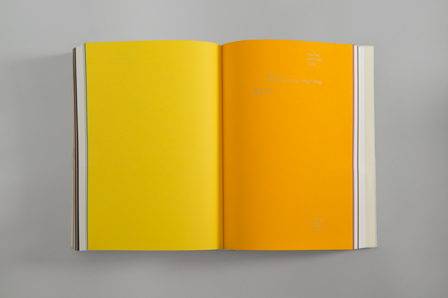
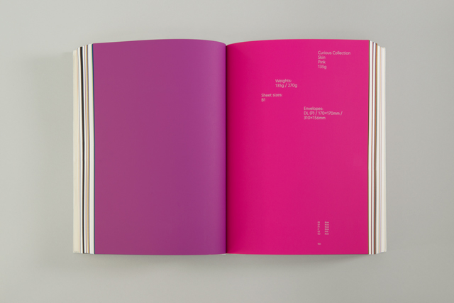
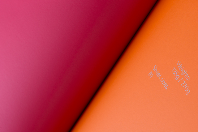
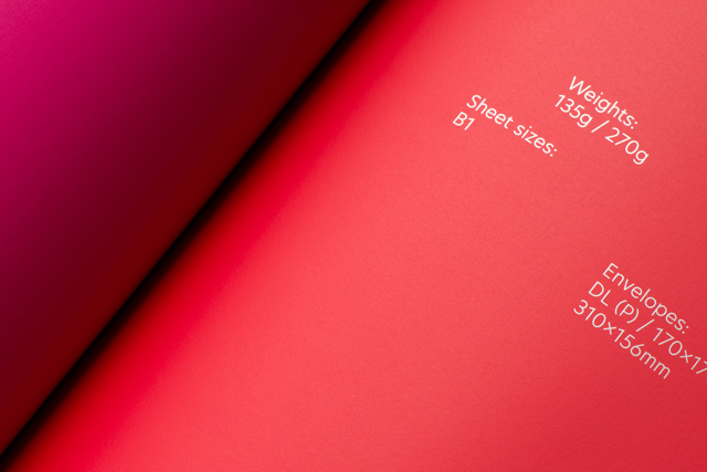
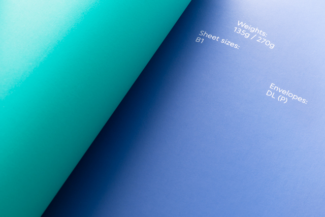
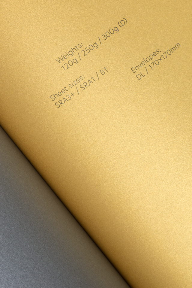
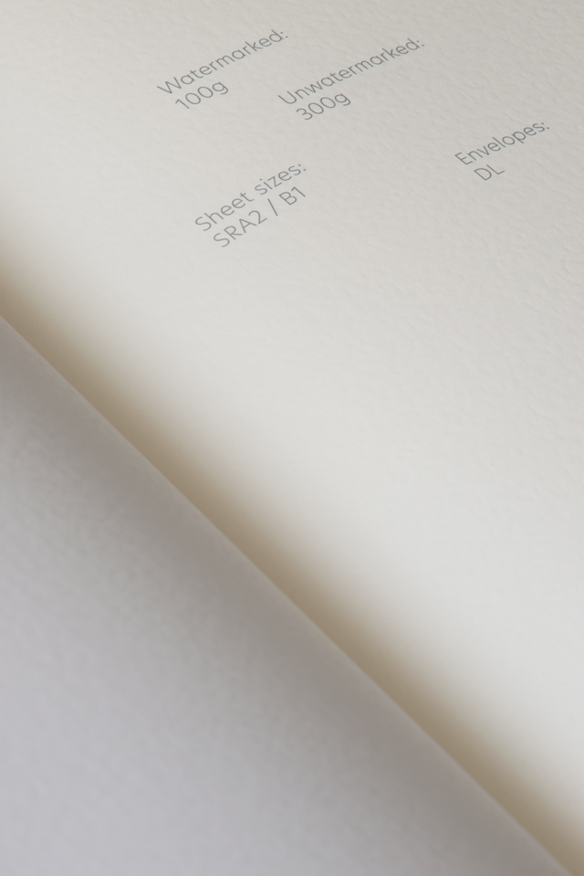
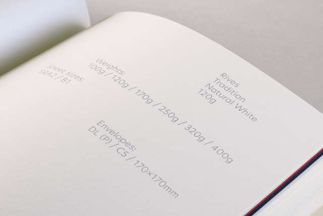
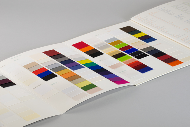
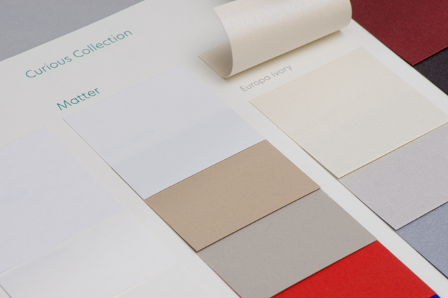
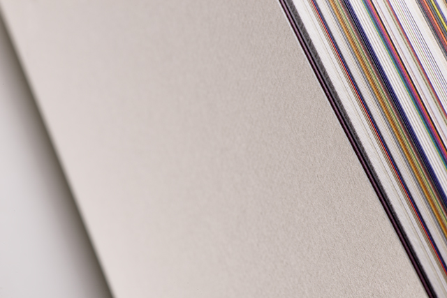
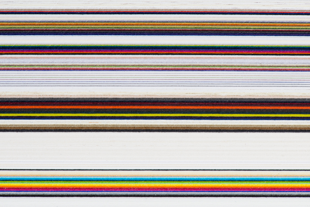
Pagination272 paper stocks, 8 paper ranges: Conqueror, Curious Collection, Keaykolour, Opale, Pop’Set, Rives, Rives Sensation, Creative Labels
28 text pages (intro + back section)Conqueror Bamboo Natural White 120gsm
Endpapers (unprinted)Pop’Set Ivory 170g
northdesign.co.uk