Bright geometric shapes and a painterly approach define the work of this emerging illustrator, whose portfolio spans posters for South London estate agents to artwork for cutting-edge techno producers.
How would you describe your style and process?
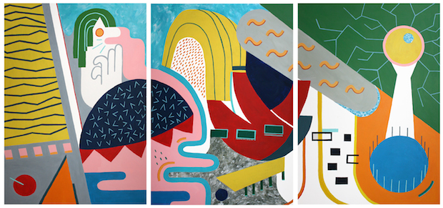
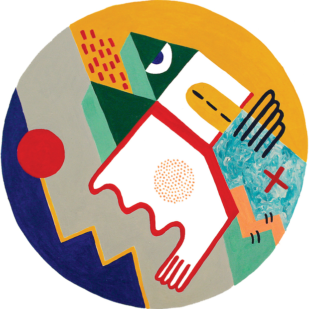
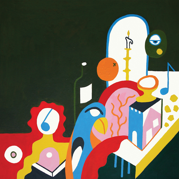
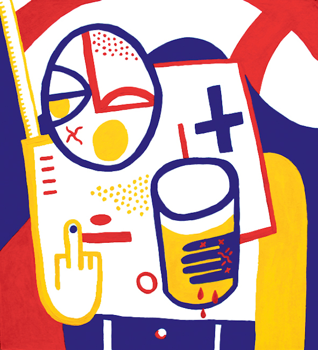
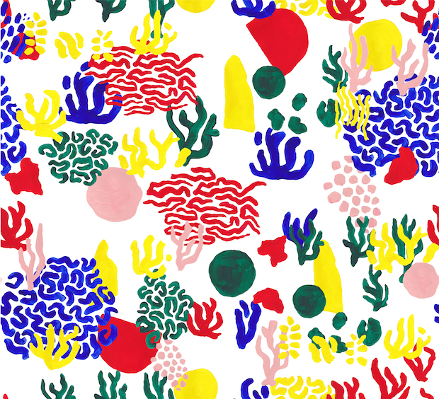
My style and process is still changing a lot at the moment while I find my feet, but essentially I think my work is defined by a bold, bright, colour palette and loose, abstract shapes. I like to be quick and instinctive so sometimes it works, sometimes it doesn't. I aim to simplify figures and objects as much as possible into shapes, lines and patterns while still retaining some kind of indication as to what that object is. It's always interesting when someone interprets the image as something totally different. I think that's a good thing.
Where do you seek your inspiration?
I mostly look at 20th Century painters like Fernand Leger, Picasso and Paolozzi. I avoid looking at other contemporary illustrators, I want to do my own thing and not just replicate trends. It's more difficult now working at the CIA, I'm looking at illustration all day. I've just got to turn on the filters!
Tell us about a commercial brief that you have particularly enjoyed?
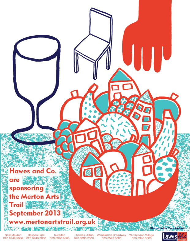
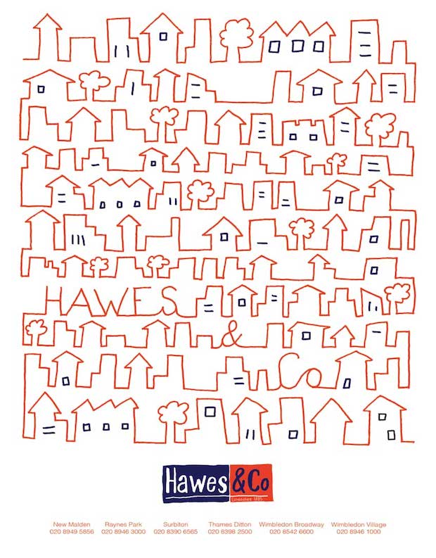
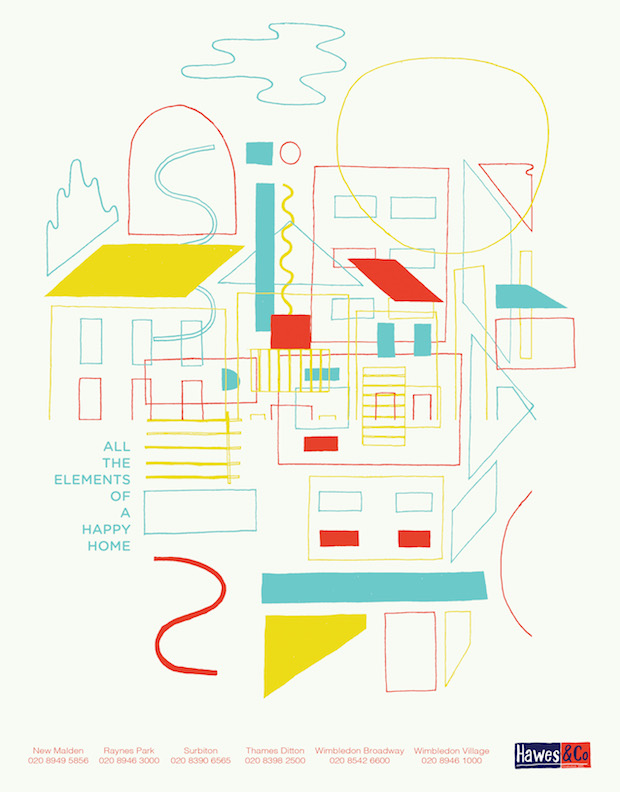
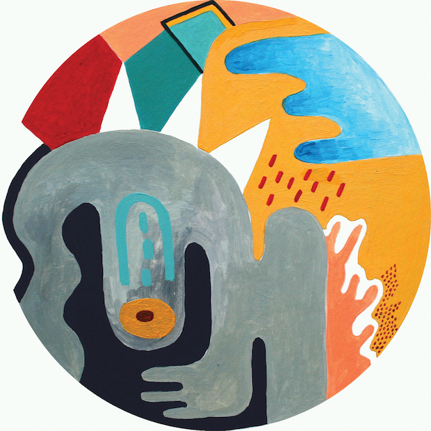
I've been doing a monthly illustration for an estate agent in South London for almost two years now. Sometimes it's tough when you're feeling uninspired and you have to deliver something, other times I've felt like I've made some really great work. You really have to push yourself to think outside the box (for lack of a better expression) when you have to create so many different illustrations about the same subject.
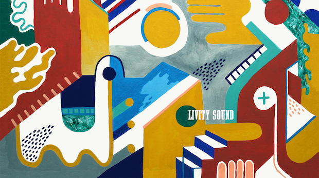

Tell us a little bit about your artwork for electronic musicians Livity Sound?
I was friends with the guys that run the label from living in Bristol but was really surprised when they asked me to do a rebrand for them. I have to applaud Peverelist's vision and the fact that he could picture my mad, bright, painterly work on a techno record. It was exciting to have the opportunity to work for people who trusted my creative opinion, and work for people whose own work you really admire.
How are you finding the difference between the creative community in Bristol and London?
I moved at the beginning of October. Bristol is amazing and I wouldn't be where I am today without my two years there, developing my work. It's a great place to go as a new graduate - theres a lot of other creative people there and things to get involved in. It's like a big village. I moved to London because I wanted to step up a gear. I started working as an agency assistant at the Central Illustration Agency and I wanted to get more involved with my collective Puck who are mostly London based. It's exciting but I feel like a very little fish in a big pond.
How would you like your practice to progress over the next few years?
I'd like to do some more exhibitions and be able to paint and sell my paintings. I'd also love to do more work with record labels and carve a career for myself in that direction. At the same time I want to do a book cover, some packaging work, some print design for fabric. I want to try everything.
tessredburn.co.uk