
As Grafik explores a text-based approach to advertising on this site, we take a look at the continuing commercial power of good writing.
Logos. You probably look at that word and think of the visual icons that companies use to represent themselves. But I’m thinking of logos, the Ancient Greek word that means ‘word, writing or rational argument’.
There’s something interesting about the fact that such a central word in design and visual communication originally refers to writing, which is now, mainly by an accident of evolution, seen to be a separate discipline. It’s a reminder that both professions share a common root and are best thought of as contributors to a single enterprise: communicating.
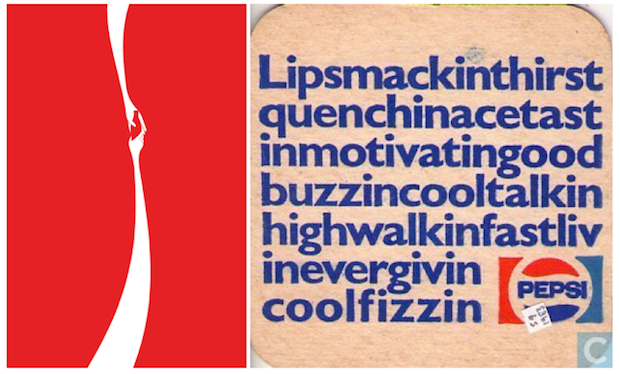
The result may be led by words or images – as in the two ads shown above for similar fizzy drinks – but it doesn’t matter as long as it communicates. It’s self-evident that words will always be an important part of communicating. It’s often said that the days of the classic ‘long copy’ advert are long gone, but this is largely because the days of classic adverts have gone. The action has moved elsewhere and writing has moved with it. You’ll now find long copy on the side of packs and coffee cups, on websites and blogs, or in the cumulative flow of brand Twitter accounts.
But just occasionally, writing rears its head in a classic advertising context. And when it does, it’s arguably more powerful, because it’s so rare.
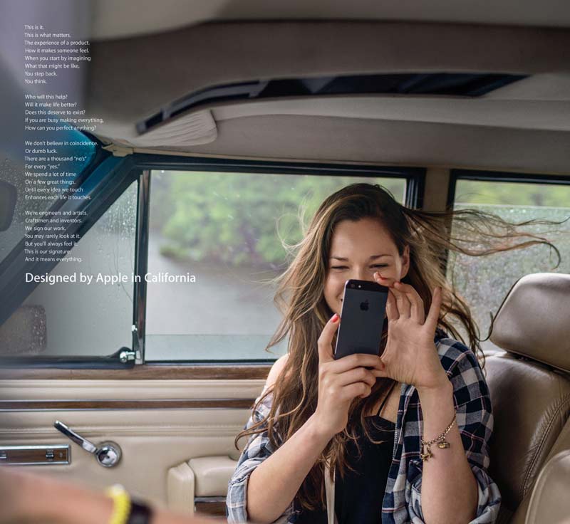
At least, it’s powerful when it’s done properly. I’ve written before about Apple’s foray into copy-led advertising, which was sadly all quasi-poetic style and no substance. (It’s arguably not ‘long copy’ given the wordcount, but I’d say any ad with more than 100 words, and where those words are playing the lead role, qualifies as long copy.)
What those Apple ads lack is captured in that third sense of logos – rational argument. Strip away the poetic presentation and visionary tone and you’re left with not much else, just a series of unsubstantiated, generic claims.
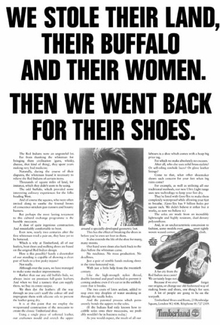
This ignores the key strength of words in advertising – their power to build an argument. Flick through the D&AD Copy Book and look at ads for Timberland and VW Beetle and you’ll see they not only have a witty, entertaining tone to them; they also set out a rigorous argument for why you should buy the product, weaving together functional sales point with such wit and grace that you hardly feel you’re being sold to – or if you do, you don’t mind. (It’s worth noting you may very well mind given how much the Timberland ad has dated in terms of social values. Although the tone is tongue-in-cheek, it most likely wouldn’t get published today.)
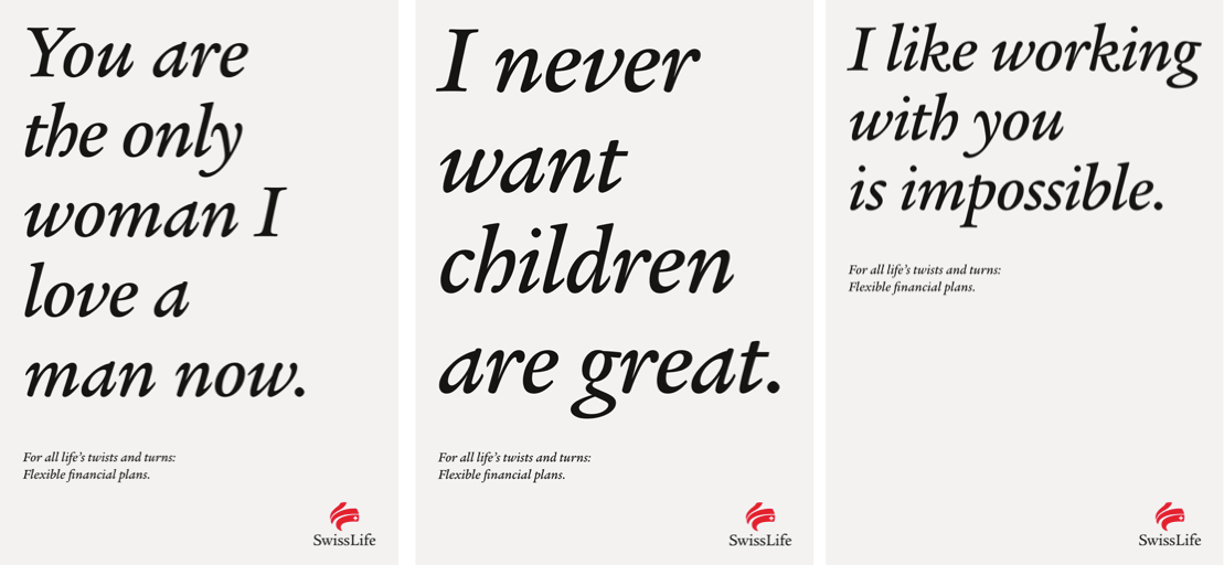
Adverts can still make a persuasive argument today, and they don’t necessarily need many words to do it. One of my favourite copy-led campaigns recently is for Swiss Life. The headlines are not only intriguing and (genuinely) poetic – they’re also rooted in a rational truth about the brand. Life has unexpected turns and that’s why you need insurance.
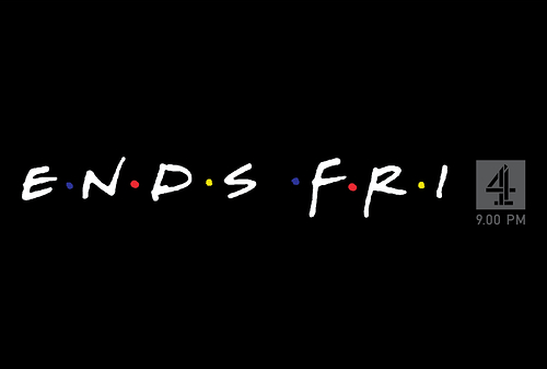
Then there’s this ad for the last episode of Friends, airing on a Friday. Possibly my favourite ad of all time. Not just brilliant in its simplicity, but also in the clarity of its message – the brief is to communicate that Friends ends on Friday, and that’s exactly what it does.
So what of the text-only approach to advertising on Grafik?
I think it’s great, not just because it’s different, but because it makes sense.
One of the most repeated mistruths of recent times is that ‘people don’t read any more’. We live in a hyper-visual culture and at best we’ll manage to read a quick tweet before losing attention.
In reality, we are reading more than ever before. We don’t just read one tweet a day, but thousands, scrolling with our thumbs and absorbing with our brains at an almost supernatural rate. The internet is made of words – they are what we type into the browser bar and form the paths that Google uses to find its way around. Arguably more important than a great logo these days is a great name. Hit upon a ‘Twitter’ or a ‘Vine’ and you have a metaphor that sets up a whole brand.
As literacy levels rise and technology spreads, words gain more power. We read our newspapers online. We email more than we speak. We read blogs and download podcasts. We share articles, quotations and jokes. We mark things ‘as read’.
We go to graphic design sites to read too – because we’re not just interested in visual culture in the sense of wanting to stare at it mutely. We want to talk about it, analyse it, figure out what’s good and bad, read about the people, processes and thinking behind it. It’s the main reason why people come to sites like Grafik. We may read some articles in detail or skim-read others, but it’s all reading.
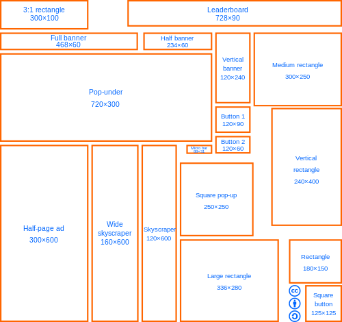
So if we’ve come here to read something interesting, the best form of advertising is giving people something interesting to read. Adding to the experience, rather than building a complex architecture of banners, skyscrapers and pop-up windows in a counterproductive attempt to distract people.
This is the weird logic at the heart of much online advertising – you’ve come to this site to read this article, but we’re going to put a whizzy picture by the side of it and pester you to come to our site instead. Why would people do that? (They don’t – various estimates show the percentage of clicks is tiny and most are mistakes.)
As a writer, I’m bound to like the idea of text-based advertising. But I’m also a reader and I like it from that point of view. There’s something more respectful about it. If you want to give it a contemporary name, you could call it ‘native’ advertising – advertising that respects the medium, enhances rather than interferes with it, and earns our attention rather than demanding it.
But is there a contradiction in using text-based ads on a site called Grafik? Not really. Once again, the word has an interesting Ancient Greek origin. From grafikos, meaning both writing and drawing. Joined at the root.
Nick Asbury is a freelance writer and one half of creative partnership Asbury & Asbury.
asburyandasbury.com