Few people are lucky enough to get to work with one of their childhood literary heroes, let alone on their first book commission. Eleanor Taylor tells us about her dream job.
Can you begin by describing the project in basic terms? The extent of what you've done and how the job came about?
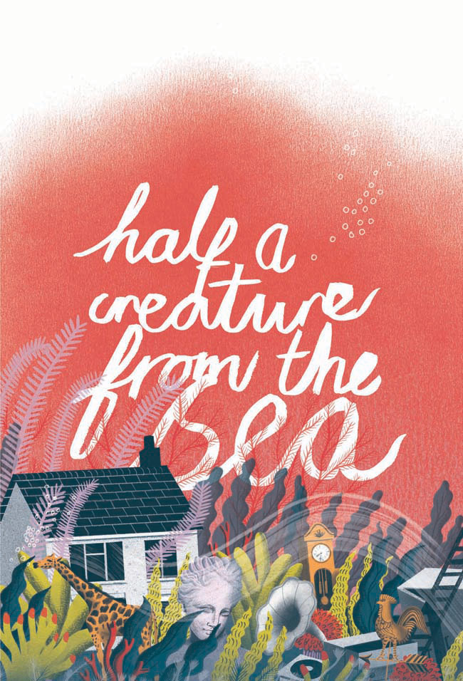
I received an email in February from David McDougall, art director at Walker Books, asking if I was interested in illustrating an upcoming publication by an exciting but undisclosed author. I said of course I would be. A few emails later he confirmed that the author was David Almond. This completely blew me away as I am a huge fan of Almond’s work and read his books avidly as a teenager. Half a Creature the Sea is the very first book I have illustrated and I couldn’t wish for a better one.
What was the original brief and did it alter at all over the course of the project?
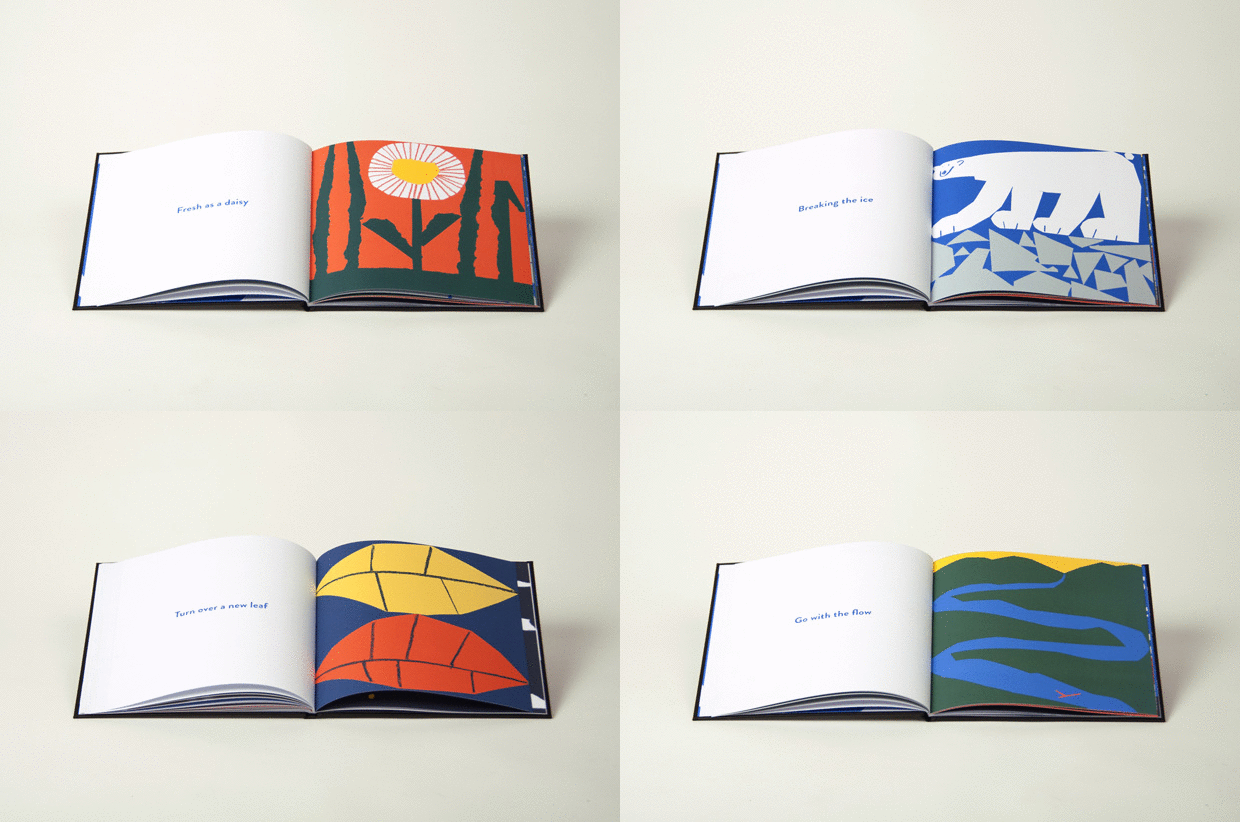
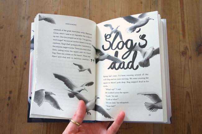
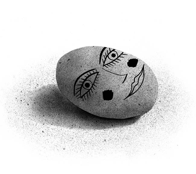
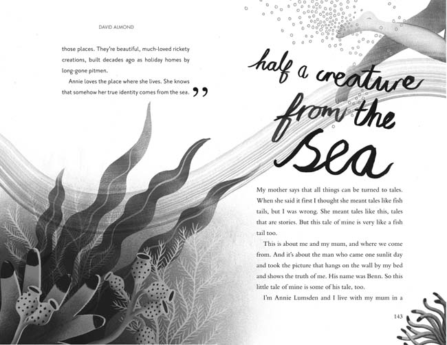
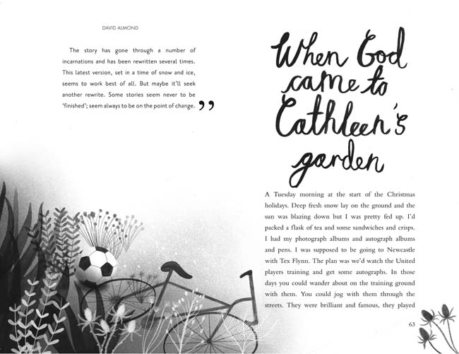
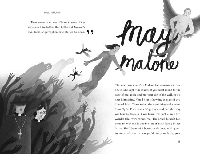
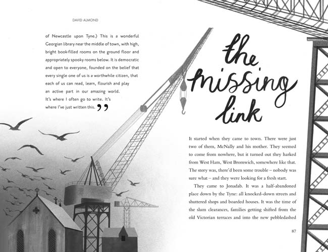
The brief was to illustrate eight short stories by Almond. Each narrative flows from a short autobiographical introduction into surreal, magical stories. These are based on Almond’s childhood growing up in Newcastle. To weave the two elements together I drew the illustrations across the page, connecting introduction to main text, which set a nice pace to the book. Each of the chapters end with a small, illustrated vignette of something that I felt was poignant to the story. When creating an artwork for the cover of a book, do you consider aspects such as how well a composition will stand out on the bookshelf, or does that hinder creativity?
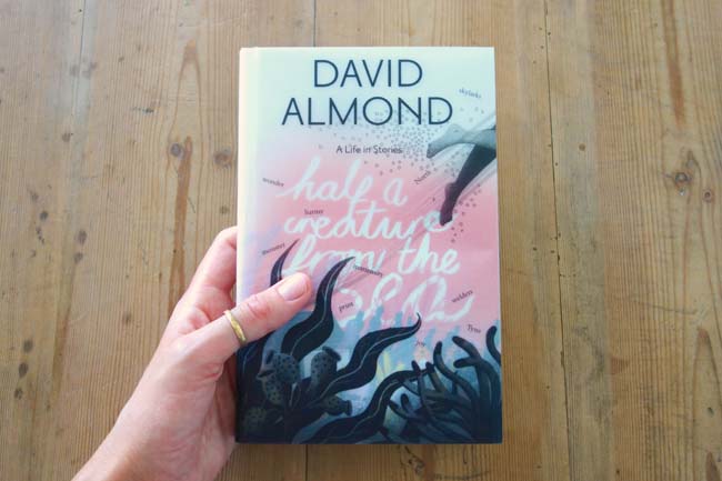
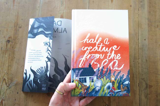
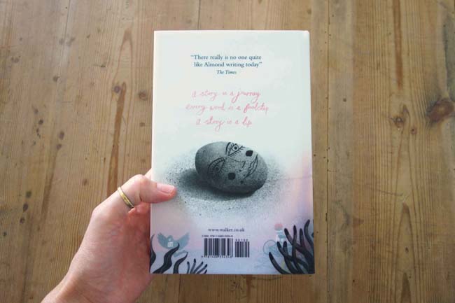
When I created the cover I did keep an awareness in the back of my mind that the composition should be strong and appealing on a bookshelf. But the most important thing I felt was creating a strong concept that was true to the stories. A cover doesn’t have to be loud and brash to stand out. I feel that with Half a Creature From the Sea you get a strong urge to pick it up and peel back the cover to reveal what is beneath. I worked very closely with David McDougall, who came up with the fantastic concept for the cover. The idea was to mimic the multilayered elements of Almond’s stories connecting the idea of solid reality and a kind of fluid dream world. The overlay is very monochrome, with seaweed snaking across the cover – quite dark and murky but beneath the overlay lies a rich and colourful world of stories. I love that this book can be both bold and colourful as well as more subtle and thoughtful.
What was your relationship with the author like?
It’s quite interesting as I think publishers generally like to keep the author and illustrator separate until the end of the project. I guess it helps to keep things running smoothly and to retain the integrity and energy of the book. It’s the job of a skillful art director to liaise with author and illustrator to make the two elements work together. David Almond took an active interest in the illustrations and all the roughs were approved by him. I recently met David for the first time. We all went out for a meal and it was so lovely to meet the man behind all these amazing stories.
What is your process and approach to illustrating a text? How do you mediate between your own artistic expression and the needs of the narrative?
As this was my first ever commission to illustrate a book, I felt a huge amount of excitement and pressure. I really wanted to do David Almond’s writing justice. I found it a struggle at first but I was given a lot of encouragement to be free with my ideas and put a bit of myself into the drawing. It helped to have in mind that I was chosen for my own illustrative voice and to trust in it a bit more. The writing itself contains so many layers and I think this can also apply to the way in which the drawings add a richness to the text.
Are there any aspects of the finished work that you are especially happy with? Are there any frustrations, such as where you would have liked to push an idea further but were limited by certain factors?
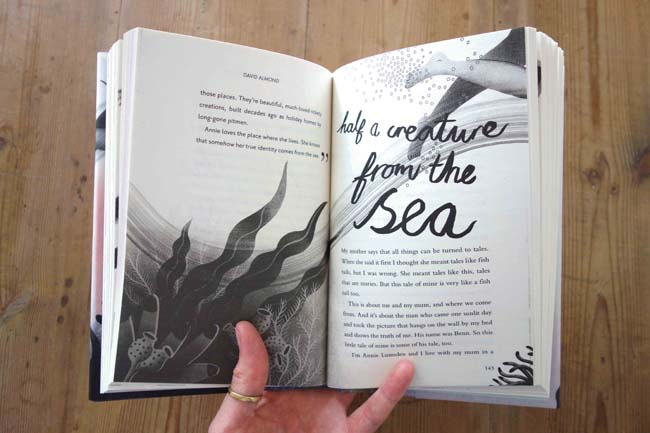
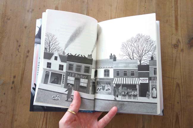
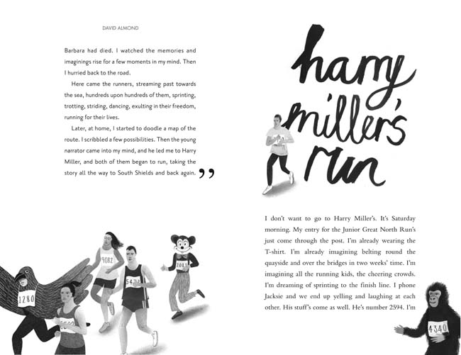
This was an incredibly rewarding and fun project where I felt I was really pushed to the best of my ability – especially as the final drawings themselves had to be completed in about three-and-a-half weeks. I found myself drawing subjects that I had never explored before like shipyards, flying furniture and people in gorilla suits. I’d never really attempted much hand-lettering before this project so I was particularly happy with how the titles turned out. I also really enjoyed creating the high street scene for the introduction, which wraps around four pages.
eleanortaylor.co.uk


