
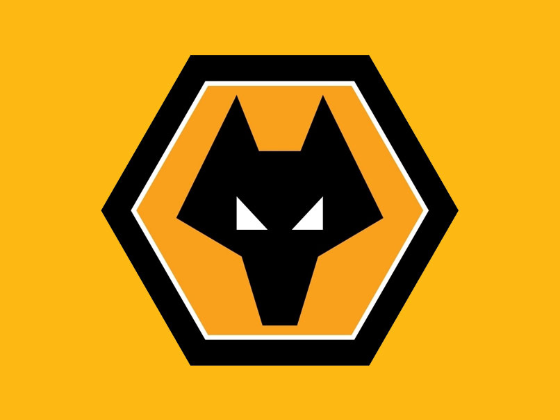
Alex Broadhurst remembers a childhood logo that really made an impression, not least on the covers of his school exercise books. I don’t have that story. You know the one that graphic designers often wheel out? That reassuringly cool album sleeve, band logo, or magazine, which observed during their formative years, revealed their destiny as a ‘graphic designer’. I know most of us don’t really have that moment. I struggle to explain what I do, let alone what led me to pursue it as a career. What I did develop in the early 90s was an unhealthy obsession with scribbling an easily reproduced, angular, pared-down representation of a wolf head. My school exercise books would never look the same again.
I’m a third generation Wolves fan. I can’t claim to be an ardent follower these days but the mention of Wolverhampton Wanderers brings back fond memories of sitting with my Dad in sub-arctic temperatures at Molineux, wearing a head-to-toe bright orange shell suit and collecting Panini stickers, with an as-then inexplicable fascination for seeking out the club badge designs.
I didn’t repeatedly sketch the Wolves logo because I liked it per se. I drew it because I followed the team and wanted other people to know I supported the hopelessly unsuccessful, perpetual underdog from the West Midlands. And, of equal importance, it was really, really easy to draw. I obviously didn’t have the opinion then that I do now; that English football crests, logos and badges are almost exclusively boring exercises in replicating traditionally familiar forms. Often heraldic and borderline biblical, they are usually de-facto coats of arms playing up to their heritage and local significance.
Wolves' 1979 logo eschewed all of these traditions in favour of a simple, symmetrical, aggressively angled wolf head. A refreshingly reduced, modern badge in a sea of emblazoned mundanity. The sort of logo redesign that today would trigger a fantastic online backlash from every armchair design commentator. I've never discovered who first drew this perfectly distilled badge, but I’d be immensely satisfied if my perception of it at all resonated with the designer’s vision.
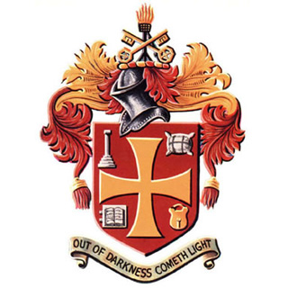
Since 1979, Wolves have modified the logo with additional unnecessary elements, and even disappointingly reinstated the city's coat of arms in its place for a few years in the mid 90s (above). Now the wolf head is back, albeit placed in a hexagonal container (below).
Ultimately it would be fair to say that I admire simplicity. I can’t really claim any truly sincere Modernist philosophy, I just like well- executed logos that appear effortless in their form. An apple for Apple Inc., mouse ears for Disney, train tracks for British Rail, a wolf for Wolves. To me this isn’t lazy. When executed well it can still provide the appropriateness, differentiation and whatever else might be required at that moment in time. It may not always have a great story, and it may not always hide something achingly clever in its negative space, but more often than not, it's the better for it.
If anyone knows who designed the original 1979 badge I’d love to hear from you. The fact it also tessellates perfectly just can’t be by chance.
alexbroadhurst.com
Alex Broadhurst
...is a UK-born designer currently working as an art director at Apple Inc. in San Francisco on campaigns for the iPhone and iWatch. Prior to moving stateside, Alex worked for B&W Studio and SEA Design, where he worked for clients including GF Smith and Monotype. Wolverhampton...
In the heart of England's so-called Black Country, Wolverhampton Wanderers' gold and black team colours originate from the city's official motto 'Out of darkness cometh light'. Rather aptly, Wolverhampton was the first town in the UK to introduce automated traffic lights in 1927, in the town's Princes Square.