
There’s no denying the visual (and financial) clout that a well-crafted logo can exercise. In this piece (originally published in November 2007), we asked ten influential graphic designers to tell us about a brand marque they thought was deserving of iconic status. Here are the results... —
01
Bryan Edmondson, SEA Design
Ford, designed by Paul Rand, 1966
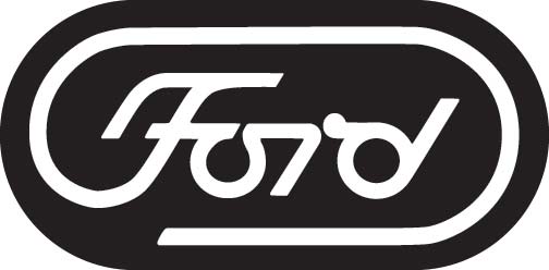
Paul Rand (1914–1996) was actually born Peretz Rosenbaum in Brooklyn, New York. Ever the consummate identity designer, he later changed his name to the much shorter Paul Rand because, apparently, he decided that “four letters here, four letters there” would “make a nice symbol".
He may seem like an obvious choice for a piece on brand icons, but, as Laszlo Moholy-Nagy famously pointed out, one of his key strengths was his ability to explain how his identities would address a company’s needs and convince the client of the important role that graphic design could play in its business. This was coupled with an enviable directness which made his work accessible to all – he is often quoted as saying: “Ideas do not need to be esoteric to be original or exciting.”
Despite Rand’s unrivalled salesmanship, unlike his other much-admired corporate identities, this particular logo never actually saw the light of day.
The Ford Motor Company commissioned Rand in 1966 to redesign its logo, but didn’t implement his design – it was deemed to be too radical a departure from the original. It seems strange to us to commission someone like Rand and then get cold feet at the last minute, but who knows what was going through the mind of Henry Ford II at the time? Probably something along the lines of what was good enough for his grandfather was good enough for him, so why change it?
It may not be considered to be as classic as Rand’s IBM, ABC or FedEx marques, but I really like the simplicity of this logo. The lozenge shape gives it a modern edge and the effortless curves reflect the automotive design of the time.
Of course, this sort of thing is totally subjective, but I know which one I’d rather see on the bonnet of the latest Ford GT.
—
02
Paul Austin, MadeThought
FedEx, designed by Lindon Leader, Landor Associates, 1994
My selection for a brand icon is the current FedEx logotype. This was made for two reasons. Firstly, the use of a large-scale sans-serif face in such a bold manner is always a refreshing change to the general corporate politeness adopted by most brands. I have always enjoyed the sheer brutality with which the mark resides on various forms of transport (the utilitarian truck in particular). It is fresh, iconic and spirited, but also possesses a sense of efficiency and reliability.
The second reason for making this my choice is the extremely subtle and clever inclusion of an arrow, formed from the counter space between the 'e' and 'x'. An obvious choice of symbol for a company involved solely with movement and transportation, but used in an unassuming way. I had never noticed it until it was pointed out to me some years ago, but once you know it is there, it's the first thing you see whenever a FedEx truck drives by. —
03
Markus Weisbeck, Surface
Deutsche Bank, designed by Anton Stankowski, 1974

One significant aspect of living and working in Frankfurt is the metapresence – sometimes casting huge shadows with their high-rises – of the largest banking institutions in Germany. Second to none is the Deutsche Bank.
Located directly in the centre of the city, its logo is precisely integrated into the grid of the glass façade, and has been its brand sign for the past thity-five years now. The image characterises – in a simplistic way – its possible financial growth. It was originally designed by Anton Stankowski in 1973 for Stuttgart Airport but was rejected and later entered into a design competition for the Deutsche Bank.
Like stockmarket software, sequencer software is often based on Fibonacci-curves.
When I moved to Frankfurt in the mid-90s, the banking centre of the EU also became the centre for electronic dance music called Techno. Clubs like Dorian Gray and Omen were playing this new dance music, and DJs from all over the world performed there. It was then that I heard for the very first time a new, very minimalistic type of electronic music which sounded completely different than anything I´d heard before. You could count the different acoustic elements on the dance floor lying on a black and white geometric flying carpet. The label behind these patterns was called m-nus. Following these musical principles the graphic language translated into a similar minimalism. Sometimes a few small dots in one corner of a record sleeve or sometimes only the logo, and generally a lot of white space. The logo sign itself depicts the mathematical symbol for minus, centred in a black-framed square. The name is written by abandoning the letter ‘i’ and replacing it by the mathematical sign. Alphabetising the name makes it unique and enables one to find the label via Google. Richie Hawtin, the founder and mastermind behind the label, designed it in 1998.
In the near future I hope I can invite him to participate on a project for our label: ‘whatness’. —
04
Sean Perkins, North
ERCO, designed by Otl Aicher, 1976
A simple black and white typographic concept. Four letters, four weights of Univers. Progressing from the bold to light, the logo gradually illuminates. I admire its simplicity at the same time as communicating so much, the name and the business. “ERCO create light” – Aicher visualised the wish of ERCO to sell light and not lighting devices. It is functional and simple to produce, works at all sizes, tiny on products, massive on architecture. It is ultra-legible, intelligent, timeless, relentlessly modern and (like ERCO products), a classic.
—
05
Massimo Vignelli
CBS, designed by Bill Golden, 1951
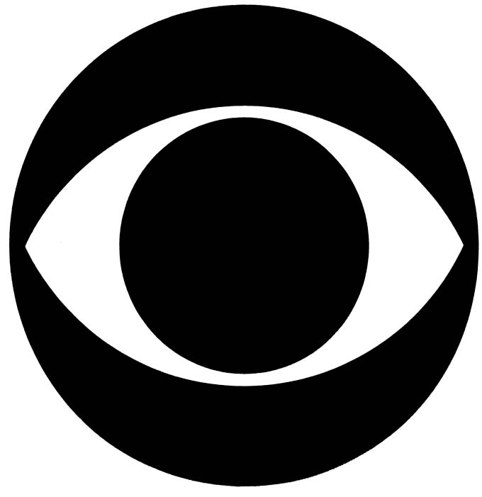
One of the logos that I always admired the most is the CBS eye. Done a long time ago by Bill Golden, it still one of the best ever. Appropriate, powerful, memorable. But there are so many others – the Apple one is delightful, and the reference to temptation is a masterpiece. It is a very long list, and those with more exposure are the winners. —
06
Michael Johnson, johnson banks
Time Warner, designed by Steff Geissbuhler, Chermayeff & Geismar USA, 1990
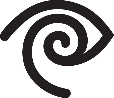
The Time Warner symbol from the early Nineties is my nomination for one of the best logos ever.
It was developed as a visual solution to the merger of Time Inc and Warner Communications, and neatly ties into a desire to be ‘the eyes and ears of the world’. Any decent identity designer will confirm that having a good idea is one thing, but a useful line like that supplies fantastic ‘boardroom rationale’ as you unveil the preferred solution.
The logo itself looks beautifully simple, but study it carefully and you’ll see it’s not really geometric, but actually quite organic. It’s one of those ideas that we’ve all scribbled into our notebooks, but then quickly come unstuck when trying to create in real life.
If my memory isn’t playing tricks on me, I think that its designer, Steff Geissbuhler, had been struggling to get the curves to work on a computer and ended up painting the solution at home one weekend with a set of big fat paintbrushes. Try creating something like this with a standard drawing programme and you’ll soon begin to appreciate how much time Geissbuhler and his team would have spent balancing the weights of the lines which are often technically ‘wrong’ but look visually so right.
As the overall organisation’s mnemonic it was sadly short-lived because a boardroom reshuffle removed its main supporters and it ended up being shunted over to the cable division. This was justified at the time because ‘the symbol is so strong, it’s hard to make it work with the other symbols’. Quite rightly, the US design fraternity threw up it hands in protest (albeit to no avail). I’ve always thought that was an inherently paradoxical criticism, that a logo could be too strong.
Thankfully it’s had enough time in the public domain to become a late twentieth-century classic, and the phrase ‘I wish I’d done that’ doesn’t even begin to cover it for me. If I ever get my eyes to see or my ears to hear a solution as good as that I’ll die happy. —
07
Tony Brook, Spin
British Steel, designed by David Gentleman, 1966

When I was younger, so much younger than today (Lennon/McCartney), I collected stamps. Like many kids and some adults, I was magnetically drawn to them. They were colourful, delicate and rare, like paper butterflies. I would buy them by the bag for 10p (obviously not that rare). I can clearly remember the first time I became aware of a set of stamps being ‘designed’; they celebrated the life of Churchill, and they cost me more than my pocket money. I bought them because they were gorgeous. I was around ten years old and they made me want to draw stamps.
At college I came across an identity that had a similar effect on me. It was perfect and it belonged to British Steel. Reductive, unmistakable, the form suggests the pliability of steel, the weight of the line, strength. In spite of its bold nature, the logo is elegant and beautiful. It is a testament to the power and quality of this wonderful marque that, even though British Steel no longer exists, its former identity still resonates as a fresh, impactful piece of design.
It wasn’t until after I left college that I learned, much to my amazement, that two of the most influential moments in my design life were created by the same person: David Gentleman. I have had numerous 'Who did that? David Gentleman…' moments since I first saw his name: Charing Cross Station murals/David Gentleman, the anti-Iraq War “Bliar”/David Gentleman, etc. However, now that I am a little more familiar with the sheer range of his work (he is a peerless designer, illustrator, artist and graphic agitator) and its unbelievable quality, it isn’t quite as much of a surprise. —
08
Jethro Marshall
John Lewis Partnership, designed by Hans Schleger, 1962
Avoiding the buzz, confrontation and gloss of fashion, music or beauty retail, the only shop in London that consistently uses good design communication is John Lewis on Oxford Street. From the exemplary windows to the straightforward signage, from the array of appropriate packaging to the fleet of delivery vehicles, John Lewis has the most distinct, spare and confident identity among its vast array of competitors.
The roots of this corporate identity and visual language can be traced back to the recruitment of the progressive design duo Robert and Lucienne Day back in 1962. As a result of their association with early English modernism and their desire to reach a wide audience rather than cater to an elite, the Days were the ideal minds to understand what the John Lewis 'partnership' meant as a business ethic and how to project this attractively to the British public. "The enterprising and enlightened 'Partnership’… contains the ideas of permanence, continuity, fairness, value and progress… these qualities are not expressed by glamour, witty or temporarily entertaining images. At the same time on over-sedate or classical style would seem to deny the fact that the Partnership is alive to modern thought and progress," Robert Day wrote. The way to express this was to "avoid fussiness and work towards an uncompromising order, clarity and a modernity that will not tire".
Within five years three masterstrokes laid the foundations for this most longstanding of retail public faces: 1) the commissioning of graphic guru Hans Schleger to design a logo that was based on the three main letter characteristics but that was also a pleasing, punctuating sign; 2) the adoption of a simple two-colour palette, white and green (with the allowance of a paler green for some flexibility); and 3) the introduction of Helvetica, then a new typeface from Switzerland which was revolutionary in its cleanliness and humility.
Apart from all the subjective personal emotions one connects with John Lewis (for me rare shopping expeditions in the 70s, choice and scale, not understanding “Never knowingly undersold” until I was twenty-five, but loving the sound of it anyway), there has been no greater business success story on the high street in the past five years. The corporate qualities noted by Robin Day in the Sixties sound remarkably like a modern branding consultant’s advice to a flailing department store, and the appealing profit-share policy of the ‘Partnership’ feels like all the best aspects of contemporary caring capitalism.
The John Lewis case study should inspire retail marketing offices and reassure CEOs of the worth of long-term quality above value-led short-termism. Viva the ‘Partnership’ and keep producing those bloody brilliant shop windows. —
09
Hort
OCP (from RoboCop), designer unknown, 1987
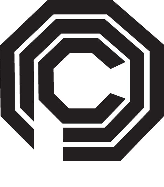
(The Hort, early afternoon. Around six people showed up, the younger ones wearing skinny outfits, scarves and pointy shoes, the older ones dressed the way teenagers used to dress in the 90s. They are having a meeting, sitting around an old couch, secretly feeling very happy not to be working at McDonald’s.)
MILA: Okay, so Grafik asked us to write about any logo that we like. We already decided we'll talk about the OCP logo from the original RoboCop movie. OCP stands for Omni Consumer Products, which is the mega-corporation that is also running the Detroit police department.
EGON: I still don't really know why we picked that particular logo.
MILA: Hmm yeah, maybe we can think about an excuse later. So here's a printout. As you can see here, the designer didn't even bother getting the letters in the right order. Nor with making them recognisable.
FRANZ: In medieval architecture the octagon was seen as a representation of god-like perfection. Looking at the somewhat lazy execution of the logo this seems kind of ironic, doesn't it? But what is striking regarding the form-feeling of the OCP octagon? It looks like a fortress, it's aggressive and self-centred as well as sealing-off and protective. Now the question is: is this logo well designed or not? Does the brutalist style build a harmony with the realm of RoboCop?
ZIGGY: To me that's not the question at all. This is just the kind of designer waffle which I'm bored to death with. I mean these are issues if you're a first-year…
EGON (stops Ziggy): Easy, I think Franz has some good thoughts here (Vivienne enters the office, cheering at everyone and everyone cheering back at her.)
MILA: Hey Vivienne, we're about to discuss this logo thing for Grafik, are you going to join us?
VIVIENNE: Uh, and they'll publish it or what? I don't know, I just came to pack some stuff 'cos I'm moving…
MILA: You know we picked this logo. The funny thing is it doesn't even really exist, it's an imaginary company.
VIVIENNE (laughs): So?
MILA: But it would be interesting to hear what…
VIVIENNE (interrupts Mila): Aw no, and besides I really need some time to relax. (Vivienne turns away and starts packing stuff at her desk while vivaciously chatting with an intern.)
ZIGGY: Can I say something? I think the logo gives us a dark future vision of graphic design. I mean a corporation like OCP doesn't really need a well-designed CI since they are the only player in the market anyway. The logo doesn't have to appeal to the customer. I also believe OCP have an in-house cyborg taking care of all their CI and advertising. He's fast and cheap. He doesn't ask questions because he's just following his prime directives.
EGON: That's the future. We're all going to melt into our Macs. We'll look like Björk in that video where she was making love to her double. We'll be shiny white design zombies producing crude logos for one and the same company.
(The conversation digresses to Björk's recent output and how Mila and Egon once ran into her at Heathrow Airport and luckily didn't have the nerve to address her.) —
10
Yorgo Tloupas
La Grande Epicerie de Paris, designed by Lewis Moberly
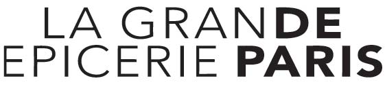
Le Bon Marché is a Parisian department store, probably the equivalent of Selfridges in London. A few years ago they decided to open an upmarket food hall within their building, and their first clever decision was to avoid choosing a fancy, bourgeois name for it, opting instead for the almost anonymous "La Grande Epicerie de Paris".
This "big grocery" is filled to the rafters with elegantly packaged food, pretty much devoid of garish biscuit boxes or multi-coloured yoghurt pots. No need to point out that the food itself is also excellent.
The logo is an example of cleverness and restraint. No silhouettes of vegetables, no organic-friendly typeface, just a brilliant decision: using the de of “Grande” to spell out the de of “de Paris”, thus shortening an otherwise very long name. Perfectly readable, albeit with a ‘double-take’ effect, instantly recognisable, it also works perfectly in black and white, in small, and can even be drawn by hand, from memory. Which should probably be the ultimate test of a logo's visual efficiency.
I also appreciate the fact that the designers have not bent to the (supposed) demands of the client, which almost certainly included a need for ‘warmth factor’, ‘open welcomeness’, ‘premium product identification’, and many more supposedly crucial elements.
This logo could actually function for any company, from a museum to a fashion label – wait – isn't a logotype supposed to clearly spell out what it stands for? I take it all back, this should have had the shape of a carrot crossed with a silver fork, with a nice 3D effect, some shadows, and evocative colours such as aubergine and burnt orange. This article first appeared in Grafik 157, November 2007