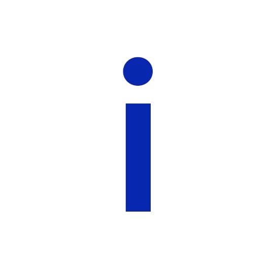
Tangible and with the ability to build a readymade grid, Susanne Vetter finds Graphik a perfect typeface for visual experimentation, especially its sturdy lowercase ‘i’. My background is in poster art and illustration rather than the minutiae of typography, which is why typefaces that promise to function as a base for working unconventionally or experimentally always have magical appeal for me. I often start working by thinking about the impact of a single character, or the interaction of only a few letters, and create the rest of the artwork around that by embracing the character‘s traits.
Graphik works particularly well with this way of designing. Its straight geometry and almost consistent line weight already builds a visual grid to work with. For me that means putting an ‘i’ on a white sheet of paper immediately forms a playground for experimenting with the characters' shape. Cutting them apart, mixing different weights (even within a single letter), or bringing other shapes into play to blur the borders between graphic elements and typography (and then probably start over again because I got carried away).
Designed by Christian Schwartz in 2009 (originally for Schwartz‘s own identity), Graphik's aesthetic roots can be found in several moments of twentieth century type design. In the lighter weights, it is reminiscent of Swiss poster art (of which I‘m a great fan), and in that respect has less similarities with Helvetica or Univers than with the typefaces of that era designed to compete with them. In the heavier weights Schwartz was inspired by the large wood type characters of Paul Renner’s Plak, the heavyset proportions of which hark back to days of hand-lettering. That is probably the reason why it feels so tangible – and makes me want to go and have some fun at a letterpress workshop for a day.
susannevetter.com
Susanne Vetter
… is a Berlin-based designer who often uses typography and glyphs to lead her illustration or identity projects. Particularly impressive is her series of typographic posters to promote the play The Mermaid, commissioned by Russian culture magazine Театр. Here the woodcut-like images feature waves, a river and a star intertwining around the lettering, distorting their forms.
Paul Renner’s Plak
Designed in 1928, this typeface was designed as an accompaniment to Stempel's Neuzeit Grotesk family. Intended as a poster type it was available exclusively in bold weights, but in three width variations, the widest variant bears similarities to some of Futura's geometric letterforms – a typeface also designed by Renner.
September 9, 2014 2 minutes read
Touch Base
Tangible and with the ability to build a readymade grid, Susanne Vetter finds Graphik a perfect typeface for visual experimentation, especially its sturdy lowercase ‘i’.

