
Luke Tonge, the designer behind Monotype’s The Recorder, praises the aesthetic impact and clever concept behind his favourite magazine cover, Eye’s brand madness special issue.
Last year I shared a brief and sweaty subway ride with Eye Magazine’s Simon Esterson on the London Underground, after an inspiring day at Jeremy Leslie’s Modern Magazine conference. As a long-time admirer of Simon’s work, it felt like a huge honour to be casually chatting magazines with one of the most talented editorial designers of our generation. At the time I was mid-way through designing the now-relaunched Recorder for Monotype and felt like an imposter entering into the same arena of publication design as Simon, how I imagine a Sunday league player might feel having a kick around with Zidane or Messi. The further I get into my own journey of graphic design, the more I appreciate just how hard it is to produce any magazine, let alone a publication as consistently good as Eye.
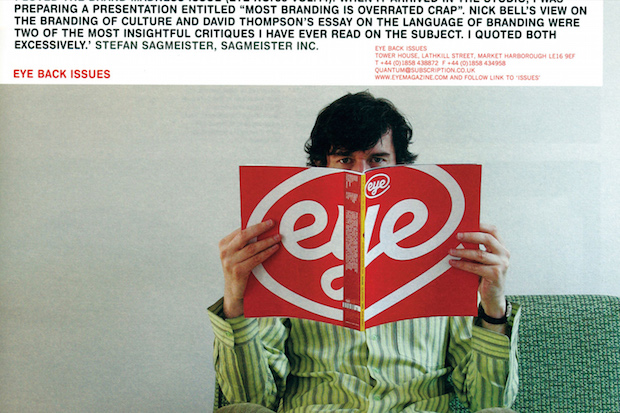
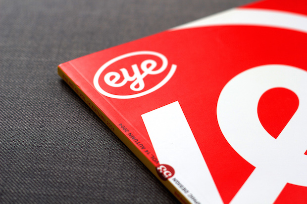
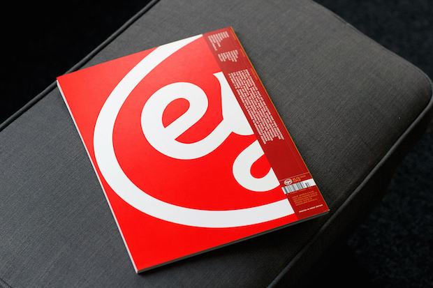
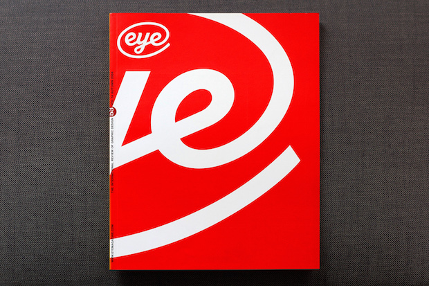
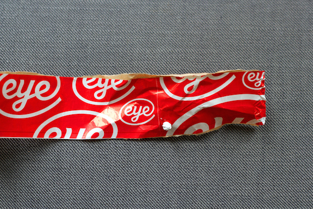
Rewind to 2004. I was nineteen, fresh out of college and about to embark on a graphic design degree far from home in Falmouth. I was already mad about magazines, always hunting down copies of Creative Review, Grafik and iDN, meticulously collecting Ride BMX and Adrenalin, cutting up my old man’s issues of National Geographic and TIME, and beginning to dabble with subscriptions of my own. Soon I would discover my new magazine addiction… Eye. Little did I know it then but that autumn would also see produced possibly the finest magazine cover ever committed to paper – for Eye 53. Vol 14 – the ‘Brand madness’ special issue. Eleven years on and I’m still hung up on how perfect it is. Magnus Rakeng’s logotype is repeated HUGE, spanning the front and back, in crisp white on a pure red backdrop. The regular-sized masthead sits in its usual position, now nestled inside the behemoth that has enveloped the covers. If you visit the Eye website you’ll see it still, loitering in the sidebar, Stefan Sagmeister peeping over the top of its open pages.
It’s quite a confident move to blow up your own logo for a branding special cover in favour of perhaps a brand discussed on the pages within (some might even say self-indulgent). In an effort to dig a bit deeper, I spoke with some of the team from Esterson Associates, who currently handle the design and production of Eye amongst many other titles. They kindly put me in touch with Nick Bell, who in 2004 was the creative director at Eye and responsible for the cover design of Eye 53. He and long-time Eye editor John L. Walters provided some fresh insight for this piece. Here’s an excerpt from Walters editor’s letter that sheds some light on the decision to hero the Eye brand:
“Eye is a brand, and we don’t want to you to forget it, even when we’re putting together an issue with the theme of brand madness, and the air is heavy with critical writing.
“Yet for all this emphasis on the brand; the look and feel; the smell of paper and ink; the steadily expanding website; the cool curves of our twenty-first century logo; we never forget the core of Eye’s brand. Writing. Critical writing. That’s why our slogan is: ‘Love critical writing! Love Eye!’ Extensive research has shown how much our readers love Eye’s stimulating mix of studio profiles, interviews, overviews, polemic, critique, reviews and visually led explorations of graphic design and visual culture.
“So with this issue, under the aegis of the Eye brand, we take a cool look at the issue of branding. Because if a brand is a promise and the promise is critical writing, it’s essential that we make good that promise – even if it means being critical of branding itself.”
Nick expanded further on this subtext in our correspondence…
“The thinking was to implicate Eye itself as part of the culture of branding despite its critical stance on it. To suggest that it’s possible to participate critically and not think that you can’t be critical because you are participating, or assume that participation disqualifies you from being critical.”
This sort of considered and reflective self-assessment hints at the sensitivity and humility with which the Eye team (past and present) have approached their work – they are a refreshingly honest and well-informed critical voice in an era of transient blog posts, inflammatory link-bait and those dreaded comments. It’s this offer of excellent critical writing wrapped up in beautifully designed and produced tactile package which has seen Eye survive for twenty-five years and ride out the credit crunch.
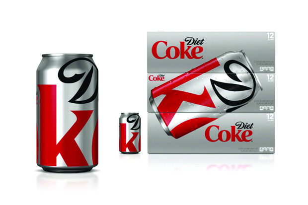
As smart a statement as it makes, it’s the simple aesthetic wallop that first caught my attention, and makes me still love it so: timeless, iconic, and perfectly executed. The ‘crop’ is of course a common visual trick usually reserved on magazine covers for portraits and has more recently been embraced by brands themselves to great effect – such as the 2011 Turner Duckworth-orchestrated packaging refresh for Diet Coke (below).
On that note, I asked Nick whether he considered any other colours or crops: “Once I saw the cover in red on my computer screen, it was immediately obvious that it had to be red with the logo in white. There’s something in the proportion of red to white: we thought there was something a bit Coca-Cola about it – which we thought was appropriate.”
Here’s Walters again with the last word on why he considers oversized to be the right size: “Reproducing the logo as big as you can get away with, it’s madness. Brand madness.”
So there you have it. Officially my favourite magazine cover, from probably my favourite magazine. If you love graphic design I recommend you take a look at Eye – and if you’re big on branding you can still pick up back issues of No.53 here – it’d be brand madness not to.
luketonge.com
Luke Tonge
…is a senior creative at Birmingham-based LIFE agency, working with clients such as KitKat, Nivea, Nescafe, Carling and Samsung, to name just a few. He was the art director at nomadic travel magazine Boat, developing the first six issues, and is the brains behind the visual language of Monotype’s The Recorder. In fact, you can read more about the latest issue of the The Recorder in our interview with Tonge here.