
Revealing the winners of the 46th annual Laus design awards, with some jaw-droppingly good design from across the globe.
If you want to see an extraordinary selection of the most impressive graphic design and illustration work from the last year, get a load of the winners of the 46th Laus Awards. The scheme is run by the Spanish Association of Graphic Designers and Art Directors (ADG-FAD) but for the first time this year, it opened its doors to international entries. When the winners were revealed at the end of last week, it was a treat to see such extraordinary work by world class designers gathered together.
We’re pleased to present here an overview of some of the winners, across categories including ‘Honorary Laus’, ‘Laus Company Award’, ‘Grand Laus’ and ‘Gold Laus’ awards.
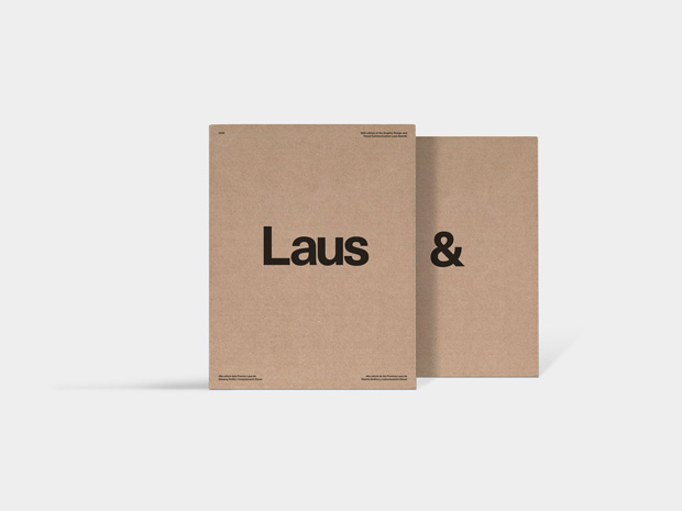
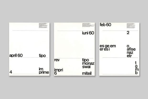
This year’s awards have been celebrated in a wonderful catalogue designed by Barcelona-based studio Solo, with essays and interviews alongside representations of the entries and winners.
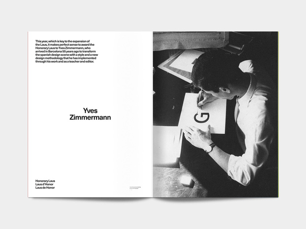
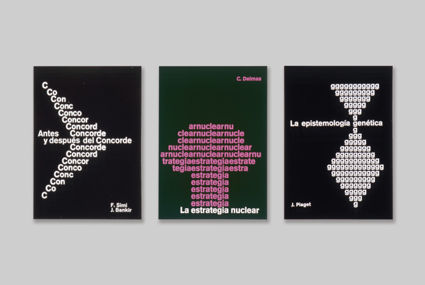
Honorary Laus – Yves ZimmermannA new award for this year’s expanded awards, this category celebrates innovative designers of enduring influence. Swiss designer Yves Zimmermann of the Basel School, settled in Barcelona in 1961 and has since influenced an entire generation of Spanish designers. He transformed the Spanish design scene with a style and a new design methodology that he implemented through his work and as a teacher and editor.
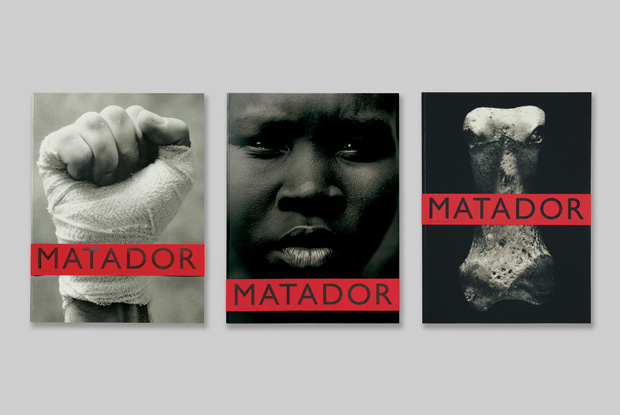
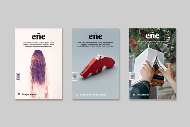
Laus Company Award – La FábricaThis award recognises a design company of remarkable outlook and achievement. The winner, La Fábrica, based in Madrid, is responsible for some of the most influential cultural and editorial projects developed in Spain, such as the photography festival Photo España, Matador magazine, the literary magazine Eñe and a host of other events and books.
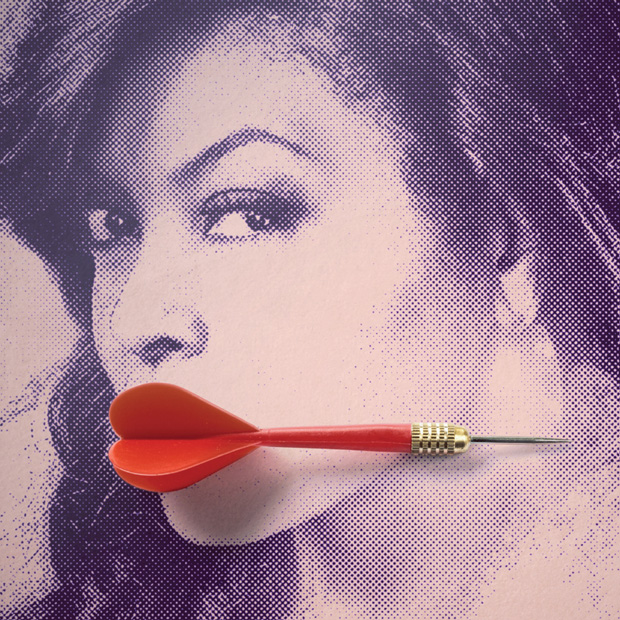
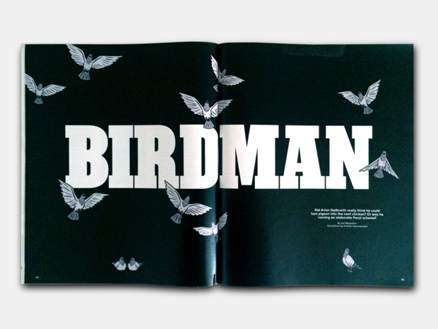
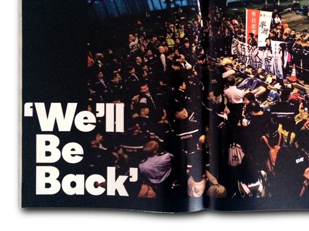
Grand Laus – Javier Jaén for The New York Times MagazineThe top gong for a body of design work went to Estudio Javier Jaén’s editorial collaboration with The New York Times Magazine. The long-running series of photographic illustrations are witty and erudite, the embodiment of the power of one-hit visual storytelling.
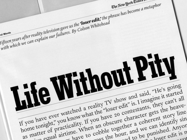
Gold – The New York Times Magazine TypefacesOverseen by art directors Gail Bichler and Matt Willey, within a period of four months, last year, A2-TYPE designed a unique set of twenty-nine fonts in three categories, for the exclusive use of The New York Times Magazine. A remarkable achievement, the project demonstrates the impact both subtle and dramatic, that a boldly holistic approach to editorial type design can have.
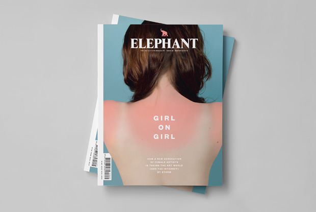
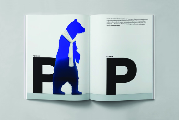
Gold – Elephant magazine Issue 24 & 25Another homerun for editorial design, a Gold award went to Atlas’s redesign of art magazine Elephant. Commissioned to make the magazine “timelier, more journalistic and lifestyle, more readable and enjoyable, looking less like a design magazine,” the Mallorca-based studio has triumphed with an approach that manages to be elegantly stripped-back and artful in it’s foregrounding of content, while also achieving an overall feel that is exciting and inviting.
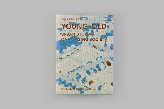
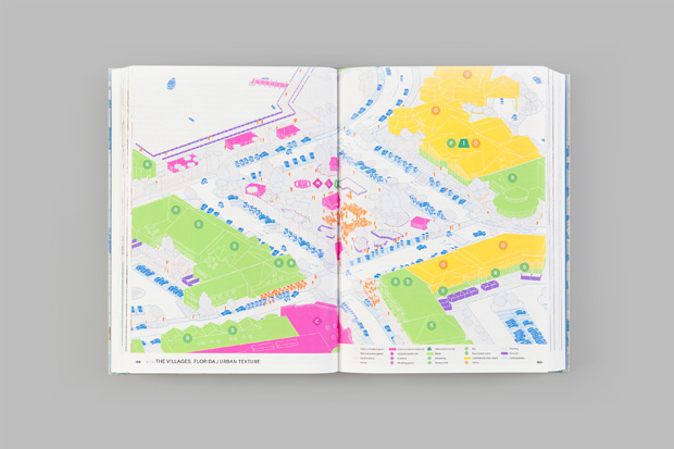
Gold – Young-Old: Urban Utopias of an Ageing SocietyIf you want to see work that embodies the cream of infographics and book design, look no further than Dutch designer Joost Grootens. We’re always impressed by Grootens's adroit handling of complex information and ‘touch-me’ use of materials and processes. This was something that impressed the Laus judges, who awarded Grootens two Golds – for Young-Old: Urban Utopias of an Ageing Society and for his redesign of the Young-Old Urban Utopias of an Ageing Society and his redesign of the 150 year old Van Dale dictionary, The Netherlands’ most extensive and prestigious dictionary.
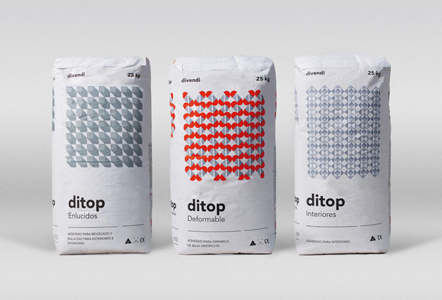
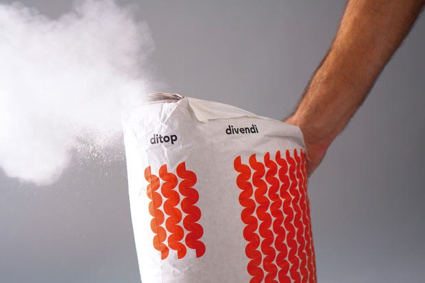
Gold – DITOP Cement SacksProving that even the most humble and work-a-day products deserve great packaging design, studio Rubio y del Amo’s design of a building materials company’s own line of cement earned a Gold Laus. Codes based on geometric patterns were used to identify a range of different products. The design of the building sacks bring a surprising ‘haute-couture’ design approach to a market where design is often disregarded.
Find out more about the Laus Awards.


