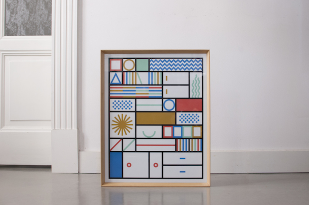
From icons for Time to The Independent’s new logo, Italian duo La Tigre have taken the international editorial world by storm. Now with identity projects in their sights, be prepared for proof that size really doesn’t matter.

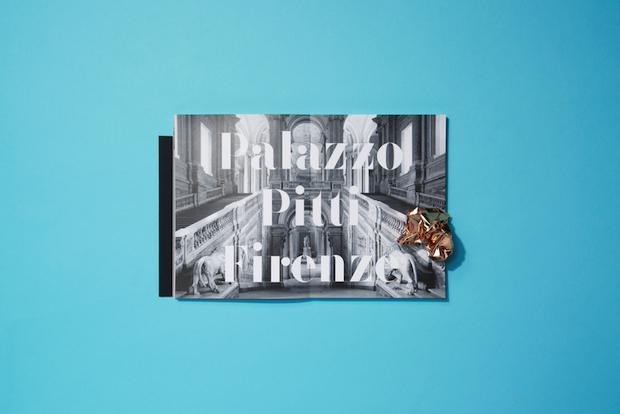
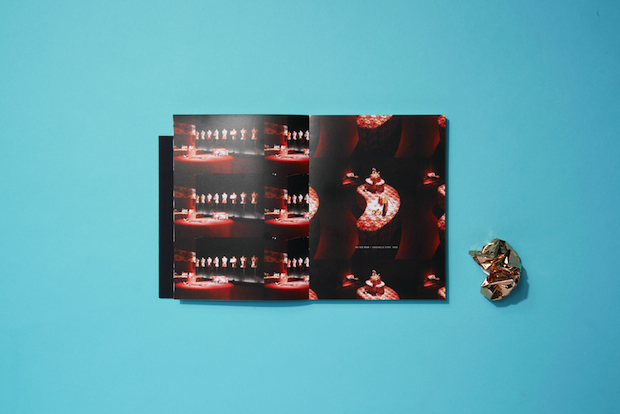
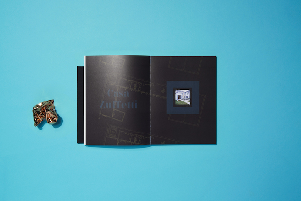
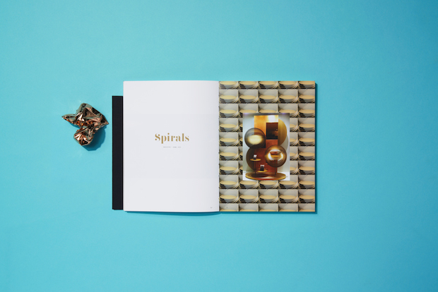
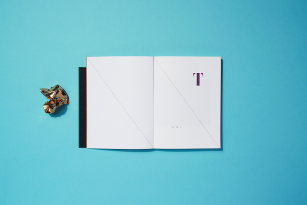
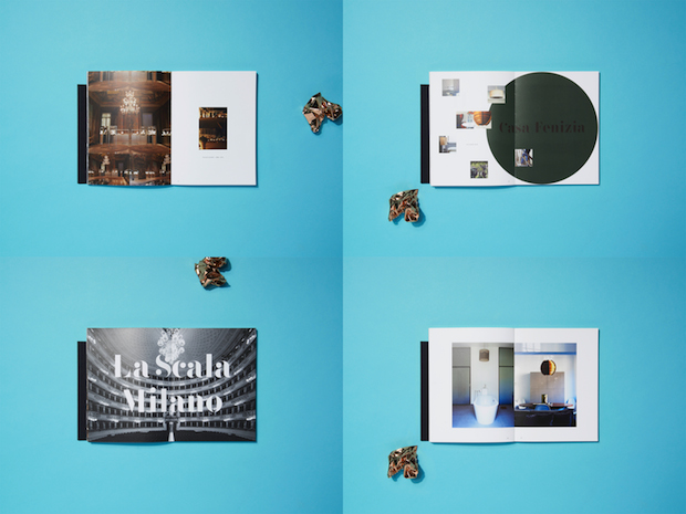
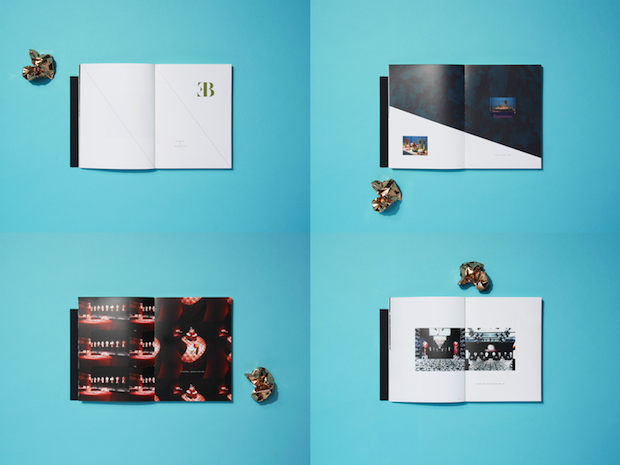
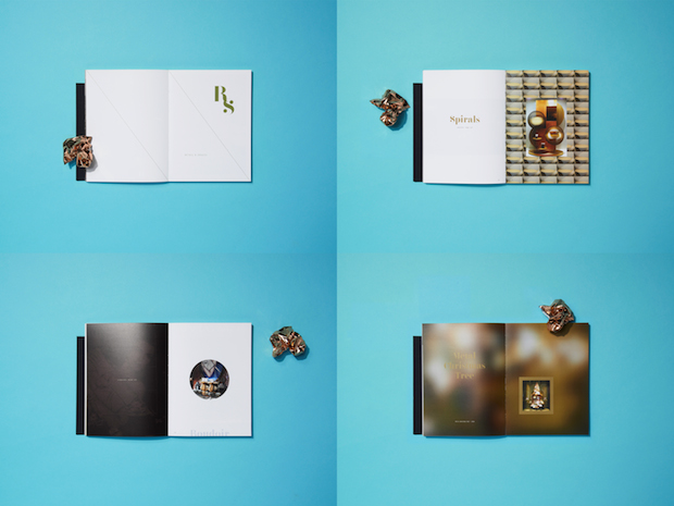
The correlation between artistry and struggle, and the recession and blossoming creativity, is nearly always bandied about lazily, and often as a supposed (and problematic) up-side to arts funding cuts. But there’s no doubt that tighter economic purse strings drive the creative industries to act differently. Such change has been felt acutely by designers in Italy, where the big agency model is being rapidly replaced, or at least heavily supplemented, with a fertile array of small, kitchen table studios. Leading the pack is La Tigre, a Milan-based studio founded by Luisa Milani and Walter Molteni in 2009, known for their direct but playful visual language. Their editorial work has been much sought after since their early days and the duo have just started to win huge clients, not least the rebrand of much-loved Italian department store Bassetti, a national treasure equivalent to something like John Lewis.
“In Italy, the big studios are less important than in the past,” says Molteni. “Milano is full of clients and businesses, plus all the magazines are here, but you can’t compare it with London or New York. It’s quite small and because of the crisis there’s not a lot of mobility. But it’s an opportunity for little studios like us, because brands that now have lower budgets are starting looking around, they find they want quality, not the name of the big agency.”
But La Tigre has also gained notoriety outside its native country. A large chunk of the young studio’s portfolio is dedicated to editorial illustrations, infographics and icons, created for the likes of The New York Times, Time, Wired, Le Monde, The Guardian, not to mention the redrafting of The Independent’s eagle logo as part of the Mat Willey-led redesign late last year.
Milani and Molteni, partners both in work and in life, first established La Tigre with two friends in 2009 after five years working in large studios (Milani at Leftloft and Molteni at Zetalab). Tired of the rather static dynamic, they were keen to experiment with a different way of working. “If you’re employed in a large studio often you can’t progress,” says Milani. “In Italy, design can be a quite difficult kind of work. If you land a job in a studio of say twenty people, it’s big but you will always have the same role as long as you work there.” Molteni adds, “It might be a nice place with nice colleagues, and for some people they’ll stay there and have a peaceful life for thirty years, but you have to understand that you wouldn’t grow.”
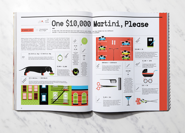
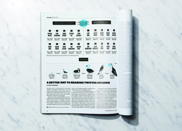
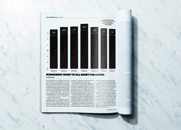
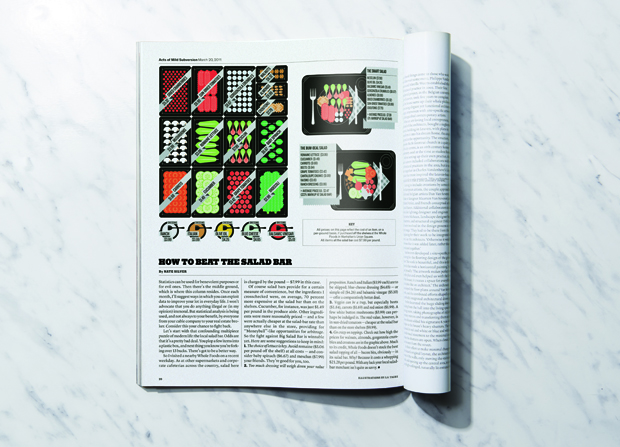
Their first commission was a spot illustration for prominent Italian financial newspaper Il Sole 24 Ore, won through a friend employed at the paper. At that point, they hadn't worked on editorial illustrations or icons before, but a raft of similar commissions meant that it soon became their strongest suit and their work was much in demand. “When we started La Tigre we were very enthusiastic and we wanted to express ourselves,” says Molteni. “We had very low budgets, but we tried to give our best. These early projects got featured in a lot of books. It was a surprise because we’re so little and so were the projects, but it really grew from there.”
After a year working together, La Tigre downsized to just Milani and Molteni, as different interests and working practices led the original line-up to disband. It’s a move that Milani somewhat attributes to the closeness between herself and Molteni. “We have a very particular process that is based on the fact that we are a couple,” she explains. “We really do discuss things a lot. It’s like we’re always working, at home, on Saturday and Sunday…”
“Often we have our best ideas when we’re in the supermarket or making dinner,” chimes in Molteni. Milani adds, “You are more than married when you have a studio together. Sometimes it’s a problem – it can be really stressful. You only really realise it when you are on holiday. But it’s really nice in some ways. We are always connected. Because we’re always together and we’re always talking about projects, they come out stronger.”
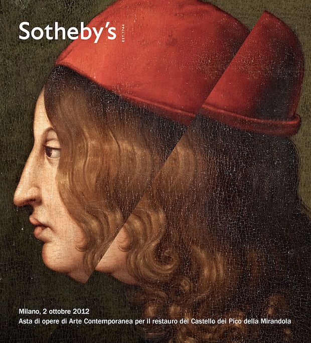
Despite their closeness, Milani and Molteni tend to approach projects in a different but complementary way. Whereas Molteni investigates ideas through drawing, Milani hits the books and design blogs to sift through nuggets of ideas that they can use for inspiration. This difference is perhaps in part down to their different academic backgrounds. Moleteni graduated from the prestigious IED, with a more conventional graphic design trajectory; Milani however studied at the Politecnicoo di Milano, a more architecture and engineering-focused establishment where students explore different disciplines and then to specialise much later down the line.
After a series of editorial illustration and identity project from Italian clients, an unexpected call from The New York Times in 2012, where Matt Willey was heading up a redesign of the paper, really upped the consultancy’s reach outside of Milan. This project involved creating clean, retro-leaning infographics for one of the paper’s new columns. In the end it only ran for four months, but the project laid the foundations for a strong relationship with Willey and a series of high profile commissions. “Studio 8 was one of our heroes,” says Molteni. “It was one of our favourite contemporary design studios. We have a good empathy with Matt but actually we’ve never met him. We never hear his voice,” Molteni laughs.

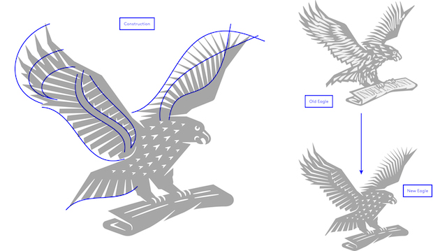
After designing icons for Wired US and the newly redesigned RIBA Journal, La Tigre’s biggest commission from Willey came as part of the redesign of the Independent newspaper in November 2013. La Tigre was set the somewhat intimidating task of rethinking the paper’s iconic eagle logo - a project that the pair feel was one of their most challenging to date. Echoing Willey’s redesign (a typography-led affair where large titles sophisticatedly balance with spacious expanses uncharacteristic for a newspaper), La Tigre approached the eagle more in terms of designing a letterform or an icon rather than a logo. “We wanted to make the original woodcut more contemporary and clean with more geometrical approach,” says Molteni. “The shape needed to be more fluid, so we didn’t work with solid lines of a consistent thickness, but grew them and thinned them, much like a glyph.”
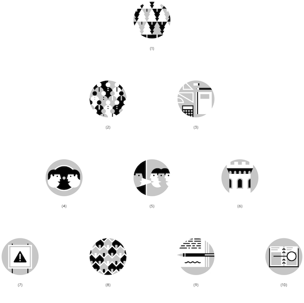
The process took approximately three months, and required a lot of back and forth between La Tigre, Willey and the paper’s in-house team to settle upon an iteration where every aspect of the eagle was perfect. “It’s really artisanal work,” says Molteni. “It was quite a free brief but there was a lot of trust there too.” As part of the project La Tigre also designed a new suite of icons for the paper, to help readers navigate through the publication and its non-print platforms. “Icons aren’t often a project that you show to someone and they say ‘oh wow’”, says Milani. “It’s more about the details, or a well designed shape, rather than making something loud. When you see an icon you have to understand what it means. It has to be really direct.”

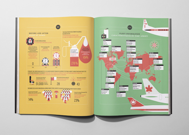
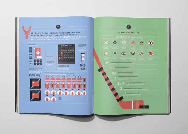
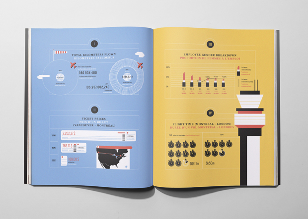
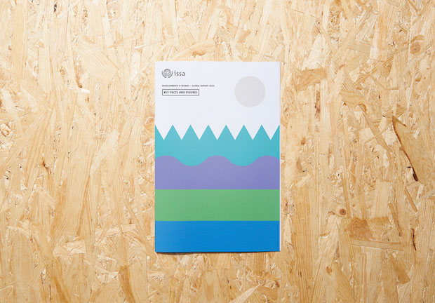
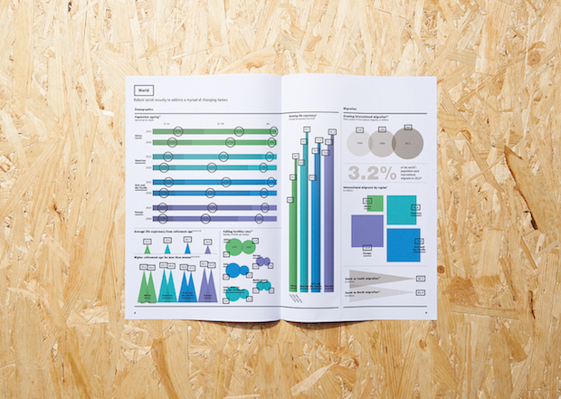
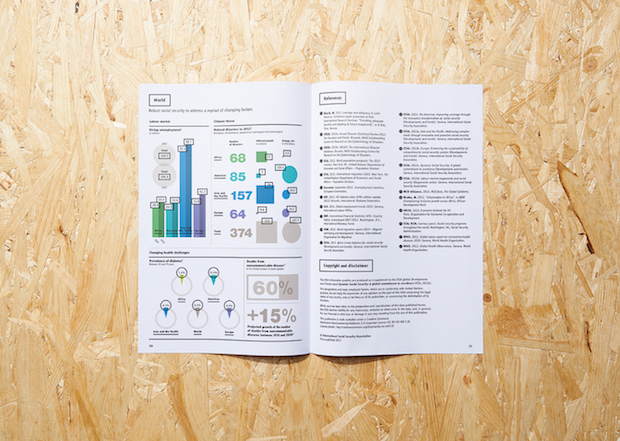
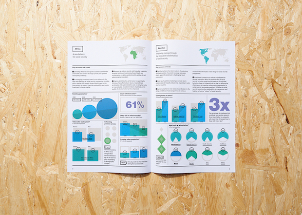
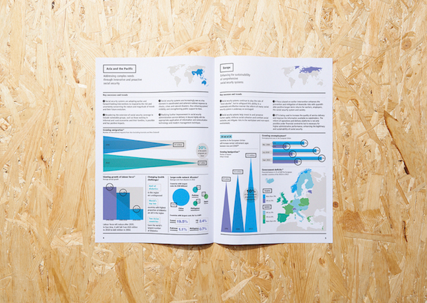
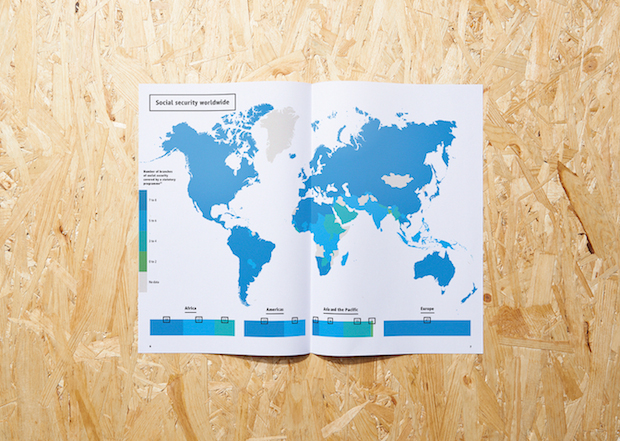
This kind of clarity has also won them projects with clients wanting to present complex data in a more palatable way. In 2012 the duo designed a special infographic report for Air Canada’s 75th anniversary, elegantly explaining the company in numbers, and last year they were commissioned by the International Social Security Association (a Switzerland-based organisation working to improve welfare across the world) to create their global report for 2013 that dealt with statistics-led developments and trends. Unusually for La Tigre’s projects, the ISSA report didn’t involve much illustration, and instead used colour and typography to breath life into charts, graphs and maps. “ISSA talks about life and death,” explains Molteni. “You have to have a fresh approach because you need to fascinate the people reading it but you can’t just play with these topics, you have to give them respect.”
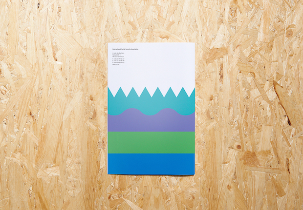
The balance between playfulness and restraint so obvious in La Tigre’s work is something Molteni and Milani believe is deeply imbedded in their Italian heritage. Profoundly inspired by Olivetti’s work in the 1940s, and icons Giovanni Pintori and Franco Grignani, they see themselves as very much part of Milan’s design scene despite their increasingly international client base. “We definitely have an Italian approach in our work,” says Molteini. “Yes, the outlook might be very different but we try to maintain the tradition of simple things, timelessness, and clean shapes. We are drawn to things that are at the point of craziness, colourful, expressive and full of energy but still really clean.”
Over the past two years, Molteni and Milani have consciously started to take the reigns of the direction of the studio, opting for more identity projects lest they get get typecast as illustrators and icon-makers. “Last year it came to a point where we thought we can’t keep doing these kind of editorial illustrations and icons. When really big newspapers call you it’s hard not to do them but we really want to work on a larger variety of projects. We’re not illustrators; we’re graphic designers.”
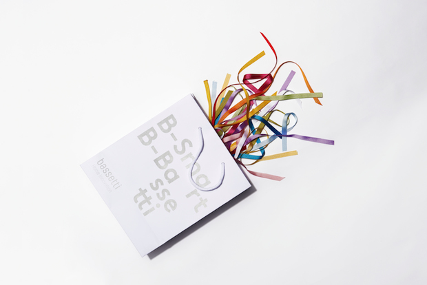
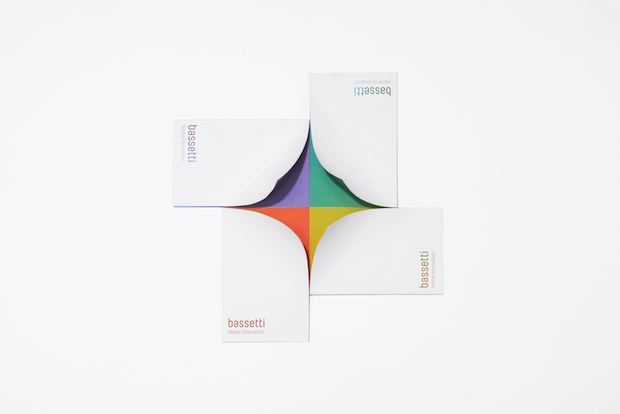
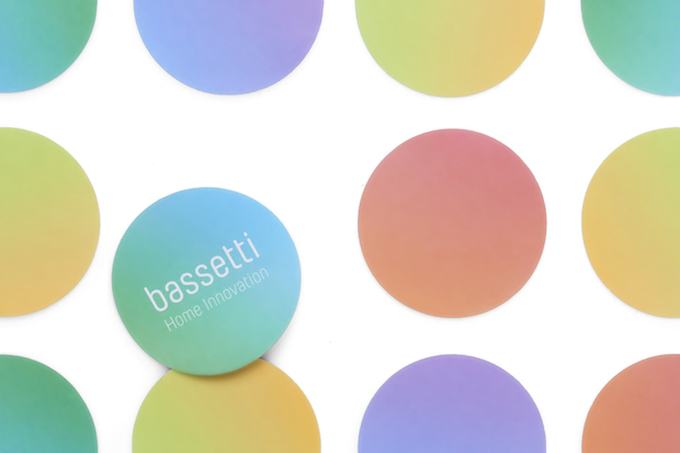
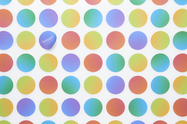
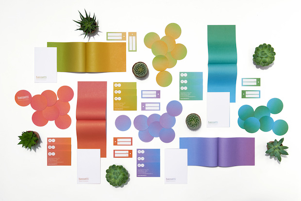
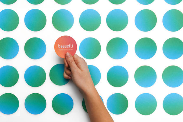
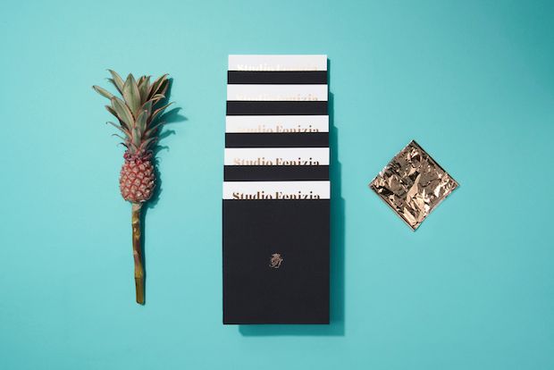
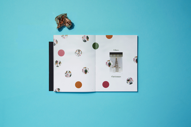
The project that really signalled that changing point landed on their lap in mid-2013, seemingly out of nowhere. Despite usually working with worldwide agencies, iconic Italian homewares company Zucchigroup was looking for a smaller, vibrant studio to redesign the its two core brands Zucchi and Bassetti, which had become too similar over the previous decade. It was the first large identity project that La Tigre had ever worked on. “Bassetti is more popular brand, that even little kids will know,” explains Milani. “It represents the average Italian family, whereas Zucchi is more sophisticated, with high quality materials and particular techniques for making patterns form antique blocks. The identity for Zucchi is like the night, it’s elegant and modern. Whereas Bassetti is modelled on the day – the identity is based around light being separated into the spectrum of the colours. A lot of the packaging and the business cards for example are white on the outside and have a coloured gradient inside. It’s innovation meets playful aspect of the brand.”
Unsurprisingly such a large-scale commission had led to a raft of identity projects of a similar stature. La Tigre are currently designing the branding for a restaurant located in a historic palace in Noto, the home of Baroque, and have also just won a year-long contract to art direct luxury Italian furniture brand Roda, with the aim of starting a much longer partnership. Milani says, “It’s the first time we've had this type of relationship with a client, we're really shoulder to shoulder. Of course it's cool to have lots of different projects, but it's great to have a relationship where you can grow together.”
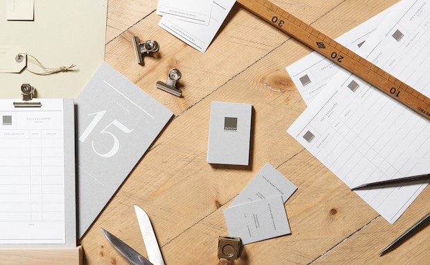
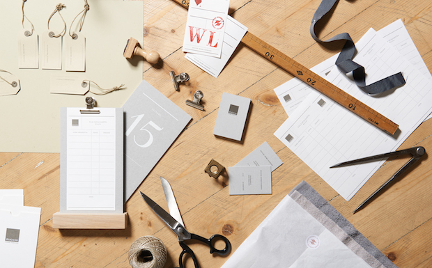
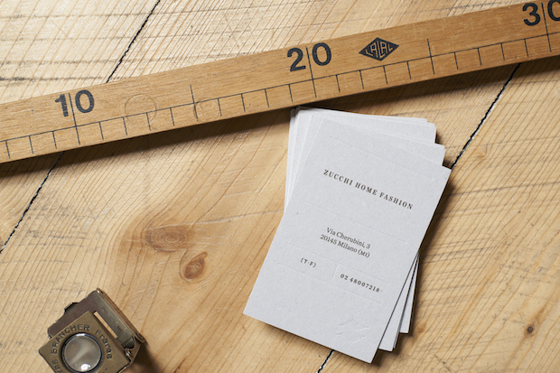
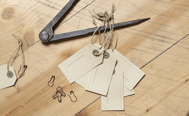

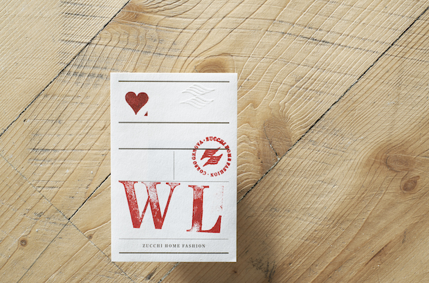
But despite the increase in commissions, Molteni and Milani have no intention of growing in number. An excellent example of successfully side-stepping a pigeonhole, the studio is keen to diversify even more. They’re keen to start experimenting with product design (Milani in particular would like to work with fabric and rugs), a natural side effect perhaps of their love for the Memphis Group and living in the world’s furniture capital. “We don’t want to become a big company with a lot of people that work for us,” says Milani. “We really see us in the future doing just as we are, but just with more new projects to challenge us.”
latigre.net
