
Reporting from Glasgow, Laura Epsom finds that exhibition The Persistence of Type manages to blur art and design in an interesting and natural way – while displaying feminist work constructed out of montaged seventies advertising.
Fiona writes and makes. Sophie and Maeve design. Steff constructs. Lucy and Catriona curate.
The Persistence of Type
– a collaboration between Sophie Dyer, Fiona Jardine and Maeve Redmond, curated by Panel (Catriona Duffy and Lucy McEachen) – is framed within the excavation and reworking of selections from the archives of Edinburgh based design agency Forth Studios (1954–1989), Post Office records, and clippings from local news sources. It explores the roles attributed to women in the Scottish advertising and marketing scene of the Seventies and Eighties, and the oscillation between girl-next-door, mother and professional in the field of affective labour-roles attached to those women.
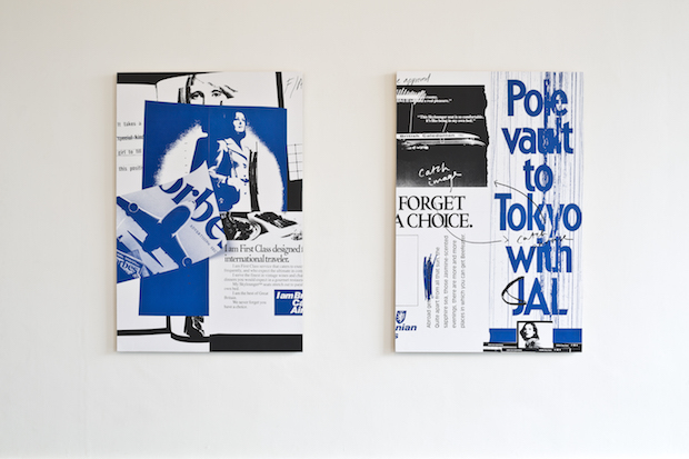
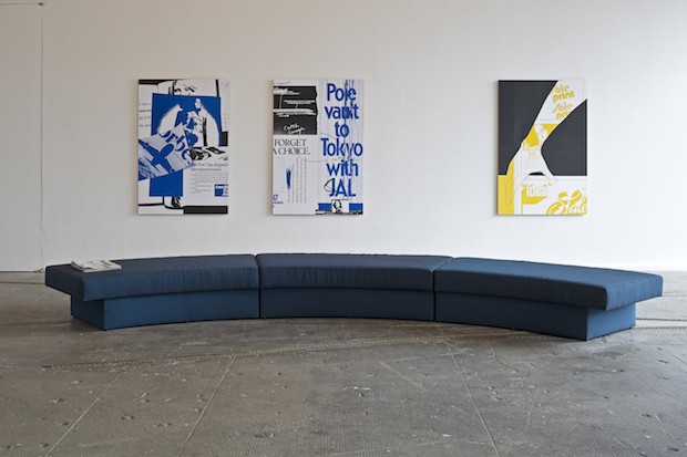
By deconstructing and re-presenting campaigns for British Caledonia Airways and Tennents 'Lager Lovelies' (now something of a cult or urban myth), a new narrative emerges. A character ('Elida'), featured on one of the billboard pieces, becomes a voice within the exhibition, and makes bold but vague statements such as “Elida penetrates text with image as a means of disruption” and “Elida likes erotic text and soft focus imagery” – alluding to themes that are picked up on in the exhibitions accompanying programme of performances and events.
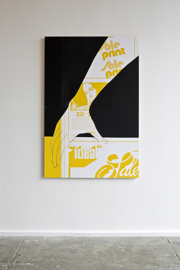
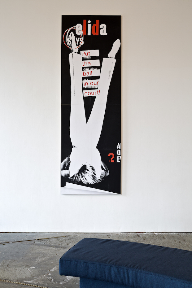
The exhibition itself consists of large 'billboard' pieces – oversized facsimiles and screen-printed fragments with mark-up text. The mark-up, presumably but not necessarily applied by Dyer and Redmond, creates an additional narrative, repurposing the cut and paste contents. While the aesthetic does reference the origins of the original advert artwork, the use of typefaces such as Compacta and Antique Olive – to me evocative of the late seventies but also very much in use today – makes the work more ambiguous in terms of its place within a graphic design lineage.
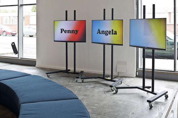
A visual counterpoint to these billboards plays across three large LCD screens – a text-based video piece by Jardine featuring the names of Tennents' Lager Lovelies, set in Cooper Black against a series of gradient backgrounds. Visually these elements have little in common with the billboards, and despite being immediately jarring this contrast provides a useful provocation to the viewer, one which makes this juxtaposition seem like a bold but important visual contrast to have made.
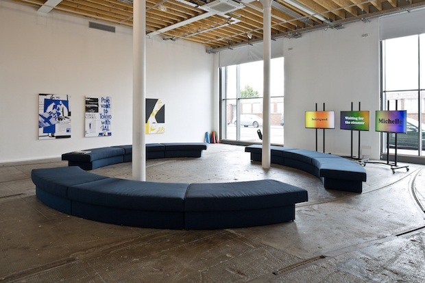
The centre of the room is occupied by a circular low-level seating arrangement, reminiscent – we are told – of “airport lounges of the era”, and far more comfortable and considered than any airport lounge I’ve passed through recently. The gallery’s massive floor to ceiling window only adds to this effect, and makes the space one which invites the visitor to stay.
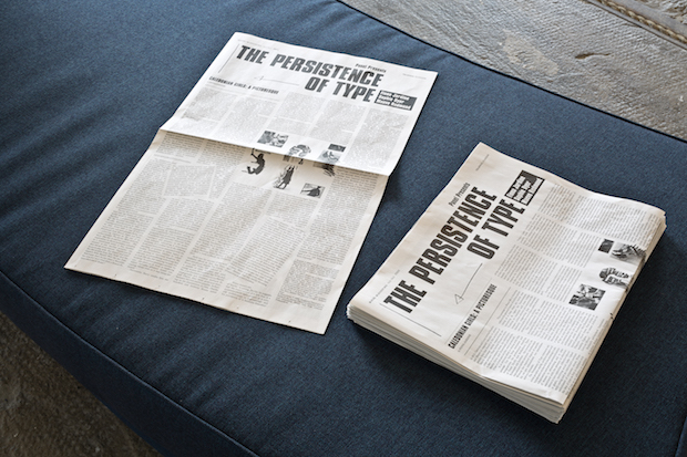
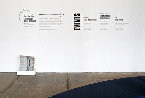
Drawing together the various strands of this exhibition is a free broadsheet newspaper containing information about the exhibition and one of the high points of the show: an essay by Jardine, designed by Redmond and Dyer, which is highly engaging about the various topics that run through the project. It provides the link between distinct elements of the project, while also being a well researched, highly entertaining, and – at times – cutting read.
Excellently curated by Panel, the exhibition casts designers as artists, and artists as writers and performers and examines the role of research and the archive in relation to them all. The show is the latest in a sequence of successful exhibitions curated and coordinated by Duffy and McEachen, non of them afraid to ask where the line between art and design starts and ends, and whether that is a moot point anyway. This helps us think of design as an activity which can be both challenging and critical, as well as a more straightforward application of skill. The approach, and the integrity with which it is undertaken, allows the viewer to contemplate the feminist perspectives of the exhibition, whilst at the same time (on my part at least) enjoying a discussion about various stylistic traits of certain typefaces.
The Persistence of Type is an exhibition that skilfully speaks in different registers – it provides visitors with what, at first glance, appears as quite a minimal intervention, albeit a layered one. By allowing visitors to think through the layers it carefully reveals the societal attitudes and modes of communication of a period that initially seems quite distant, but which are more persistent today than we might assume.
The Persistence of Type
Until 09 August 2015
Tramway, Glasgow
tramway.org
sophiedyer.net
maeveredmond.co.uk
wearepanel.co.uk
A billboard specially designed for The Persistence of Type will take the show out of the gallery and onto Bell Street in Glasgow's Merchant City for two weeks from, Wednesday 29 July – Wednesday 12 August.
You can also spot Sophie and Maeve's work pasted-up around the city for a separate project called Nothing for Sale Here. The work is a colourful poster series in collaboration with the poet, Anthony Autumn, and runs from Monday 27 July – 10 August.