
Type: New Perspectives in Typography is a handsome new book by A2/SW/HK's Henrik Kubel and Scott Williams which documents some of the most accomplished typographic design from the past fifteen years.
There are plenty of books on typography around, but when the book in question is edited and designed by typographic heavyweights A2/SW/HK, you know it's going to be something special. We caught up with A2's Scott and Henrik to find out more about their long-anticipated new publication...
How did the book come about, was it something that you’ve been thinking about doing for a while?
Henrik: We were approached by Angus Hyland, consultant Creative Director at Laurence King, five years ago about the opportunity of working on a book about typography.
Scott: Initially we were intrigued by the prospect of working as editor/commissioner, a role we have touched on previously as art directors, but not in such an all encompassing way.
There are more books on type published than ever before, which would suggest an increased interest in the subject. What would you say makes this one different?A2: Broadly speaking there does seem to be an increased interest, and appreciation, for all things type at the moment, so that might explain the number of titles being published.
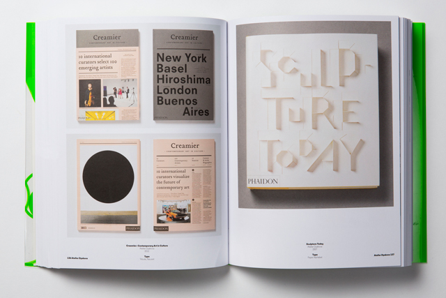
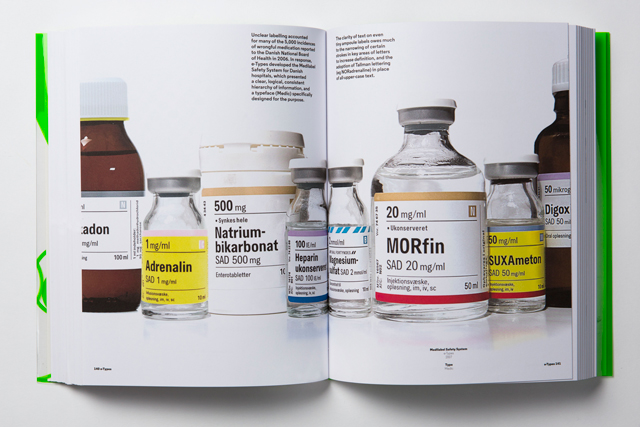
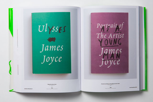
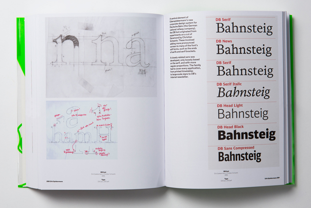
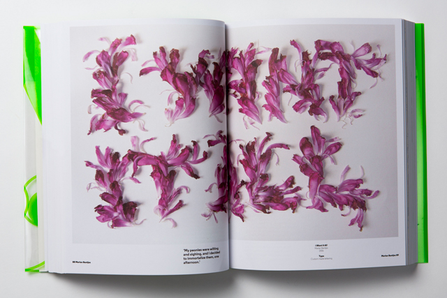
What makes this book different... Firstly, this book is not a 'call for entry' publication, we have carefully selected individual works on a project by project basis. Secondly, it is not a 'picture book' showcase covering the past few years (Tumblr, etc., do this brilliantly), but rather an overview of the past fifteen years – we hope the book will be a useful reference, something to read and not just to be looked at. Thirdly, it was important for us that the book featured 'applied' typography in contemporary graphic design, and more broadly in art/historical contexts – with a few exceptions – there are plenty of other titles published that focus solely on type design as a subject. And lastly, to our knowledge, there are few titles edited by design practitioners, we hope this fact offers something new.
You write in your introduction that you’re not setting out to be “the arbiters of a perceived ‘good taste,’ or delineate good from bad,” but isn’t every piece featured in the book a great piece of typographic design, by the very fact that it’s been included?A2: Yes, it is all effective typography, however there are many featured works that fall far outside of our own personal tastes. We admire the selected projects for reasons that go beyond style, trends, and what's considered good practice etc. We are acutely aware of the difficulties in making such a selection, to some extent it will always be subjective, but we have tried to be as open-minded and as objective as possible.
Obviously you’ve designed the book itself (and very handsome it is too), but what’s the reason for not including any of your own work?A2: We’ve purposely not included our work or any projects that we have had direct involvement with. For us the making of the book; the research, commissioning, selection, editing and the design of the book including the typefaces used in it (Regular; for text and Zadie; for the cover) is enough. That is our work. Far better to let the contributors work shine.
What did you learn from putting the book together? Were there any designers or pieces of work which you saw in a different light after carrying out the research?A2: Just how difficult it is to make a book.
What’s next for A2?
A2: We are currently working on a promotional type specimen for New Transport, a digital adaptation of Transport lettering originally designed by Jock Kinneir & Margaret Calvert in the 1960s, which was officially launched in collaboration with Margaret Calvert in September this year: newtransport.co.uk
—
We have three copies of Type: New Perspectives on Typography to give to three lucky Grafik readers, courtesy of Laurence King Publishing. If you'd like to get your hands on one of them, just drop us a line at giveaway@grafik.net with A2 in the subject box, telling us which design critic is responsible for the book's introduction. Deadline is 26 October 2015 and you can find the answer here.
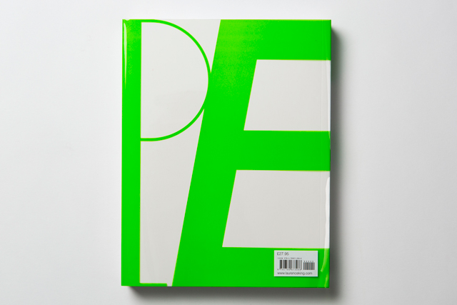
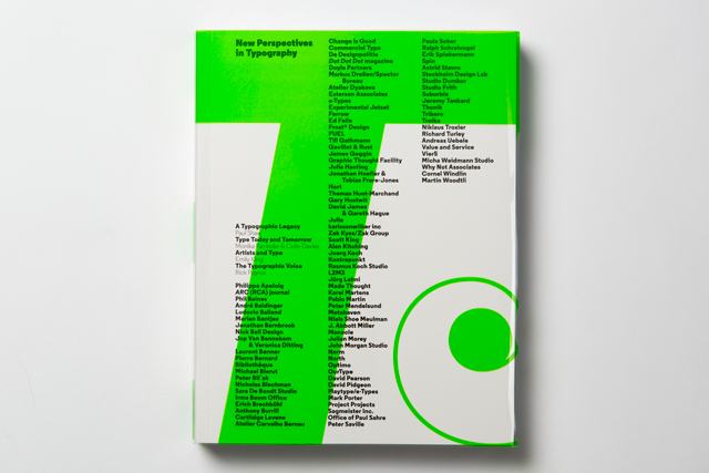
Type: New Perspectives in Typography
by Henrik Kubel and Scott Williams
Published by Laurence King, £27.95
Please note that by entering this giveaway you are consenting for your email address to be added to our weekly newsletter subscriber list. Please unsubscribe if you do not wish to receive the newsletter.