
To celebrate Element 003 magazine’s typographic cover and the exciting narratives embedded in the flick of an ascender or the curve of a bowl, Grafik introduces you to five new typefaces steeped in stories.
Behind every typefaces there’s a story. Designer Vincent Connare kept a copy of Batman: The Dark Knight Returns on his desk at Microsoft while designing the now infamous Comic Sans, looking to the hand-drawn letters in Frank Miller’s masterpiece for inspiration. When designing his eponymous typeface, Adrian Frutiger developed forms that looked clear and concise when placed on illuminated boards and could be read at an angle, because its final destination was to be the signage around Roissy Airport in France, which later became Charles de Gaullle. Even Patron, the striking Milieu Grotesque-designed typeface emblazoned on the front of the new issue of People of Print’s Element 003 magazine is an attempt to unite the contradictory approaches of type designers Günther Gerhard Lange and Roger Excoffon. Let us introduce you to five new typefaces steeped in stories.
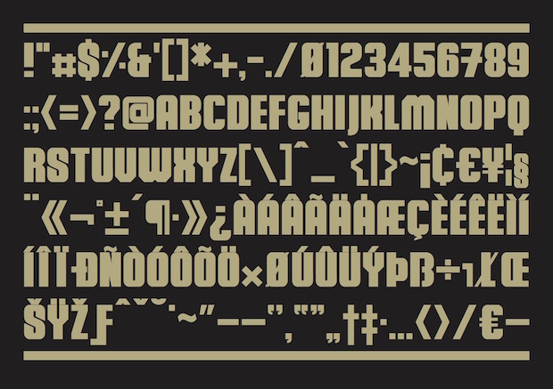
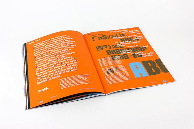
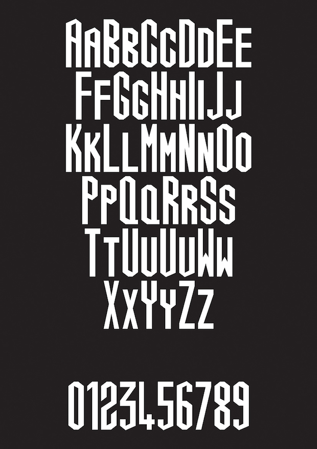
Skin by Jamie Reid
This typeface by Jamie Reid was designed for Skinhead: An Archive, a book published by Ditto Press that brought together a huge volume of printed ephemera from the subculture collected by Toby Mott. Skin’s bold, sharpened shapes were inspired by a headline font from an 1980s Penthouse article highlighting extremism within the the skinhead community. “The aggressive letterforms, its impact and density really captured by imagination,” says Reid. “I also liked that the typeface didn’t feel as DIY as a lot of material included in the book.”
One of the challenges of redrawing the Penthouse typeface – but also a huge part of the appeal – was that Reid only had the word ‘SKINHEADS’ to go from, meaning Reid had to channel the flavour of these eight letters and interpret how the others would look. “Like with most font design, once you have a few letters designed and get going, you can piece together the rest,” says Reid. “I also looked to other Swiss and German headline typefaces for some extra inspiration.” The result is a font composed of an upper case alphabet and digits, punctuation glyphs, as well as a number of hidden treasures in the form of icons from the book.
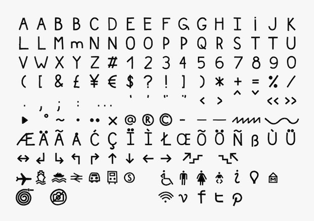
HT Sütterlinschrift by Studio Hato
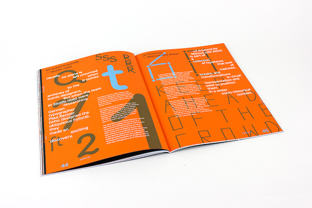
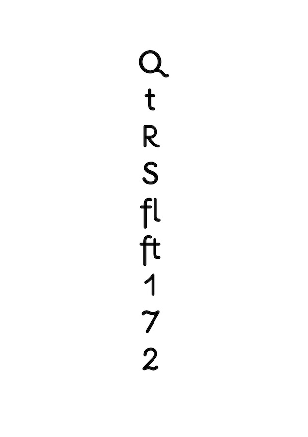
Usually no stone is left unturned when it comes to the archives of iconic designers. But when the team at Studio Hato were researching German typographer Paul Renner (who designed the ubiquitous Futura), they made an exciting discovery. Stumbling across a little-known type specimen captioned “Sütterline-Schrift, a model for children’s handwriting for use in Germany in the early 1920s”, they were keen to pay homage by reinventing it for modern times.
On discovering the typeface, Studio Hato had been immediately struck by its pleasing shapes. “Renner’s proposals and details to the style are beautiful: the squared bottom on the ‘t’, the ‘R’ has a beautiful balance and is easy to mimic. While the ‘Q’ offers a rather ‘rude’ point of view,” says co-founder Ken Kirton.
The idea behind the original Sütterline-Schrift was that the typeface would work as a school primer lettering system that children could copy when learning how to write. After doing a bit of digging, Studio Hato discovered it was proposal Renner had made to the German government to replace the existing handwriting set. His suggestion was declined and the letters lay forgotten, that is until Hato reimagined it as HT Sütterlinschrift.
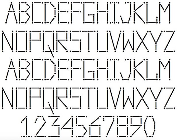
UT Protocol by Marcus Leis Allion
UT Protocol is part of a collection of typefaces that look at ruptures, breaks, and transformations in visual representation and seeks to position them in a wider socio-historical context. It was inspired by IBM’s light pen, a computer input device designed in 1968 – a bit like today’s tablet pens but used directly on screen. In promotional photos for this futuristic device, you can see a computer with the words “Keep ahead of the crowd” drawn onto its screen, each letter constructed individually using the light pen.
While the letterforms were very basic, getting the proportions right while redrawing the typeface was trickier than Leis Allion had anticipated. “I was working at quite a remove from the original, a digital scan of a printed page of a photograph of letterforms on a curved monitor screen at an angle,” he explains.
Not only was the pen and the letterforms it created intriguing, Leis Allion was also struck by the poignance of the slogan considering the worldwide escalation of political and social protest that occurred in 1968. “As such, the statement can be read as: ‘Remain in control of the public, by using the networked computing power of business machines to gather their data and limit their actions,’” says Leis Allion.
Glasgow International by Kellenberger–White
Nominated for the Design Museum’s Designs of the Year 2015, the identity for the biennial art festival Glasgow International was inspired by lettering on ships and warehouses in Glasgow’s docks, and graffiti painted on ships by Greenpeace and nuclear disarmament campaigners at Faslane, a permanent peace camp sited alongside Faslane Naval base in Argyll and Bute, Scotland.
The ships not only provided aesthetic inspiration, but a fascinating and unusual construction process too. When studying the lettering on some of the ships, Kellenberger–White saw that the activists had daubed “No Whales” on to one’s hull with a roller. Realising that the roller process was a quick and expressive communication tool, the pair decided to develop their own typeface in a similar way that would have a fun, energetic feel fitting for the critical but accessible nature of the festival.
Kellenberger–White painted the typeface by hand on to B1 sheets of paper, letting the width of the roller influence the thickness of the strokes. These forms, including their rough edges, were then digitised and reduced, ready for use on the festival’s promotional material. The “No Whales” slogan was not the only inspiration, if you look closely you can also see the influence of Glasgow’s son Charles Rennie Mackintosh, especially in the high waists of the ‘e’ and ‘a’.
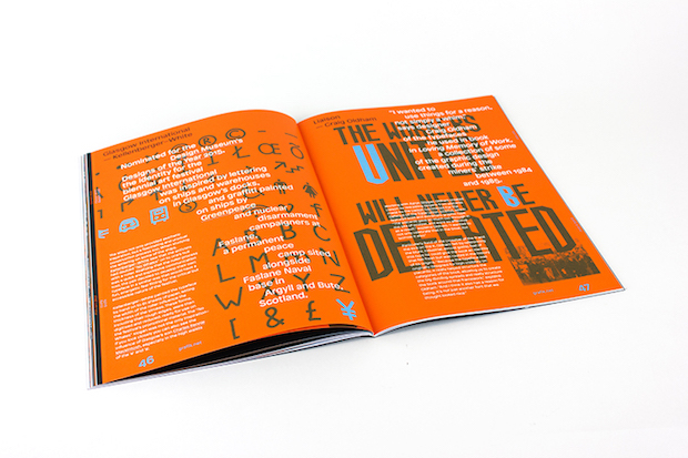
Liaison by Craig Oldham
“I wanted to use things for a reason, not simply a whim,” says designer Craig Oldham of the typefaces he used in book In Loving Memory of Work, a collection of some of the graphic design created during the miners’ strike between 1984 and 1985. Working with Aaron Skipper, Oldham created Liaison by redrawing slogans from placards made by the Liaison Committee For The Defence Of The Trade Union (LCDTU), which featured bold and extremely graphic type. “The placards gave so much cut-through in the sea of protest, and were so effective as a result,” explains Oldham. “I wanted to not only celebrate that in the book, but borrow it also.”
Particularly fond of the crossbar of the H and the kick on the K, Oldham felt by referencing the blunt, industrial, almost gothic feel of this type he could give the book an identity that felt fresh but was rooted in the history of its origins. “Because the typeface was originally designed for high-visibility on placards, it really helped structure the categories of the book, allowing us to create the big dividing spreads and really structure the book around that framework,” explains Oldham. “And I think it also has a reason for being, it’s not just another font that we thought looked nice.”
This feature was published in Element 003, the third issue of People of Print’s design culture magazine. Element 003 is themed around variable data, most prominently visible on its cover which can be personalised by readers thanks to HP Indigo technology, a new printing innovation which allows smaller customisable print runs. Inside (printed using litho in blue, black and orange), the content reflects this innovative approach with articles on personalisation, variable data and the idea of permanence, and insight from the likes of Eike König, Hansje van Halem, YEVU Clothing, Peter Judson, Studio Moross, Kin Design, and Brixton Brewery. To order your copy, visit the Element 003 site here.